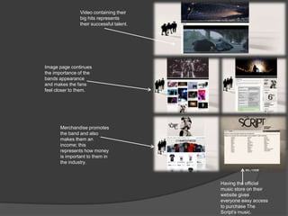
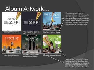
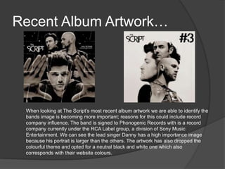
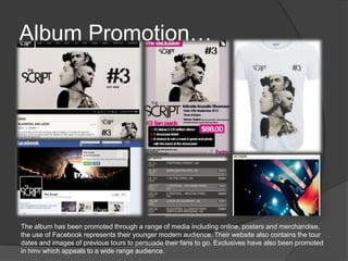
Cross media case study
The Early Years…
The Script are an alternative rock band from Dublin who formed in
2001. After signing to the Sony Label Group they were based in London
where they went on to release their debut album in August 2008,
featuring hit songs “The Man Who Can’t Be Moved” and “Breakeven.”
They then went on to release their second album Science and Faith in
2010 which contains the hit songs “For The First Time” and “Nothing.”
The bands music has become popular in television programmes and
has recently been featured in Waterloo Road, Eastenders and 90210.
The
Website
Simple colours
represents a wide
target audience.
The use of this
photograph
represents the
bands image is
important. However,
I feel they are not
interacting with their
audience as they are
all looking towards
the size.
Continuous slide
show of photo’s
represents the
bands success and
the importance of
their image.
Social network
represents a
youthful audience
and a modern way
of interacting with
their fans.
Live twitter and
instagram updates
shows how they
want their audience
to have a constant
engagement with
them and their lives.
Advertising their
new tour dates .
Website pages…
Consistent simple theme
throughout the website.
Colour scheme applies to
both male and female of
all ages, giving the band
a wide audience.
The bands image is
important throughout
each page, with close ups
and concerts being
present throughout.
The use of social network
throughout each page
represents how the band
has personal contact with
their fans.
Constant promotion of
their new album,
Video containing their
big hits represents
their successful talent.
Having the official
music store on their
website gives
everyone easy access
to purchase The
Script’s music.
Image page continues
the importance of the
bands appearance
and makes the fans
feel closer to them.
Merchandise promotes
the band and also
makes them an
income; this
represents how money
is important to them in
the industry.
Album Artwork…
We Cry promo sleeve
We Cry single sleeve
The Man Who Cant Be
Moved promo sleeve
The Man Who Cant Be
Moved single sleeve
The Script Album sleeve
Before The Worst artwork
The album artwork has a
consistent theme with the use of a
colour triangle and the use of
simple white typography/ From this
artwork we are able to understand
the bands image is not important
but the music is the main focus.
There is also a continuous use of
buildings such as high flats which
could give us a sense of the bands
background and could show their
fans how the band is just like them.
Recent Album Artwork…
When looking at The Script’s most recent album artwork we are able to identify the
bands image is becoming more important; reasons for this could include record
company influence. The band is signed to Phonogenic Records with is a record
company currently under the RCA Label group, a division of Sony Music
Entertainment. We can see the lead singer Danny has a high importance image
because his portrait is larger than the others. The artwork has also dropped the
colourful theme and opted for a neutral black and white one which also
corresponds with their website colours.
Album Promotion…
The album has been promoted through a range of media including online, posters and merchandise,
the use of Facebook represents their younger modern audience. Their website also contains the tour
dates and images of previous tours to persuade their fans to go. Exclusives have also been promoted
in hmv which appeals to a wide range audience.
Goodwin Analyse –
Millionaires…
The music video opens with a mid shot of
two unidentified actors. The audience is
immediately able to see a relationship
between the visuals and lyrics.
Wide shots reveal other actors, but still no
visuals of band members.
Visuals then appear opposite to the lyrics
“Spending our time like millionaires”
compared to the visual of a sweet ring in a
park.
Close ups of the actors goes against
Goodwin because he suggests the need for
close ups of the artists in order to promote
them and their work.
Reference to the notion of looking through
the use of a mirror.
Lip syncing.
Continuous use of close ups but still not involving the
artists.
This motion can be an inter
textual reference to celebration
E.g. at the end of a race. This
can also link to the lyrics “Living
like millionaires.”
I really like the use of the
opposing images through
one action because the
wine represents the “living
like millionaires” in the
lyrics, and then the mugs
continue to present reality.
There is a relationship between the music and the visuals, we
can see this when the music begins to speed up the edit cuts
become faster and the harsh beat is reflected through the
actors arguing/fighting.
The visuals continue to be opposite to the lyrics as
there is no sign of being a millionaire, but average
people.
The artists are seen 2.59 into the video which suggests
they go against Goodwin's analysis as he suggests
there is a need for close ups in order to promote the
artists. In this shot lip syncing is used.
It could be considered the visuals represent the lyrics
“things we can’t by” as the use of a rose suggests this
is love.
To conclude I don’t feel The Scripts latest music video follows Goodwin’s music video
analysis as there are no close ups of the artists. However, it could be argued that it does
through the use of relations between the lyrics and visuals. I also feel the video does not
demonstrate the rock genre as stereotypical images are not used such as guitars and the
colour black. Overall I feel this video represents the band to have little interest in their image
and focus on their music more.
Conclusion…
Overall I feel the band is beginning to show some record company influence, we
can see this through their album artwork. However when analysing their latest
music video “Millionaires” I feel their main focus was on the music as they did
not feature in the video until the very end, and even then it was a long shot
which proves their image was not important. We are able to understand they
have a good relationship with their fans through the use of social networking
sites such as Facebook and instagram. This allows their fans to be in constant
contact and receive continuous updates.
From viewing the bands website we can understand they have a wide target
audience as neutral colours and a simple layout is used; the website also
suggests the bands identity is important as there are many images of them, this
includes a slide show of concert photos which continuously plays on each page.
There is also a video where the audience is able to access all the bands music,
this is used as good promotion and can present the bands success.

The script cross media cae study

  • 1.
  • 2.
    The Early Years… TheScript are an alternative rock band from Dublin who formed in 2001. After signing to the Sony Label Group they were based in London where they went on to release their debut album in August 2008, featuring hit songs “The Man Who Can’t Be Moved” and “Breakeven.” They then went on to release their second album Science and Faith in 2010 which contains the hit songs “For The First Time” and “Nothing.” The bands music has become popular in television programmes and has recently been featured in Waterloo Road, Eastenders and 90210.
  • 3.
    The Website Simple colours represents awide target audience. The use of this photograph represents the bands image is important. However, I feel they are not interacting with their audience as they are all looking towards the size. Continuous slide show of photo’s represents the bands success and the importance of their image. Social network represents a youthful audience and a modern way of interacting with their fans. Live twitter and instagram updates shows how they want their audience to have a constant engagement with them and their lives. Advertising their new tour dates .
  • 4.
    Website pages… Consistent simpletheme throughout the website. Colour scheme applies to both male and female of all ages, giving the band a wide audience. The bands image is important throughout each page, with close ups and concerts being present throughout. The use of social network throughout each page represents how the band has personal contact with their fans. Constant promotion of their new album,
  • 5.
    Video containing their bighits represents their successful talent. Having the official music store on their website gives everyone easy access to purchase The Script’s music. Image page continues the importance of the bands appearance and makes the fans feel closer to them. Merchandise promotes the band and also makes them an income; this represents how money is important to them in the industry.
  • 6.
    Album Artwork… We Crypromo sleeve We Cry single sleeve The Man Who Cant Be Moved promo sleeve The Man Who Cant Be Moved single sleeve The Script Album sleeve Before The Worst artwork The album artwork has a consistent theme with the use of a colour triangle and the use of simple white typography/ From this artwork we are able to understand the bands image is not important but the music is the main focus. There is also a continuous use of buildings such as high flats which could give us a sense of the bands background and could show their fans how the band is just like them.
  • 7.
    Recent Album Artwork… Whenlooking at The Script’s most recent album artwork we are able to identify the bands image is becoming more important; reasons for this could include record company influence. The band is signed to Phonogenic Records with is a record company currently under the RCA Label group, a division of Sony Music Entertainment. We can see the lead singer Danny has a high importance image because his portrait is larger than the others. The artwork has also dropped the colourful theme and opted for a neutral black and white one which also corresponds with their website colours.
  • 8.
    Album Promotion… The albumhas been promoted through a range of media including online, posters and merchandise, the use of Facebook represents their younger modern audience. Their website also contains the tour dates and images of previous tours to persuade their fans to go. Exclusives have also been promoted in hmv which appeals to a wide range audience.
  • 9.
    Goodwin Analyse – Millionaires… Themusic video opens with a mid shot of two unidentified actors. The audience is immediately able to see a relationship between the visuals and lyrics. Wide shots reveal other actors, but still no visuals of band members.
  • 10.
    Visuals then appearopposite to the lyrics “Spending our time like millionaires” compared to the visual of a sweet ring in a park. Close ups of the actors goes against Goodwin because he suggests the need for close ups of the artists in order to promote them and their work. Reference to the notion of looking through the use of a mirror. Lip syncing.
  • 11.
    Continuous use ofclose ups but still not involving the artists. This motion can be an inter textual reference to celebration E.g. at the end of a race. This can also link to the lyrics “Living like millionaires.” I really like the use of the opposing images through one action because the wine represents the “living like millionaires” in the lyrics, and then the mugs continue to present reality. There is a relationship between the music and the visuals, we can see this when the music begins to speed up the edit cuts become faster and the harsh beat is reflected through the actors arguing/fighting.
  • 12.
    The visuals continueto be opposite to the lyrics as there is no sign of being a millionaire, but average people. The artists are seen 2.59 into the video which suggests they go against Goodwin's analysis as he suggests there is a need for close ups in order to promote the artists. In this shot lip syncing is used. It could be considered the visuals represent the lyrics “things we can’t by” as the use of a rose suggests this is love. To conclude I don’t feel The Scripts latest music video follows Goodwin’s music video analysis as there are no close ups of the artists. However, it could be argued that it does through the use of relations between the lyrics and visuals. I also feel the video does not demonstrate the rock genre as stereotypical images are not used such as guitars and the colour black. Overall I feel this video represents the band to have little interest in their image and focus on their music more.
  • 13.
    Conclusion… Overall I feelthe band is beginning to show some record company influence, we can see this through their album artwork. However when analysing their latest music video “Millionaires” I feel their main focus was on the music as they did not feature in the video until the very end, and even then it was a long shot which proves their image was not important. We are able to understand they have a good relationship with their fans through the use of social networking sites such as Facebook and instagram. This allows their fans to be in constant contact and receive continuous updates. From viewing the bands website we can understand they have a wide target audience as neutral colours and a simple layout is used; the website also suggests the bands identity is important as there are many images of them, this includes a slide show of concert photos which continuously plays on each page. There is also a video where the audience is able to access all the bands music, this is used as good promotion and can present the bands success.