
Recommended
More Related Content
What's hot
What's hot (18)
Similar to Contents
Similar to Contents (20)
More from niltiachplar
More from niltiachplar (19)
Recently uploaded
Recently uploaded (20)
Contents
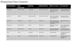
- 1. Photoshoot Plan Contents Model/Object Shot type/angle Lighting Editing Details Mise-en-scene Connotation George Shelley Medium Long Shot Blue spot light Make colours more vibrant Concert, George on stage with a mic in hand and a crowd in front George enjoying singing in front of fans at the concert Luke Friend Long Shot Red/Orange Spotlight Make colours more vibrant Concert, Luke on stage at a mic stand holding a guitar and a crowd in front Luke enjoying singing in front of fans at the concert Poppy Casson Medium Shot Light box High Contrast Poppy looking down so we can see her eye makeup, sat on a bed with purple sheets and headboard Poppy is glamourous pop star Poppy Casson Medium Close Up Light box High Contrast Poppy laying on a purple background Poppy is engaged with the camera and therefore her fans/the reader Poppy Casson Medium Close Up Light box High Contrast Poppy wearing headphones against dark background Poppy enjoys listening to music on the headphones Guitar Close Up Natural light High Contrast Hand playing guitar The magazine features pop musicians/ singer songwriters Piano Close Up Room lighting (warm toned) High Contrast Hands playing piano The magazine features pop musicians/ singer songwriters
- 2. Photo Selection contents page I chose this photograph because I really like the split lighting and my model’s expression because she is clearly engaged with the camera. I chose this photograph because I liked the angle and I liked how clearly you can see the headphones. I chose this image because I really like how the right hand is blurred I chose these 2 photographs because I love the mise en scene and I feel like they will make my contents page look a lot more professional because they have concert lighting. I really like this photo because of my model’s makeup and I think it could look good on the contents page
- 4. On each image, I used the shadow and highlight tool to make them clearer. I then used the brightness and contrast tool to add depth to each photo and make my photographs look more pop/professional.
- 5. I made my contents page on Photoshop. I used the text box tool to insert all of my text and changed the font colours to work with my images. I used the shape tool to insert my banners and the place tool to insert my photographs. I made sure that I had my masthead in the top right hand corner to create a sense of branding.
- 7. Feedback
- 8. I played with the hue of my photographs to make them all a bit more purple toned to match my new colour scheme which I created with the paint bucket tool. I also increased the levels of blue in the photos to make a sense of house style.
- 10. I used the rulers to make sure everything is equally spaced out and aligned with each element I inserted an image of my front cover into my subscription box to show what it advertises visually. I extended my banner all the way across the page and put the date and issue number in it so that it has a clear function. I moved my selfie closer to my name to make it clear that it’s the editor in the photo. I got rid of the ‘p’ in front of each number as I felt it was already obvious what the numbers were for.