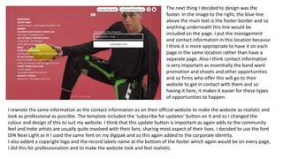
The document describes the process of creating a website for a fictional band called The Drums using the website builder Wix.com. Key points:
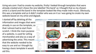
- The creator started with a template labeled "the band" and deleted existing content to start from scratch.
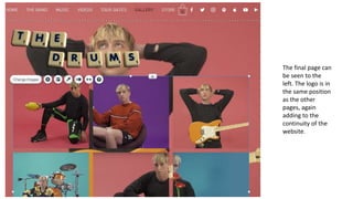
- Pages were created for home, about the band, music, videos, tour dates, gallery, and an online store. Consistent branding elements like the logo and color scheme were added across pages.
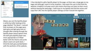
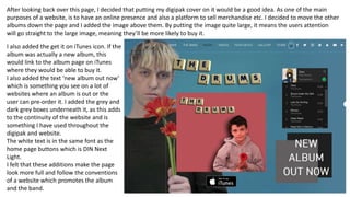
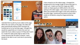
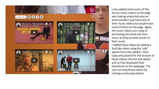
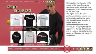
- Images, videos, and other media were included from a fictional music video, album artwork, and social media to make the site look professional and promote the band.
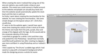
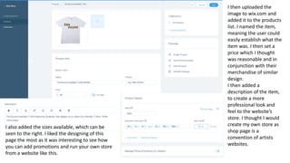
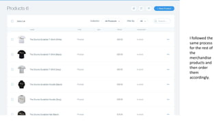
- An online store was built to sell merchandise like t-shirts with the