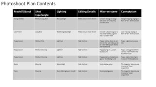
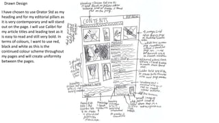
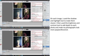
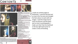
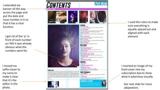
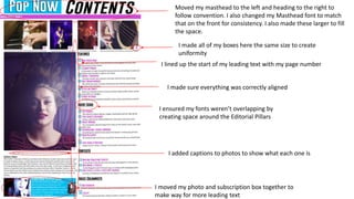
Photoshoot Plan Contents
Model/Object Shot
type/angle
Lighting Editing Details Mise-en-scene Connotation
George Shelley Medium Long Shot Blue spot light Make colours more vibrant Concert, George on stage
with a mic in hand and a
crowd in front
George enjoying singing in
front of fans at the concert
Luke Friend Long Shot Red/Orange Spotlight Make colours more vibrant Concert, Luke on stage at a
mic stand holding a guitar
and a crowd in front
Luke enjoying singing in
front of fans at the concert
Poppy Casson Medium Shot Light box High Contrast Poppy looking down so we
can see her eye makeup, sat
on a bed with purple sheets
and headboard
Poppy is glamourous pop
star
Poppy Casson Medium Close Up Light box High Contrast Poppy laying on a purple
background
Poppy is engaged with the
camera and therefore her
fans/the reader
Poppy Casson Medium Close Up Light box High Contrast Poppy wearing headphones
against dark background
Poppy enjoys listening to
music on the headphones
Guitar Close Up Natural light High Contrast Hand playing guitar The magazine features pop
musicians/ singer
songwriters
Piano Close Up Room lighting (warm toned) High Contrast Hands playing piano The magazine features pop
musicians/ singer
songwriters
Photo Selection contents page
I chose this photograph
because I really like the split
lighting and my model’s
expression because she is
clearly engaged with the
camera.
I chose this photograph because I
liked the angle and I liked how
clearly you can see the headphones.
I chose this image because I really like
how the right hand is blurred
I chose these 2 photographs because I love the mise en scene and
I feel like they will make my contents page look a lot more
professional because they have concert lighting.
I really like this photo because of
my model’s makeup and I think it
could look good on the contents
page
Drawn Design
I have chosen to use Orator Std as my
heading and for my editorial pillars as
it is very contemporary and will stand
out on the page. I will use Calibri for
my article titles and leading text as it
is easy to read and still very bold. In
terms of colours, I want to use red,
black and white as this is the
continued colour scheme throughout
my pages and will create uniformity
between the pages.
On each image, I used the shadow
and highlight tool to make them
clearer. I then used the brightness and
contrast tool to add depth to each
photo and make my photographs look
more pop/professional.
I made my contents page on
Photoshop. I used the text box tool
to insert all of my text and changed
the font colours to work with my
images. I used the shape tool to
insert my banners and the place
tool to insert my photographs. I
made sure that I had my masthead
in the top right hand corner to
create a sense of branding.
Feedback
Having been given my feedback, I have changed my colour scheme. I chose to use a bright blue and pink as they are both bright
and contrast each other and this is a technique often employed by Pop magazines such as ‘Top of the Pops’ to catch the eye of
readers and those colours work well next to my photos which are mostly purple toned.
I then went about looking for a new font to replace AR Bonnie and Orator Std. I looked through all of the fonts already on my
school and home computers but decided I’d be better off finding a new one online. I went onto Dafont.com and looked through
all of the possible fonts I could use before settling on GoBold. I downloaded and installed it to my home computer and used
Gobold itallic as well on my contents page to create some variation.
Font and Colour Scheme Changes
I played with the hue of my photographs
to make them all a bit more purple
toned to match my new colour scheme
which I created with the paint bucket
tool. I also increased the levels of blue in
the photos to make a sense of house
style.
Teacher Feedback:
I used the rulers to make
sure everything is
equally spaced out and
aligned with each
element
I inserted an image of my
front cover into my
subscription box to show
what it advertises visually.
I extended my
banner all the way
across the page and
put the date and
issue number in it so
that it has a clear
function.
I moved my
selfie closer to
my name to
make it clear
that it’s the
editor in the
photo.
I got rid of the ‘p’ in
front of each number
as I felt it was already
obvious what the
numbers were for.
See next slide for more
adaptations
Moved my masthead to the left and heading to the right to
follow convention. I also changed my Masthead font to match
that on the front for consistency. I also made these larger to fill
the space.
I made all of my boxes here the same size to create
uniformity
I lined up the start of my leading text with my page number
I made sure everything was correctly aligned
I ensured my fonts weren’t overlapping by
creating space around the Editorial Pillars
I added captions to photos to show what each one is
I moved my photo and subscription box together to
make way for more leading text

Contents new

  • 1.
    Photoshoot Plan Contents Model/ObjectShot type/angle Lighting Editing Details Mise-en-scene Connotation George Shelley Medium Long Shot Blue spot light Make colours more vibrant Concert, George on stage with a mic in hand and a crowd in front George enjoying singing in front of fans at the concert Luke Friend Long Shot Red/Orange Spotlight Make colours more vibrant Concert, Luke on stage at a mic stand holding a guitar and a crowd in front Luke enjoying singing in front of fans at the concert Poppy Casson Medium Shot Light box High Contrast Poppy looking down so we can see her eye makeup, sat on a bed with purple sheets and headboard Poppy is glamourous pop star Poppy Casson Medium Close Up Light box High Contrast Poppy laying on a purple background Poppy is engaged with the camera and therefore her fans/the reader Poppy Casson Medium Close Up Light box High Contrast Poppy wearing headphones against dark background Poppy enjoys listening to music on the headphones Guitar Close Up Natural light High Contrast Hand playing guitar The magazine features pop musicians/ singer songwriters Piano Close Up Room lighting (warm toned) High Contrast Hands playing piano The magazine features pop musicians/ singer songwriters
  • 2.
    Photo Selection contentspage I chose this photograph because I really like the split lighting and my model’s expression because she is clearly engaged with the camera. I chose this photograph because I liked the angle and I liked how clearly you can see the headphones. I chose this image because I really like how the right hand is blurred I chose these 2 photographs because I love the mise en scene and I feel like they will make my contents page look a lot more professional because they have concert lighting. I really like this photo because of my model’s makeup and I think it could look good on the contents page
  • 3.
    Drawn Design I havechosen to use Orator Std as my heading and for my editorial pillars as it is very contemporary and will stand out on the page. I will use Calibri for my article titles and leading text as it is easy to read and still very bold. In terms of colours, I want to use red, black and white as this is the continued colour scheme throughout my pages and will create uniformity between the pages.
  • 4.
    On each image,I used the shadow and highlight tool to make them clearer. I then used the brightness and contrast tool to add depth to each photo and make my photographs look more pop/professional.
  • 5.
    I made mycontents page on Photoshop. I used the text box tool to insert all of my text and changed the font colours to work with my images. I used the shape tool to insert my banners and the place tool to insert my photographs. I made sure that I had my masthead in the top right hand corner to create a sense of branding.
  • 7.
  • 8.
    Having been givenmy feedback, I have changed my colour scheme. I chose to use a bright blue and pink as they are both bright and contrast each other and this is a technique often employed by Pop magazines such as ‘Top of the Pops’ to catch the eye of readers and those colours work well next to my photos which are mostly purple toned. I then went about looking for a new font to replace AR Bonnie and Orator Std. I looked through all of the fonts already on my school and home computers but decided I’d be better off finding a new one online. I went onto Dafont.com and looked through all of the possible fonts I could use before settling on GoBold. I downloaded and installed it to my home computer and used Gobold itallic as well on my contents page to create some variation. Font and Colour Scheme Changes
  • 9.
    I played withthe hue of my photographs to make them all a bit more purple toned to match my new colour scheme which I created with the paint bucket tool. I also increased the levels of blue in the photos to make a sense of house style.
  • 10.
  • 11.
    I used therulers to make sure everything is equally spaced out and aligned with each element I inserted an image of my front cover into my subscription box to show what it advertises visually. I extended my banner all the way across the page and put the date and issue number in it so that it has a clear function. I moved my selfie closer to my name to make it clear that it’s the editor in the photo. I got rid of the ‘p’ in front of each number as I felt it was already obvious what the numbers were for. See next slide for more adaptations
  • 12.
    Moved my mastheadto the left and heading to the right to follow convention. I also changed my Masthead font to match that on the front for consistency. I also made these larger to fill the space. I made all of my boxes here the same size to create uniformity I lined up the start of my leading text with my page number I made sure everything was correctly aligned I ensured my fonts weren’t overlapping by creating space around the Editorial Pillars I added captions to photos to show what each one is I moved my photo and subscription box together to make way for more leading text