Album Covers
Album Covers
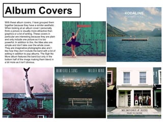
With these album covers, I have grouped them
together because they have a similar aesthetic .
When looking at an album cover I personally
think a picture is visually more attractive than
graphics or a lot of writing. These covers in
particular are interesting because they are plain
and only include one picture so it is too
powerful. In addition to this, the titles also are
simple and don't take over the whole cover.
They are imaginative photographs also and I
like how they don’t include the band with a lot of
editing in addition to pop albums. The Sigh No
More album features the band but only in the
bottom half of the image making them blend in
a bit more as it isn't obvious.
Album Covers
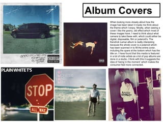
When looking more closely about how the
image has been taken it made me think about
the theme which I enjoy. Mostly, when seeing a
cover I like the grainy, old effect which most of
these images have. I need to think about what
camera to take these with, which could either be
digital, disposable, film or polaroid's. The
Kendrick Lamar album is really interesting
because the whole cover is a polaroid which
has been scanned in to fill the entire cover,
including the spare at the bottom which has the
title on. I have found that this media is featured
in a lot of indie artists as a lot of pop albums are
done in a studio. I think with this it suggests the
idea of ‘being in the moment’ which makes the
consumer feel more connected.
Album Covers
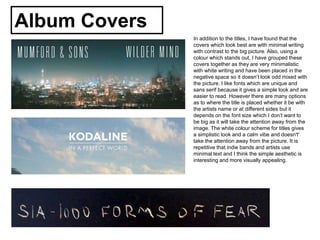
In addition to the titles, I have found that the
covers which look best are with minimal writing
with contrast to the big picture. Also, using a
colour which stands out, I have grouped these
covers together as they are very minimalistic
with white writing and have been placed in the
negative space so it doesn’t look odd mixed with
the picture. I like fonts which are unique and
sans serif because it gives a simple look and are
easier to read. However there are many options
as to where the title is placed whether it be with
the artists name or at different sides but it
depends on the font size which I don’t want to
be big as it will take the attention away from the
image. The white colour scheme for titles gives
a simplistic look and a calm vibe and doesn't'
take the attention away from the picture. It is
repetitive that indie bands and artists use
minimal text and I think the simple aesthetic is
interesting and more visually appealing.

Album covers

  • 1.
  • 2.
    Album Covers With thesealbum covers, I have grouped them together because they have a similar aesthetic . When looking at an album cover I personally think a picture is visually more attractive than graphics or a lot of writing. These covers in particular are interesting because they are plain and only include one picture so it is too powerful. In addition to this, the titles also are simple and don't take over the whole cover. They are imaginative photographs also and I like how they don’t include the band with a lot of editing in addition to pop albums. The Sigh No More album features the band but only in the bottom half of the image making them blend in a bit more as it isn't obvious.
  • 3.
    Album Covers When lookingmore closely about how the image has been taken it made me think about the theme which I enjoy. Mostly, when seeing a cover I like the grainy, old effect which most of these images have. I need to think about what camera to take these with, which could either be digital, disposable, film or polaroid's. The Kendrick Lamar album is really interesting because the whole cover is a polaroid which has been scanned in to fill the entire cover, including the spare at the bottom which has the title on. I have found that this media is featured in a lot of indie artists as a lot of pop albums are done in a studio. I think with this it suggests the idea of ‘being in the moment’ which makes the consumer feel more connected.
  • 4.
    Album Covers In additionto the titles, I have found that the covers which look best are with minimal writing with contrast to the big picture. Also, using a colour which stands out, I have grouped these covers together as they are very minimalistic with white writing and have been placed in the negative space so it doesn’t look odd mixed with the picture. I like fonts which are unique and sans serif because it gives a simple look and are easier to read. However there are many options as to where the title is placed whether it be with the artists name or at different sides but it depends on the font size which I don’t want to be big as it will take the attention away from the image. The white colour scheme for titles gives a simplistic look and a calm vibe and doesn't' take the attention away from the picture. It is repetitive that indie bands and artists use minimal text and I think the simple aesthetic is interesting and more visually appealing.