
Recommended
More Related Content
What's hot
What's hot (18)
Similar to Artist magazine adverts analysis
Similar to Artist magazine adverts analysis (20)
More from TPugsley
More from TPugsley (12)
Recently uploaded
Recently uploaded (20)
Artist magazine adverts analysis
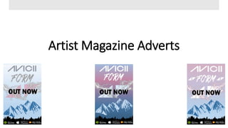
- 2. Design 1: Throughout my three designs, you can clearly see the layout is near the exact same in each individual product. This is because from the start of A2, I already had a pretty detailed idea in my mind in what I wanted it too look like, what was shown and also what stands out more then other factors on the advert. This can be clearly shown in my three drawings presented above. Fonts I used a variety of fonts throughout the magazine advert as I didn’t want any repetitions to be shown. This is because Steve Neale stated that “mere repetitions wouldn’t attract an audience”. Due to me wanting to have a differing font with each piece of text displayed, I had to research many different fonts that were in some ways similar to the genre to keep the connection but also some ways different to insure originality. This is why I used the ‘Franklin Gothic Heavy’ font for the ‘OUT NOW’ and ‘Calibri (Body)’ font for the link to Tim Berglings website. Overall, I believe the fonts used on the advert cover are very effective, help catch the readers eye, reflect the genre in a positive and adventurous way and also stand out against the light background. Colours Throughout each cover, I used a variety of different colours that link in some way to the genre. I used a light blue fading into an even lighter blue for two reasons; to act as the day light sky above the mountains and forest but also because I believed the blue would help make the fonts and lightning effect stand out even more to not only catch the readers eye, but to also entice them to read about the advert. Overall, I believe the variety of colours used help portray the electronic dance music with a twist of adventure also being portrayed in a successful way and would therefore be successful as a real life media product.
- 3. Design 2: Colours On my second design, I decided to use a light blue fading into a purple to portray a sunset, night sky theme against the forest and mountains. I wanted this because the Electronic Dance Music genre can be seen to be played in night clubs around the world at night so therefore wanted to try and portray the night time theme across my second advert design. This meant I had to change the colour of the majority of the texts used to help them stand out. Due to this minor problem, I had to find a colour which linked to the genre but also stood out against the background. The colour white was my best choice out of the colours I had available with Microsoft publisher. If I had more resources available, like PhotoShop, I would have had a wider variety of colours available and then would have been able to create a fading effect within the main fonts which would have linked to the background fade. Overall, with the resources I had available, I believe the colours used are very successful and again help portray the genre. Layout/Design Throughout the three designs, the main layout stays the same apart from two additional Avicii logos added in on this design. I wanted a repeated design throughout my three designs as from day 1 of A2, I had this design idea in mind and my ideas for it only got stronger and more detailed. When it came to researching Aviciis adverts, I found that many of his adverts were very different to mine so therefore I decided I would stay with my designs in order to be original within the genre which many artists struggle to do these days. Due to the originality within my designs, I believe the general layout and overall design of the three is very successful and would no doubt compete against some of the thousands media product adverts out in the world today.
- 4. Design 3: Colours For my third and final design, I decided to stay with the night sky theme as the background colour. This was again because of the idea of Electronic Dance Music being played in clubs late at night around the world. I used three differing colours on this design which are two different shades of blue and a purple. These 3 differing colours were used as they are often seen to be used with different lighting effects in clubs and also would help make the font colours and main texts stand out against the seemingly dark background. I believe the colours used are the most appealing and eye catching out of the three and therefore help create an adventurous atmosphere throughout the design as well as link the whole design to the genre successfully. Logos Throughout each cover, a variety of logos have been included to make my adverts look as real as possible and to also add a hint of professionalism to the adverts. These include the Spotify logo, Itunes logo, Google Play Music logo and lastly the official Avicii Logo. The importance of these logos is very high due to it telling the audience that you can now listen to Avicii’s new album online and can also buy it. This helps the advertising of the new album and also shows the audience that the album is available on many differing music media platforms.
- 5. My Final Piece I chose this as my final piece as both me and my audience believed it was the most professional looking, most eye catching and is easily linked to the genre out of the three designs. The audience liked the fact that this design was “very colourful”, the “title of the album stands out against the fading pink” and the “use of pink stands out as a contrast to the lightning and the bolder blue beneath”. The feedback I received from this design compared to the others was very successful and only positive opinions were given. This meant that I didn't need to amend any of the design and it was therefore finished and ready to be used as a 1/3 of my final piece. Looking back at my design now, I would change a few little things to maximise its potential and to also make the artists logo more recognisable. In order to do this, I would create two more official Avicii logos and place them either side of the “FORM” font much like design 2 shows. This would mean the logo can be easily seen and wouldn’t be hidden to anyone's eye if they could not see the main official logo behind the lightning and the “OUT NOW” font. Even though there is a few things I would change, I am overall very happy with my final piece and therefore believe it would do very well against some of the official adverts out there today in the world. Including some of Avicii’s own.