
Recommended
More Related Content
What's hot
What's hot (19)
Viewers also liked
Similar to Kings of leon
Similar to Kings of leon (20)
Recently uploaded
Recently uploaded (20)
Kings of leon
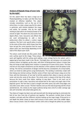
- 1. Analysis of Digipak:Kings of Leon‘only by the night’. For this advert there has been a large use of Photoshop/editing to make sure that they have created an effective look/feel. This advert includes conventions such as the use of the artists face, in a more unique way for this advert in particular, with relation between the image and words, for example ‘only by the night’ relating to owls which are famously known to be around at night. The advert has also used a more digital effect, more masculine and effects that are used online/gaming to add a more professional effect to attract a certain target audience. The font is not specific when it comes to the name of the artist, which shows how they have not got the same signature font for every album cover, but interchange depending on the style of the album cover itself. The colours used include red, blue, green, black and a yellow wash to the image. These colours work well together with the yellow wash adding a more vintage feel to the advert, with it appearing to have been made in the 70s etc. The bright blue, red and green are used as the contrast colours to brighten up the cover, with them all being primary colours it shows how they are trying to look slightly more amateur in comparison to some artists covers. The blue and red are very bright and balance out the attention of the audience from the photo to the writing. The red has connotations of danger and the blue has connotations of a virtual world, which can relate to video games using intertextuality. The wording is extremely simple with their being very minimal writing. Only the names of their most well-known songs are on the front, with the information of ‘out now’ to tell the audience their album is now on sale, their name and also the name of the album. The artists name is always at the top of the album because the brain reads from above, working its way down. There is not much use of punctuation to add a more masculine and relaxed feel to the rocky and rough style of the pop/rock genre. The font that is used is straight and rather plane, but with sharp edges and very little curves when circular. The font matches and uses the style of gaming and the virtual world/internet, this relates to the target audience being male and of an older average age who will remember old-school video games etc. The choice of images has been very well planned with the design wanting to aim/create the feel of one face from lots of portraits put together. The portraits include those of band members and owls with four different sections making up one large image. If focused on in real depth the photo shows to have small crosses in each corner and in the middle edges, these crosses create a feel of amateur camera skills and as though the photo has just been
- 2. taken or so the audience is looking through the camera lens as the photo is going to be taken. The wash of colour adds a vintage feel which will appeal to the older target audience (20-35) that will be more interested/ educated around the earlier year of the 60s/70s. The layout of the advert is fairly basic, with the font being each end of the photo without any overlapping which takes more time in Photoshop. This shows how they are a more rough and ready and targeting a more niche market of people who do not want the glitzand glamour of pop music.