1. Lana Del ReyDigipakanalysis
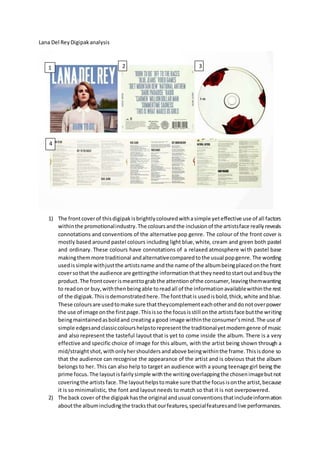
1) The frontcoverof thisdigipakisbrightlycolouredwithasimple yeteffective use of all factors
withinthe promotionalindustry.The coloursandthe inclusionof the artistsface reallyreveals
connotations and conventions of the alternative pop genre. The colour of the front cover is
mostly based around pastel colours including light blue,white, cream and green both pastel
and ordinary. These colours have connotations of a relaxed atmosphere with pastel base
makingthemmore traditional andalternativecomparedtothe usual popgenre.The wording
usedissimple withjustthe artistsname andthe name of the albumbeingplacedonthe front
coversothat the audience are gettingthe informationthattheyneedtostartoutandbuythe
product.The frontcoverismeanttograbthe attentionofthe consumer,leavingthemwanting
to readon or buy,withthenbeingable toreadall of the informationavailablewithinthe rest
of the digipak.Thisisdemonstratedhere.The fontthatis usedisbold,thick,white andblue.
These coloursare usedtomake sure thattheycomplementeachotheranddonotoverpower
the use of image onthe firstpage.Thisisso the focusisstill onthe artistsface butthe writing
beingmaintainedasboldand creatinga good image withinthe consumer’smind.The use of
simple edgesandclassiccolourshelpstorepresentthe traditionalyetmoderngenre of music
and also represent the tasteful layout that is yet to come inside the album. There is a very
effective and specific choice of image for this album, with the artist being shown through a
mid/straightshot,withonlyhershouldersandabove beingwithinthe frame.Thisisdone so
that the audience can recognise the appearance of the artist and is obvious that the album
belongs to her. This can also help to target an audience with a young teenage girl being the
prime focus.The layoutisfairlysimple withthe writingoverlappingthe chosenimagebutnot
coveringthe artists face.The layouthelpstomake sure thatthe focusisonthe artist,because
it is so minimalistic, the font and layout needs to match so that it is not overpowered.
2) The back cover of the digipakhasthe original andusual conventionsthatincludeinformation
aboutthe albumincludingthe tracksthatourfeatures,specialfeaturesandlive performances.
1 2 3
4
2. By havingthisincludeditmeansthatthe audience isinformedaboutthe contentbeforethey
buyso that theywill be satisfied.The coloursthatare used are fairly minimal andare chosen
sothattheyworkwiththe frontcoverandcomplementeachother.The coloursonthe reverse
include white/cream and blue which matches the font on the front colour. The wording is
fairly simple withthe pack statingwhat tracks are includedandtheirtitle without additional
information or design that wouldn’t be of any use to the audience. They have included the
copy right and record label information at the bottom of this sectionso that the audience is
informed.The fontthat is usedis extremelysimilartothat used on the front cover.The font
is mostlyplainbut tall and skinnyto lookvery elegantandstreamline withthe designof this
page. There are not any images that are used as the information that is given is the most
importantthingasthe artisthasalreadybeenshownoff.Thisisbecausesomeconsumersmay
like the musicandnotthe artistsetc.All of these factorsshow conventionsof alternative pop
throughthe wayitisdesignedtocapture the eye of the targetaudience andlookaesthetically
pleasing.
3) The designof the diskis once againkept to a minimumbutwitha small feature of redroses
to add a more feminine feel,withthe rosesalsoaddingto the elegantfontfromother areas
of the digipakandalsotargetingthe correct target audience.The CDisusingboth cream and
red which are both contrasting each other so that the colours are focused on greatly by the
audience. This keeps the layout minimal but with there only being a few red roses it means
that the audience is left wondering why they have been used.
4) The inside of the digipak is represented as a more knowledgeable and informative to the
audience andthis ison displayusuallyafterthe digipakhasbeenbought.Thisinformationis
about the content of the CD and how it was created and information that will help to make
the audience tofeel more exclusive.The colourislargelycreamandblackwitha small popof
red when there is a glimpse of a red rose. This is done to run smoothly with the outside
packagingand alsonot take the focusaway fromthe writing.The coloursworkwell together
withthembasingaround a more feminine appearance.The fontthat isusedis rather simple
andisverysimilartothatof whichhasbeenusedonthe reverse of the outsidepackaging.The
design and layout is very well thought out with the writing looking very neat and easy to
understand. The lyrics are includedto the audience to help them feel more special and also
be able to sing along and feel more relatable to the lyrics. This is a popular convention of
alternative pop with fans being supportive of this type of feature.