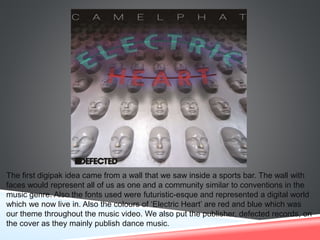
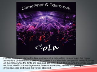
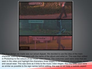
INITIAL DIGIPAK IDEAS
The first digipak idea came from a wall that we saw inside a sports bar. The wall with
faces would represent all of us as one and a community similar to conventions in the
music genre. Also the fonts used were futuristic-esque and represented a digital world
which we now live in. Also the colours of ‘Electric Heart’ are red and blue which was
our theme throughout the music video. We also put the publisher, defected records, on
the cover as they mainly publish dance music.
For this design we planned to take an image of a club setting or rave to pin the typical
annotations of dance music and youth culture. It is a simplistic design that mainly focuses
on the image while the fonts are plain and don’t stand out. The colours are similar to ones
we have used in our montage scene however more deep and dark to portray a
mysterious vibe and make the viewer attracted.
The final design we made was our actual digipak. We decided to use the idea of the main
character walking by road signs with the name of the album and artist on. This was then edited
in Photoshop to the colours of our music video theme. The costumes used were ones that are
seen in the video and highlight the characters three stages in his weekend; Work/college, sports
and casual wear. This was done as it links to the music video stages. Also the fonts used were
as similar as possible to the sign names before editing, this was so we keep a realistic aspect

Initial digipack ideas

  • 1.
  • 2.
    The first digipakidea came from a wall that we saw inside a sports bar. The wall with faces would represent all of us as one and a community similar to conventions in the music genre. Also the fonts used were futuristic-esque and represented a digital world which we now live in. Also the colours of ‘Electric Heart’ are red and blue which was our theme throughout the music video. We also put the publisher, defected records, on the cover as they mainly publish dance music.
  • 3.
    For this designwe planned to take an image of a club setting or rave to pin the typical annotations of dance music and youth culture. It is a simplistic design that mainly focuses on the image while the fonts are plain and don’t stand out. The colours are similar to ones we have used in our montage scene however more deep and dark to portray a mysterious vibe and make the viewer attracted.
  • 4.
    The final designwe made was our actual digipak. We decided to use the idea of the main character walking by road signs with the name of the album and artist on. This was then edited in Photoshop to the colours of our music video theme. The costumes used were ones that are seen in the video and highlight the characters three stages in his weekend; Work/college, sports and casual wear. This was done as it links to the music video stages. Also the fonts used were as similar as possible to the sign names before editing, this was so we keep a realistic aspect