
Recommended
More Related Content
What's hot
What's hot (19)
Similar to Magazine Advert feedback
Similar to Magazine Advert feedback (20)
More from Amy Clarke
Recently uploaded
Recently uploaded (20)
Magazine Advert feedback
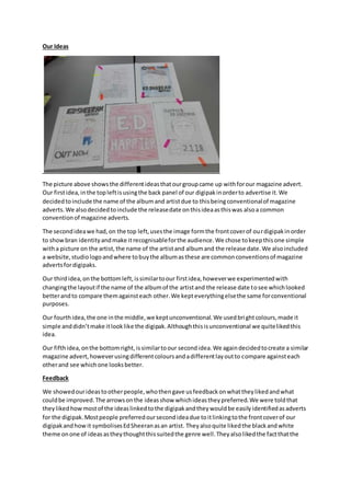
- 1. Our Ideas The picture above showsthe differentideasthatourgroupcame up withforour magazine advert. Our firstidea,inthe topleftisusingthe back panel of our digipakinorderto advertise it.We decidedtoinclude the name of the albumand artistdue to thisbeingconventionalof magazine adverts.We alsodecidedtoinclude the releasedate onthisideaasthiswas alsoa common conventionof magazine adverts. The secondideawe had,on the top left,usesthe image formthe frontcoverof ourdigipakinorder to showbran identityandmake itrecognisableforthe audience.We chose tokeepthisone simple witha picture on the artist,the name of the artistand albumand the release date.We alsoincluded a website,studiologoandwhere tobuythe albumasthese are commonconventionsof magazine advertsfordigipaks. Our thirdidea,onthe bottomleft,issimilartoour firstidea,howeverwe experimentedwith changingthe layoutif the name of the albumof the artistand the release date tosee whichlooked betterandto compare themagainsteach other.We kepteverythingelsethe same forconventional purposes. Our fourthidea,the one inthe middle,we keptunconventional.We usedbrightcolours,made it simple anddidn’tmake itlooklike the digipak.Althoughthisisunconventional we quitelikedthis idea. Our fifthidea,onthe bottomright,issimilartoour secondidea.We againdecidedtocreate a similar magazine advert,howeverusingdifferentcoloursandadifferentlayoutto compare againsteach otherand see whichone looksbetter. Feedback We showedourideastootherpeople,whothengave usfeedbackonwhattheylikedandwhat couldbe improved.The arrowsonthe ideasshow whichideastheypreferred.We were toldthat theylikedhowmostof the ideaslinkedtothe digipakandtheywouldbe easilyidentifiedasadverts for the digipak.Mostpeople preferredoursecondideadue toitlinkingtothe frontcoverof our digipakandhowit symbolisesEdSheeranasan artist. Theyalsoquite likedthe blackandwhite theme onone of ideasastheythoughtthissuitedthe genre well.Theyalsolikedthe factthatthe
- 2. name of the artiststandsout more than the name of the albumso that the audience know whom the albumis for. Changedand Decisionsmade Listeningtothe feedback,we decidedthatwe were goingtogowiththe secondideainorderfor it to linktothe digipak.We feel the ideabestsuitsthe digipakandwill allow the audience toidentify whatthe magazine advertisfor.We likedthe simple designand the factthat itis still conventional. We alsoquite likedthe ideaof ourunconventionalideasowe have decidedtoincorporate thisand use boldercoloursforthe backgroundfor outmagazine advert.