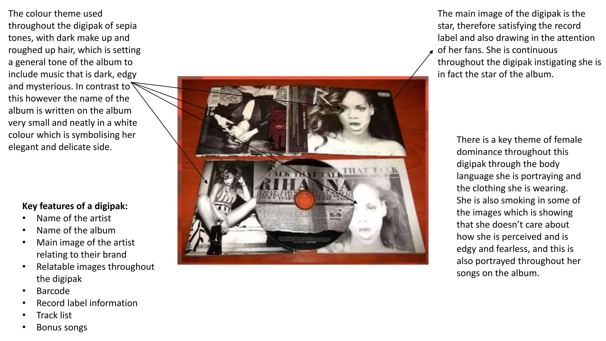
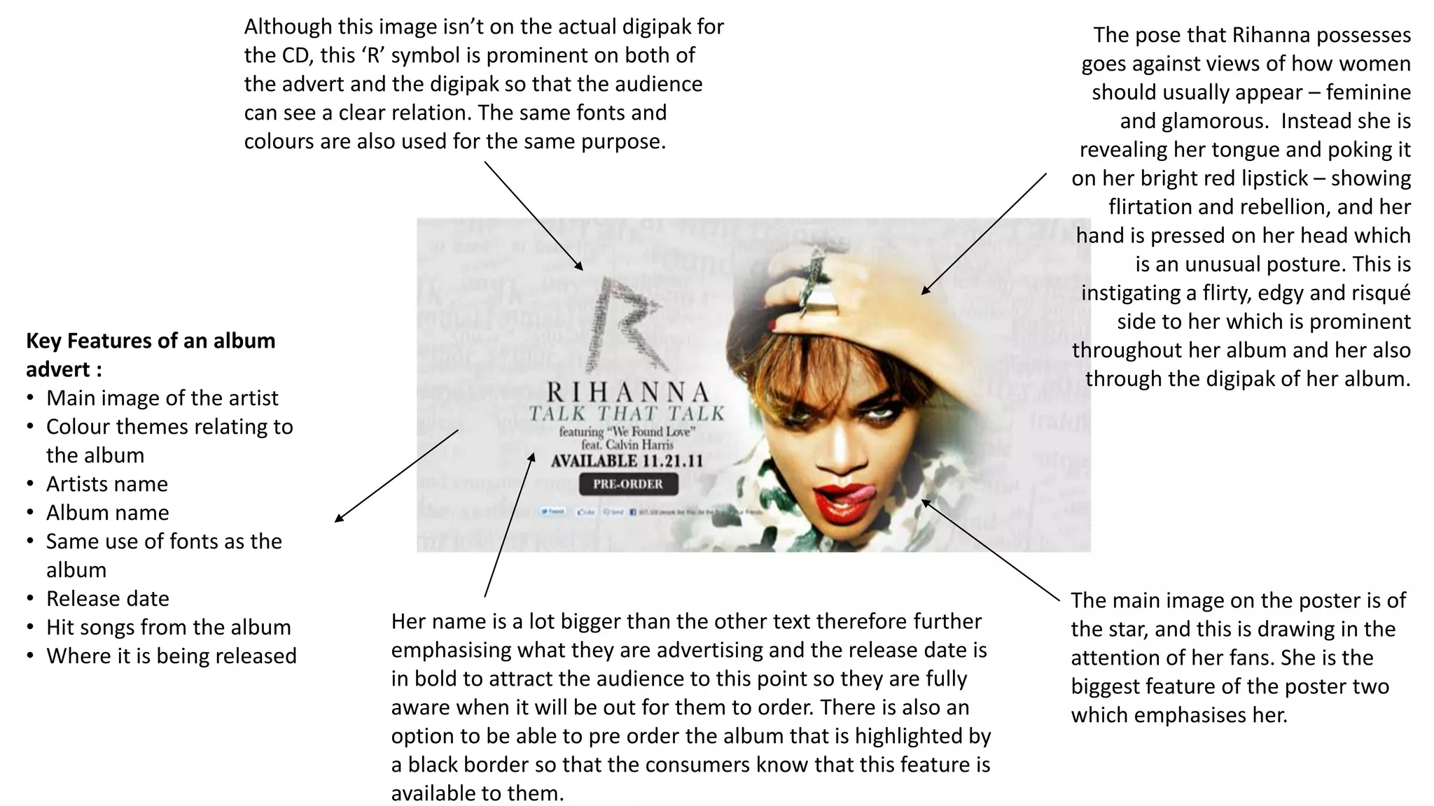
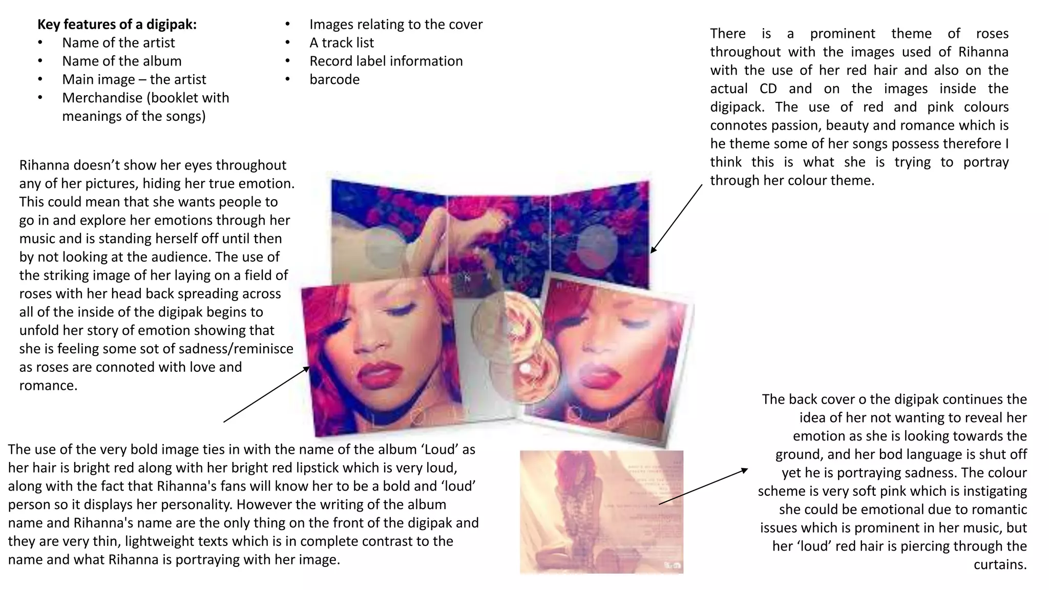
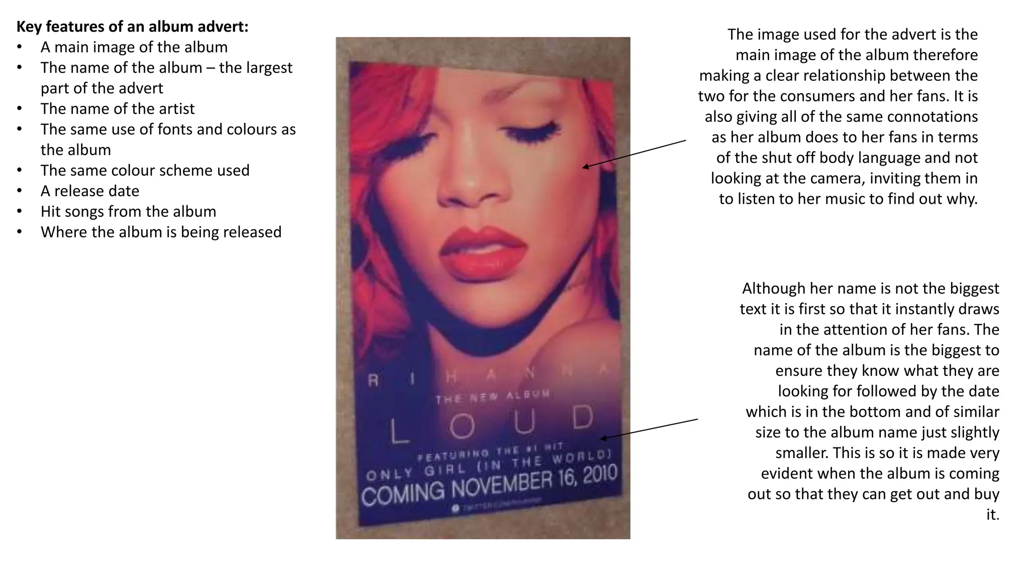
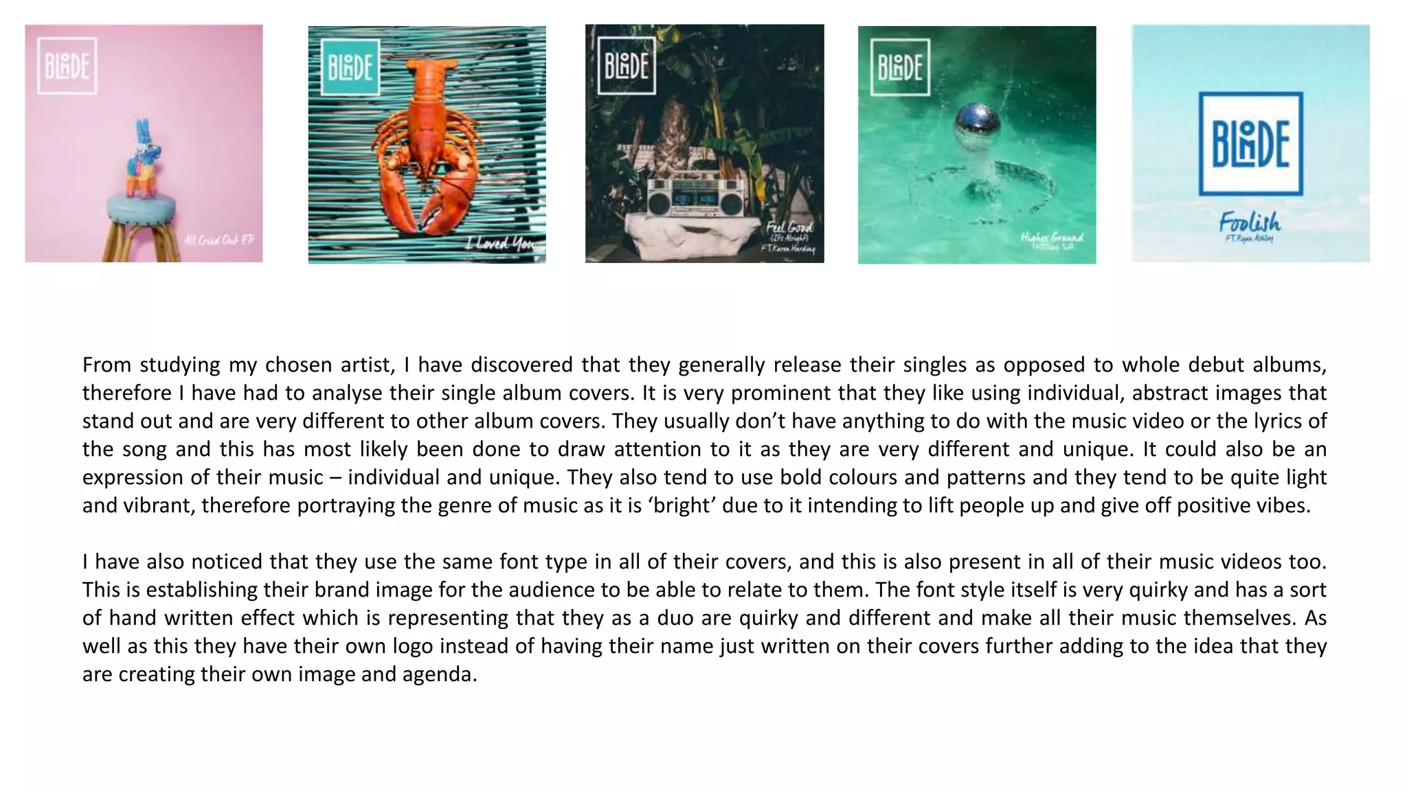
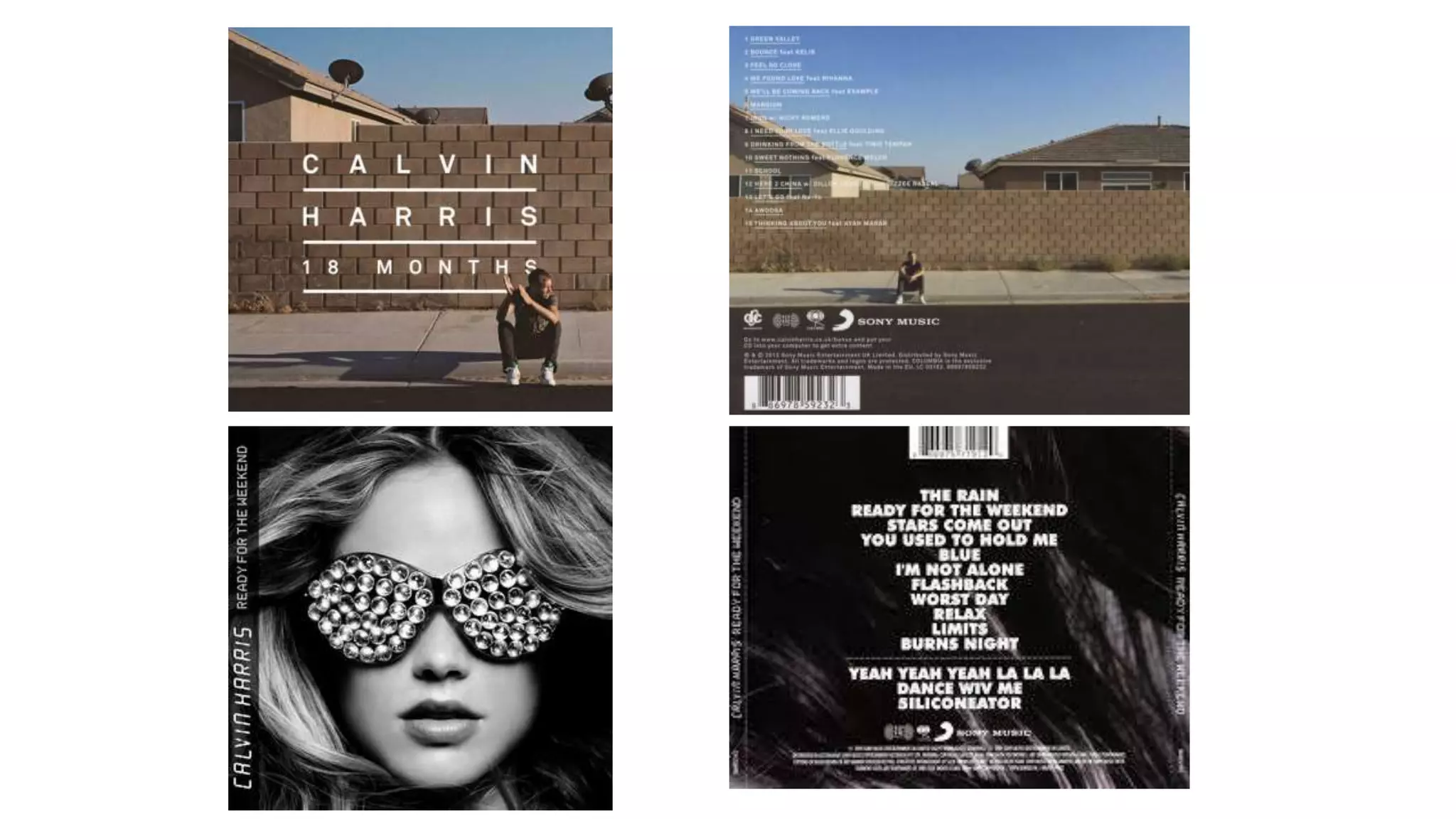
Digipak and Magazine
Album Advert
Analysis
The main image of the digipak is the
star, therefore satisfying the record
label and also drawing in the attention
of her fans. She is continuous
throughout the digipak instigating she is
in fact the star of the album.
The colour theme used
throughout the digipak of sepia
tones, with dark make up and
roughed up hair, which is setting
a general tone of the album to
include music that is dark, edgy
and mysterious. In contrast to
this however the name of the
album is written on the album
very small and neatly in a white
colour which is symbolising her
elegant and delicate side.
Key features of a digipak:
• Name of the artist
• Name of the album
• Main image of the artist
relating to their brand
• Relatable images throughout
the digipak
• Barcode
• Record label information
• Track list
• Bonus songs
There is a key theme of female
dominance throughout this
digipak through the body
language she is portraying and
the clothing she is wearing.
She is also smoking in some of
the images which is showing
that she doesn’t care about
how she is perceived and is
edgy and fearless, and this is
also portrayed throughout her
songs on the album.
Key Features of an album
advert :
• Main image of the artist
• Colour themes relating to
the album
• Artists name
• Album name
• Same use of fonts as the
album
• Release date
• Hit songs from the album
• Where it is being released
The main image on the poster is of
the star, and this is drawing in the
attention of her fans. She is the
biggest feature of the poster two
which emphasises her.
Although this image isn’t on the actual digipak for
the CD, this ‘R’ symbol is prominent on both of
the advert and the digipak so that the audience
can see a clear relation. The same fonts and
colours are also used for the same purpose.
The pose that Rihanna possesses
goes against views of how women
should usually appear – feminine
and glamorous. Instead she is
revealing her tongue and poking it
on her bright red lipstick – showing
flirtation and rebellion, and her
hand is pressed on her head which
is an unusual posture. This is
instigating a flirty, edgy and risqué
side to her which is prominent
throughout her album and her also
through the digipak of her album.
Her name is a lot bigger than the other text therefore further
emphasising what they are advertising and the release date is
in bold to attract the audience to this point so they are fully
aware when it will be out for them to order. There is also an
option to be able to pre order the album that is highlighted by
a black border so that the consumers know that this feature is
available to them.
There is a prominent theme of roses
throughout with the images used of Rihanna
with the use of her red hair and also on the
actual CD and on the images inside the
digipack. The use of red and pink colours
connotes passion, beauty and romance which is
he theme some of her songs possess therefore I
think this is what she is trying to portray
through her colour theme.
Rihanna doesn’t show her eyes throughout
any of her pictures, hiding her true emotion.
This could mean that she wants people to
go in and explore her emotions through her
music and is standing herself off until then
by not looking at the audience. The use of
the striking image of her laying on a field of
roses with her head back spreading across
all of the inside of the digipak begins to
unfold her story of emotion showing that
she is feeling some sot of sadness/reminisce
as roses are connoted with love and
romance.
The use of the very bold image ties in with the name of the album ‘Loud’ as
her hair is bright red along with her bright red lipstick which is very loud,
along with the fact that Rihanna's fans will know her to be a bold and ‘loud’
person so it displays her personality. However the writing of the album
name and Rihanna's name are the only thing on the front of the digipak and
they are very thin, lightweight texts which is in complete contrast to the
name and what Rihanna is portraying with her image.
The back cover o the digipak continues the
idea of her not wanting to reveal her
emotion as she is looking towards the
ground, and her bod language is shut off
yet he is portraying sadness. The colour
scheme is very soft pink which is instigating
she could be emotional due to romantic
issues which is prominent in her music, but
her ‘loud’ red hair is piercing through the
curtains.
Key features of a digipak:
• Name of the artist
• Name of the album
• Main image – the artist
• Merchandise (booklet with
meanings of the songs)
• Images relating to the cover
• A track list
• Record label information
• barcode
The image used for the advert is the
main image of the album therefore
making a clear relationship between the
two for the consumers and her fans. It is
also giving all of the same connotations
as her album does to her fans in terms
of the shut off body language and not
looking at the camera, inviting them in
to listen to her music to find out why.
Key features of an album advert:
• A main image of the album
• The name of the album – the largest
part of the advert
• The name of the artist
• The same use of fonts and colours as
the album
• The same colour scheme used
• A release date
• Hit songs from the album
• Where the album is being released
Although her name is not the biggest
text it is first so that it instantly draws
in the attention of her fans. The
name of the album is the biggest to
ensure they know what they are
looking for followed by the date
which is in the bottom and of similar
size to the album name just slightly
smaller. This is so it is made very
evident when the album is coming
out so that they can get out and buy
it.
The main image of the dog is very dominant on the album and the bread of dog is
commonly known to be related to aggression/violence therefore suggesting there could
be some slightly more hard core music within the album.
The next most noticeable thing would be the name of the artist in bold yellow, which is
a very bright and bold colour and is usually related with happiness. However as it is on
a darker background it is creating a contrast. This could mean that they are wanting the
writing to stand out from the background to draw in the consumers attention. It could
also mean that they are implementing that there is controversy or diversity within their
album and not just hard core/edgy music. It is also the biggest text so that the
consumers know straight away who’s album it is and can buy it if they are fans.
The name of the album is very small and is almost ‘hiding’ maybe suggesting that they
are moving away from the name of the album within the songs they have on it and the
lyrics they have.
Again, the yellow writing has been used on a black background on the back of the
album which may have been used in order to create a contrast appeal.
Key features of a digipak:
• Name of the artist
• Name of the album
• Main image
• Record label information
• Track list
• Bar code
Key features of an album advert:
• Name of the artist bold and clear at
the top of the advert
• Relatability to the album – colour
scheme
• The name of the album
• The release date
• Hit songs
• Where it is being released
The name of the artist is at the top of the
poster in the same colour and font as is
on the album, followed by the name of
the album. This is making it very clear to
the consumer who's album it is and what
it is called so that if it interests them they
can read on and find out more. It is also
in the same colour scheme to make a
clear relation between the alum and the
advert. This counter acts the fact that the
image is completely different to the
album as the colour schemes and fonts
will make the relation for the image.
Key features of an album:
• Name of the artist
• Name of the album
• A main image relatable to
the band/brand image
• Record label information
• Track list
• Barcode
There is a theme throughout this album
that is very relatable to the name of the
album which is ‘Only by the night’. I
believe this to be a night effect. This is
because the presence of an owl has
been featured in the images on the front
and back of the album, and owls only
come out at night and are nocturnal
which relates to the ‘only by the night’
element.
As well as this, the colour scheme of the
album is green and black which is the
colours you will see when looking
through night time goggles, so it I
essentially as if we are looking through
night time goggles at the ‘owl’ made up
of the artists’ faces and the back of their
heads. There are arrows in the centre of
the screen which would appear on night
time goggles too.
The font of the text on the album has an
electronic appeal as if it was the
electronic writing that appears on night
vision goggles or night vision technology.
Adding to the idea of a night time
theme from the name of the album,
it is suggesting a slightly darker and
mysterious appeal which could be
suggesting the tone of their album as
they are a rock band therefore have
slightly darker music and lyrics.
Key features of an album advert:
• Main image relatable to the
album/brand image of the artist
• Name of the album and artist very
clear
• Same use of fonts as on the album
• Hit songs from the album
• Where it is released
• Release date ‘out now’
The name of the artist is very
prominent to the audience at the top
of the album therefore making them
aware instantly that it is their album
being advertised and they should
read on if they like this artist. The it
is also in white which is opposite to
the colours of the rest of the writing
to make it even clearer to the
audience.
The next most noticeable feature is
the name of the album, making a
further relation to the album and
then the fact that it is ‘out now’ so
the consumers will know they can go
out and buy it now.
The main image of the poster
is also exactly the same as
the album cover therefore
making a very clear relation
to the audience. The same
fonts are also used to give
the same effect as is
intended in the album and to
make a clear relation. the
night time theme is still very
prominent in the poster as it
is in the album as well so
giving off the same tone for
the album from it.
RESEARCHING INTO MY CHOSEN ARTIST’S
PREVIOUS WORK
From studying my chosen artist, I have discovered that they generally release their singles as opposed to whole debut albums,
therefore I have had to analyse their single album covers. It is very prominent that they like using individual, abstract images that
stand out and are very different to other album covers. They usually don’t have anything to do with the music video or the lyrics of
the song and this has most likely been done to draw attention to it as they are very different and unique. It could also be an
expression of their music – individual and unique. They also tend to use bold colours and patterns and they tend to be quite light
and vibrant, therefore portraying the genre of music as it is ‘bright’ due to it intending to lift people up and give off positive vibes.
I have also noticed that they use the same font type in all of their covers, and this is also present in all of their music videos too.
This is establishing their brand image for the audience to be able to relate to them. The font style itself is very quirky and has a sort
of hand written effect which is representing that they as a duo are quirky and different and make all their music themselves. As
well as this they have their own logo instead of having their name just written on their covers further adding to the idea that they
are creating their own image and agenda.
The logo and the font type have
been used here in order to
establish and implement their
brand image.
There is a bold background used of a very
light pink, this is very dominant and is light
and vibrant as its quite a pastel colour,
therefore giving off good feelings and
positivity. I also think the colour pink has
been used as its coming from a females
point of view therefore using a very female
orientated colour would show this to the
audience. Its also about love and break ups
therefore relating the pink to the lyrics as it
usually represents love and happiness.
Adding to this, the piñata on the stool also
has a very female appearance, with long
eye lashes and big eyes. The way it has
delicately been put on the stool. I think this
mise-en-scene has been used to portray
the lyrics as it is showing that the girl
singing the song is fragile and delicate due
to the break up she is singing about in the
song, and that she doesn’t want to feel like
that anymore. It could also represent how
she was in the past, in love, (pink
background) delicate and naive, and is now
moving away from that through the song.
Further Research
• I also decided to do some research into digipaks and posters of artists that produce house music
to see if there was any common theme or relation within this genre of music in terms of their
advertising and albums.
• I decided to look into the work of Calvin Harris, as he is an extremely successful DJ that is well
known for a lot of house music records. I discovered that he also uses quite different and quirky
images on his album covers in order to attract the attention of his fans. He appears in a few of
his album covers which has most likely been done to satisfy the record label as he is intriguing
his fans by appearing on them. As well as this, when he has an artist featuring in his song he likes
to incorporate them in the main image of the album cover to get them excited for the song.
• Much like Blonde, he also uses the same text font and colours on the majority of his album
covers, especially his most recent ones, and often underlines the words in a thick white
underline. This is establishing his brand image as an artist and is instantly recognisable to the
consumers as when they see this kind of text and underlining they will relate it to Calvin Harris.
The font style itself is very clean, concise and articulated, which is representing his music. As he
is a DJ, he works on computers and synthesisers and has to make sure that his music is very
clean and concise also, making every beat perfectly in time, therefore he is portraying his music
through the fonts as they are so well presented and have a clean finishing effect.
Digipaks
• In terms of his digipaks, he likes to relate the back cover very strongly to the front of the
album, in the examples on the next slide for his album ‘18 Months’ he uses the same
scenery for the image: a brick wall with him sat next to it on a pavement, just with a wider
shot. With the album ‘Ready For The Weekend’ he has an image of a girl with her hair
around her face, and on the back of the album continues with the black and white colour
scheme along with her hair being part of the main image.
• Similarly to Blonde, he also likes to draw away from the actual meaning of the album and
the songs/lyrics, along with the content of music videos for them, when deciding on the
images for his album covers. For example with ‘18 Months’ he is next to a brick wall which
has no relation to the name of the album; with the album for ‘Summer’ the main image is a
picture of him which doesn’t represent the name of the album ‘Summer.
Digipak and poster analysis (2)2

Digipak and poster analysis (2)2

  • 1.
  • 2.
    The main imageof the digipak is the star, therefore satisfying the record label and also drawing in the attention of her fans. She is continuous throughout the digipak instigating she is in fact the star of the album. The colour theme used throughout the digipak of sepia tones, with dark make up and roughed up hair, which is setting a general tone of the album to include music that is dark, edgy and mysterious. In contrast to this however the name of the album is written on the album very small and neatly in a white colour which is symbolising her elegant and delicate side. Key features of a digipak: • Name of the artist • Name of the album • Main image of the artist relating to their brand • Relatable images throughout the digipak • Barcode • Record label information • Track list • Bonus songs There is a key theme of female dominance throughout this digipak through the body language she is portraying and the clothing she is wearing. She is also smoking in some of the images which is showing that she doesn’t care about how she is perceived and is edgy and fearless, and this is also portrayed throughout her songs on the album.
  • 3.
    Key Features ofan album advert : • Main image of the artist • Colour themes relating to the album • Artists name • Album name • Same use of fonts as the album • Release date • Hit songs from the album • Where it is being released The main image on the poster is of the star, and this is drawing in the attention of her fans. She is the biggest feature of the poster two which emphasises her. Although this image isn’t on the actual digipak for the CD, this ‘R’ symbol is prominent on both of the advert and the digipak so that the audience can see a clear relation. The same fonts and colours are also used for the same purpose. The pose that Rihanna possesses goes against views of how women should usually appear – feminine and glamorous. Instead she is revealing her tongue and poking it on her bright red lipstick – showing flirtation and rebellion, and her hand is pressed on her head which is an unusual posture. This is instigating a flirty, edgy and risqué side to her which is prominent throughout her album and her also through the digipak of her album. Her name is a lot bigger than the other text therefore further emphasising what they are advertising and the release date is in bold to attract the audience to this point so they are fully aware when it will be out for them to order. There is also an option to be able to pre order the album that is highlighted by a black border so that the consumers know that this feature is available to them.
  • 4.
    There is aprominent theme of roses throughout with the images used of Rihanna with the use of her red hair and also on the actual CD and on the images inside the digipack. The use of red and pink colours connotes passion, beauty and romance which is he theme some of her songs possess therefore I think this is what she is trying to portray through her colour theme. Rihanna doesn’t show her eyes throughout any of her pictures, hiding her true emotion. This could mean that she wants people to go in and explore her emotions through her music and is standing herself off until then by not looking at the audience. The use of the striking image of her laying on a field of roses with her head back spreading across all of the inside of the digipak begins to unfold her story of emotion showing that she is feeling some sot of sadness/reminisce as roses are connoted with love and romance. The use of the very bold image ties in with the name of the album ‘Loud’ as her hair is bright red along with her bright red lipstick which is very loud, along with the fact that Rihanna's fans will know her to be a bold and ‘loud’ person so it displays her personality. However the writing of the album name and Rihanna's name are the only thing on the front of the digipak and they are very thin, lightweight texts which is in complete contrast to the name and what Rihanna is portraying with her image. The back cover o the digipak continues the idea of her not wanting to reveal her emotion as she is looking towards the ground, and her bod language is shut off yet he is portraying sadness. The colour scheme is very soft pink which is instigating she could be emotional due to romantic issues which is prominent in her music, but her ‘loud’ red hair is piercing through the curtains. Key features of a digipak: • Name of the artist • Name of the album • Main image – the artist • Merchandise (booklet with meanings of the songs) • Images relating to the cover • A track list • Record label information • barcode
  • 5.
    The image usedfor the advert is the main image of the album therefore making a clear relationship between the two for the consumers and her fans. It is also giving all of the same connotations as her album does to her fans in terms of the shut off body language and not looking at the camera, inviting them in to listen to her music to find out why. Key features of an album advert: • A main image of the album • The name of the album – the largest part of the advert • The name of the artist • The same use of fonts and colours as the album • The same colour scheme used • A release date • Hit songs from the album • Where the album is being released Although her name is not the biggest text it is first so that it instantly draws in the attention of her fans. The name of the album is the biggest to ensure they know what they are looking for followed by the date which is in the bottom and of similar size to the album name just slightly smaller. This is so it is made very evident when the album is coming out so that they can get out and buy it.
  • 6.
    The main imageof the dog is very dominant on the album and the bread of dog is commonly known to be related to aggression/violence therefore suggesting there could be some slightly more hard core music within the album. The next most noticeable thing would be the name of the artist in bold yellow, which is a very bright and bold colour and is usually related with happiness. However as it is on a darker background it is creating a contrast. This could mean that they are wanting the writing to stand out from the background to draw in the consumers attention. It could also mean that they are implementing that there is controversy or diversity within their album and not just hard core/edgy music. It is also the biggest text so that the consumers know straight away who’s album it is and can buy it if they are fans. The name of the album is very small and is almost ‘hiding’ maybe suggesting that they are moving away from the name of the album within the songs they have on it and the lyrics they have. Again, the yellow writing has been used on a black background on the back of the album which may have been used in order to create a contrast appeal. Key features of a digipak: • Name of the artist • Name of the album • Main image • Record label information • Track list • Bar code
  • 7.
    Key features ofan album advert: • Name of the artist bold and clear at the top of the advert • Relatability to the album – colour scheme • The name of the album • The release date • Hit songs • Where it is being released The name of the artist is at the top of the poster in the same colour and font as is on the album, followed by the name of the album. This is making it very clear to the consumer who's album it is and what it is called so that if it interests them they can read on and find out more. It is also in the same colour scheme to make a clear relation between the alum and the advert. This counter acts the fact that the image is completely different to the album as the colour schemes and fonts will make the relation for the image.
  • 8.
    Key features ofan album: • Name of the artist • Name of the album • A main image relatable to the band/brand image • Record label information • Track list • Barcode There is a theme throughout this album that is very relatable to the name of the album which is ‘Only by the night’. I believe this to be a night effect. This is because the presence of an owl has been featured in the images on the front and back of the album, and owls only come out at night and are nocturnal which relates to the ‘only by the night’ element. As well as this, the colour scheme of the album is green and black which is the colours you will see when looking through night time goggles, so it I essentially as if we are looking through night time goggles at the ‘owl’ made up of the artists’ faces and the back of their heads. There are arrows in the centre of the screen which would appear on night time goggles too. The font of the text on the album has an electronic appeal as if it was the electronic writing that appears on night vision goggles or night vision technology. Adding to the idea of a night time theme from the name of the album, it is suggesting a slightly darker and mysterious appeal which could be suggesting the tone of their album as they are a rock band therefore have slightly darker music and lyrics.
  • 9.
    Key features ofan album advert: • Main image relatable to the album/brand image of the artist • Name of the album and artist very clear • Same use of fonts as on the album • Hit songs from the album • Where it is released • Release date ‘out now’ The name of the artist is very prominent to the audience at the top of the album therefore making them aware instantly that it is their album being advertised and they should read on if they like this artist. The it is also in white which is opposite to the colours of the rest of the writing to make it even clearer to the audience. The next most noticeable feature is the name of the album, making a further relation to the album and then the fact that it is ‘out now’ so the consumers will know they can go out and buy it now. The main image of the poster is also exactly the same as the album cover therefore making a very clear relation to the audience. The same fonts are also used to give the same effect as is intended in the album and to make a clear relation. the night time theme is still very prominent in the poster as it is in the album as well so giving off the same tone for the album from it.
  • 10.
    RESEARCHING INTO MYCHOSEN ARTIST’S PREVIOUS WORK
  • 11.
    From studying mychosen artist, I have discovered that they generally release their singles as opposed to whole debut albums, therefore I have had to analyse their single album covers. It is very prominent that they like using individual, abstract images that stand out and are very different to other album covers. They usually don’t have anything to do with the music video or the lyrics of the song and this has most likely been done to draw attention to it as they are very different and unique. It could also be an expression of their music – individual and unique. They also tend to use bold colours and patterns and they tend to be quite light and vibrant, therefore portraying the genre of music as it is ‘bright’ due to it intending to lift people up and give off positive vibes. I have also noticed that they use the same font type in all of their covers, and this is also present in all of their music videos too. This is establishing their brand image for the audience to be able to relate to them. The font style itself is very quirky and has a sort of hand written effect which is representing that they as a duo are quirky and different and make all their music themselves. As well as this they have their own logo instead of having their name just written on their covers further adding to the idea that they are creating their own image and agenda.
  • 13.
    The logo andthe font type have been used here in order to establish and implement their brand image. There is a bold background used of a very light pink, this is very dominant and is light and vibrant as its quite a pastel colour, therefore giving off good feelings and positivity. I also think the colour pink has been used as its coming from a females point of view therefore using a very female orientated colour would show this to the audience. Its also about love and break ups therefore relating the pink to the lyrics as it usually represents love and happiness. Adding to this, the piñata on the stool also has a very female appearance, with long eye lashes and big eyes. The way it has delicately been put on the stool. I think this mise-en-scene has been used to portray the lyrics as it is showing that the girl singing the song is fragile and delicate due to the break up she is singing about in the song, and that she doesn’t want to feel like that anymore. It could also represent how she was in the past, in love, (pink background) delicate and naive, and is now moving away from that through the song.
  • 14.
    Further Research • Ialso decided to do some research into digipaks and posters of artists that produce house music to see if there was any common theme or relation within this genre of music in terms of their advertising and albums. • I decided to look into the work of Calvin Harris, as he is an extremely successful DJ that is well known for a lot of house music records. I discovered that he also uses quite different and quirky images on his album covers in order to attract the attention of his fans. He appears in a few of his album covers which has most likely been done to satisfy the record label as he is intriguing his fans by appearing on them. As well as this, when he has an artist featuring in his song he likes to incorporate them in the main image of the album cover to get them excited for the song. • Much like Blonde, he also uses the same text font and colours on the majority of his album covers, especially his most recent ones, and often underlines the words in a thick white underline. This is establishing his brand image as an artist and is instantly recognisable to the consumers as when they see this kind of text and underlining they will relate it to Calvin Harris. The font style itself is very clean, concise and articulated, which is representing his music. As he is a DJ, he works on computers and synthesisers and has to make sure that his music is very clean and concise also, making every beat perfectly in time, therefore he is portraying his music through the fonts as they are so well presented and have a clean finishing effect.
  • 16.
    Digipaks • In termsof his digipaks, he likes to relate the back cover very strongly to the front of the album, in the examples on the next slide for his album ‘18 Months’ he uses the same scenery for the image: a brick wall with him sat next to it on a pavement, just with a wider shot. With the album ‘Ready For The Weekend’ he has an image of a girl with her hair around her face, and on the back of the album continues with the black and white colour scheme along with her hair being part of the main image. • Similarly to Blonde, he also likes to draw away from the actual meaning of the album and the songs/lyrics, along with the content of music videos for them, when deciding on the images for his album covers. For example with ‘18 Months’ he is next to a brick wall which has no relation to the name of the album; with the album for ‘Summer’ the main image is a picture of him which doesn’t represent the name of the album ‘Summer.