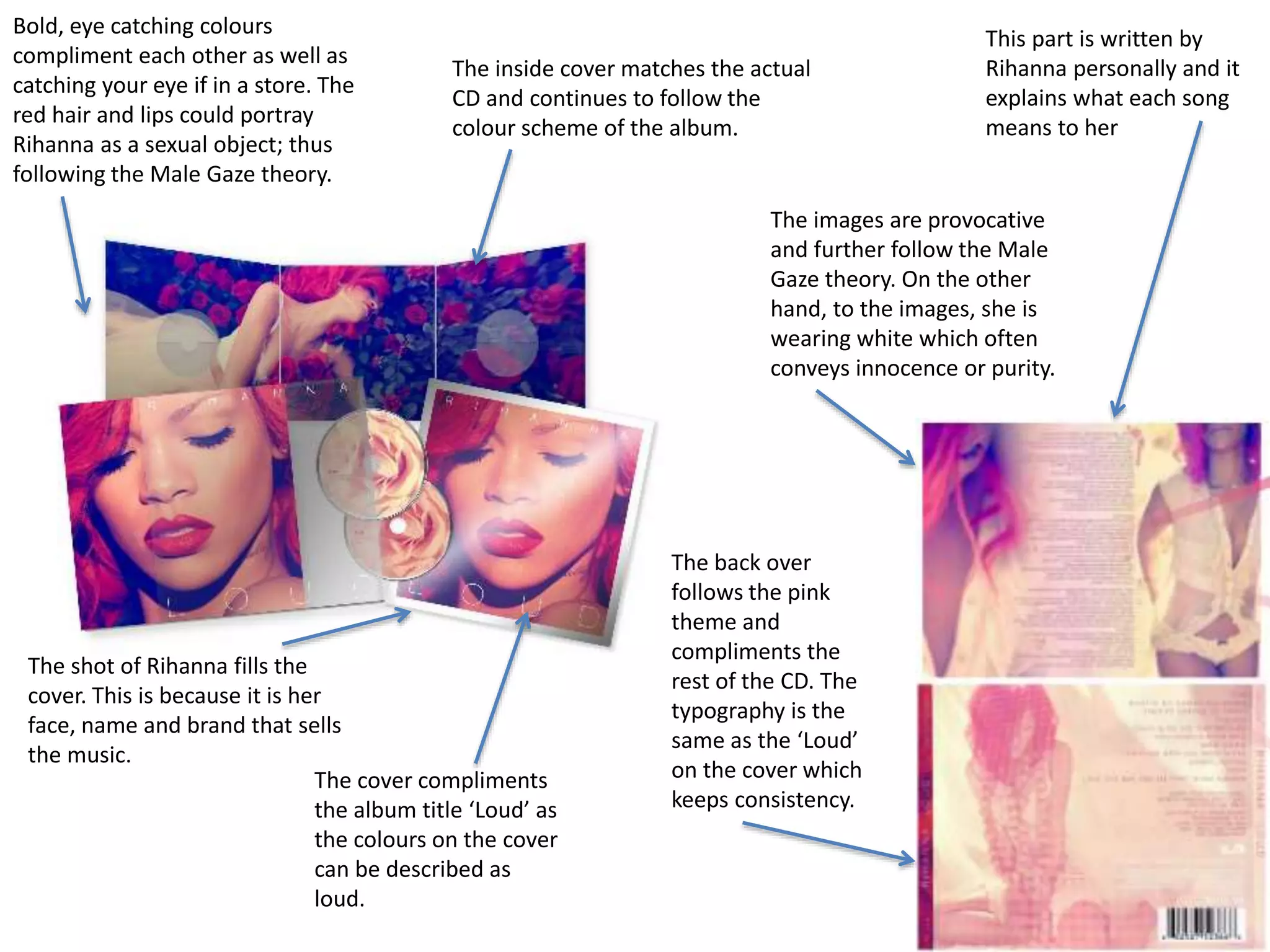
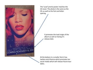
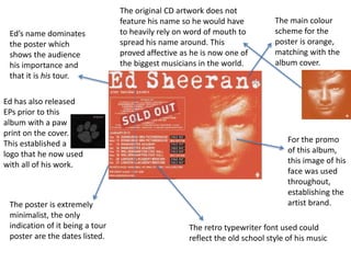
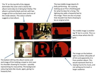
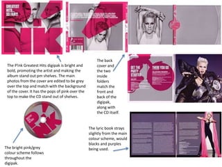
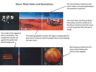
Bold, eye catching colours 
compliment each other as well as 
catching your eye if in a store. The 
red hair and lips could portray 
Rihanna as a sexual object; thus 
following the Male Gaze theory. 
The shot of Rihanna fills the 
cover. This is because it is her 
face, name and brand that sells 
the music. 
The inside cover matches the actual 
CD and continues to follow the 
colour scheme of the album. 
The cover compliments 
the album title ‘Loud’ as 
the colours on the cover 
can be described as 
loud. 
This part is written by 
Rihanna personally and it 
explains what each song 
means to her 
The images are provocative 
and further follow the Male 
Gaze theory. On the other 
hand, to the images, she is 
wearing white which often 
conveys innocence or purity. 
The back over 
follows the pink 
theme and 
compliments the 
rest of the CD. The 
typography is the 
same as the ‘Loud’ 
on the cover which 
keeps consistency.
The ‘Loud’ promo poster matches the 
CD cover. The photo is the same as the 
CD, as well as the font and letter 
spacing. 
It promotes the lead single of the 
album as well as having it’s 
release date. 
At the bottom in a smaller font it has 
twitter.com/rihanna which promotes her 
social media which will release future tour 
dates.
The main colour 
scheme for the 
poster is orange, 
matching with the 
album cover. 
For the promo 
of this album, 
this image of his 
face was used 
throughout, 
establishing the 
artist brand. 
The retro typewriter font used could 
reflect the old school style of his music 
Ed’s name dominates 
the poster which 
shows the audience 
his importance and 
that it is his tour. 
The poster is extremely 
minimalist, the only 
indication of it being a tour 
poster are the dates listed. 
The original CD artwork does not 
feature his name so he would have 
to heavily rely on word of mouth to 
spread his name around. This 
proved affective as he is now one of 
the biggest musicians in the world. 
Ed has also released 
EPs prior to this 
album with a paw 
print on the cover. 
This established a 
logo that he now used 
with all of his work.
The ‘R’ on the top left of the digipak 
dominates the cover and is clearly the 
album name (due to it being by R-Kelly). The 
album is primarily black and red, with two 
images of him as the back cover and one of 
the inside sleeves. This colour scheme 
suggests a love album. 
The bottom left has the album names and 
and image of him holding a towel or shirt over 
his shoulder showing his muscles – possibly 
representing his masculinity. The background 
colouring looks like clouds, again, giving it a 
heavenly feel. 
The top middle image depicts R-Kelly 
performing. He is posing 
looking up as if he is thanking god 
for what he does for a living. The 
lighting also adds a heavenly feel to 
the image. There are also no props 
that shouldn’t be there showing to 
be an original artist. 
The middle image is another 
big ‘R’ but in a circle. This is a 
way to show where the CD 
goes. 
The image on the bottom 
right is another silhouette of 
of him and apparently it is 
from another album. This 
would represent that he is 
staying true to his music, and 
not selling out to reach a 
larger audience.
The P!nk Greatest Hits digipak is bright and 
bold, promoting the artist and making the 
album stand out pm shelves. The main 
photos from the cover are edited to be grey 
over the top and match with the background 
of the cover. It has the pops of pink over the 
top to make the CD stand out of shelves. 
The bright pink/grey 
colour scheme follows 
throughout the 
digipak. 
The back 
cover and 
the two 
inside 
folders 
match the 
front and 
back of the 
digipak, 
along with 
the CD itself. 
The lyric book strays 
slightly from the main 
colour scheme, would 
blacks and purples 
being used.
Muse: Black Holes and Revelations The red and blue contrast on the 
cover makes it visually appealing to 
the potential customers. 
The cover does not feature Muse 
themselves and this conforms to 
the Muse insistence that the music 
is more important than the band 
image. 
The bold typography used for the logo is recognisable for 
fans and it is easy to read for people who are just looking 
for new music. 
The inside of the digipak is 
fairly minimalistic. The 
orange font stands out 
against the patterned 
black background 
Mars features behind the CD 
space which follows the 
theme of the digipak.

Digipak analysis

  • 1.
    Bold, eye catchingcolours compliment each other as well as catching your eye if in a store. The red hair and lips could portray Rihanna as a sexual object; thus following the Male Gaze theory. The shot of Rihanna fills the cover. This is because it is her face, name and brand that sells the music. The inside cover matches the actual CD and continues to follow the colour scheme of the album. The cover compliments the album title ‘Loud’ as the colours on the cover can be described as loud. This part is written by Rihanna personally and it explains what each song means to her The images are provocative and further follow the Male Gaze theory. On the other hand, to the images, she is wearing white which often conveys innocence or purity. The back over follows the pink theme and compliments the rest of the CD. The typography is the same as the ‘Loud’ on the cover which keeps consistency.
  • 2.
    The ‘Loud’ promoposter matches the CD cover. The photo is the same as the CD, as well as the font and letter spacing. It promotes the lead single of the album as well as having it’s release date. At the bottom in a smaller font it has twitter.com/rihanna which promotes her social media which will release future tour dates.
  • 3.
    The main colour scheme for the poster is orange, matching with the album cover. For the promo of this album, this image of his face was used throughout, establishing the artist brand. The retro typewriter font used could reflect the old school style of his music Ed’s name dominates the poster which shows the audience his importance and that it is his tour. The poster is extremely minimalist, the only indication of it being a tour poster are the dates listed. The original CD artwork does not feature his name so he would have to heavily rely on word of mouth to spread his name around. This proved affective as he is now one of the biggest musicians in the world. Ed has also released EPs prior to this album with a paw print on the cover. This established a logo that he now used with all of his work.
  • 4.
    The ‘R’ onthe top left of the digipak dominates the cover and is clearly the album name (due to it being by R-Kelly). The album is primarily black and red, with two images of him as the back cover and one of the inside sleeves. This colour scheme suggests a love album. The bottom left has the album names and and image of him holding a towel or shirt over his shoulder showing his muscles – possibly representing his masculinity. The background colouring looks like clouds, again, giving it a heavenly feel. The top middle image depicts R-Kelly performing. He is posing looking up as if he is thanking god for what he does for a living. The lighting also adds a heavenly feel to the image. There are also no props that shouldn’t be there showing to be an original artist. The middle image is another big ‘R’ but in a circle. This is a way to show where the CD goes. The image on the bottom right is another silhouette of of him and apparently it is from another album. This would represent that he is staying true to his music, and not selling out to reach a larger audience.
  • 5.
    The P!nk GreatestHits digipak is bright and bold, promoting the artist and making the album stand out pm shelves. The main photos from the cover are edited to be grey over the top and match with the background of the cover. It has the pops of pink over the top to make the CD stand out of shelves. The bright pink/grey colour scheme follows throughout the digipak. The back cover and the two inside folders match the front and back of the digipak, along with the CD itself. The lyric book strays slightly from the main colour scheme, would blacks and purples being used.
  • 6.
    Muse: Black Holesand Revelations The red and blue contrast on the cover makes it visually appealing to the potential customers. The cover does not feature Muse themselves and this conforms to the Muse insistence that the music is more important than the band image. The bold typography used for the logo is recognisable for fans and it is easy to read for people who are just looking for new music. The inside of the digipak is fairly minimalistic. The orange font stands out against the patterned black background Mars features behind the CD space which follows the theme of the digipak.