Download to read offline


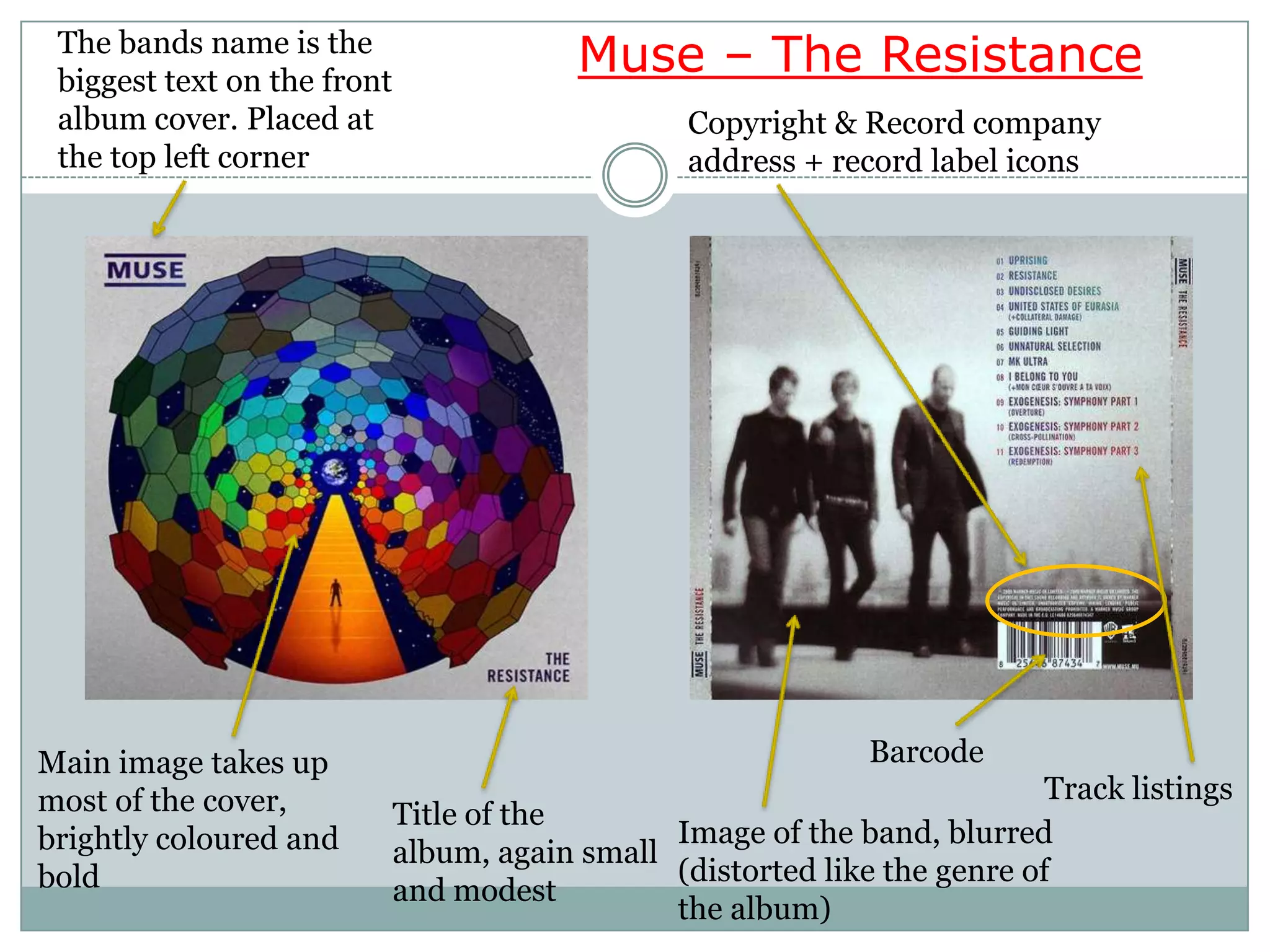

The document discusses conventions for CD album covers, comparing two examples. It notes that one cover, Linkin Park's Living Things, uses a minimalist design with only the necessary information. The other, Muse's The Resistance, uses bright colors and a blurred image of the band to draw attention. Both covers place the album title and band name in small, modest font, likely because they are well-known bands that do not need to advertise heavily.


![Rihanna- Talk That Talk [Deluxe]- digipak analysis](https://cdn.slidesharecdn.com/ss_thumbnails/rihannadigipak-121109021119-phpapp02-thumbnail.jpg?width=640&height=640&fit=bounds)


