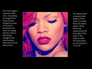
The Band name is placed in the top left hand corner and is the biggest font that is on the cover. This making it the first thing that the buyer will see, also making it the most important bit of information on the cover. The lettering is in capital letters to make it stand out more.The background to the cover is just a plain creamy beige colour. This enables everything on the cover to stand out and allows people not to be distracted by a busy background.The Image on the front cover has no relevance to the album name or the name of the band. Therefore I feel that it is just used to make the cover look more interesting and appealing to the people wanting to buy the album. The image is placed right in the centre of the cover therefore making it stand out even more.The other piece of text on this cover is the name of the album. This is in a smaller font and a different colour to the band name. This is to help the band name stand out more but still make the album name seen so people will know what the album is actually called.
The main image to the cover is an angry looking bear. This has relevance to the band name which will instantly help someone to know that this cover goes with this certain band. The image covers the entire cover making it look more interesting and appealing to the eye.The band’s name is written across the width of the cover and also is printed in white. By printing the band’s name in a different colour is allows it to stand out from the rest of the cover. This certain album cover has no album name. This may b due to the fact that the album doesn’t have a name. Or a name wasn’t put on the cover so that it didn’t distract the buyer from the bands name.
The background is coloured white, this allows everything else to stand out, also so people will not be distracted by a complicated background.An image of the band has been put directly in the centre of the cover. This shows what they look like and will allow people to know who's created the album by this image. The image has also been made so it looks like it has been painted. This makes it look more creative and interesting for the viewer.The Band’s name is printed across the width of the top of the album cover and is coloured blue, differently from the rest of the text and background. It is also the largest piece of text on the cover. Therefore making it stand out and showing  that it is an important part and will be easily seen.The Album name is placed directly below the band’s name and is a green colour and slightly smaller.  This shows the importance of the band’s name. However  by colouring it green it allows it to stand out still.
An image of the artist in the middle of the cover, slightly moved to the right allows the buyer to see the artist first and give her more important than anything on the cover.The artist’s name and also the album name is placed together in a line. However the word pink is highlighted making it stand out from the artist name and the rest of the album name. The rest of the text is in capital letters and is coloured grey to create a contrast between the pink. The background is a mix between white and pink. The pink relates to the name of the album and also makes the cover stand out because it is bright. The white on the bottom of the cover allows the text to show up better and also stand out. All these colours compliment eachother.
The main image is a picture of the artist.  By putting an Image of the artist and not having the name of the artist printed on the cover it’s saying that the artist is well known enough to not need to place their name on the album cover.The album name is placed at the bottom of the cover in a white font and capital letters. These letters are spaced out to fill the width of the cover it also helps to make the word stand out and makes it “L O U D”
The artist’s name is placed at the top of the cover of the single. It is in bold letter and a red font. It stands out from the rest of the cover. It is also in the style of a comic book font, thus making it purposely aimed at teenagers. There is an image of the artists on centre left of the cover showing people what they look like and people are also able to recognise who the artist is that made the single. Also having the speech bubble with the name of the Single makes that piece of text stand out and also adds to the comic book effect, again making it appeal to teenagers.The constant comic book theme is kept with the background also. There are many different colours in this cover making it appealing to the eye and also making it stand out over other covers that haven’t used many different bright colours like these.

Album cover analysis

  • 1.
    The Band nameis placed in the top left hand corner and is the biggest font that is on the cover. This making it the first thing that the buyer will see, also making it the most important bit of information on the cover. The lettering is in capital letters to make it stand out more.The background to the cover is just a plain creamy beige colour. This enables everything on the cover to stand out and allows people not to be distracted by a busy background.The Image on the front cover has no relevance to the album name or the name of the band. Therefore I feel that it is just used to make the cover look more interesting and appealing to the people wanting to buy the album. The image is placed right in the centre of the cover therefore making it stand out even more.The other piece of text on this cover is the name of the album. This is in a smaller font and a different colour to the band name. This is to help the band name stand out more but still make the album name seen so people will know what the album is actually called.
  • 2.
    The main imageto the cover is an angry looking bear. This has relevance to the band name which will instantly help someone to know that this cover goes with this certain band. The image covers the entire cover making it look more interesting and appealing to the eye.The band’s name is written across the width of the cover and also is printed in white. By printing the band’s name in a different colour is allows it to stand out from the rest of the cover. This certain album cover has no album name. This may b due to the fact that the album doesn’t have a name. Or a name wasn’t put on the cover so that it didn’t distract the buyer from the bands name.
  • 3.
    The background iscoloured white, this allows everything else to stand out, also so people will not be distracted by a complicated background.An image of the band has been put directly in the centre of the cover. This shows what they look like and will allow people to know who's created the album by this image. The image has also been made so it looks like it has been painted. This makes it look more creative and interesting for the viewer.The Band’s name is printed across the width of the top of the album cover and is coloured blue, differently from the rest of the text and background. It is also the largest piece of text on the cover. Therefore making it stand out and showing that it is an important part and will be easily seen.The Album name is placed directly below the band’s name and is a green colour and slightly smaller. This shows the importance of the band’s name. However by colouring it green it allows it to stand out still.
  • 4.
    An image ofthe artist in the middle of the cover, slightly moved to the right allows the buyer to see the artist first and give her more important than anything on the cover.The artist’s name and also the album name is placed together in a line. However the word pink is highlighted making it stand out from the artist name and the rest of the album name. The rest of the text is in capital letters and is coloured grey to create a contrast between the pink. The background is a mix between white and pink. The pink relates to the name of the album and also makes the cover stand out because it is bright. The white on the bottom of the cover allows the text to show up better and also stand out. All these colours compliment eachother.
  • 5.
    The main imageis a picture of the artist. By putting an Image of the artist and not having the name of the artist printed on the cover it’s saying that the artist is well known enough to not need to place their name on the album cover.The album name is placed at the bottom of the cover in a white font and capital letters. These letters are spaced out to fill the width of the cover it also helps to make the word stand out and makes it “L O U D”
  • 6.
    The artist’s nameis placed at the top of the cover of the single. It is in bold letter and a red font. It stands out from the rest of the cover. It is also in the style of a comic book font, thus making it purposely aimed at teenagers. There is an image of the artists on centre left of the cover showing people what they look like and people are also able to recognise who the artist is that made the single. Also having the speech bubble with the name of the Single makes that piece of text stand out and also adds to the comic book effect, again making it appeal to teenagers.The constant comic book theme is kept with the background also. There are many different colours in this cover making it appealing to the eye and also making it stand out over other covers that haven’t used many different bright colours like these.