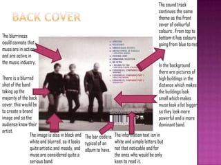
Download to read offline

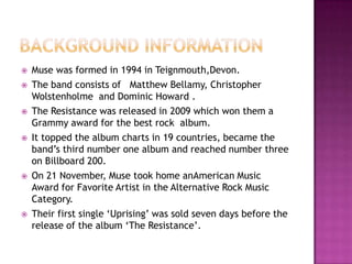


Muse is a British rock band formed in 1994. Their album The Resistance, released in 2009, won them a Grammy for best rock album. It topped the charts in 19 countries and reached number 3 on the Billboard 200 chart in the US. Muse also won an American Music Award that year for Favorite Artist in the Alternative Rock Music Category. Their first single "Uprising" from The Resistance was released a week before the full album.


![Research and conclusions2[1]](https://cdn.slidesharecdn.com/ss_thumbnails/researchandconclusions21-121022032341-phpapp01-thumbnail.jpg?width=640&height=640&fit=bounds)


