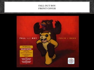
Analysis of CD covers (digipaks)
ADVANCED PRODUCTION
FALL OUT BOY
FRONT COVER
FALL OUT BOY
BACK COVER
FALL OUT BOY
DISC
The image portrayed on the front cover of the CD is a man in a bear costume giving a piggy back to an actual
bear who is roaring. This links to the image of the artists as the band are quite trendy and ‘hipster’ and the
image on the front cover is different and somewhat considered ‘cool’ to young adults and teenagers. It links to
the genre of the band as they fit into the genre of punk rock and this genre is demonstrated through the use
of darkness as the image is far from bright and cheery. The image links to the target audience as their target
audience consists of young adults from the ages of 15 – 25, and the image compliments it as it is an
animation and not very mature as a picture. The background of the front cover links to the image of the
artists as they are quite ‘punky’ and alternative have a dark image and the background of the front cover is
quite dark and has a gradient effect which also links to the genre of music being punk rock as the dark
atmosphere compliments the genre. The use of colour on the front cover is bright red and a very deep red
which fits to the image and genre of the artist as they represent punk rock and the use of the red
compliments it as it is the opposite to bright and cheerful and is more on the grim side. There is a contrast in
the colours used (bright red, dark red, dark brown, bright yellow) The layout of the front cover is quite
simple with the image in the centre and the titles and artists name on each side of the image, and this links
with the image of the artist as they aren't really an ‘out there’ band as they look very simple rather than
portraying a complex , loud image. The layout links to the genre of the band as it’s quite simple and more to
do with the music rather than the image of the band. The layout would be attractive to their target audience as
the album cover would stand out to them due to the contrast in colours and the image used as a whole. The
use and position of text is straight forward and it’s easy to recognise who the artists are due to the text being
clear and spaced out, so it is easy to read and this is an advantage as their target audience won’t have to spend
time figuring out who the artist is and what the name of the album is. The font selection is clear and easy to
read, the letters are mostly in capitals and the words are spaced out evenly to make it as clear as possible
which is convenient for people looking at the album cover as they have made it as understandable as possible.
FRONT COVER
The image on the back cover is very small and portrays two cartoon skeleton
pirates having a sword fight and this links to the image of the artist as its
youthful and ‘edgy’ which conforms to what the artist’s portray. The
background is very plain and this diverts the main focus of the back cover to
the text and images used. The use of colour on the back cover is significant
because a deep red is used but an ombre/gradient effect is used, going into a
dark red towards the bottom of the back cover. The text is presented in a
bright orange/yellow tone which contrasts with the red, making it stand out
which is an advantage because it makes the text clear and easy to read. The
layout of the back cover is presented with the text in the middle as the main
focus and the label information/barcode/etc. at the bottom. All the text is in
capital letters, which makes it clear and easy to read. It is also presented in an
organised fashion with a vertical list of the song titles. The back cover links
with the genre of the artist as it is looks youthful and well put together which
also compliments the target audience too.
BACK COVER
The disc portrays a very simple, plain yellow background which
fits in with the colour scheme of the whole pack. The bright
yellow shade stands out and has the title of the album and artist’s
name on each other side of the hole in the disk, which is
presented in an organised, easy to understand fashion. The text is
portrayed in mostly capital letters which conforms with the theme
of the rest of the pack. There is a blue print on the disk which
provides information about the record label however it is difficult
to identify and read, which brings the main focus to the rest of
the disk.
DISC
Summarise the conventions of a CD cover i.e. typical features.
Include the front covers
Back covers
Discs
Try to find typical features of the inlays (inside the CD) and the spines
Do the conventions of CD covers vary according to genre of music?
CONVENTIONS

Fall out boy analysis

  • 1.
    Analysis of CDcovers (digipaks) ADVANCED PRODUCTION
  • 2.
  • 3.
  • 4.
  • 5.
    The image portrayedon the front cover of the CD is a man in a bear costume giving a piggy back to an actual bear who is roaring. This links to the image of the artists as the band are quite trendy and ‘hipster’ and the image on the front cover is different and somewhat considered ‘cool’ to young adults and teenagers. It links to the genre of the band as they fit into the genre of punk rock and this genre is demonstrated through the use of darkness as the image is far from bright and cheery. The image links to the target audience as their target audience consists of young adults from the ages of 15 – 25, and the image compliments it as it is an animation and not very mature as a picture. The background of the front cover links to the image of the artists as they are quite ‘punky’ and alternative have a dark image and the background of the front cover is quite dark and has a gradient effect which also links to the genre of music being punk rock as the dark atmosphere compliments the genre. The use of colour on the front cover is bright red and a very deep red which fits to the image and genre of the artist as they represent punk rock and the use of the red compliments it as it is the opposite to bright and cheerful and is more on the grim side. There is a contrast in the colours used (bright red, dark red, dark brown, bright yellow) The layout of the front cover is quite simple with the image in the centre and the titles and artists name on each side of the image, and this links with the image of the artist as they aren't really an ‘out there’ band as they look very simple rather than portraying a complex , loud image. The layout links to the genre of the band as it’s quite simple and more to do with the music rather than the image of the band. The layout would be attractive to their target audience as the album cover would stand out to them due to the contrast in colours and the image used as a whole. The use and position of text is straight forward and it’s easy to recognise who the artists are due to the text being clear and spaced out, so it is easy to read and this is an advantage as their target audience won’t have to spend time figuring out who the artist is and what the name of the album is. The font selection is clear and easy to read, the letters are mostly in capitals and the words are spaced out evenly to make it as clear as possible which is convenient for people looking at the album cover as they have made it as understandable as possible. FRONT COVER
  • 6.
    The image onthe back cover is very small and portrays two cartoon skeleton pirates having a sword fight and this links to the image of the artist as its youthful and ‘edgy’ which conforms to what the artist’s portray. The background is very plain and this diverts the main focus of the back cover to the text and images used. The use of colour on the back cover is significant because a deep red is used but an ombre/gradient effect is used, going into a dark red towards the bottom of the back cover. The text is presented in a bright orange/yellow tone which contrasts with the red, making it stand out which is an advantage because it makes the text clear and easy to read. The layout of the back cover is presented with the text in the middle as the main focus and the label information/barcode/etc. at the bottom. All the text is in capital letters, which makes it clear and easy to read. It is also presented in an organised fashion with a vertical list of the song titles. The back cover links with the genre of the artist as it is looks youthful and well put together which also compliments the target audience too. BACK COVER
  • 7.
    The disc portraysa very simple, plain yellow background which fits in with the colour scheme of the whole pack. The bright yellow shade stands out and has the title of the album and artist’s name on each other side of the hole in the disk, which is presented in an organised, easy to understand fashion. The text is portrayed in mostly capital letters which conforms with the theme of the rest of the pack. There is a blue print on the disk which provides information about the record label however it is difficult to identify and read, which brings the main focus to the rest of the disk. DISC
  • 8.
    Summarise the conventionsof a CD cover i.e. typical features. Include the front covers Back covers Discs Try to find typical features of the inlays (inside the CD) and the spines Do the conventions of CD covers vary according to genre of music? CONVENTIONS