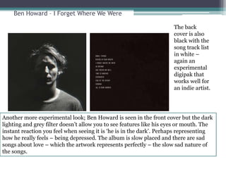
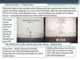
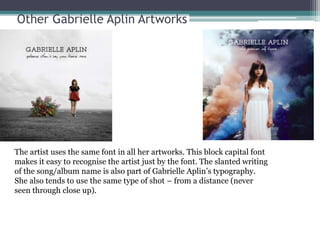
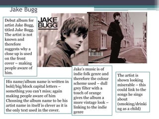
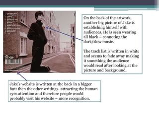
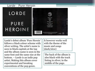
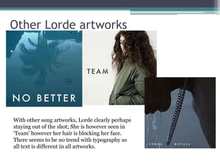
Digipak Research 
Rishi, Algwyne, Oliwia
Like many other indie genre digipak’s the artist face is not the focus. 
Indie artists experiment more; clearly shown in this cover. The artist 
is seen running away; perhaps representing that he is running away 
from his life (linked to the dark nature of the music.) 
The colour scheme used in the digipak is 
a dark brown colour. It is clearly in the 
dark; with lights from a car giving a 
spotlight effect on the singer who 
appears to be running. – the dull colour 
works well for the band because the 
music of the album is of dark nature. 
The mise en 
scene used 
is a car with 
only the 
headlights 
visible; a 
location 
which is an 
open road; 
and the 
artist 
running 
away. 
The text used is white a bold. It sticks 
out from the dull background; therefore 
making it the first thing you see when 
you see the album cover. The same font 
is used in the back of the digipak; this 
consistency makes the album artwork 
attractive and professional.
Other Bastille Album artworks. 
When looking at themes 
and typography, we can 
see how Bastille use the 
same font and same 
triangle in all covers – 
making them instantly 
recognisable when 
someone see’s the name 
in that font (on a 
magazine or billboard). 
We can also see as an 
Indie artist the album 
artworks are unusual 
and experimental; 
Something which seems 
to be a trend with indie 
artists.
Lana Del Rey – Born To Die 
Artist is in the centre of the cover. Using a 
Mid shot clearly shows that she is the artist 
of the album. 
A more minimalistic approach is 
‘Born To Die’. The white them runs 
throughout the digipak (even the 
artist is wearing white). 
The front cover is bright (blue sky). This 
reflects the mood of the music. This particular 
album from Lana is more up tempo and light; 
compared to other albums. 
Lana is 
seen 
wearing 
make up 
(Red 
lipstick) 
– making 
her look 
attractive 
and 
perhaps 
targeting 
to male 
audience 
s? 
Red rose on 
the CD, 
connotes 
love and 
sexual desire 
– main 
theme in the 
music
Other Lana Del Rey Artworks 
The artworks 
clearly reflect 
the mood and 
themes of the 
album – the 
dark 
Use of colour 
for example 
reflects the 
dark nature 
of the music. 
Lana uses the same font style in all artworks; establishing her typography 
with consumers and fans. She uses a bold/big/capital letters for both her 
name and the album name. With the ‘Ultraviolence’ cover, the album is 
her 4th album- making her an established artist; this reflects with the fact 
she doesn’t have her name on the album cover – she has already built up 
her fan base and audience.
Ben Howard – I Forget Where We Were 
The back 
cover is also 
black with the 
song track list 
in white – 
again an 
experimental 
digipak that 
works well for 
an indie artist. 
Another more experimental look; Ben Howard is seen in the front cover but the dark 
lighting and grey filter doesn’t allow you to see features like his eyes or mouth. The 
instant reaction you feel when seeing it is ‘he is in the dark’. Perhaps representing 
how he really feels – being depressed. The album is slow placed and there are sad 
songs about love – which the artwork represents perfectly – the slow sad nature of 
the songs.
Gabrielle Aplin – English Rain 
Gabrielle Aplin is also an indie artist; linking with the experimental nature of indie 
artists and album digipaks; we can see how Gabrielle Aplin has also expierimented; 
We see her from a long distance away – not something you usually see in album 
covers – normally the main focus is the artist’s facial features. 
The dull location links with the title of the album – English Rain 
Prop Used – Multi Coloured Umbrella; 
contrasts well with dull background and 
represents her colourful personality in a dark 
world (Area) 
Bright yellow dress worn by the 
artist who is shown on a long 
shot. The dress contrasts with 
the dull background 
The songs 
on the 
album are 
slow love 
songs – 
hence the 
theme of 
the dull 
background 
goes well.
Other Gabrielle Aplin Artworks 
The artist uses the same font in all her artworks. This block capital font 
makes it easy to recognise the artist just by the font. The slanted writing 
of the song/album name is also part of Gabrielle Aplin’s typography. 
She also tends to use the same type of shot – from a distance (never 
seen through close up).
Jake Bugg 
Debut album for 
artist Jake Bugg, 
titled Jake Bugg. 
The artist is not 
known and 
therefore 
suggests why a 
close up is used 
on the front 
cover – making 
people aware of 
him. 
His name/album name is written in 
bold/big/block capital letters – 
something you can’t miss; again 
making people aware of him 
Choosing the album name to be his 
artist name in itself is clever as it is 
the only text used in the cover. 
Jake’s music is of 
indie folk genre and 
therefore the colour 
scheme used – dull 
grey filter with a 
touch of orange 
gives the album a 
more vintage look – 
linking to the indie 
genre 
The artist is 
shown looking 
miserable – this 
could link to the 
songs he sings 
about 
(smoking/drinki 
ng as a child)
On the back of the artwork, 
another big picture of Jake is 
establishing himself with 
audiences. He is seen wearing 
all black – connoting the 
dark/slow music. 
The track list is written in white 
and seems to fade away making 
it something the audience 
would read after looking at the 
picture and background. 
Jake’s website is written at the back in a bigger 
font then the other writings- attracting the human 
eyes attention and therefore people would 
probably visit his website – more recognition.
Lorde – Pure Heroin 
Lorde’s debut album ‘Pure Heroin’ 
follows a black colour scheme with 
silver writing. The artist’s name is 
seen in block capitals at the top 
and the album name is seen in the 
same font and the same size at the 
bottom. – Lorde is an indie pop 
artist; Making this album cover 
experimental and breaking 
conventions of the pop genre. 
It however works well 
with the theme of the 
music and songs 
(dark/slow) 
The back of the album is 
also black with the track 
listing in silver; in the 
middle of the page.
Other Lorde artworks 
With other song artworks, Lorde clearly perhaps 
staying out of the shot; She is however seen in 
‘Team’ however her hair is blocking her face. 
There seems to be no trend with typography as 
all text is different in all artworks.

Digipak research

  • 1.
    Digipak Research Rishi,Algwyne, Oliwia
  • 2.
    Like many otherindie genre digipak’s the artist face is not the focus. Indie artists experiment more; clearly shown in this cover. The artist is seen running away; perhaps representing that he is running away from his life (linked to the dark nature of the music.) The colour scheme used in the digipak is a dark brown colour. It is clearly in the dark; with lights from a car giving a spotlight effect on the singer who appears to be running. – the dull colour works well for the band because the music of the album is of dark nature. The mise en scene used is a car with only the headlights visible; a location which is an open road; and the artist running away. The text used is white a bold. It sticks out from the dull background; therefore making it the first thing you see when you see the album cover. The same font is used in the back of the digipak; this consistency makes the album artwork attractive and professional.
  • 3.
    Other Bastille Albumartworks. When looking at themes and typography, we can see how Bastille use the same font and same triangle in all covers – making them instantly recognisable when someone see’s the name in that font (on a magazine or billboard). We can also see as an Indie artist the album artworks are unusual and experimental; Something which seems to be a trend with indie artists.
  • 4.
    Lana Del Rey– Born To Die Artist is in the centre of the cover. Using a Mid shot clearly shows that she is the artist of the album. A more minimalistic approach is ‘Born To Die’. The white them runs throughout the digipak (even the artist is wearing white). The front cover is bright (blue sky). This reflects the mood of the music. This particular album from Lana is more up tempo and light; compared to other albums. Lana is seen wearing make up (Red lipstick) – making her look attractive and perhaps targeting to male audience s? Red rose on the CD, connotes love and sexual desire – main theme in the music
  • 5.
    Other Lana DelRey Artworks The artworks clearly reflect the mood and themes of the album – the dark Use of colour for example reflects the dark nature of the music. Lana uses the same font style in all artworks; establishing her typography with consumers and fans. She uses a bold/big/capital letters for both her name and the album name. With the ‘Ultraviolence’ cover, the album is her 4th album- making her an established artist; this reflects with the fact she doesn’t have her name on the album cover – she has already built up her fan base and audience.
  • 6.
    Ben Howard –I Forget Where We Were The back cover is also black with the song track list in white – again an experimental digipak that works well for an indie artist. Another more experimental look; Ben Howard is seen in the front cover but the dark lighting and grey filter doesn’t allow you to see features like his eyes or mouth. The instant reaction you feel when seeing it is ‘he is in the dark’. Perhaps representing how he really feels – being depressed. The album is slow placed and there are sad songs about love – which the artwork represents perfectly – the slow sad nature of the songs.
  • 7.
    Gabrielle Aplin –English Rain Gabrielle Aplin is also an indie artist; linking with the experimental nature of indie artists and album digipaks; we can see how Gabrielle Aplin has also expierimented; We see her from a long distance away – not something you usually see in album covers – normally the main focus is the artist’s facial features. The dull location links with the title of the album – English Rain Prop Used – Multi Coloured Umbrella; contrasts well with dull background and represents her colourful personality in a dark world (Area) Bright yellow dress worn by the artist who is shown on a long shot. The dress contrasts with the dull background The songs on the album are slow love songs – hence the theme of the dull background goes well.
  • 8.
    Other Gabrielle AplinArtworks The artist uses the same font in all her artworks. This block capital font makes it easy to recognise the artist just by the font. The slanted writing of the song/album name is also part of Gabrielle Aplin’s typography. She also tends to use the same type of shot – from a distance (never seen through close up).
  • 9.
    Jake Bugg Debutalbum for artist Jake Bugg, titled Jake Bugg. The artist is not known and therefore suggests why a close up is used on the front cover – making people aware of him. His name/album name is written in bold/big/block capital letters – something you can’t miss; again making people aware of him Choosing the album name to be his artist name in itself is clever as it is the only text used in the cover. Jake’s music is of indie folk genre and therefore the colour scheme used – dull grey filter with a touch of orange gives the album a more vintage look – linking to the indie genre The artist is shown looking miserable – this could link to the songs he sings about (smoking/drinki ng as a child)
  • 10.
    On the backof the artwork, another big picture of Jake is establishing himself with audiences. He is seen wearing all black – connoting the dark/slow music. The track list is written in white and seems to fade away making it something the audience would read after looking at the picture and background. Jake’s website is written at the back in a bigger font then the other writings- attracting the human eyes attention and therefore people would probably visit his website – more recognition.
  • 11.
    Lorde – PureHeroin Lorde’s debut album ‘Pure Heroin’ follows a black colour scheme with silver writing. The artist’s name is seen in block capitals at the top and the album name is seen in the same font and the same size at the bottom. – Lorde is an indie pop artist; Making this album cover experimental and breaking conventions of the pop genre. It however works well with the theme of the music and songs (dark/slow) The back of the album is also black with the track listing in silver; in the middle of the page.
  • 12.
    Other Lorde artworks With other song artworks, Lorde clearly perhaps staying out of the shot; She is however seen in ‘Team’ however her hair is blocking her face. There seems to be no trend with typography as all text is different in all artworks.