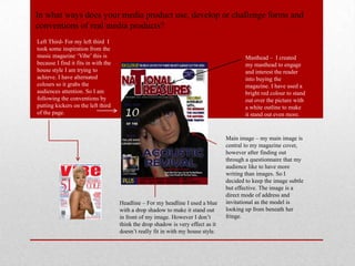
The document describes the design choices made for a magazine media product. It explains how conventions from real magazines, like Vibe, were used in elements like the masthead, images, headlines, and pull quotes. The double page spread follows conventions by using a large main photo on one page and the accompanying article on the other. Colors and formatting are used purposefully throughout to draw attention and engage readers according to the "house style." The overall design keeps elements organized and makes strategic use of space, following conventions seen in other magazines.