Separation of Lanthanides/ Lanthanides and Actinides
Contents as
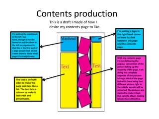
1. Contents production
This is a draft I made of how I
desire my contents page to like.
I’m putting a logo in
I'm putting the mastheads the right hand corner
in the left top so there is a link
hand, though it may be between this page
formal to put the them in
the left my argument is
and the contents
that this is the first part of page.
a page people look at and
I want them to know what
page it is straight away.
With my contents page
I'm not following the
popular convention of the
picture taking up the
majority of the page. I am
doing the complete
opposite of the pictures
taking a third of the page
The text is on both
but with there being four
sides to make the
different picture right in
page look less like a the middle people will be
list. The text is in a attracted. The pictures are
column to make it slanted to make it look
look neat and like a photo album making
presentable. it look more attractive.
2. Step 1
B)
A) C)
I tried creating my masthead in Photoshop but then analysing my
work afterwards I realised it did not look professional , so then…
Step 2
… I used InDesign!
I started by typing
out each individual
letter.
3. Step 2
… I used InDesign!
And this is
I used the the result
selection
tool to move
letters
around
I started by typing With there being boxes
all the letters out. around each, it is easier to
align the letters making it
look more neater
4. This is me using my initial
‘godfather’ text as I wanted
At first I wanted the masthead to to make a link between the
be yellow this turned out looking front page and contents.
childish and not a colour
appropriate for my genre.
5. When writing at first my text although aligned across the page, it was not
equally spaced out. So to help with this I inserted columns.
Despite my research
showing me that most
of the time the text is
on one side and the
main picture on the
other. I wanted the
picture to be central
giving it central stage
and spread the texts
out to both sides so
that it would not be
overwhelming.
6. Here is the result of inserting columns, which makes the contents
appear more presentable and professional.
7. Then I soon discovered another problem where although I was able to
proportionally arrange my text vertically, I was struggling with making it
horizontally in line.