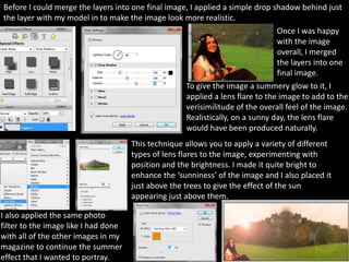
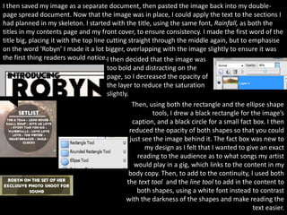
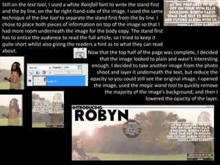
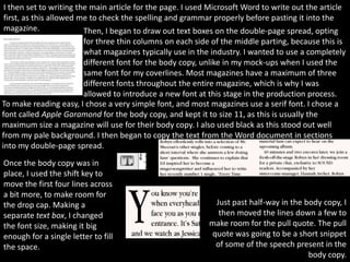
Download to read offline

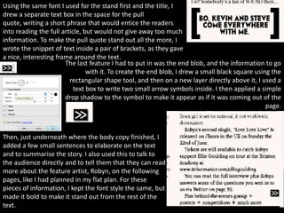

The document summarizes the process of designing a double-page magazine spread. It describes altering the document dimensions to double the width, adding guidelines and consistency elements from other pages. An main image was created by combining two photos - a forest background and an edited model photo pasted on top. Text elements like the title, caption and article were then added. Minor tweaks were made to enhance the overall design.


