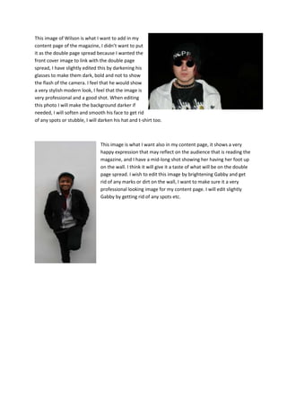
Images I wish to use
This image is of Gabby, I wanted her to be
on my front cover of my magazine, I
wanted her because she represents indie
rock bands such as does it offend you,
yeah? She doesn’t dress or look indie so I
felt it would move away from the
stereotypical look of indie rock/indie music
type look. I also felt it looked very
professional; it has great lighting, good
professional look to it and a great medium
close up shot of her. She is giving direct
address to the camera giving a kind of
connection between the audience and her. Also she seems to be slightly smiling showing a friendly
look towards the audience of the magazine. When editing/creating my front cover I wish to soften
her skin to get rid of any spots so she doesn’t look like a teenager, I will be lightening the background
also so it makes it look more like a professional background.


                                                Again this is Gabby, I wish to use this for the double
                                                page spread, and I wanted the double page to link to
                                                the front cover image. I would be able to carry on this
                                                colour of the background on the other page of the
                                                double page spread to put the text of the double
                                                page spread on, I feel it would make it look
                                                professional looking, it would make gabby the centre
                                                piece of the double page spread and make the
                                                wording clear to read. I wanted to have the white
                                                background because if I did want to edit the
                                                background I would have been able to do it more
                                                easily. When editing this photo I wish to brighten
                                                Gabby due to it looking darker than what it was in the
                                                other image, I also wish to get rid of anything on the
                                                wall (e.g. dirt on the wall etc.)
This image of Wilson is what I want to add in my
content page of the magazine, I didn’t want to put
it as the double page spread because I wanted the
front cover image to link with the double page
spread, I have slightly edited this by darkening his
glasses to make them dark, bold and not to show
the flash of the camera. I feel that he would show
a very stylish modern look, I feel that the image is
very professional and a good shot. When editing
this photo I will make the background darker if
needed, I will soften and smooth his face to get rid
of any spots or stubble, I will darken his hat and t-shirt too.


                                This image is what I want also in my content page, it shows a very
                                happy expression that may reflect on the audience that is reading the
                                magazine, and I have a mid-long shot showing her having her foot up
                                on the wall. I think it will give it a taste of what will be on the double
                                page spread. I wish to edit this image by brightening Gabby and get
                                rid of any marks or dirt on the wall, I want to make sure it a very
                                professional looking image for my content page. I will edit slightly
                                Gabby by getting rid of any spots etc.

Unaltered photos

  • 1.
    Images I wishto use This image is of Gabby, I wanted her to be on my front cover of my magazine, I wanted her because she represents indie rock bands such as does it offend you, yeah? She doesn’t dress or look indie so I felt it would move away from the stereotypical look of indie rock/indie music type look. I also felt it looked very professional; it has great lighting, good professional look to it and a great medium close up shot of her. She is giving direct address to the camera giving a kind of connection between the audience and her. Also she seems to be slightly smiling showing a friendly look towards the audience of the magazine. When editing/creating my front cover I wish to soften her skin to get rid of any spots so she doesn’t look like a teenager, I will be lightening the background also so it makes it look more like a professional background. Again this is Gabby, I wish to use this for the double page spread, and I wanted the double page to link to the front cover image. I would be able to carry on this colour of the background on the other page of the double page spread to put the text of the double page spread on, I feel it would make it look professional looking, it would make gabby the centre piece of the double page spread and make the wording clear to read. I wanted to have the white background because if I did want to edit the background I would have been able to do it more easily. When editing this photo I wish to brighten Gabby due to it looking darker than what it was in the other image, I also wish to get rid of anything on the wall (e.g. dirt on the wall etc.)
  • 2.
    This image ofWilson is what I want to add in my content page of the magazine, I didn’t want to put it as the double page spread because I wanted the front cover image to link with the double page spread, I have slightly edited this by darkening his glasses to make them dark, bold and not to show the flash of the camera. I feel that he would show a very stylish modern look, I feel that the image is very professional and a good shot. When editing this photo I will make the background darker if needed, I will soften and smooth his face to get rid of any spots or stubble, I will darken his hat and t-shirt too. This image is what I want also in my content page, it shows a very happy expression that may reflect on the audience that is reading the magazine, and I have a mid-long shot showing her having her foot up on the wall. I think it will give it a taste of what will be on the double page spread. I wish to edit this image by brightening Gabby and get rid of any marks or dirt on the wall, I want to make sure it a very professional looking image for my content page. I will edit slightly Gabby by getting rid of any spots etc.