
Recommended
More Related Content
What's hot
What's hot (17)
Similar to Contents Page Progression
Similar to Contents Page Progression (20)
More from epearson94
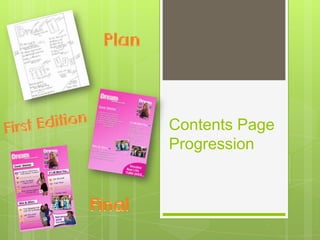
Contents Page Progression
- 2. Contents Design & Inspiration I gained inspiration for my contents page by using this Top of The Pops page. I used subtitles to separate the different sections, as seen in the Tops of the Pops magazine. I also borrowed the idea of using various graphic features spread across the page, to make it visually interesting and to entertain my target audience.
- 3. Contents Design Continued… In my first paper plan I decided to include an editors letter, as this was something I saw featured in other magazines e.g. heat, which is aimed at females of a similar age to my own target audience. However for my first and final editions of my contents I decided to remove this feature, as I felt is was unnecessary and I could use the space for more graphic features, which were likely to appeal more to my target audience.
- 4. Contents Page – First Addition I have followed my original paper plan by including subtitles, sections and graphic features. However I quickly realised that the first addition of my contents page was bare and needed to be much busier. Following this I decided that I needed to add more graphic features to my contents, and possibly begin to overlap pictures and text to make the page appear more crowded. In addition I could also include the use of shapes such as boxes and improve the general layout.
- 5. Contents – Final Having looked over my previous paper plan and my initial first design, I added lots more graphic features to maintain the interest of young females. Furthermore I added boxes which contain the different sections of my magazine and also placed hearts next to each brief page description. I also increased the size of the page numbers to make them more visible, and used the colour yellow to connote happiness and vibrancy. I highlighted some pieces of text, to make it edgy and interesting as yellow will catch the readers eye.
- 6. Contents - Final Continued… The subtitles are also now included in boxes and the font size has been increased to make the text more dominant. The colour black also connotes this idea of power and dominance, the kind of presence that pop stars typically have. Some page numbers are highlighted in white with a glowing outer ridge, to connote this theme of dreams and becoming a star, similar to the main title of the magazine. Other new features included a sneak preview article of Justin Beiber, whom is a popular artist among young females.