
Recommended
More Related Content
What's hot
What's hot (18)
Viewers also liked
Viewers also liked (16)
Similar to Preliminary evaluation
Similar to Preliminary evaluation (20)
Preliminary evaluation
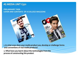
- 1. PRELIMINARY TASK- COVER AND CONTENTS OF A COLLEGE MAGAZINE 1. In what ways does your media product use, develop or challenge forms and conventions of real media products? 2. What have you learnt about the technologies from the process of constructing this product
- 2. In what ways does your media product use, develop or challenge forms and conventions of real media products? THE FRONT COVER-SIMILARITIES
- 3. with front cover The main images are different as both magazines have different key demographic Use of colour schemes include bright and consistent colours to attract my target audience Use of different cover /seller lines Both main images include MCU but my image is of a male smiling which is used to create a positive effect
- 4. In what ways does your media product use, develop or challenge forms and conventions of real media products? contents page Initial magazine masthead Use of images Layout out of columns for features within the magazine and categorised Magazine logo Same colour background
- 5. DIFFERENCES WITH CONTENTS PAGE The colour scheme of the font is different. Consistent house style Different images are used. My magazine used 3 which are all of college students who are either happy or studying which again creates a very positive effect towards the audience
- 6. What have you learnt about the technologies from the process of constructing this product A lot of technology was used to construct my magazine, each of which included a great learning I used a digital camera to take different types of shots and experience here are camera angles of students for a few that were a Learned the features the magazine great asset of In Design to create my contents and Photoshop was a great double page spread. learning experience as it helped to edit my image and add effects I used Moodle to get certain resources that we needed for the magazine
- 7. I use Adobe Photoshop Digital Camera & Adobe to make an average student into a “model” Photoshop CS6 student for a college magazine Using the digital camera, I would ensure that the main image that I would use for my front I manipulated the image of the student cover would be a MCU which dominated through different tools in Adobe Photoshop most of the frame. I left a little bit of space cs6. The first tool was used to cut out the for the masthead so that you could see it very background which I thought was a great clearly. I took into the account of the rule of skill. third which is where I put what the magazine • I changed the levels of the colours, to was offering as it was very important for my add more emphasis on the student. target audience. The main image itself is well • Added drop shadow to some of the taken and saves a lot of space for the cover information/cover lines/masthead so it lines however I should have taken the photo looked more appealing closer as it looks more of MS instead of MCU. • I also added a lens flare into the I have taken the image of a model student masthead so it would seem more who seems happy which gives a very positive attractive and catch the attention of the effect towards the product. viewer
- 8. Adobe InDesign CS6 I used Adobe InDesign CS6 to create my contents page of my magazine I had a main text box at the top with the main title and I I placed 3 images in my made sure I used the same contents page to make colours as on the front it look more visual. cover so I could a The images are all consistent house style. I actually used word art for photo’s of current the title so the content students who all seem page would be more eye happy, this creates a catching. very warm feeling. I converted all of the image’s shape to circle I also added different effects to all the information, figure that would make including drop shadow, levelling colours, etc. the images look more unique.