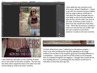
The document describes the process of designing the front cover of a magazine. Key points:
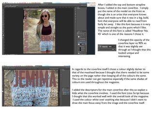
1) A photo was chosen and cropped to fit the cover, with adjustments made to make it appealing.
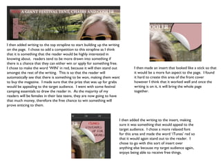
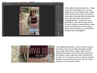
2) Text was added including the magazine title in a scorched font and coverlines about winning prizes and festival survival guides.
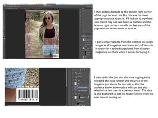
3) Smaller descriptive text and a barcode were also included, and adjustments made to colors and positioning throughout to complete the design.