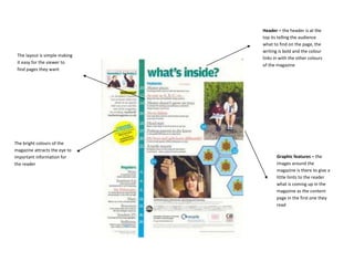
1. Header – the header is at the
top its telling the audience
what to find on the page, the
writing is bold and the colour
The layout is simple making
links in with the other colours
it easy for the viewer to
of the magazine
find pages they want
The bright colours of the
magazine attracts the eye to
important information for Graphic features – the
the reader images around the
magazine is there to give a
little hints to the reader
what is coming up in the
magazine as the content
page in the first one they
read
2. Graphic features – the smaller images
adds a teaser to the audience as they can
get a brief idea on what to expect from the
magazine
Header - a line of information at
the top help tell the viewer what is
on the page
The main body of information is
there to help the reader locate
important articles they want to
read, it being easy for the reader
may make them like the magazine
more
With half the page being image
based it makes it more visual for
the viewer and easier to find
pages
The colours are all simple and aren’t bright but these will
fit in with the colour scheme.