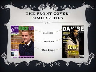
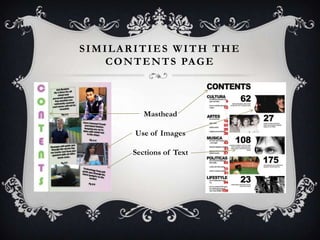
1. The document describes the similarities and differences between the student's magazine cover and contents page and real magazine examples.
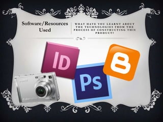
2. It discusses what was learned about Photoshop and InDesign from constructing the magazine project. Photoshop allowed image editing like cropping, blurring and adjusting levels. InDesign facilitated page layout, adding graphics and text, and creating a two-page spread.
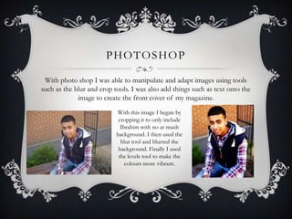
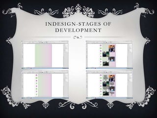
3. Stages of development are described for working in Photoshop and InDesign to construct the magazine pages. Images were edited in Photoshop before being imported into InDesign for page layout.