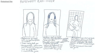
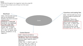
2. Photograph selection
I didn’t choose this photo as the
headphones were too subtle and therefore,
it would not be obvious that mine was a
music magazine.
I chose this photograph because I liked the
lighting and how the headphones contrast
the brightness of the background. I also
liked that there is enough space for my
masthead and cover lines.
I felt that both of these images were too dark and that my
model looked unhappy so I chose not to use either of them
as my final cover image.
3. Fonts
Cover
Coverlines and Leading Text
Masthead
Contest Banner
I knew that throughout my magazine I was only using 3/4
fonts so I have chosen one of those 3 or 4 for each
component
Calibri- I felt that Calibri was too
plain for my masthead and
therefore, may result in my cover
looking ameture
AR Bonnie- I chose AR
Bonnie for my masthead
as it has a ‘pop’ feel
without looking tacky
Orator Std- I didn’t
want to us eorator std
as I felt it would look
better elsewhere in my
magazine
Calibri- I chose to use Calibri to
distinguish it from the rest of my cover
AR Bonnie- This is my masthead
font so I didn’t want to use it
elsewhere
Orator Std- I didn’t want to
use this font as I felt it
would get confused with my
Calibri- I felt that Calibri was not eye
catching enough for coverlines and
leading text
AR Bonnie- This is my
masthead font so I didn’t
want to use it elsewhere
Orator Std- I chose this
font because it is eye
catching without being
overpowering on the cover
5. I duplicated the layer so
that if I made any
mistakes, I could revert
back to my original
image. I then used the
spot heal tool to remove
imperfections from my
model’s face in order to
make my photo look
more professional and
flawless.
6. Next, I used the burn tool to
darken her eyebrows, lash line
and hair to contrast the
brightness of the background.
Next, I used the clone tool to
remove the split between the
wall panels in the background to
stop it distracting from my
model. I considered using the
clone tool to remove my model’s
shadow however, I feel like it
makes her stand out further so I
left it in.
7. I used the gradient tool to
add colour to my image for
that real pop magazine look
using bright colours. I then
created my Masthead using
AR Bonnie size 286.5 so that
it’s clear what the magazine
is called.
8. I used the quick select tool
to select the top of my
model’s head then made a
copy for it and pasted it to a
new layer to bring it in front
of my masthead. I then
selected the masthead and
used the drop shadow tool
to make it stand out via the
layer style tool.
9. 286.5 AR
Bonnie
48 and 36
35 and 31
I used Orator STD for all of my
cover lines and leading text. The
first numbers in each annotation
is the cover line size and the
second, leading text size.
39 and 36
36 and 30
54 and 43
The larger the text and the higher up the
page, the more important the article. I
tried to create natural eye flow for the
reader and used a slightly darker pink
than her jumper for the cover lines to tie
together the text and image and to make
them stand out.
10. I then added in the date and
issue no. (Calibri size 18) under
the masthead and also added
in my barcode base using the
rectangle tool. I then used the
rectangle marquee tool and
used the bucket tool to add a
white tint to act as a banner. I
used Calibri in size 30 to write
about the contest in order to
make people want to buy my
magazine.