
Recommended
More Related Content
What's hot
What's hot (17)
Viewers also liked
Viewers also liked (20)
Similar to Contents pages
Similar to Contents pages (20)
More from martincooper
More from martincooper (20)
Contents pages
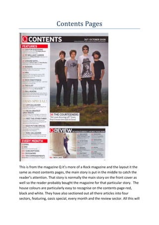
- 1. Contents Pages This is from the magazine Q it’s more of a Rock magazine and the layout it the same as most contents pages, the main story is put in the middle to catch the reader’s attention. That story is normally the main story on the front cover as well so the reader probably bought the magazine for that particular story. The house colours are particularly easy to recognise on the contents page-red, black and white. They have also sectioned out all there articles into four sectors, featuring, oasis special, every month and the review sector. All this will
- 2. make it easier for the readers to pick out what sections they want to read and where they are. This is from the NME magazine and has a different style to Q magazine it is less organised, again the main story line is in the middle of the page. It is what draws the reader in and again the picture is there to catch the eye of the reader. Most stories are on the left of the page but the key stories are on the right and again have been split onto sections to make it easier for the reader to find what they’re looking for. At the bottom they have a subscription to try and keep readers tied in to this magazine so they get the most money thy can. In the contents page they also use the idea of changing the size of the font so that they can draw the reader’s eye in as much as possible.
- 3. This magazine is more of a mainstream styled magazine it has more than one picture as this is a magazine is trying to target a wider set audience, you can see this as instead of just a genre they have the whole top 40 on the side which indicates to people the kind of artists that will be within the magazine. The house colours again are clear blue, black and white again this will be seen throughout the magazine. There is no clear lead picture within this contents page this could mean that they feel all artists have an equal quality. The layout is also a bit different as well as they have a new factor as well, at the bottom right they have upcoming events and what you can find online all to try and draw readers in.