Masthead and Subheading fonts
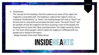
InsideHearts
 InsideHearts
- The concept for this heading is that the audience are aware of the region the
magazine is associated with. The heading is a play on the region’s name, as
instead of “Hertfordshire” or “Herts”, the heading design will read as “heart” but
be coloured in a way which accentuates the place name. The word “hearts” will
be symbolic of how the magazine will focus on giving a voice to the people and
allowing them to share their ideas and experiences. The slogan would be similar
to “The heart of the people”, which implies the magazine is affiliated with the
people and is rooted in the region.
Design Example: (Font used: Bebas Neue)
BehindThe
Scenes
 BehindTheScenes
- The idea for this heading is that the magazine will not focus
on Hertfordshire as a place, but instead on the people. By
naming a regional based magazine “BehindTheScenes”, this
suggests that the magazine will reveal uncommon
information about the area. As I would like to focus on the
locals of Hertfordshire, this heading would be effective in
conveying the uniqueness of the magazine, and how it
relates to the people rather than the picturesque front
many regional magazines display when reporting on the
location.
Scene
 Scene
- I like this heading as it describes a place, which
suggests how the magazine is based on a region. The
con to this heading is how it doesn’t directly link to the
theme of my magazine. I want to convey the essence
of the magazine within the heading, whether it
includes the region name or alludes to the genre being
based on the locals. I think that this heading would be
more relevant to a fashion magazine.
Scenic
 Scenic
- I like how this magazine describes an attractive/desirable
location, as it could attract tourists to the magazine to find
out more about the location. However, I would prefer the
magazine heading to focus on how it is based on the
people of the region. Rather than depicting a picturesque
front of the region, I would rather focus the magazine on
the people living there, to ensure the magazine is void of
pretensions and illusions.
Design Ideas
After thinking of various potential headings for my magazine, I decided
to test how both “InsideHearts” and “BehindTheScenes” appeared in
different styles. As I was unable to choose a title most suitable for my
magazine after producing multiple ideas, I will most likely choose styles
suitable for my masthead, and then ask others for opinions on which
masthead would be more successful in conveying my ideas.
Design
Ideas
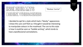
Blackout
Sunrise
“Blackout Sunrise”
I decided to opt for a style which had a “blocky” appearance.
I chose this sans serif font as I thought it would be interesting
to manipulate colours in the masthead. The con to this style
is how it could be seen as “bubble writing”, which tends to
have unprofessional connotations.
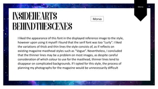
Morva
Morva
I liked the appearance of this font in the displayed reference image to the style,
however upon using it myself I found that the serif font was too “curly”. I liked
the variations of thick and thin lines the style consists of, as if reflects on
existing magazine masthead styles such as “Vogue”. Nevertheless, I concluded
that the thinner lines may be a problem on most images, as despite careful
consideration of which colour to use for the masthead, thinner lines tend to
disappear on complicated backgrounds. If I opted for this style, the process of
planning my photographs for the magazine would be unnecessarily difficult
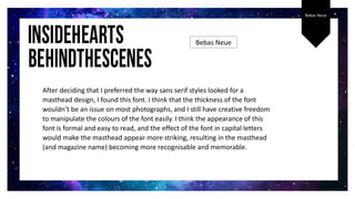
Bebas Neue
After deciding that I preferred the way sans serif styles looked for a
masthead design, I found this font. I think that the thickness of the font
wouldn’t be an issue on most photographs, and I still have creative freedom
to manipulate the colours of the font easily. I think the appearance of this
font is formal and easy to read, and the effect of the font in capital letters
would make the masthead appear more striking, resulting in the masthead
(and magazine name) becoming more recognisable and memorable.
Bebas Neue
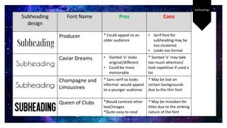
Subheadings
Subheading
design
Font Name Pros Cons
Producer * Could appeal to an
older audience
• Serif font for
subheading may be
too clustered
• Looks too formal
Caviar Dreams • Slanted ‘e’ looks
original/different
• Could be more
memorable
* Slanted ‘e’ may take
too much attention/
look repetitive if used a
lot
Champagne and
Limousines
* Sans serif so looks
informal- would appeal
to a younger audience
* May be lost on
certain backgrounds
due to the thin font
Queen of Clubs *Would contrast other
text/images
*Quite easy to read
* May be mistaken for
titles due to the striking
nature of the font

Masthead and Subheading fonts.docx

  • 1.
  • 2.
    InsideHearts  InsideHearts - Theconcept for this heading is that the audience are aware of the region the magazine is associated with. The heading is a play on the region’s name, as instead of “Hertfordshire” or “Herts”, the heading design will read as “heart” but be coloured in a way which accentuates the place name. The word “hearts” will be symbolic of how the magazine will focus on giving a voice to the people and allowing them to share their ideas and experiences. The slogan would be similar to “The heart of the people”, which implies the magazine is affiliated with the people and is rooted in the region. Design Example: (Font used: Bebas Neue)
  • 3.
    BehindThe Scenes  BehindTheScenes - Theidea for this heading is that the magazine will not focus on Hertfordshire as a place, but instead on the people. By naming a regional based magazine “BehindTheScenes”, this suggests that the magazine will reveal uncommon information about the area. As I would like to focus on the locals of Hertfordshire, this heading would be effective in conveying the uniqueness of the magazine, and how it relates to the people rather than the picturesque front many regional magazines display when reporting on the location.
  • 4.
    Scene  Scene - Ilike this heading as it describes a place, which suggests how the magazine is based on a region. The con to this heading is how it doesn’t directly link to the theme of my magazine. I want to convey the essence of the magazine within the heading, whether it includes the region name or alludes to the genre being based on the locals. I think that this heading would be more relevant to a fashion magazine.
  • 5.
    Scenic  Scenic - Ilike how this magazine describes an attractive/desirable location, as it could attract tourists to the magazine to find out more about the location. However, I would prefer the magazine heading to focus on how it is based on the people of the region. Rather than depicting a picturesque front of the region, I would rather focus the magazine on the people living there, to ensure the magazine is void of pretensions and illusions.
  • 6.
    Design Ideas After thinkingof various potential headings for my magazine, I decided to test how both “InsideHearts” and “BehindTheScenes” appeared in different styles. As I was unable to choose a title most suitable for my magazine after producing multiple ideas, I will most likely choose styles suitable for my masthead, and then ask others for opinions on which masthead would be more successful in conveying my ideas. Design Ideas
  • 7.
    Blackout Sunrise “Blackout Sunrise” I decidedto opt for a style which had a “blocky” appearance. I chose this sans serif font as I thought it would be interesting to manipulate colours in the masthead. The con to this style is how it could be seen as “bubble writing”, which tends to have unprofessional connotations.
  • 8.
    Morva Morva I liked theappearance of this font in the displayed reference image to the style, however upon using it myself I found that the serif font was too “curly”. I liked the variations of thick and thin lines the style consists of, as if reflects on existing magazine masthead styles such as “Vogue”. Nevertheless, I concluded that the thinner lines may be a problem on most images, as despite careful consideration of which colour to use for the masthead, thinner lines tend to disappear on complicated backgrounds. If I opted for this style, the process of planning my photographs for the magazine would be unnecessarily difficult
  • 9.
    Bebas Neue After decidingthat I preferred the way sans serif styles looked for a masthead design, I found this font. I think that the thickness of the font wouldn’t be an issue on most photographs, and I still have creative freedom to manipulate the colours of the font easily. I think the appearance of this font is formal and easy to read, and the effect of the font in capital letters would make the masthead appear more striking, resulting in the masthead (and magazine name) becoming more recognisable and memorable. Bebas Neue
  • 10.
    Subheadings Subheading design Font Name ProsCons Producer * Could appeal to an older audience • Serif font for subheading may be too clustered • Looks too formal Caviar Dreams • Slanted ‘e’ looks original/different • Could be more memorable * Slanted ‘e’ may take too much attention/ look repetitive if used a lot Champagne and Limousines * Sans serif so looks informal- would appeal to a younger audience * May be lost on certain backgrounds due to the thin font Queen of Clubs *Would contrast other text/images *Quite easy to read * May be mistaken for titles due to the striking nature of the font