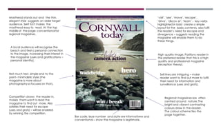
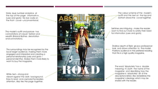
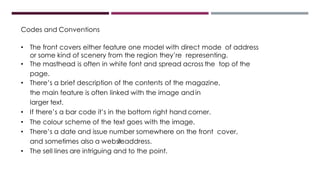
CODES AND
CONVENTIONS OF
REGIONAL
MAGAZINES –
FRONT COVERS
The model’s hand andttpopcorn is
covering part of the masthead;
suggest the magazine is so well
known the name can still be
recognized. Also creates a 3D effect
and adds interest to the design.
Date and issue number show the
magazine is recent so the
information is relevant. The website
address in a bold font encourages
the reader to engage with the
magazine – increases the
accessibility.
Openposture and expressioncreate a
personal relationship with the reader,
making them feel connected and
engaged with the magazine. The
popcorn is unusual and eye catching
and links to the sell lines. The style looks
light-hearted, which fulfils the reader’s
need for escapism and diversion (uses
and grats).
Red features across front cover
draw the page together, fitting in
with the house colours and
reinforcing the brand identity.
Masthead on the left hand side is a
common convention of regional
magazines. The white outline and
bold sans serif font standsout. The
stylish font establishes the ideology
and house style of the magazine.
Well known actress draws in the
reader’s attention, as Time Out has a
diverse targetaudience (from ages
15-35+) and she would need to be
known by most age groups. The
direct mode of address creates a
personal relationship with the
reader- makes them more likely to
purchase the magazine.
No bar code or price on the front cover is unconventional
for regional magazines- could be because it’s free.
The model looks surprised, suggesting there’s
something interesting inside the magazine.
Uses and gratifications – surveillance – the
reader wants to read on to find out more.
Sell line ‘plus’ grabs the reader’s
attention, by encouraging them to
read on to find out more.
Bar code not too big, doesn’t interfere
with the design and is conventional for
regional magazines.
The masthead across the top
is conventional for regional
magazines.White serif font
standsout and establishes the
style of the magazine.
Outlines what’s in the magazine quickly
and efficiently. White, bold, sans serif
font fits in with the colour scheme and
ties the page together.
Although you can’t see the
model’s eyes, there is direct mode
of address in the way she’s smiling
at the reader, which creates a
personal relationship and makes
the reader more engaged with
and likely to buy the magazine.
The image partly covers the masthead,
with the net of the head dress going
over the text. This adds to the cover’s
unique look and attracts the attention
of the reader.
The image has a shallow depth of
field, so that only the model is in
focus- helps to position the audience
in the preferred reading that the
magazine is professional and high
quality,
The bright colours fit with the festival
theme and attracts a younger
targetaudience. The theme fun
looks light-hearted, which satisfies
the reader’s need for diversion
and escape.
The sell lines and the vibrant
image are intriguing, making
the reader want to find out
more (uses and gratifications
– surveillance)
Date, issue number and quite a high
price (£3). Conventional, shows
magazine is legitimate and high
quality which would be the preferred
reading (reception theory)
The masthead is bold and stands out
across the top of the page. Sans serif
font is consistent across all issues.
Creates an identity for the brand so
it’s more likely to be recognised.
Date and issue number let the reader
know the magazine is recent. The small
font doesn’t disruptthe design of the
magazine. Also conventional and looks
professional.
The direct mode of address creates a
personal relationship with the reader
(Uses and gratifications – personal
relationships). Makes them feel
connected with the magazine and
more likely to pick it up.
The magazine is free
so iseasily accessible.
Nobar code.
It could be argued the model is being
objectified according to Mulvey’s male
gaze theory, due to her revealing clothes
and the fact that she’s being used to
encourage the attention of readers
through her physical appearance.
However, the direct mode of address
gives her human identity by making her
the subject rather than an object.
Sell lines are intriguing- encourage local
audiences to want to find out more
about their region to fulfil their cognitive
need for information and surveillance
(uses and grats).
Sell lines reflect the ideology of the
local target audience (Brighton has
the UK’s biggest LGBT pride festival).
Creates a personal relationship
which engages the reader (uses and
gratifications – personal identity).
The model is centred – conventional.
Regional magazines have either a
model or a landscape shot on the
front cover, dependant on the style
and target audience.
Bar code, issue number and date are informativee and
conventional – show the magazine is legitimate.
Masthead stands out and the thin,
elegant style suggests an older target
audience. Serif font makes the
masthead easy to read. At the top
middle of the page- conventional for
regional magazines.
Competition draws the reader in,
makes themwant to read the
magazine to find out more. Also
satisfies their need for escape
(uses and grats) – will be enabled
by winning the competition.
Regional magazinesare often
centred around nature.The
bright and vibrant contrasting
colours draw in the reader.
The colour scheme ties the
page together.
Not much text, simple and to the
point- minimalistic style (the
magazine is more about
photographyso focuses on that).
‘visit’, ‘see’, ‘move’,‘escape’,
‘drive’, ‘discov er’, ‘learn’ - key verbs
highlighted in bold create a simple
layout for the basic contents, also fulfil
the reader’s need for escape and
divergence – suggests reading the
magazine will enable them to do
these things.
High quality image. Positions reader in
the preferred reader that this is a high
quality and professional magazine
(reception theory).
A local audience will recognise the
beach and feel a personal connection
to the image, increasing their interest in
the magazine (uses and gratifications –
personal identity).
Sell lines are intriguing – make
reader want to find out more to fulfil
their need for information and
surveillance (uses and grats).
The colour scheme of the model’s
outfit and the text on the top and
bottom draws the covertogether.
White text – strong and
vibrant against the dark background.
Easy to read and capturesthe readers
attention. Also ties the page together.
Date, issue number andprice at
the top of the page- informativ e
(uses and grats) No bar code on
the front cover– unconventional.
Shallow depth of field givesa professional
look and draws attention to the model.
Positions audience in the preferred reading
that this is a high quality magazine.
The word ‘Absolutely’has a double
meaning- it’s both the name of the
magazine and describing how the
magazine is ‘absolutely’ all of the
descriptions listed. Also establishes the
magazine’s ideology which may be
shared with the reader.
The model’s outfit and posture has
connotations of casual fashion and
wealth (Roland Bathes denotation
andconnotation).
Sell lines are intriguing - make the reader
want to find out more to satisfy their need
for information (uses and grats).
The surroundings may be recognised by the
local target audience, making them more
engaged and interested and creating a
personal relationship (uses and grats –
personal identity). Makes them more likely to
want to buy the magazine.
Codes and Conventions
• The front covers either feature one model with direct mode of address
or some kind of scenery from the region they’re representing.
• The masthead is often in white font and spread across the top of the
page.
• There’s a brief description of the contents of the magazine,
the main feature is often linked with the image andin
larger text.
• If there’s a bar code it’s in the bottom right hand corner.
• The colour scheme of the text goes with the image.
• There’s a date and issue number somewhere on the front cover,
and sometimes also a websiteaddress.
• The sell lines are intriguing and to the point.

Codes and Conventions - FRONT COVERS

  • 1.
  • 2.
    The model’s handandttpopcorn is covering part of the masthead; suggest the magazine is so well known the name can still be recognized. Also creates a 3D effect and adds interest to the design. Date and issue number show the magazine is recent so the information is relevant. The website address in a bold font encourages the reader to engage with the magazine – increases the accessibility. Openposture and expressioncreate a personal relationship with the reader, making them feel connected and engaged with the magazine. The popcorn is unusual and eye catching and links to the sell lines. The style looks light-hearted, which fulfils the reader’s need for escapism and diversion (uses and grats). Red features across front cover draw the page together, fitting in with the house colours and reinforcing the brand identity. Masthead on the left hand side is a common convention of regional magazines. The white outline and bold sans serif font standsout. The stylish font establishes the ideology and house style of the magazine. Well known actress draws in the reader’s attention, as Time Out has a diverse targetaudience (from ages 15-35+) and she would need to be known by most age groups. The direct mode of address creates a personal relationship with the reader- makes them more likely to purchase the magazine. No bar code or price on the front cover is unconventional for regional magazines- could be because it’s free. The model looks surprised, suggesting there’s something interesting inside the magazine. Uses and gratifications – surveillance – the reader wants to read on to find out more. Sell line ‘plus’ grabs the reader’s attention, by encouraging them to read on to find out more.
  • 3.
    Bar code nottoo big, doesn’t interfere with the design and is conventional for regional magazines. The masthead across the top is conventional for regional magazines.White serif font standsout and establishes the style of the magazine. Outlines what’s in the magazine quickly and efficiently. White, bold, sans serif font fits in with the colour scheme and ties the page together. Although you can’t see the model’s eyes, there is direct mode of address in the way she’s smiling at the reader, which creates a personal relationship and makes the reader more engaged with and likely to buy the magazine. The image partly covers the masthead, with the net of the head dress going over the text. This adds to the cover’s unique look and attracts the attention of the reader. The image has a shallow depth of field, so that only the model is in focus- helps to position the audience in the preferred reading that the magazine is professional and high quality, The bright colours fit with the festival theme and attracts a younger targetaudience. The theme fun looks light-hearted, which satisfies the reader’s need for diversion and escape. The sell lines and the vibrant image are intriguing, making the reader want to find out more (uses and gratifications – surveillance) Date, issue number and quite a high price (£3). Conventional, shows magazine is legitimate and high quality which would be the preferred reading (reception theory)
  • 4.
    The masthead isbold and stands out across the top of the page. Sans serif font is consistent across all issues. Creates an identity for the brand so it’s more likely to be recognised. Date and issue number let the reader know the magazine is recent. The small font doesn’t disruptthe design of the magazine. Also conventional and looks professional. The direct mode of address creates a personal relationship with the reader (Uses and gratifications – personal relationships). Makes them feel connected with the magazine and more likely to pick it up. The magazine is free so iseasily accessible. Nobar code. It could be argued the model is being objectified according to Mulvey’s male gaze theory, due to her revealing clothes and the fact that she’s being used to encourage the attention of readers through her physical appearance. However, the direct mode of address gives her human identity by making her the subject rather than an object. Sell lines are intriguing- encourage local audiences to want to find out more about their region to fulfil their cognitive need for information and surveillance (uses and grats). Sell lines reflect the ideology of the local target audience (Brighton has the UK’s biggest LGBT pride festival). Creates a personal relationship which engages the reader (uses and gratifications – personal identity). The model is centred – conventional. Regional magazines have either a model or a landscape shot on the front cover, dependant on the style and target audience.
  • 5.
    Bar code, issuenumber and date are informativee and conventional – show the magazine is legitimate. Masthead stands out and the thin, elegant style suggests an older target audience. Serif font makes the masthead easy to read. At the top middle of the page- conventional for regional magazines. Competition draws the reader in, makes themwant to read the magazine to find out more. Also satisfies their need for escape (uses and grats) – will be enabled by winning the competition. Regional magazinesare often centred around nature.The bright and vibrant contrasting colours draw in the reader. The colour scheme ties the page together. Not much text, simple and to the point- minimalistic style (the magazine is more about photographyso focuses on that). ‘visit’, ‘see’, ‘move’,‘escape’, ‘drive’, ‘discov er’, ‘learn’ - key verbs highlighted in bold create a simple layout for the basic contents, also fulfil the reader’s need for escape and divergence – suggests reading the magazine will enable them to do these things. High quality image. Positions reader in the preferred reader that this is a high quality and professional magazine (reception theory). A local audience will recognise the beach and feel a personal connection to the image, increasing their interest in the magazine (uses and gratifications – personal identity). Sell lines are intriguing – make reader want to find out more to fulfil their need for information and surveillance (uses and grats).
  • 6.
    The colour schemeof the model’s outfit and the text on the top and bottom draws the covertogether. White text – strong and vibrant against the dark background. Easy to read and capturesthe readers attention. Also ties the page together. Date, issue number andprice at the top of the page- informativ e (uses and grats) No bar code on the front cover– unconventional. Shallow depth of field givesa professional look and draws attention to the model. Positions audience in the preferred reading that this is a high quality magazine. The word ‘Absolutely’has a double meaning- it’s both the name of the magazine and describing how the magazine is ‘absolutely’ all of the descriptions listed. Also establishes the magazine’s ideology which may be shared with the reader. The model’s outfit and posture has connotations of casual fashion and wealth (Roland Bathes denotation andconnotation). Sell lines are intriguing - make the reader want to find out more to satisfy their need for information (uses and grats). The surroundings may be recognised by the local target audience, making them more engaged and interested and creating a personal relationship (uses and grats – personal identity). Makes them more likely to want to buy the magazine.
  • 7.
    Codes and Conventions •The front covers either feature one model with direct mode of address or some kind of scenery from the region they’re representing. • The masthead is often in white font and spread across the top of the page. • There’s a brief description of the contents of the magazine, the main feature is often linked with the image andin larger text. • If there’s a bar code it’s in the bottom right hand corner. • The colour scheme of the text goes with the image. • There’s a date and issue number somewhere on the front cover, and sometimes also a websiteaddress. • The sell lines are intriguing and to the point.