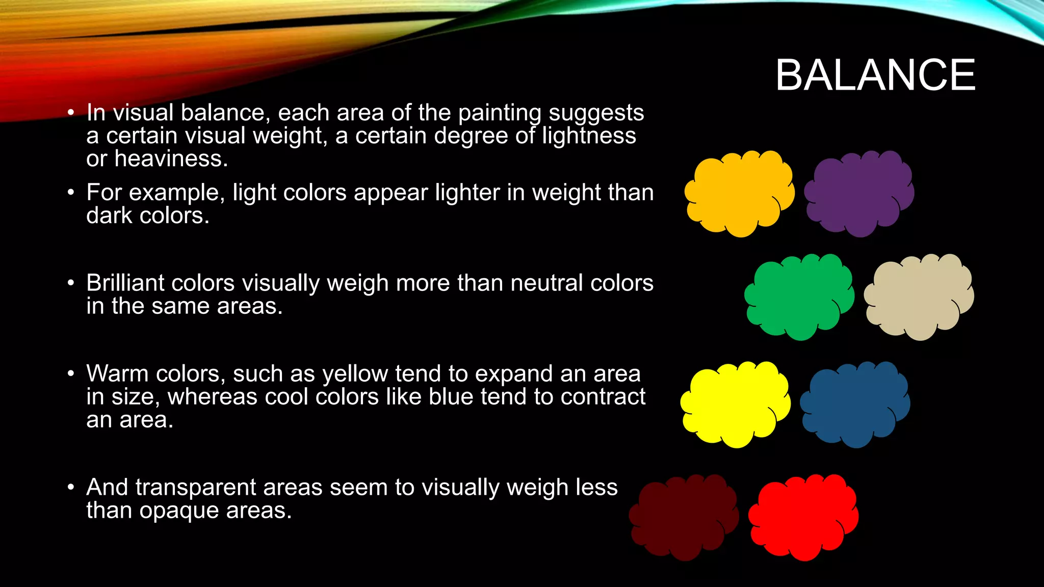
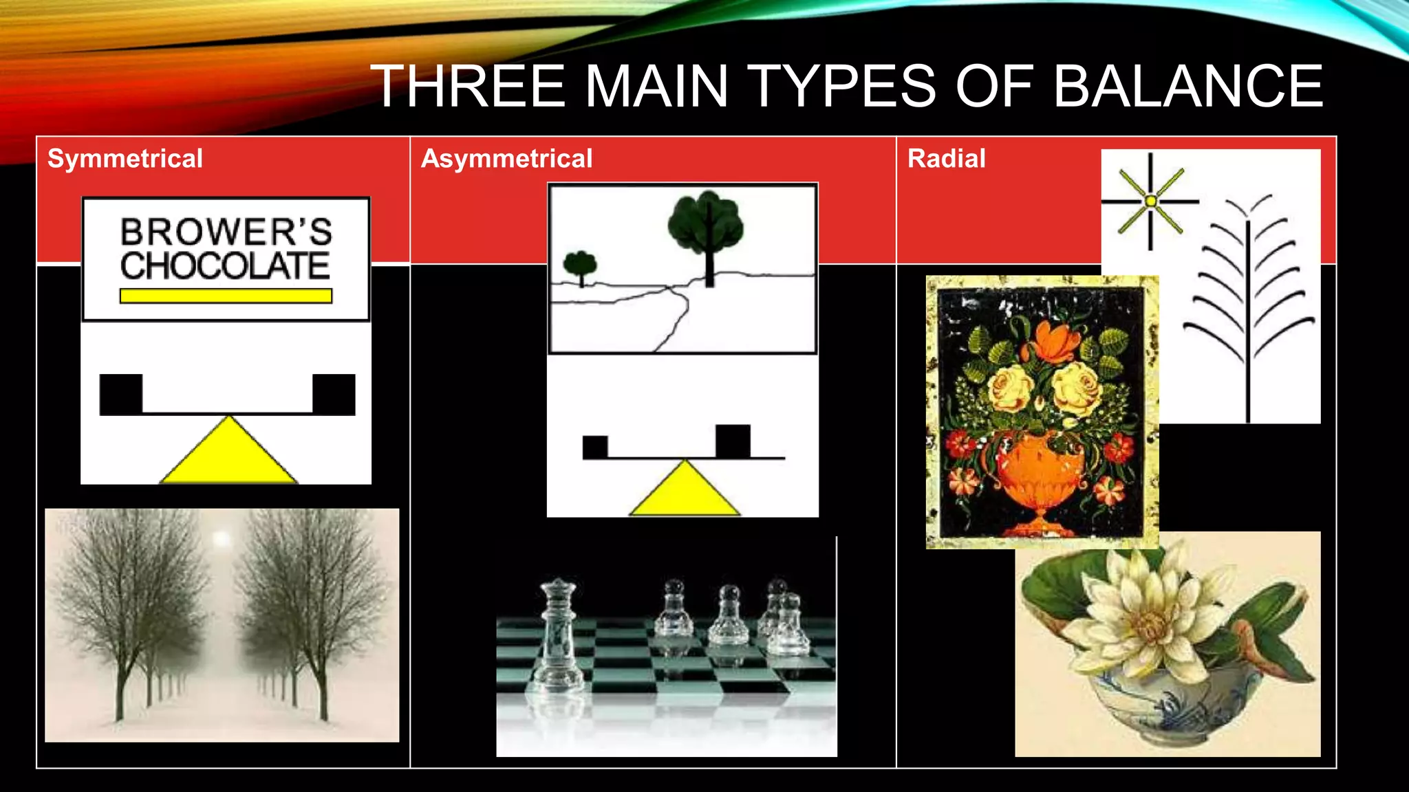
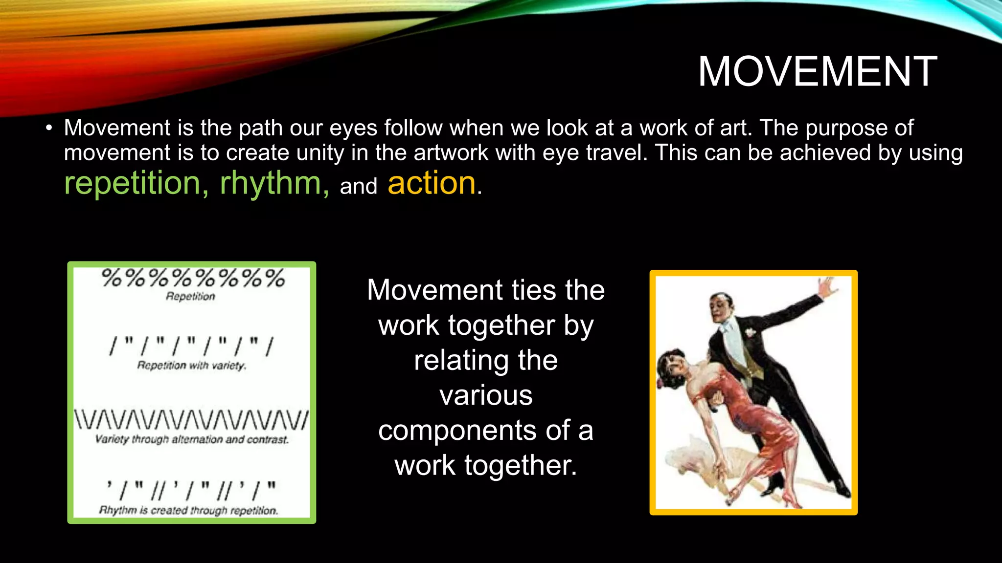
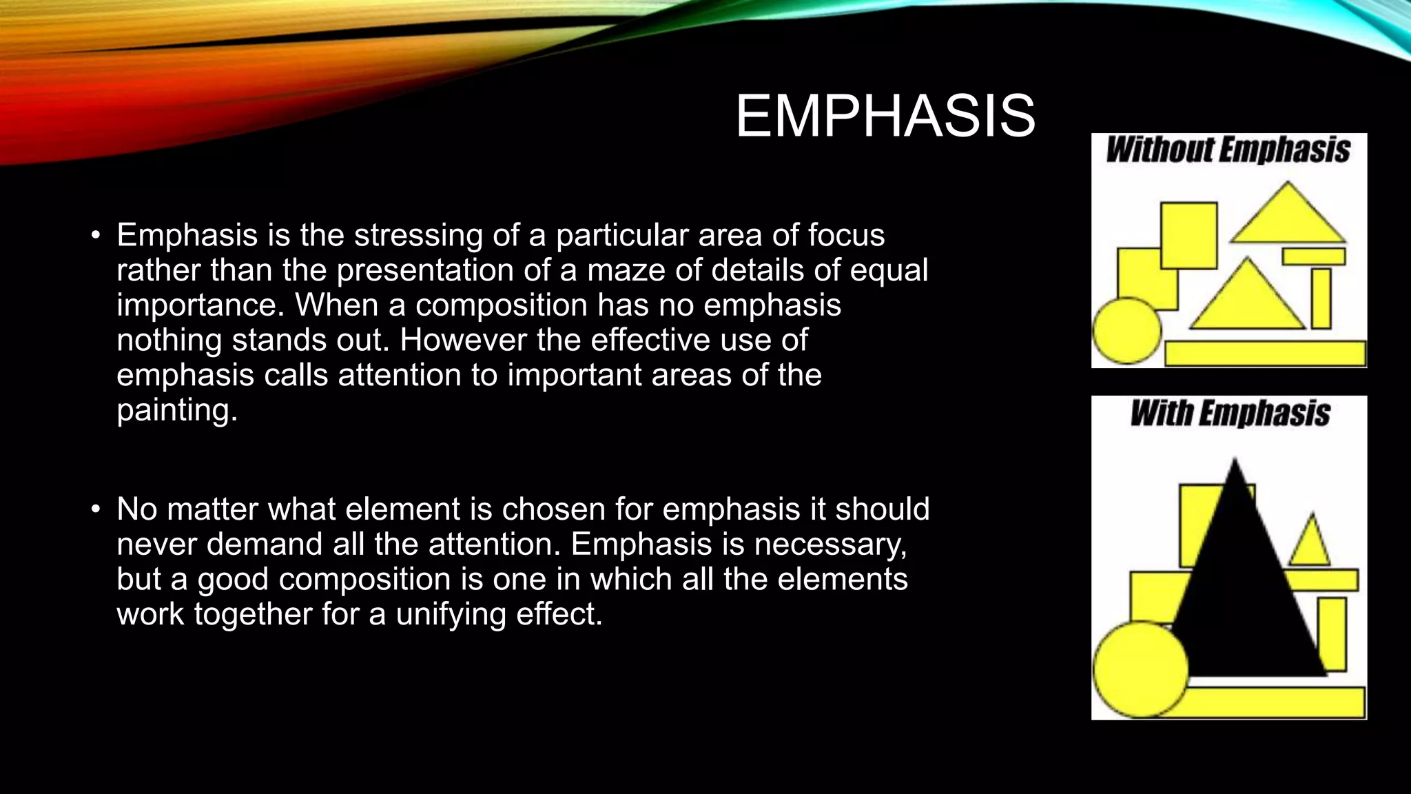
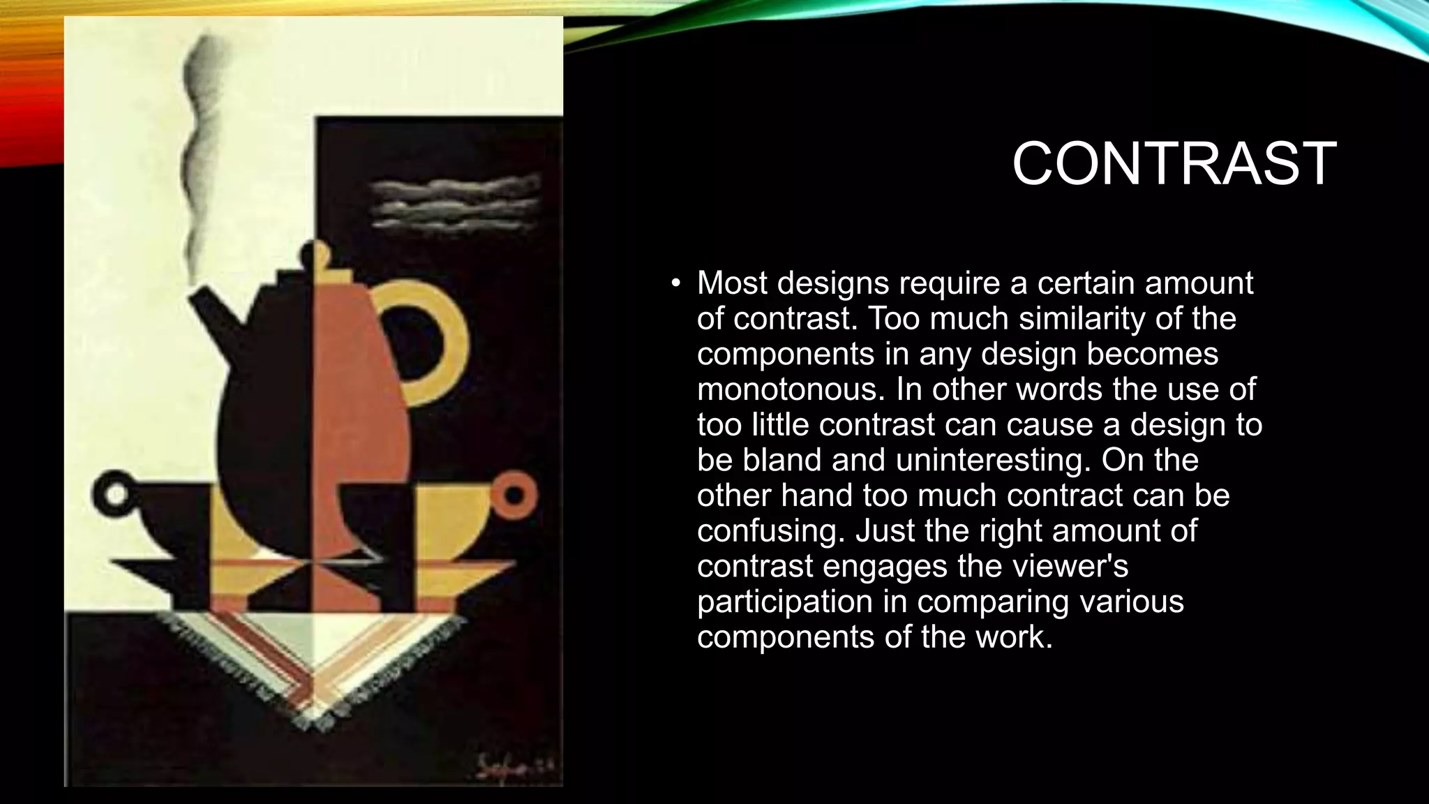
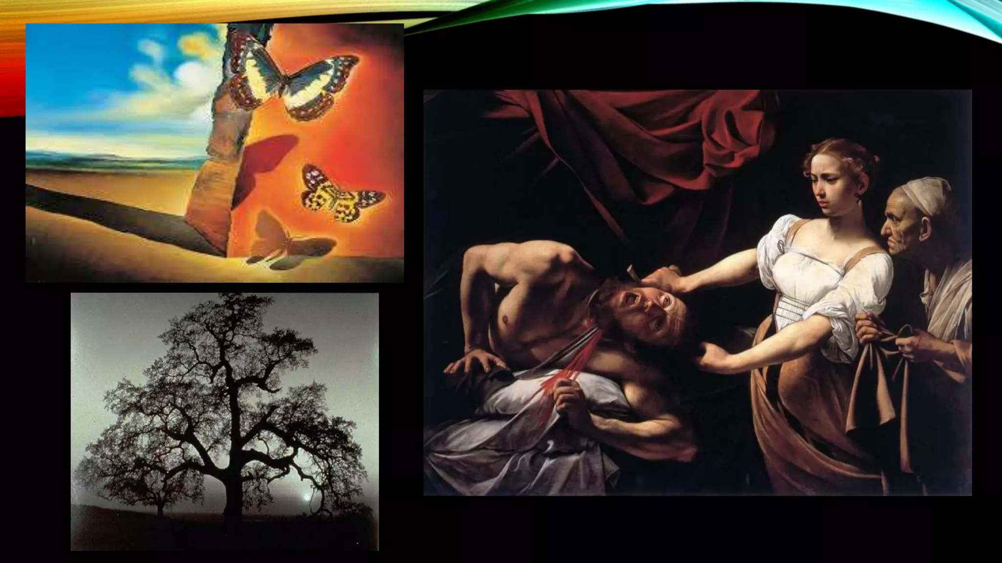
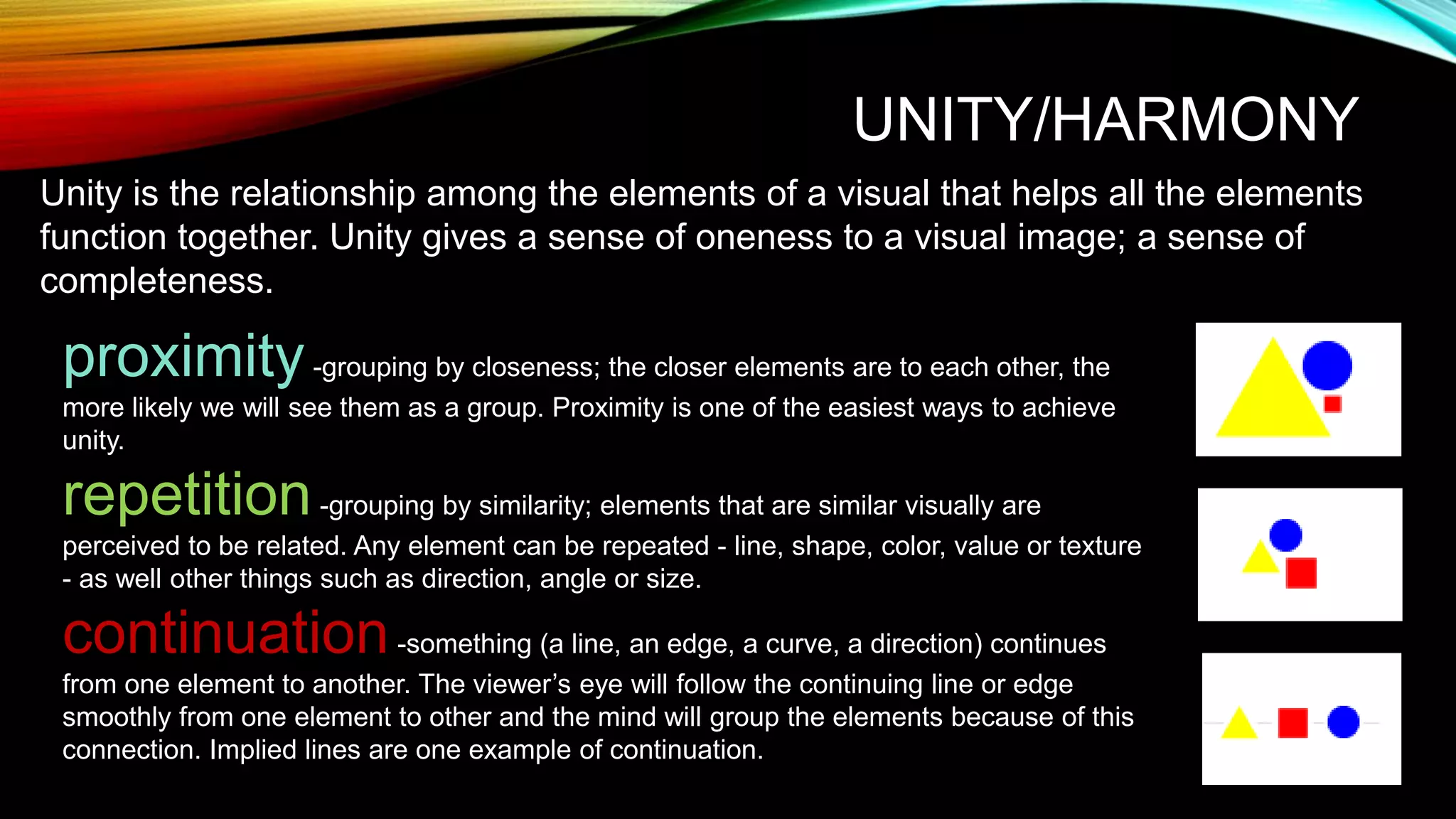
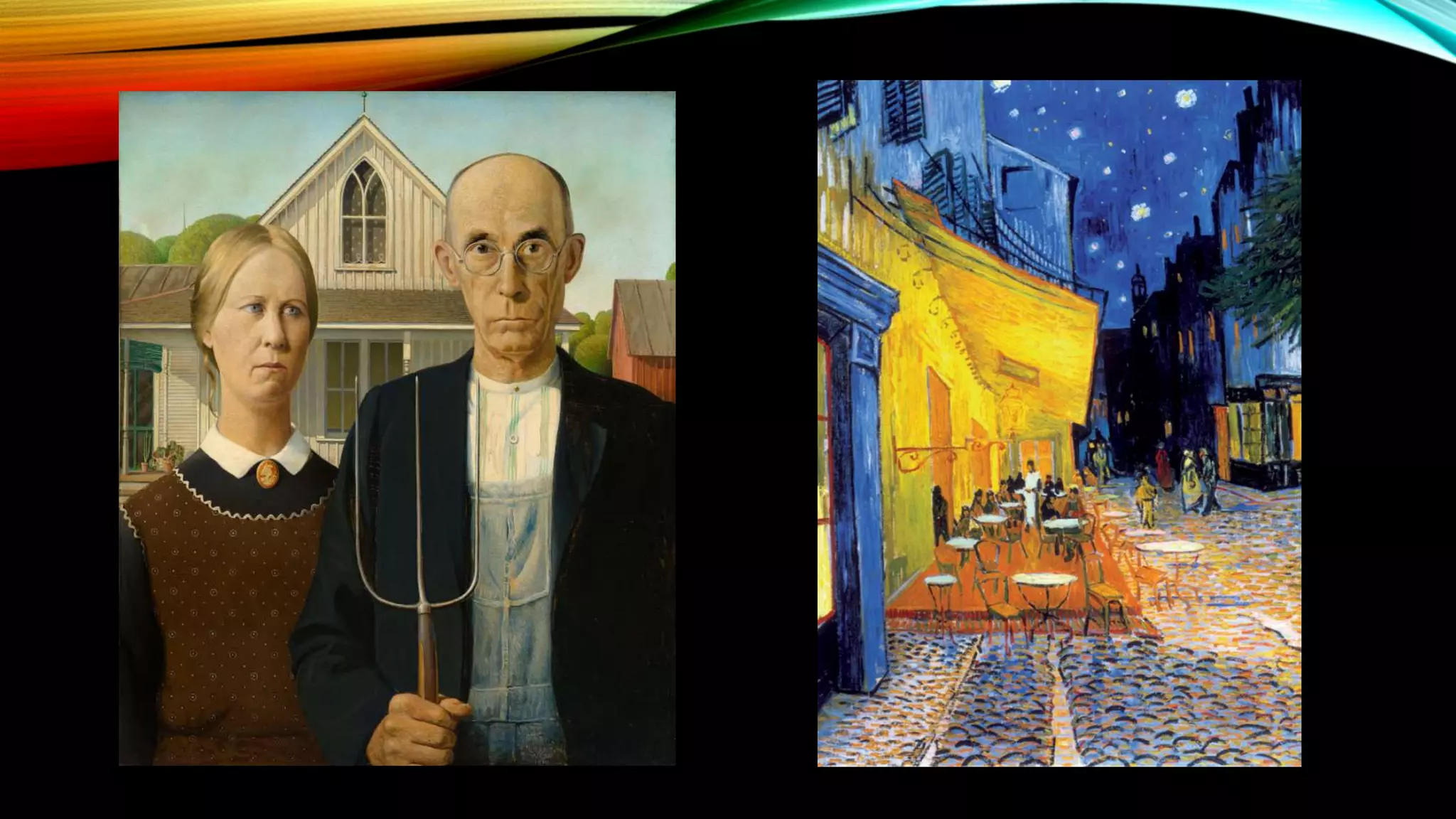
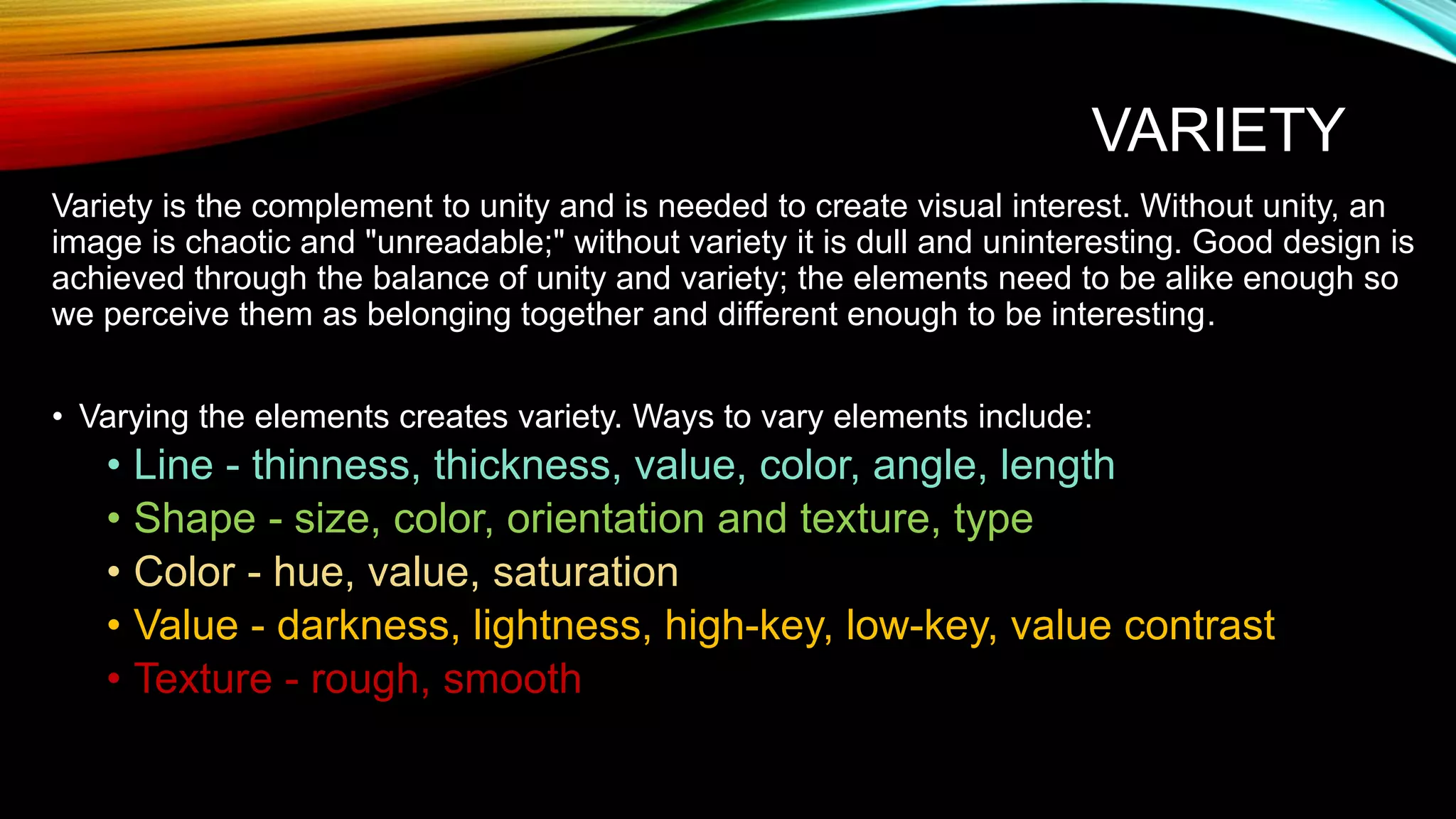
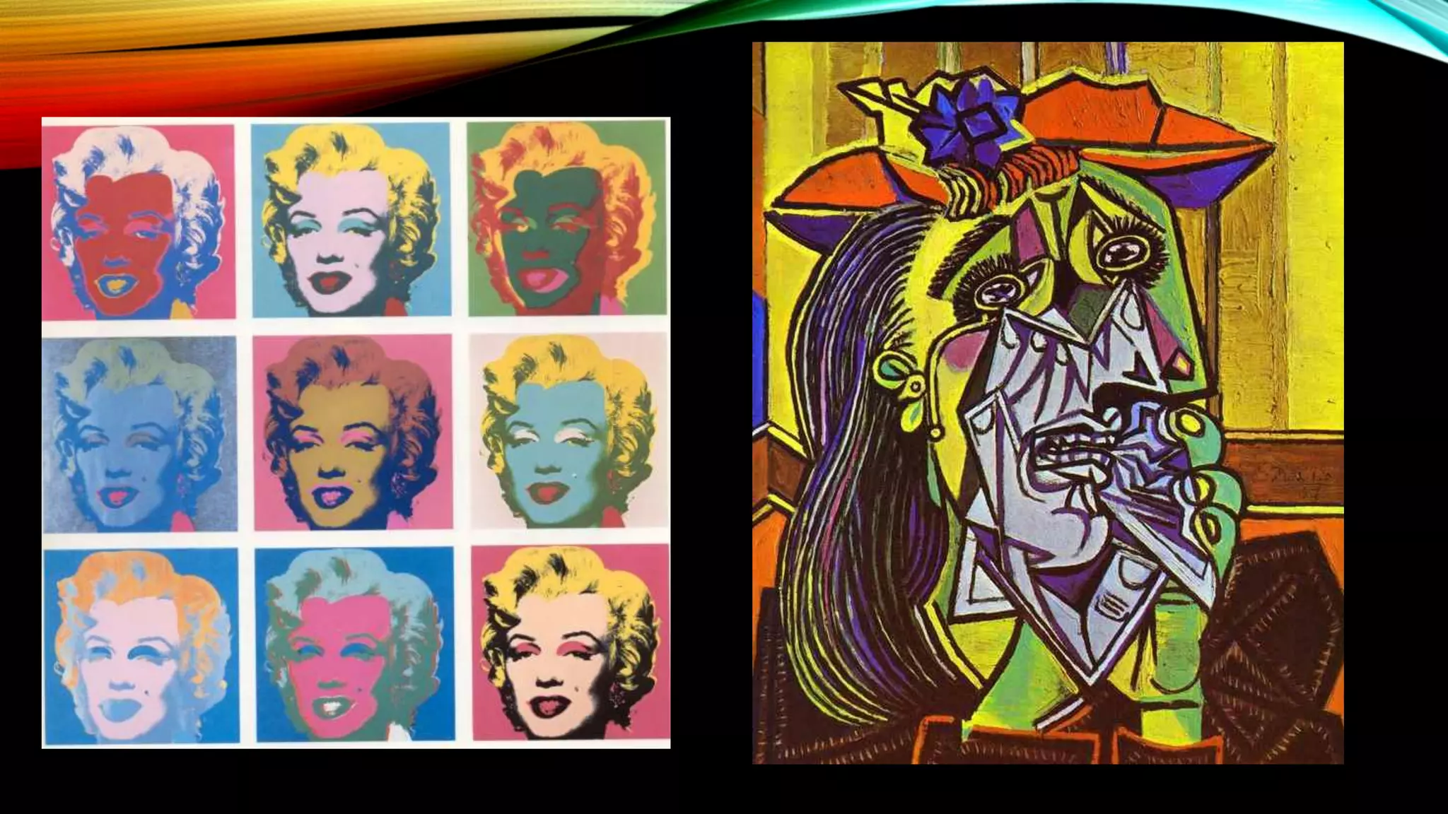
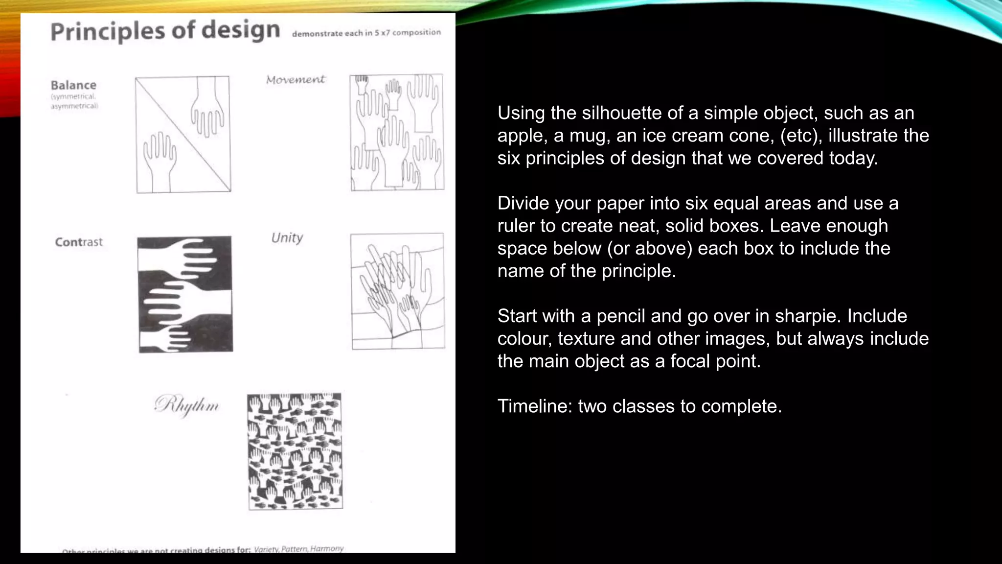
THE PRINCIPLES OF
DESIGN
Following the “laws” of making GOOD art
http://www.incredibleart.org/lessons/rhodes/designprinciples2.html
BALANCE
• In visual balance, each area of the painting suggests
a certain visual weight, a certain degree of lightness
or heaviness.
• For example, light colors appear lighter in weight than
dark colors.
• Brilliant colors visually weigh more than neutral colors
in the same areas.
• Warm colors, such as yellow tend to expand an area
in size, whereas cool colors like blue tend to contract
an area.
• And transparent areas seem to visually weigh less
than opaque areas.
THREE MAIN TYPES OF BALANCE
Symmetrical Asymmetrical Radial
MOVEMENT
• Movement is the path our eyes follow when we look at a work of art. The purpose of
movement is to create unity in the artwork with eye travel. This can be achieved by using
repetition, rhythm, and action.
Movement ties the
work together by
relating the
various
components of a
work together.
EMPHASIS
• Emphasis is the stressing of a particular area of focus
rather than the presentation of a maze of details of equal
importance. When a composition has no emphasis
nothing stands out. However the effective use of
emphasis calls attention to important areas of the
painting.
• No matter what element is chosen for emphasis it should
never demand all the attention. Emphasis is necessary,
but a good composition is one in which all the elements
work together for a unifying effect.
CONTRAST
• Most designs require a certain amount
of contrast. Too much similarity of the
components in any design becomes
monotonous. In other words the use of
too little contrast can cause a design to
be bland and uninteresting. On the
other hand too much contract can be
confusing. Just the right amount of
contrast engages the viewer's
participation in comparing various
components of the work.
UNITY/HARMONY
Unity is the relationship among the elements of a visual that helps all the elements
function together. Unity gives a sense of oneness to a visual image; a sense of
completeness.
proximity-grouping by closeness; the closer elements are to each other, the
more likely we will see them as a group. Proximity is one of the easiest ways to achieve
unity.
repetition-grouping by similarity; elements that are similar visually are
perceived to be related. Any element can be repeated - line, shape, color, value or texture
- as well other things such as direction, angle or size.
continuation-something (a line, an edge, a curve, a direction) continues
from one element to another. The viewer’s eye will follow the continuing line or edge
smoothly from one element to other and the mind will group the elements because of this
connection. Implied lines are one example of continuation.
VARIETY
Variety is the complement to unity and is needed to create visual interest. Without unity, an
image is chaotic and "unreadable;" without variety it is dull and uninteresting. Good design is
achieved through the balance of unity and variety; the elements need to be alike enough so
we perceive them as belonging together and different enough to be interesting.
• Varying the elements creates variety. Ways to vary elements include:
• Line - thinness, thickness, value, color, angle, length
• Shape - size, color, orientation and texture, type
• Color - hue, value, saturation
• Value - darkness, lightness, high-key, low-key, value contrast
• Texture - rough, smooth
Using the silhouette of a simple object, such as an
apple, a mug, an ice cream cone, (etc), illustrate the
six principles of design that we covered today.
Divide your paper into six equal areas and use a
ruler to create neat, solid boxes. Leave enough
space below (or above) each box to include the
name of the principle.
Start with a pencil and go over in sharpie. Include
colour, texture and other images, but always include
the main object as a focal point.
Timeline: two classes to complete.

The principles of design

  • 1.
    THE PRINCIPLES OF DESIGN Followingthe “laws” of making GOOD art http://www.incredibleart.org/lessons/rhodes/designprinciples2.html
  • 2.
    BALANCE • In visualbalance, each area of the painting suggests a certain visual weight, a certain degree of lightness or heaviness. • For example, light colors appear lighter in weight than dark colors. • Brilliant colors visually weigh more than neutral colors in the same areas. • Warm colors, such as yellow tend to expand an area in size, whereas cool colors like blue tend to contract an area. • And transparent areas seem to visually weigh less than opaque areas.
  • 3.
    THREE MAIN TYPESOF BALANCE Symmetrical Asymmetrical Radial
  • 5.
    MOVEMENT • Movement isthe path our eyes follow when we look at a work of art. The purpose of movement is to create unity in the artwork with eye travel. This can be achieved by using repetition, rhythm, and action. Movement ties the work together by relating the various components of a work together.
  • 7.
    EMPHASIS • Emphasis isthe stressing of a particular area of focus rather than the presentation of a maze of details of equal importance. When a composition has no emphasis nothing stands out. However the effective use of emphasis calls attention to important areas of the painting. • No matter what element is chosen for emphasis it should never demand all the attention. Emphasis is necessary, but a good composition is one in which all the elements work together for a unifying effect.
  • 9.
    CONTRAST • Most designsrequire a certain amount of contrast. Too much similarity of the components in any design becomes monotonous. In other words the use of too little contrast can cause a design to be bland and uninteresting. On the other hand too much contract can be confusing. Just the right amount of contrast engages the viewer's participation in comparing various components of the work.
  • 11.
    UNITY/HARMONY Unity is therelationship among the elements of a visual that helps all the elements function together. Unity gives a sense of oneness to a visual image; a sense of completeness. proximity-grouping by closeness; the closer elements are to each other, the more likely we will see them as a group. Proximity is one of the easiest ways to achieve unity. repetition-grouping by similarity; elements that are similar visually are perceived to be related. Any element can be repeated - line, shape, color, value or texture - as well other things such as direction, angle or size. continuation-something (a line, an edge, a curve, a direction) continues from one element to another. The viewer’s eye will follow the continuing line or edge smoothly from one element to other and the mind will group the elements because of this connection. Implied lines are one example of continuation.
  • 13.
    VARIETY Variety is thecomplement to unity and is needed to create visual interest. Without unity, an image is chaotic and "unreadable;" without variety it is dull and uninteresting. Good design is achieved through the balance of unity and variety; the elements need to be alike enough so we perceive them as belonging together and different enough to be interesting. • Varying the elements creates variety. Ways to vary elements include: • Line - thinness, thickness, value, color, angle, length • Shape - size, color, orientation and texture, type • Color - hue, value, saturation • Value - darkness, lightness, high-key, low-key, value contrast • Texture - rough, smooth
  • 15.
    Using the silhouetteof a simple object, such as an apple, a mug, an ice cream cone, (etc), illustrate the six principles of design that we covered today. Divide your paper into six equal areas and use a ruler to create neat, solid boxes. Leave enough space below (or above) each box to include the name of the principle. Start with a pencil and go over in sharpie. Include colour, texture and other images, but always include the main object as a focal point. Timeline: two classes to complete.