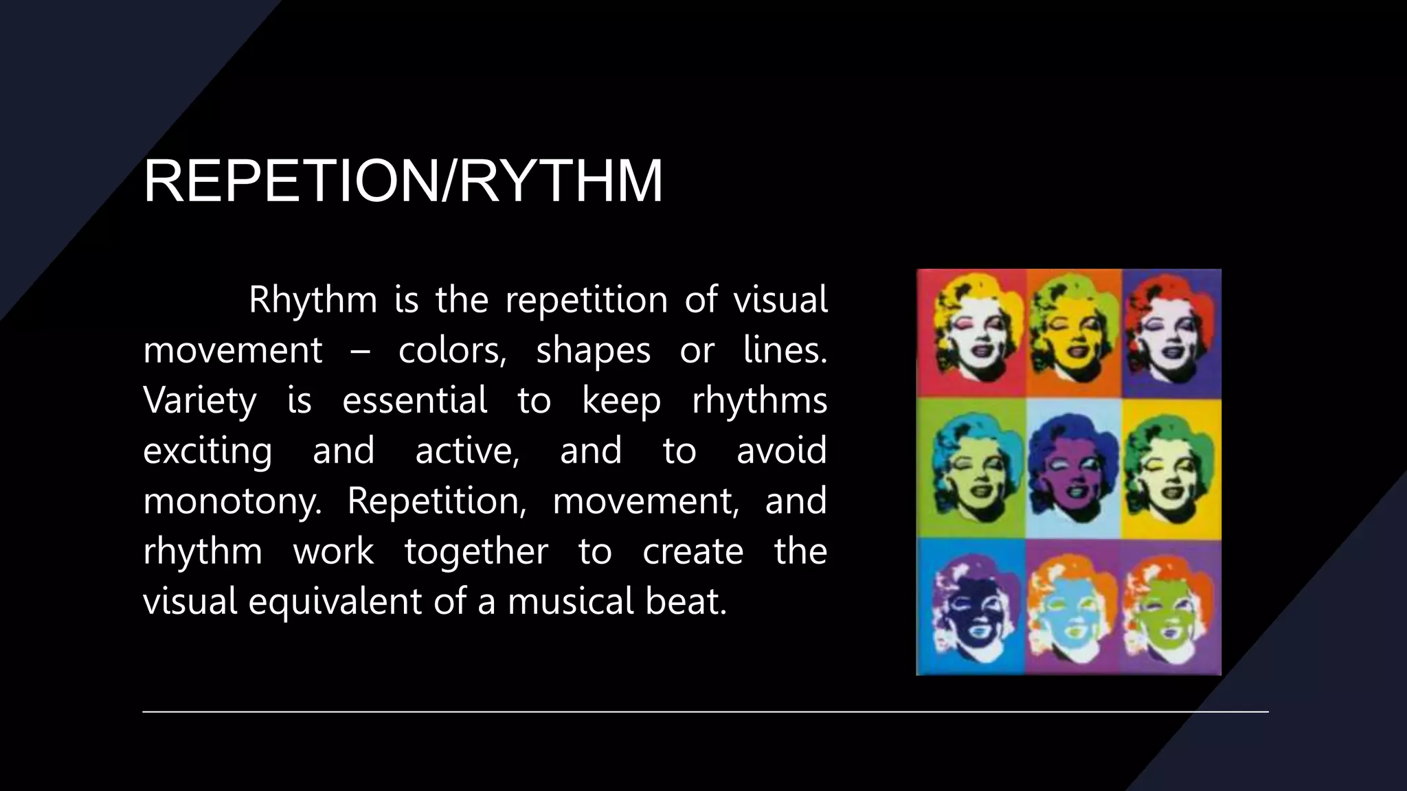
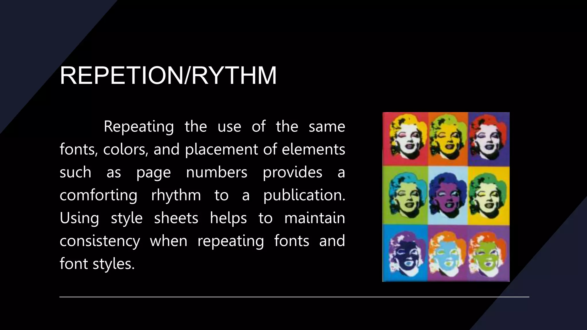
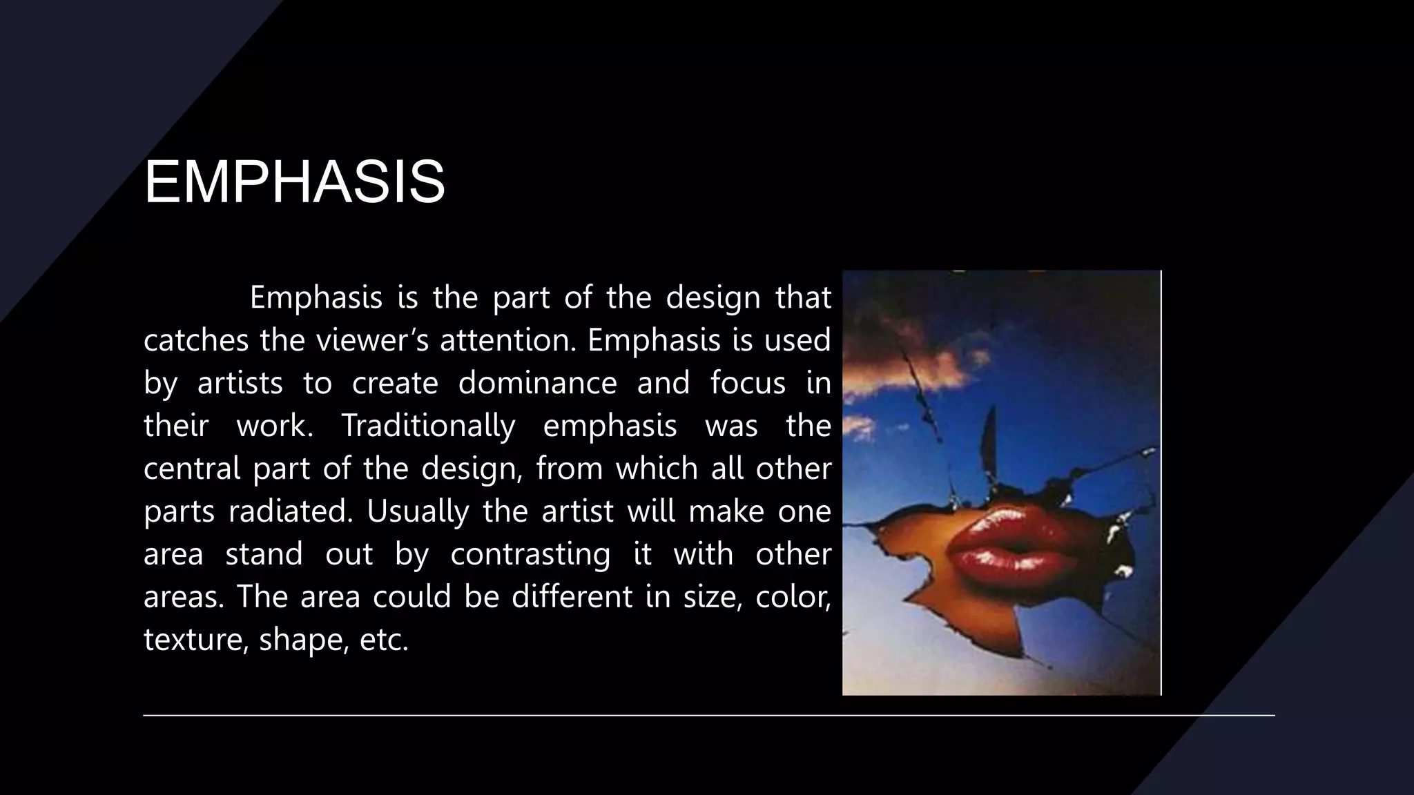
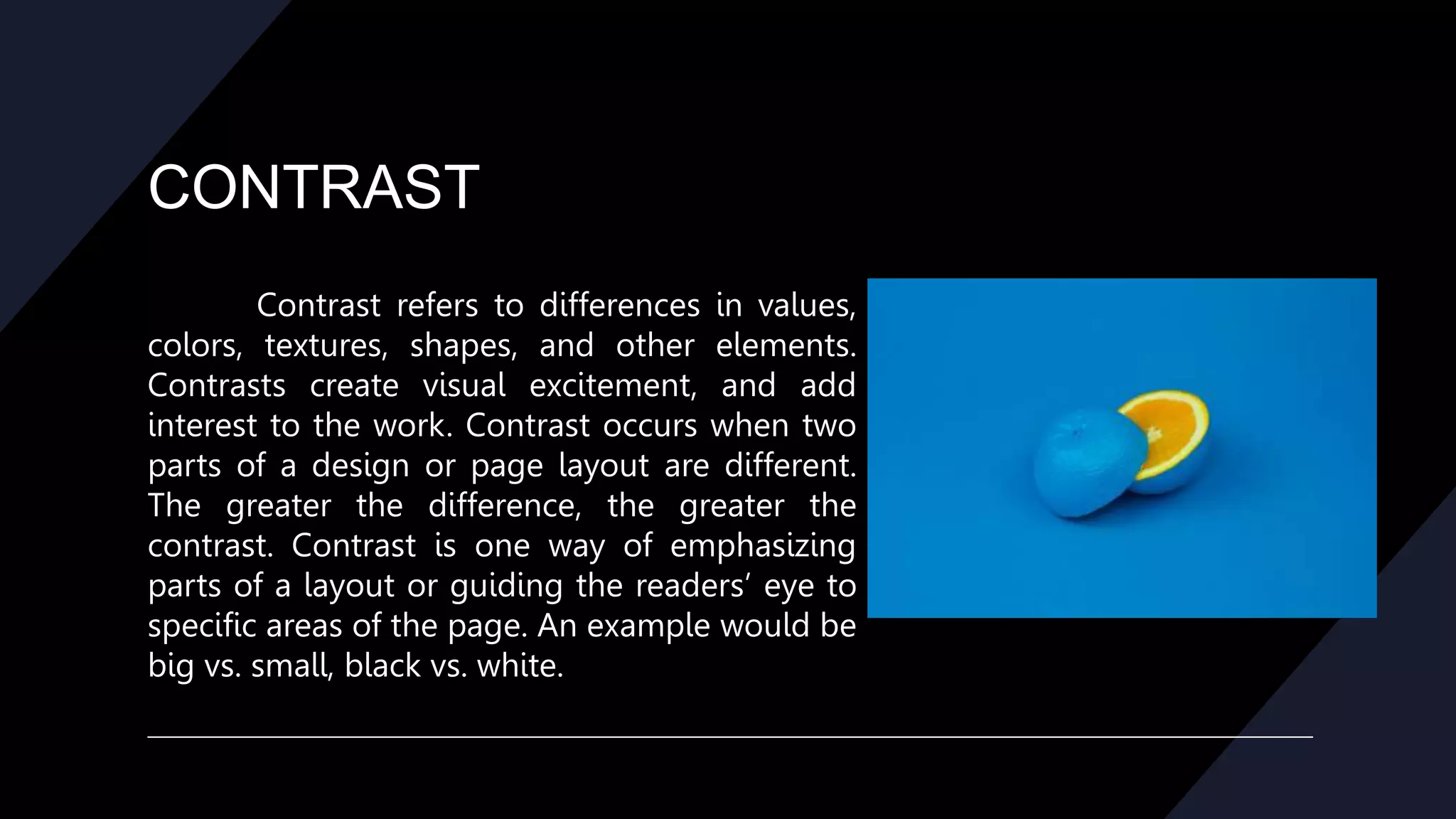
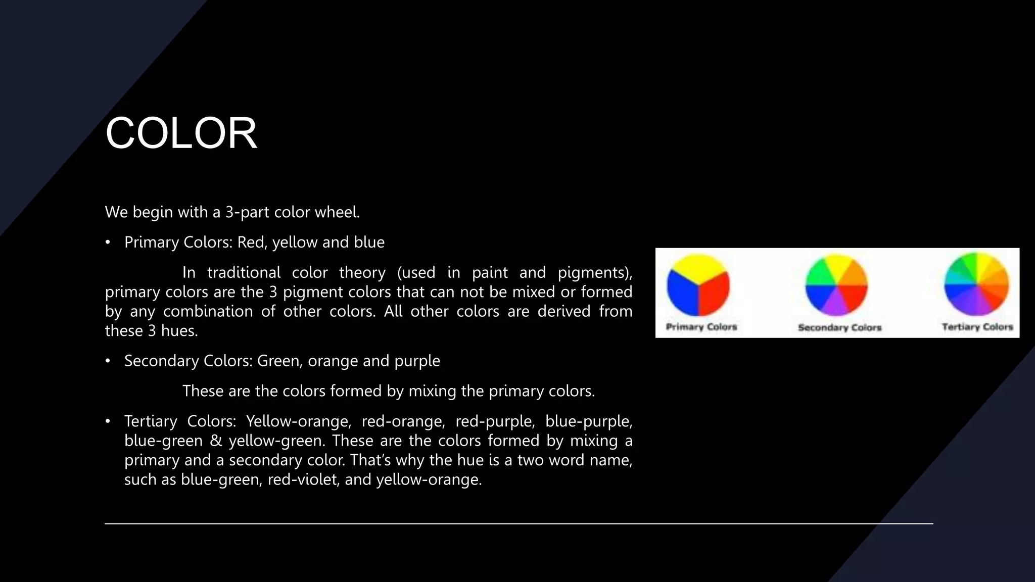
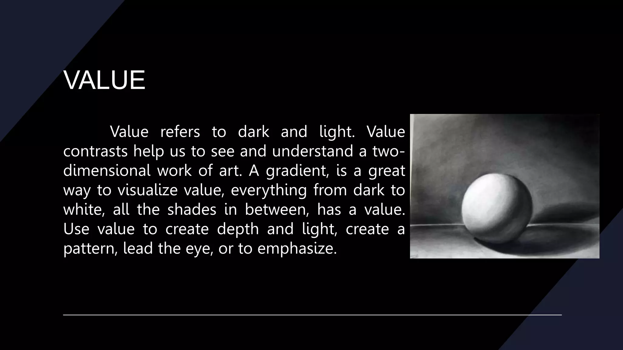
PRINCIPLES
OF DESIGN
Principle of Design
The principles are:
• balance
• movement
• repetition/rhythm
• emphasis
• contrast
• unity
• alignment
BALANCE
Balance provides stability and structure to a design.
Balance is the distribution of the visual weight of objects,
colors, texture, and space. If the design was a scale, these
elements should be balanced to make a design feel stable.
The elements don’t need to be the same size.
Balance can be achieved by placing a large element on one
side of your design and several small elements on the other
side. Balance is achieved not only by the distribution of text
and images but the distribution of white space.
Balance can be achieved in three ways, Symmetrical,
Asymmetrical, and Radial.
BALANCE
Symmetrical, where the page
elements are centered or create mirror
images. In Symmetrical balance, the
elements used on one side of the design
are similar to those on the other side.
Examples of Symmetrical Balance are
often seen in more formal, static page
layouts.
BALANCE
Asymmetrical where there are an
odd number of elements or the elements
are off-center. In asymmetrical balance, the
sides are different but still look balanced.
Examples of Asymmetrical Balance may
incorporate odd numbers of elements or
different sized elements and can be more
informal and relaxed or more dynamic.
BALANCE
Radial, where elements on the page
radiate from a central point. In radial balance,
the elements are arranged around a central
point and may be similar. Examples of Radial
Balance might appear in a circular arrangement
or a spiral. Radial Symmetry relates to images
emitting from a point like spokes on a wheel or
ripples from a pebble tossed into a pond.
MOVEMENT
Movement is the path our eyes follow
when we look at a work of art. The purpose of
movement is to create unity in the artwork with
eye travel. This can be achieved by using
repetition, rhythm, and action. Such movement
can be directed along lines, edges, shape, and
color within the work of art. Movement ties the
work together by relating the various
components of a work together.
REPETION/RYTHM
Rhythm is the repetition of visual
movement – colors, shapes or lines.
Variety is essential to keep rhythms
exciting and active, and to avoid
monotony. Repetition, movement, and
rhythm work together to create the
visual equivalent of a musical beat.
REPETION/RYTHM
Repeating the use of the same
fonts, colors, and placement of elements
such as page numbers provides a
comforting rhythm to a publication.
Using style sheets helps to maintain
consistency when repeating fonts and
font styles.
EMPHASIS
Emphasis is the part of the design that
catches the viewer’s attention. Emphasis is used
by artists to create dominance and focus in
their work. Traditionally emphasis was the
central part of the design, from which all other
parts radiated. Usually the artist will make one
area stand out by contrasting it with other
areas. The area could be different in size, color,
texture, shape, etc.
CONTRAST
Contrast refers to differences in values,
colors, textures, shapes, and other elements.
Contrasts create visual excitement, and add
interest to the work. Contrast occurs when two
parts of a design or page layout are different.
The greater the difference, the greater the
contrast. Contrast is one way of emphasizing
parts of a layout or guiding the readers’ eye to
specific areas of the page. An example would be
big vs. small, black vs. white.
UNITY
Unity is the feeling of harmony
between all parts of the work of art,
which creates a sense of completeness.
Unity provides the cohesive quality that
makes an artwork feel complete and
finished. When all the elements in a
work look as though they belong
together, the artist has achieved unity.
ALIGNMENT
Alignment is the principle of design
governing how text and graphics line up
with each other. One of the principles of
design, alignment refers to lining up the
top, bottom, sides, or middle of text or
graphic elements on a page. The use of
grids and guides can aid in placement and
alignment of both text and graphics.
ELEMENTS OF DESIGN
The elements are components or parts which can be isolated and defined in
any visual design or work of art. They are the structure of the work, and can carry a
wide variety of messages.
The elements are:
• Line *Size
• Color *Value
• Shape *Texture
• Space
LINE
The most basic element of design is that of the line. A
line is a continuous mark made on a surface by a moving
point; it may be flat (pencil line) or three-dimensional (a rod,
groove, ridge, etc.) Line can also be created when two
shapes/textures meet. Types of line can include actual,
implied, vertical, horizontal, diagonal and contour lines. Lines
are useful for dividing space and drawing the eye to a specific
location. For example, think about how a magazine uses lines
to separate content, headlines and side panels.
COLOR
Color is one of the most obvious elements of design, for both the user
and the designer. It can stand alone, as a background, or be applied to other
elements, like lines, shapes, textures or typography. Color creates a mood within
the piece and tells a story about the brand. Every color says something
different, and combinations can alter that impression further. Color is the part
of light that is reflected by the object we see. Color has three characteristics:
hue, value, and intensity.
Hue is the name of the color (red, green, etc.)
COLOR
We begin with a 3-part color wheel.
• Primary Colors: Red, yellow and blue
In traditional color theory (used in paint and pigments),
primary colors are the 3 pigment colors that can not be mixed or formed
by any combination of other colors. All other colors are derived from
these 3 hues.
• Secondary Colors: Green, orange and purple
These are the colors formed by mixing the primary colors.
• Tertiary Colors: Yellow-orange, red-orange, red-purple, blue-purple,
blue-green & yellow-green. These are the colors formed by mixing a
primary and a secondary color. That’s why the hue is a two word name,
such as blue-green, red-violet, and yellow-orange.
SHAPE
Shapes, geometric or organic, add interest. Shapes are defined by
boundaries, such as a lines or color, and they are often used to emphasize a
portion of the page. Everything is ultimately a shape, so you must always
think in terms of how the various elements of your design are creating
shapes, and how those shapes are interacting. Shapes can be geometric
(square, circle, etc.) or organic (banana, amoeba, etc.)
SIZE
Size is how small or large something is. You use size to
define importance, create visual interest in design, and attract
attention. Size is simply the relationship of the area occupied by
one shape to that of another. Size refers to variations in the
proportions of objects, lines or shapes.
There is a variation of sizes in objects either real or
imagined.
VALUE
Value refers to dark and light. Value
contrasts help us to see and understand a two-
dimensional work of art. A gradient, is a great
way to visualize value, everything from dark to
white, all the shades in between, has a value.
Use value to create depth and light, create a
pattern, lead the eye, or to emphasize.
TEXTURE
Texture refers to the surface quality, both
simulated and actual, of artwork. Textures can
create a more three-dimensional appearance on
this two-dimensional surface. Is about surface
quality either tactile or visual. Texture can be real
or implied by different uses of media. It is also the
degree of roughness or smoothness in objects.
Texture helps build an immersive world.
SPACE
One of the elements of design, white
space is the absence of text and graphics.
White space provides visual breathing room
for the eye. White space is more than just
large empty places on the page, it’s also the
overall airiness or density of the page
including space between lines of type
(leading), text offset around graphics, size of
margins, and heaviness or lightness of the
fonts.

PRINCIPLES OF DESIGN.pptx

  • 1.
  • 2.
    Principle of Design Theprinciples are: • balance • movement • repetition/rhythm • emphasis • contrast • unity • alignment
  • 3.
    BALANCE Balance provides stabilityand structure to a design. Balance is the distribution of the visual weight of objects, colors, texture, and space. If the design was a scale, these elements should be balanced to make a design feel stable. The elements don’t need to be the same size. Balance can be achieved by placing a large element on one side of your design and several small elements on the other side. Balance is achieved not only by the distribution of text and images but the distribution of white space. Balance can be achieved in three ways, Symmetrical, Asymmetrical, and Radial.
  • 4.
    BALANCE Symmetrical, where thepage elements are centered or create mirror images. In Symmetrical balance, the elements used on one side of the design are similar to those on the other side. Examples of Symmetrical Balance are often seen in more formal, static page layouts.
  • 5.
    BALANCE Asymmetrical where thereare an odd number of elements or the elements are off-center. In asymmetrical balance, the sides are different but still look balanced. Examples of Asymmetrical Balance may incorporate odd numbers of elements or different sized elements and can be more informal and relaxed or more dynamic.
  • 6.
    BALANCE Radial, where elementson the page radiate from a central point. In radial balance, the elements are arranged around a central point and may be similar. Examples of Radial Balance might appear in a circular arrangement or a spiral. Radial Symmetry relates to images emitting from a point like spokes on a wheel or ripples from a pebble tossed into a pond.
  • 7.
    MOVEMENT Movement is thepath our eyes follow when we look at a work of art. The purpose of movement is to create unity in the artwork with eye travel. This can be achieved by using repetition, rhythm, and action. Such movement can be directed along lines, edges, shape, and color within the work of art. Movement ties the work together by relating the various components of a work together.
  • 8.
    REPETION/RYTHM Rhythm is therepetition of visual movement – colors, shapes or lines. Variety is essential to keep rhythms exciting and active, and to avoid monotony. Repetition, movement, and rhythm work together to create the visual equivalent of a musical beat.
  • 9.
    REPETION/RYTHM Repeating the useof the same fonts, colors, and placement of elements such as page numbers provides a comforting rhythm to a publication. Using style sheets helps to maintain consistency when repeating fonts and font styles.
  • 10.
    EMPHASIS Emphasis is thepart of the design that catches the viewer’s attention. Emphasis is used by artists to create dominance and focus in their work. Traditionally emphasis was the central part of the design, from which all other parts radiated. Usually the artist will make one area stand out by contrasting it with other areas. The area could be different in size, color, texture, shape, etc.
  • 11.
    CONTRAST Contrast refers todifferences in values, colors, textures, shapes, and other elements. Contrasts create visual excitement, and add interest to the work. Contrast occurs when two parts of a design or page layout are different. The greater the difference, the greater the contrast. Contrast is one way of emphasizing parts of a layout or guiding the readers’ eye to specific areas of the page. An example would be big vs. small, black vs. white.
  • 12.
    UNITY Unity is thefeeling of harmony between all parts of the work of art, which creates a sense of completeness. Unity provides the cohesive quality that makes an artwork feel complete and finished. When all the elements in a work look as though they belong together, the artist has achieved unity.
  • 13.
    ALIGNMENT Alignment is theprinciple of design governing how text and graphics line up with each other. One of the principles of design, alignment refers to lining up the top, bottom, sides, or middle of text or graphic elements on a page. The use of grids and guides can aid in placement and alignment of both text and graphics.
  • 14.
    ELEMENTS OF DESIGN Theelements are components or parts which can be isolated and defined in any visual design or work of art. They are the structure of the work, and can carry a wide variety of messages. The elements are: • Line *Size • Color *Value • Shape *Texture • Space
  • 15.
    LINE The most basicelement of design is that of the line. A line is a continuous mark made on a surface by a moving point; it may be flat (pencil line) or three-dimensional (a rod, groove, ridge, etc.) Line can also be created when two shapes/textures meet. Types of line can include actual, implied, vertical, horizontal, diagonal and contour lines. Lines are useful for dividing space and drawing the eye to a specific location. For example, think about how a magazine uses lines to separate content, headlines and side panels.
  • 16.
    COLOR Color is oneof the most obvious elements of design, for both the user and the designer. It can stand alone, as a background, or be applied to other elements, like lines, shapes, textures or typography. Color creates a mood within the piece and tells a story about the brand. Every color says something different, and combinations can alter that impression further. Color is the part of light that is reflected by the object we see. Color has three characteristics: hue, value, and intensity. Hue is the name of the color (red, green, etc.)
  • 17.
    COLOR We begin witha 3-part color wheel. • Primary Colors: Red, yellow and blue In traditional color theory (used in paint and pigments), primary colors are the 3 pigment colors that can not be mixed or formed by any combination of other colors. All other colors are derived from these 3 hues. • Secondary Colors: Green, orange and purple These are the colors formed by mixing the primary colors. • Tertiary Colors: Yellow-orange, red-orange, red-purple, blue-purple, blue-green & yellow-green. These are the colors formed by mixing a primary and a secondary color. That’s why the hue is a two word name, such as blue-green, red-violet, and yellow-orange.
  • 18.
    SHAPE Shapes, geometric ororganic, add interest. Shapes are defined by boundaries, such as a lines or color, and they are often used to emphasize a portion of the page. Everything is ultimately a shape, so you must always think in terms of how the various elements of your design are creating shapes, and how those shapes are interacting. Shapes can be geometric (square, circle, etc.) or organic (banana, amoeba, etc.)
  • 19.
    SIZE Size is howsmall or large something is. You use size to define importance, create visual interest in design, and attract attention. Size is simply the relationship of the area occupied by one shape to that of another. Size refers to variations in the proportions of objects, lines or shapes. There is a variation of sizes in objects either real or imagined.
  • 20.
    VALUE Value refers todark and light. Value contrasts help us to see and understand a two- dimensional work of art. A gradient, is a great way to visualize value, everything from dark to white, all the shades in between, has a value. Use value to create depth and light, create a pattern, lead the eye, or to emphasize.
  • 21.
    TEXTURE Texture refers tothe surface quality, both simulated and actual, of artwork. Textures can create a more three-dimensional appearance on this two-dimensional surface. Is about surface quality either tactile or visual. Texture can be real or implied by different uses of media. It is also the degree of roughness or smoothness in objects. Texture helps build an immersive world.
  • 22.
    SPACE One of theelements of design, white space is the absence of text and graphics. White space provides visual breathing room for the eye. White space is more than just large empty places on the page, it’s also the overall airiness or density of the page including space between lines of type (leading), text offset around graphics, size of margins, and heaviness or lightness of the fonts.