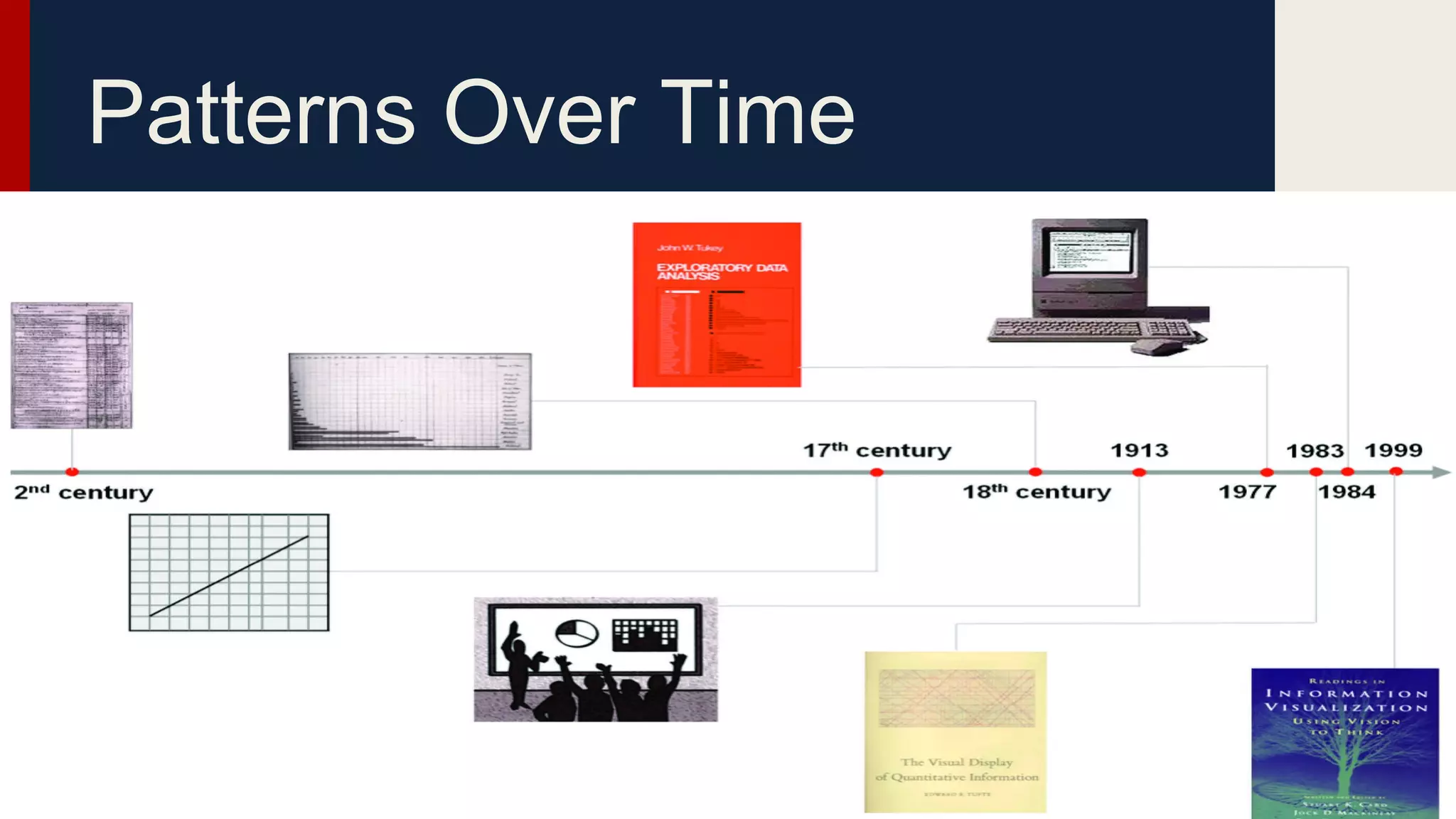
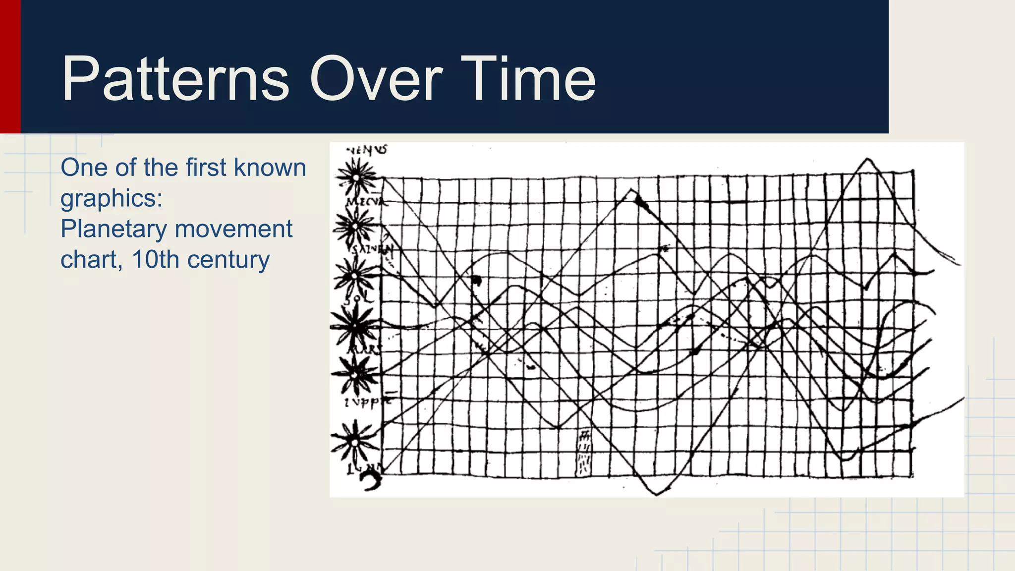
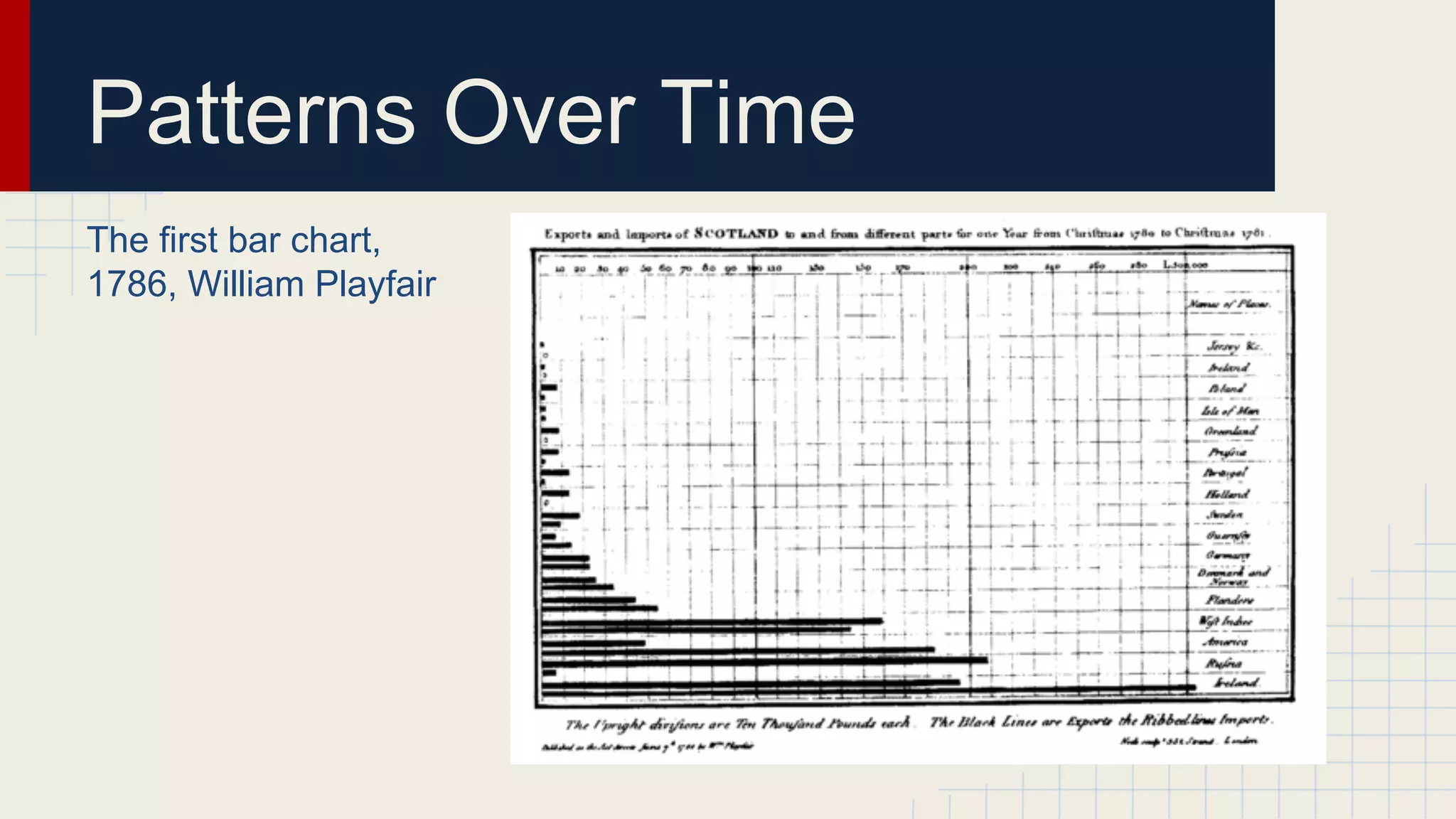
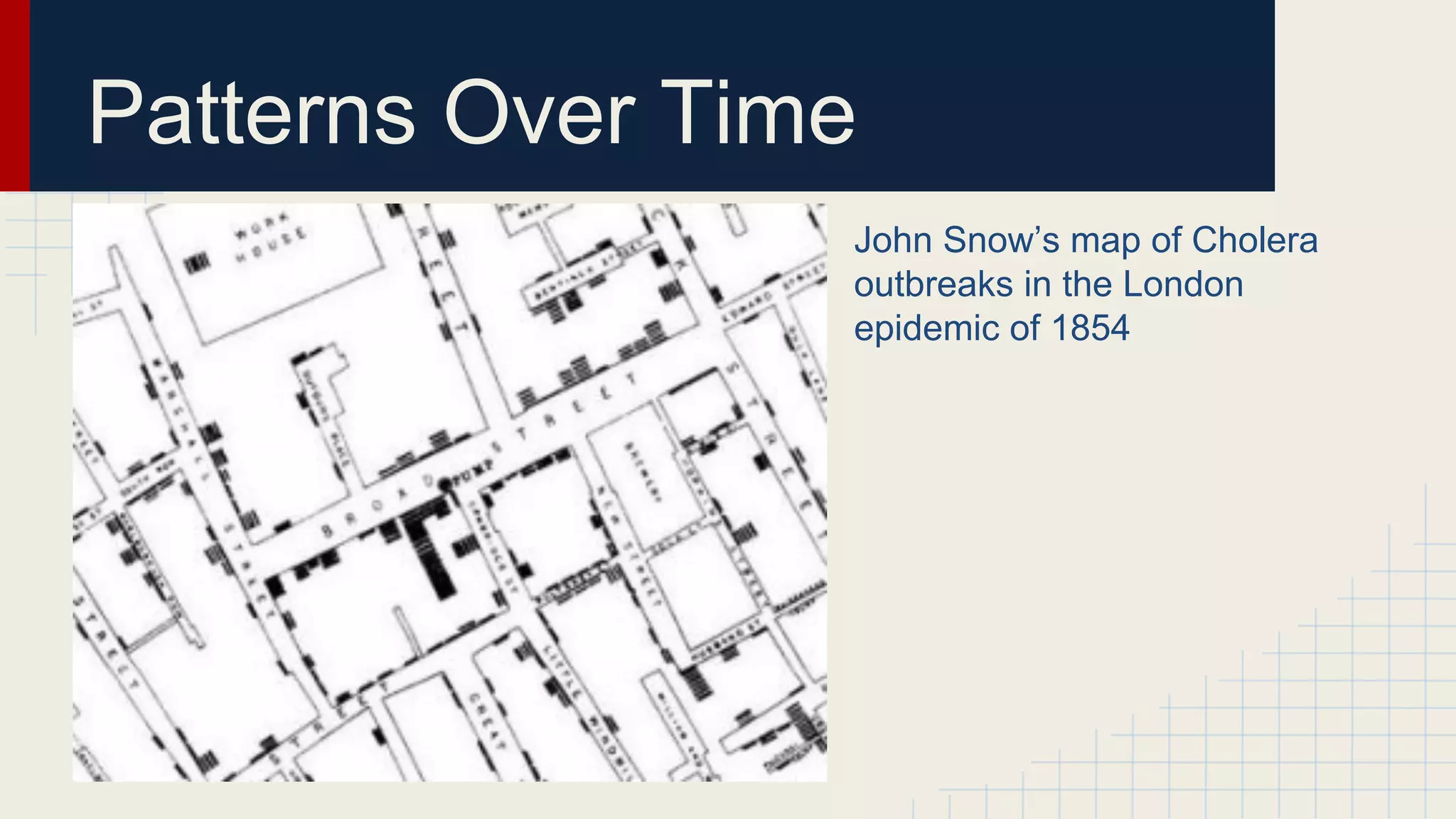
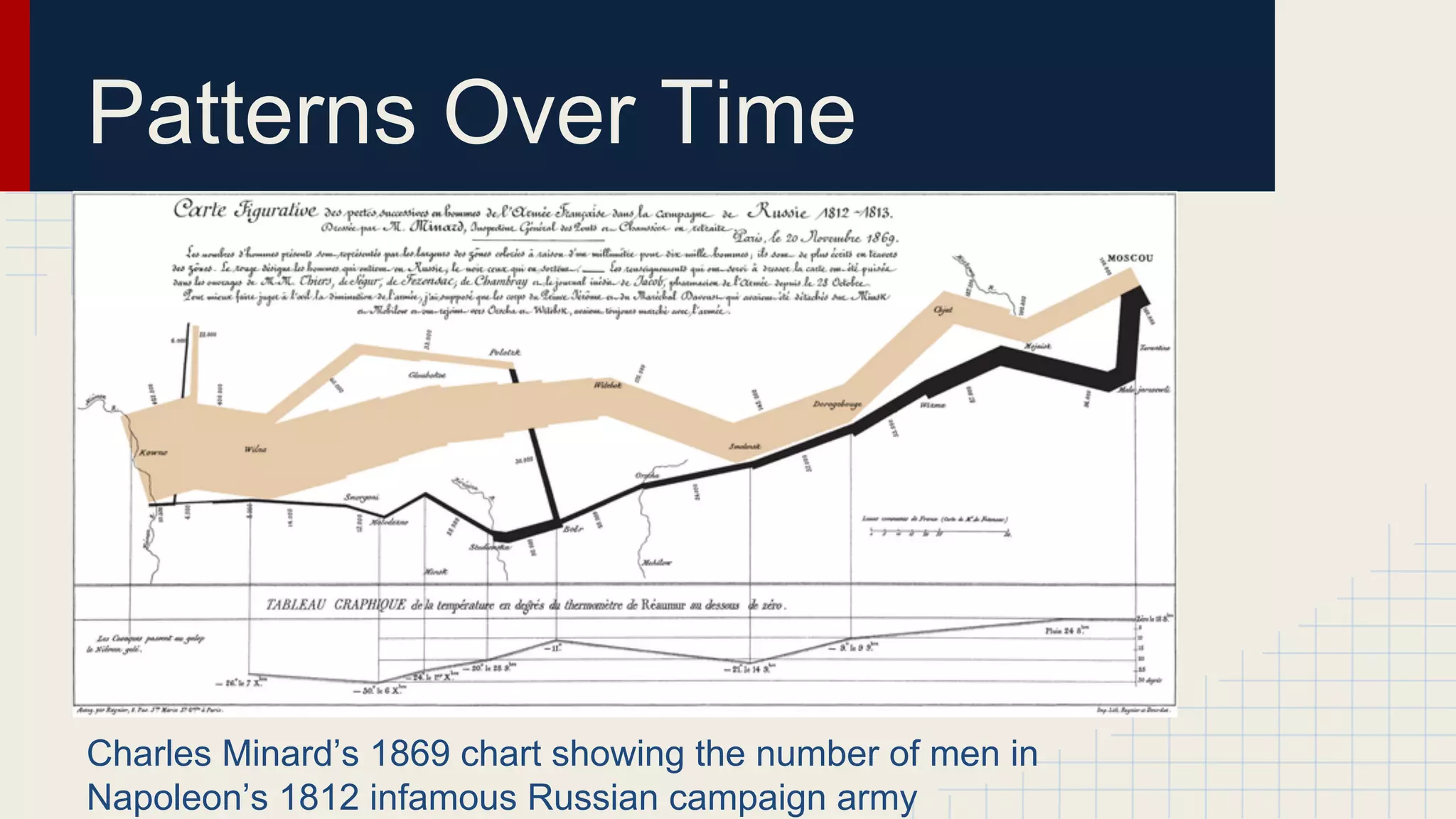
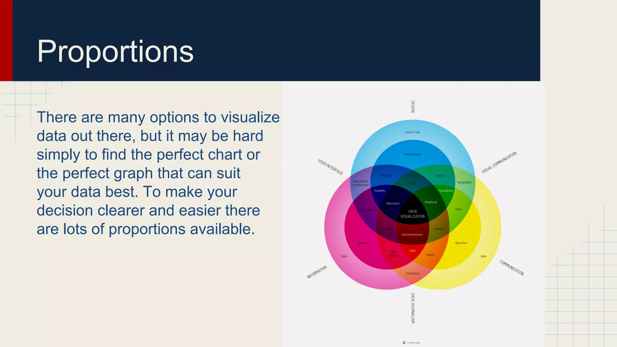
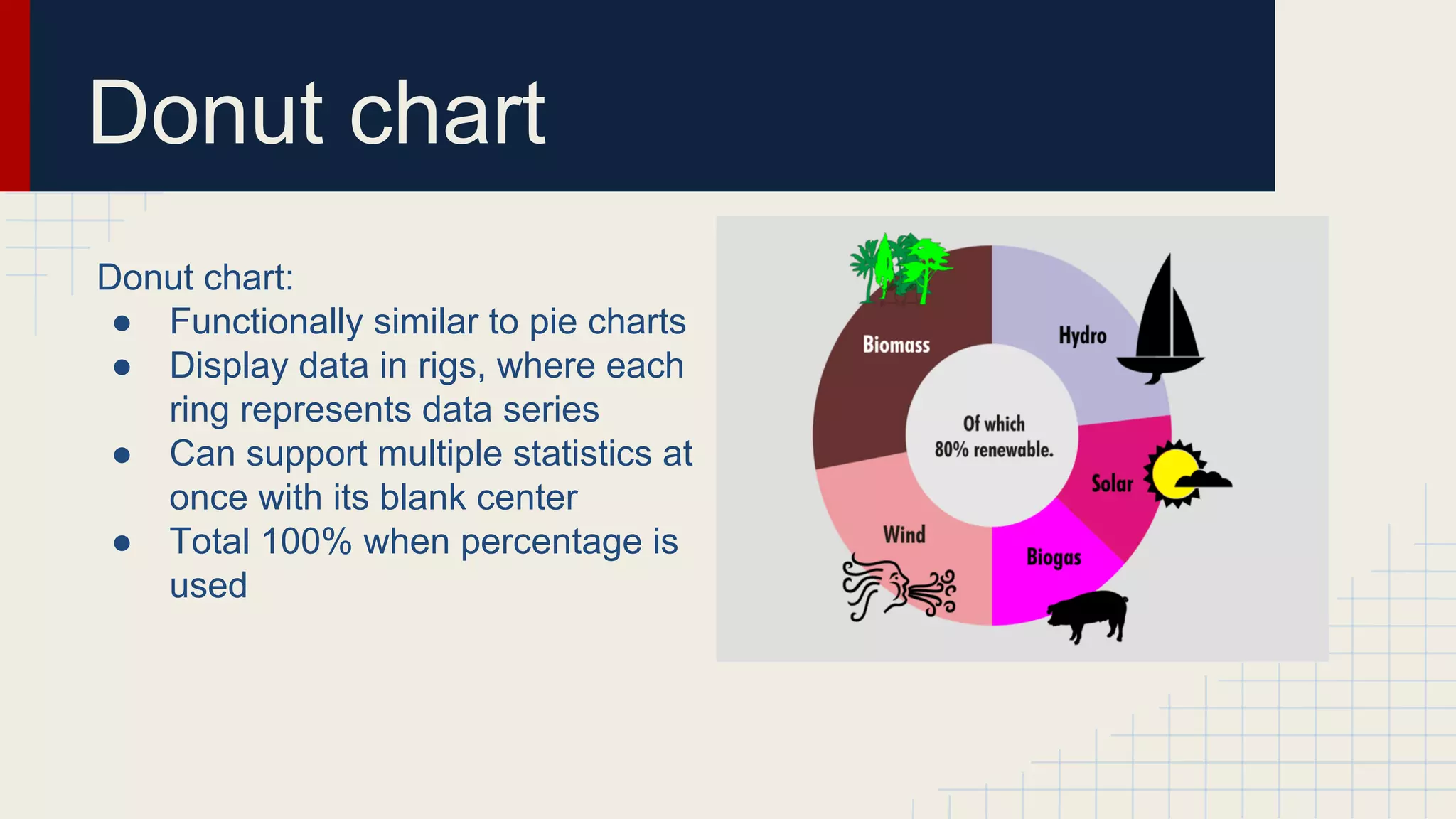
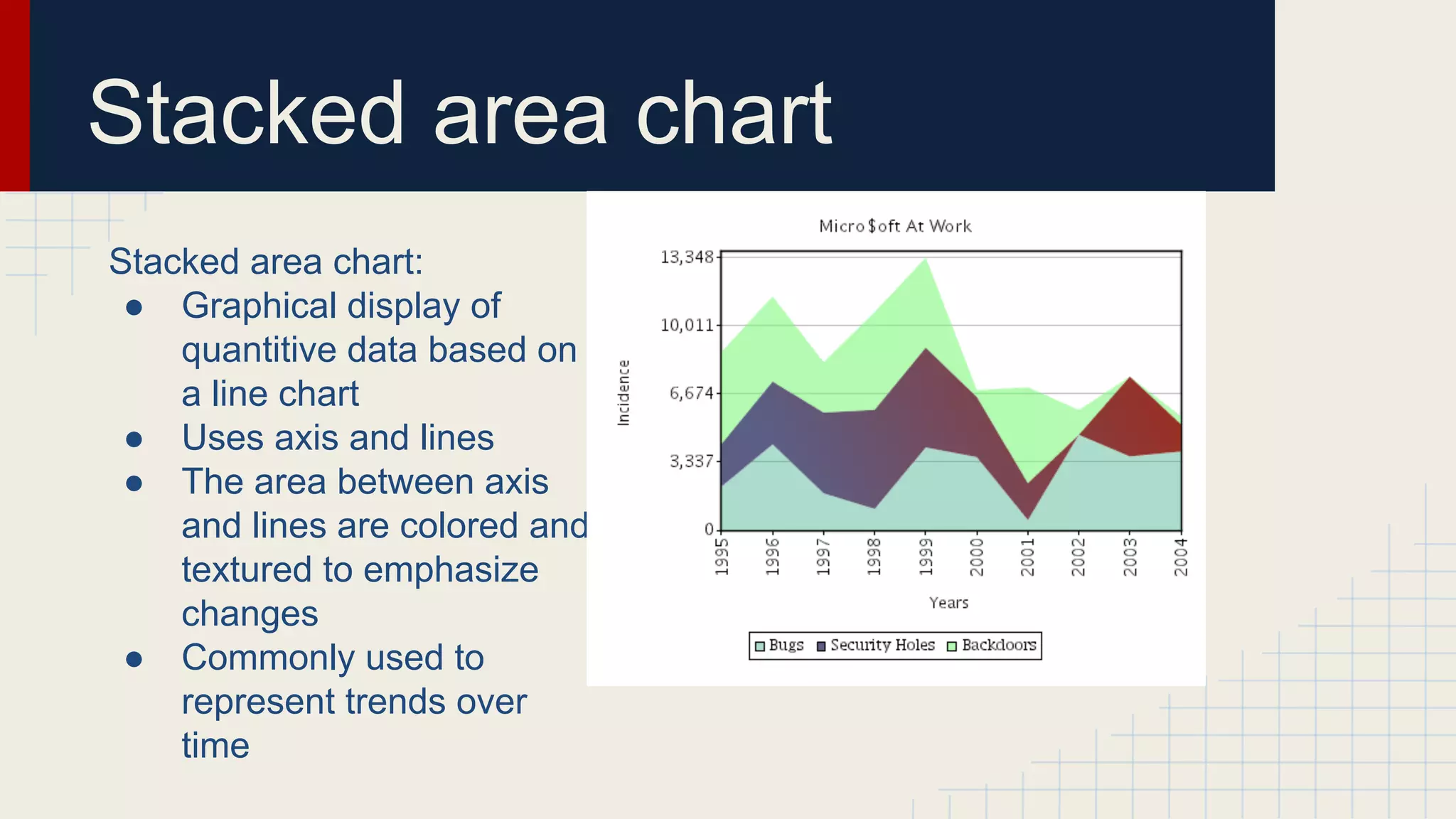
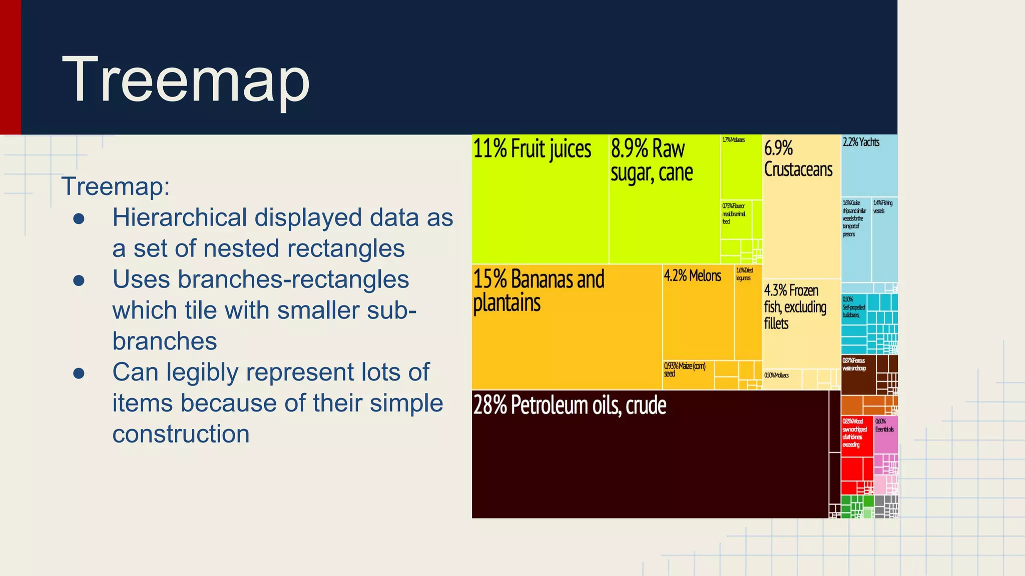
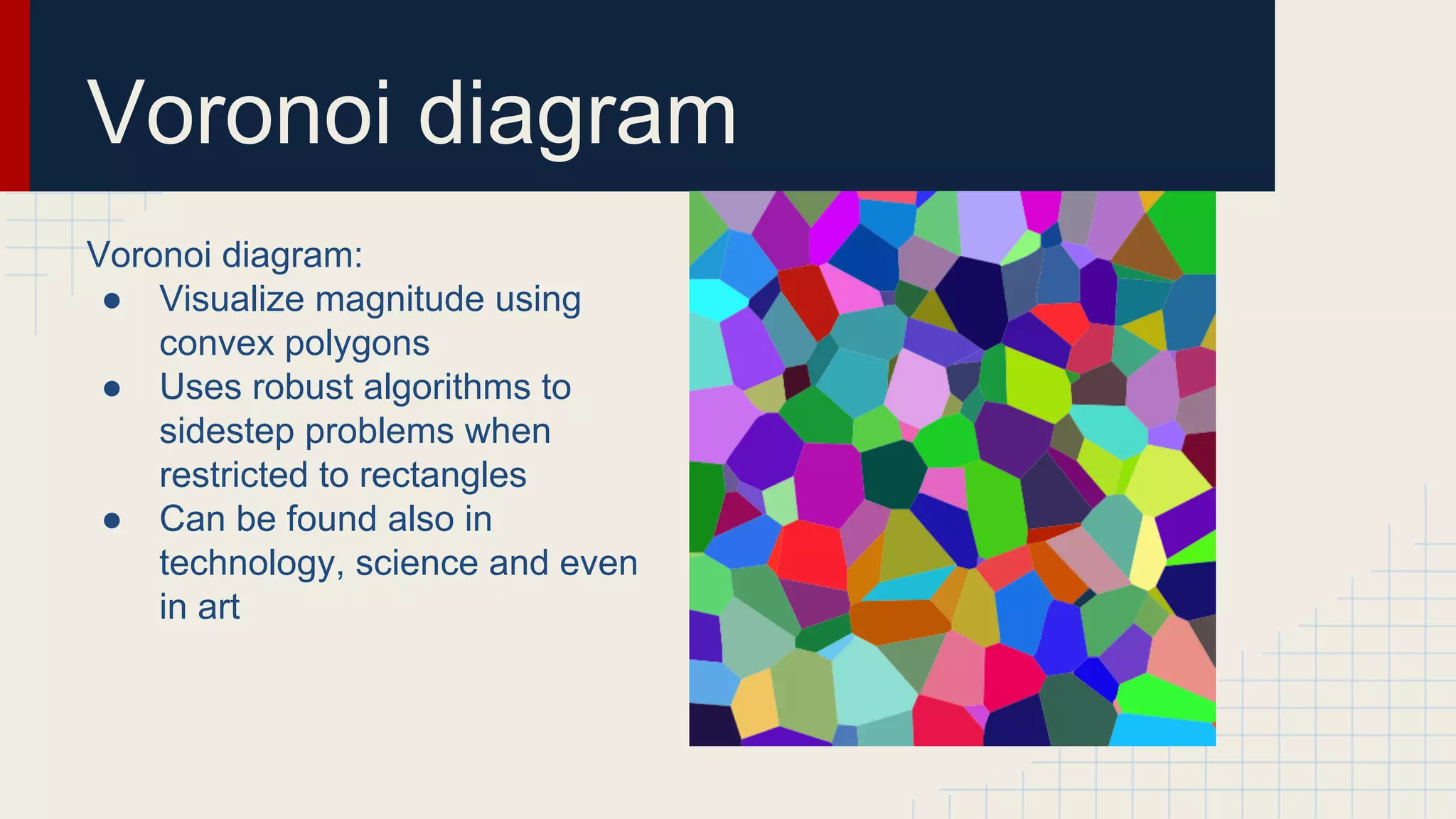
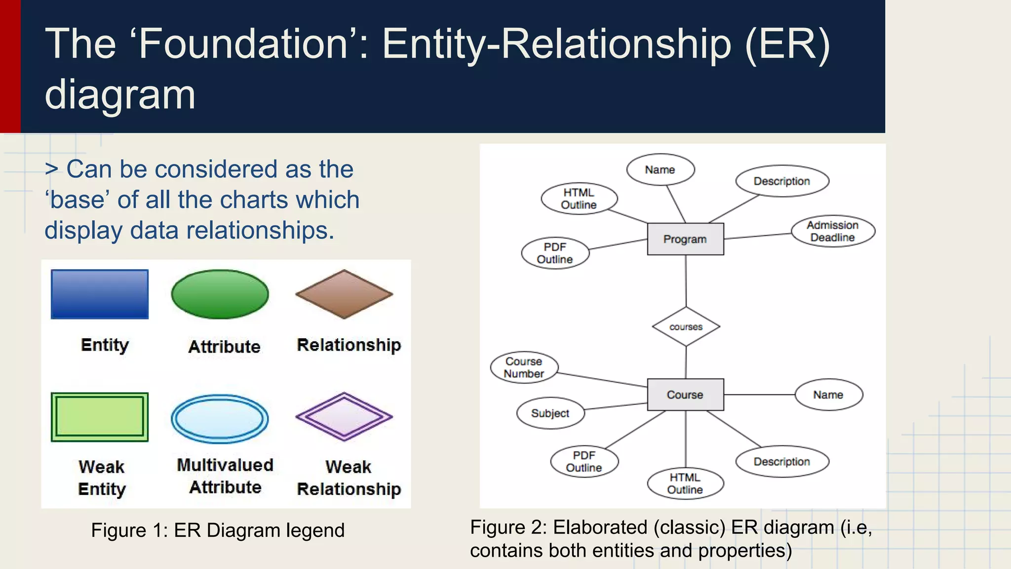
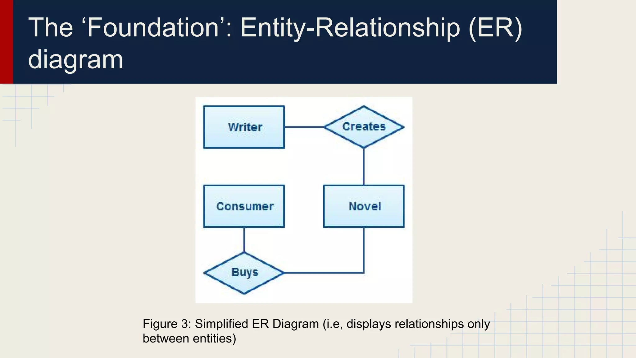
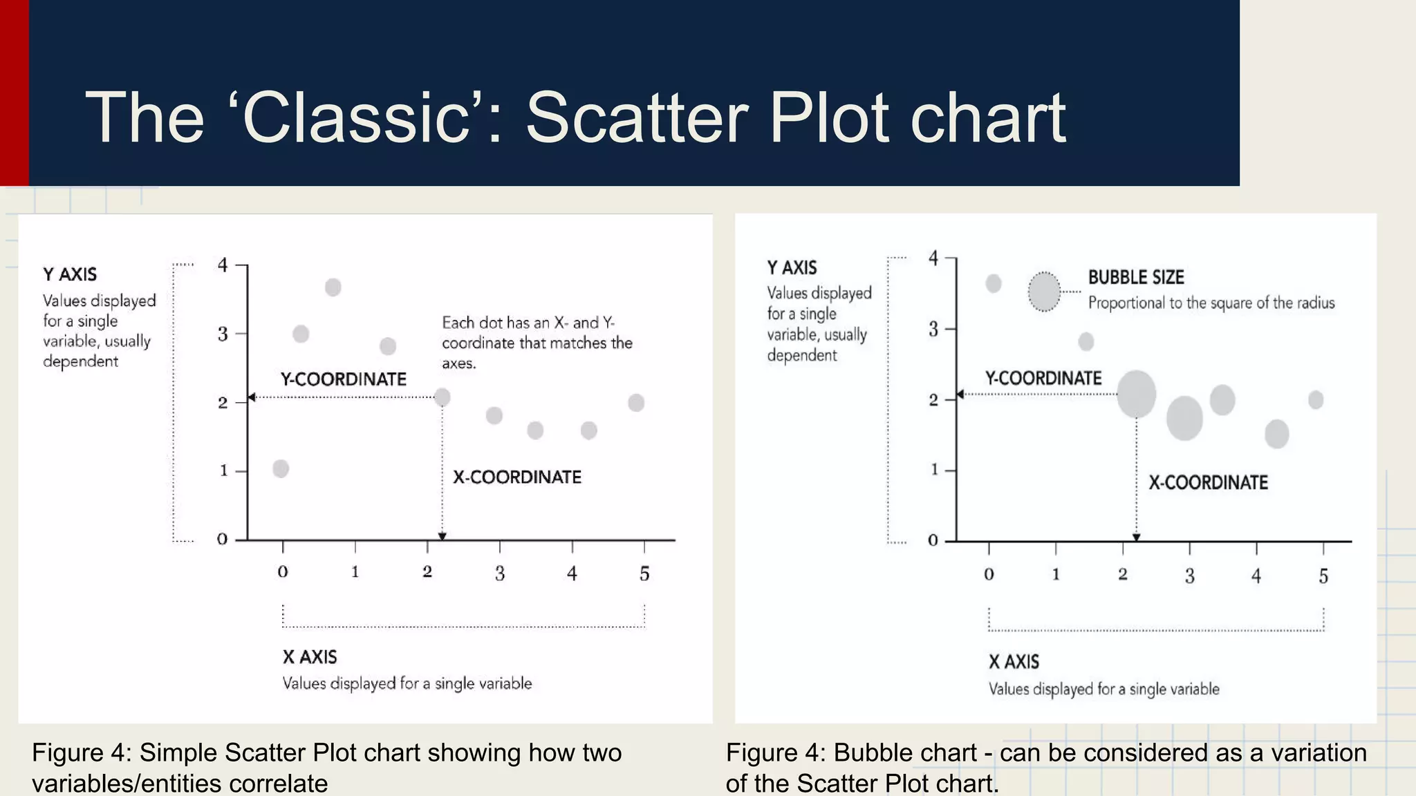
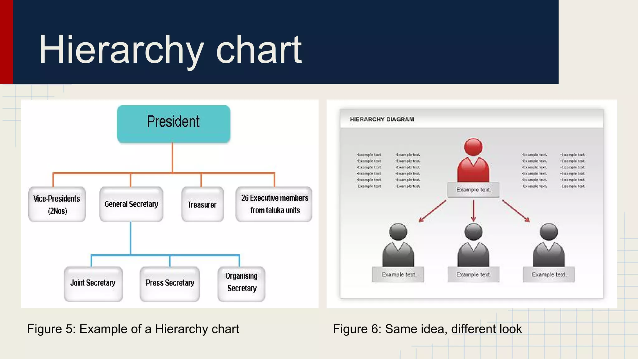
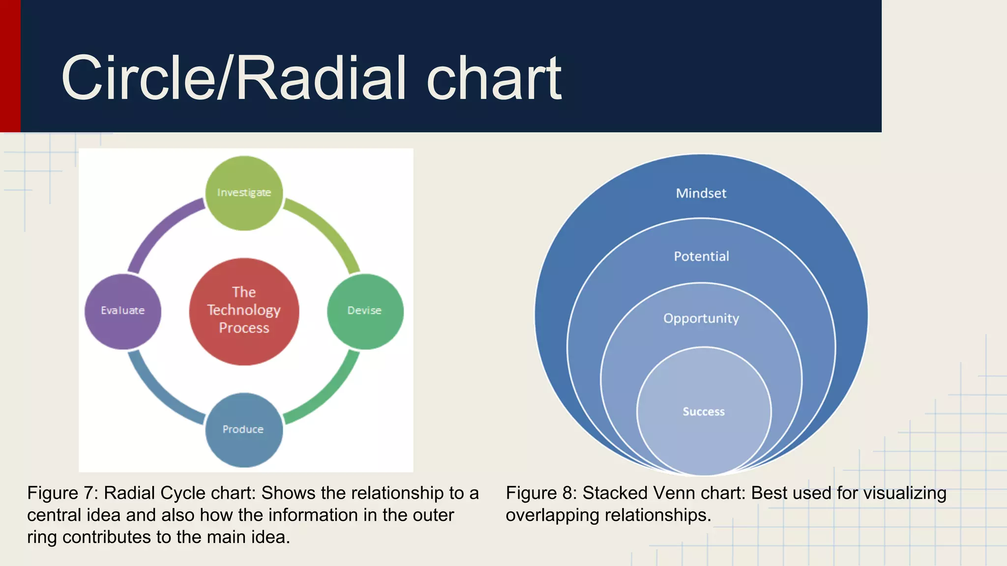
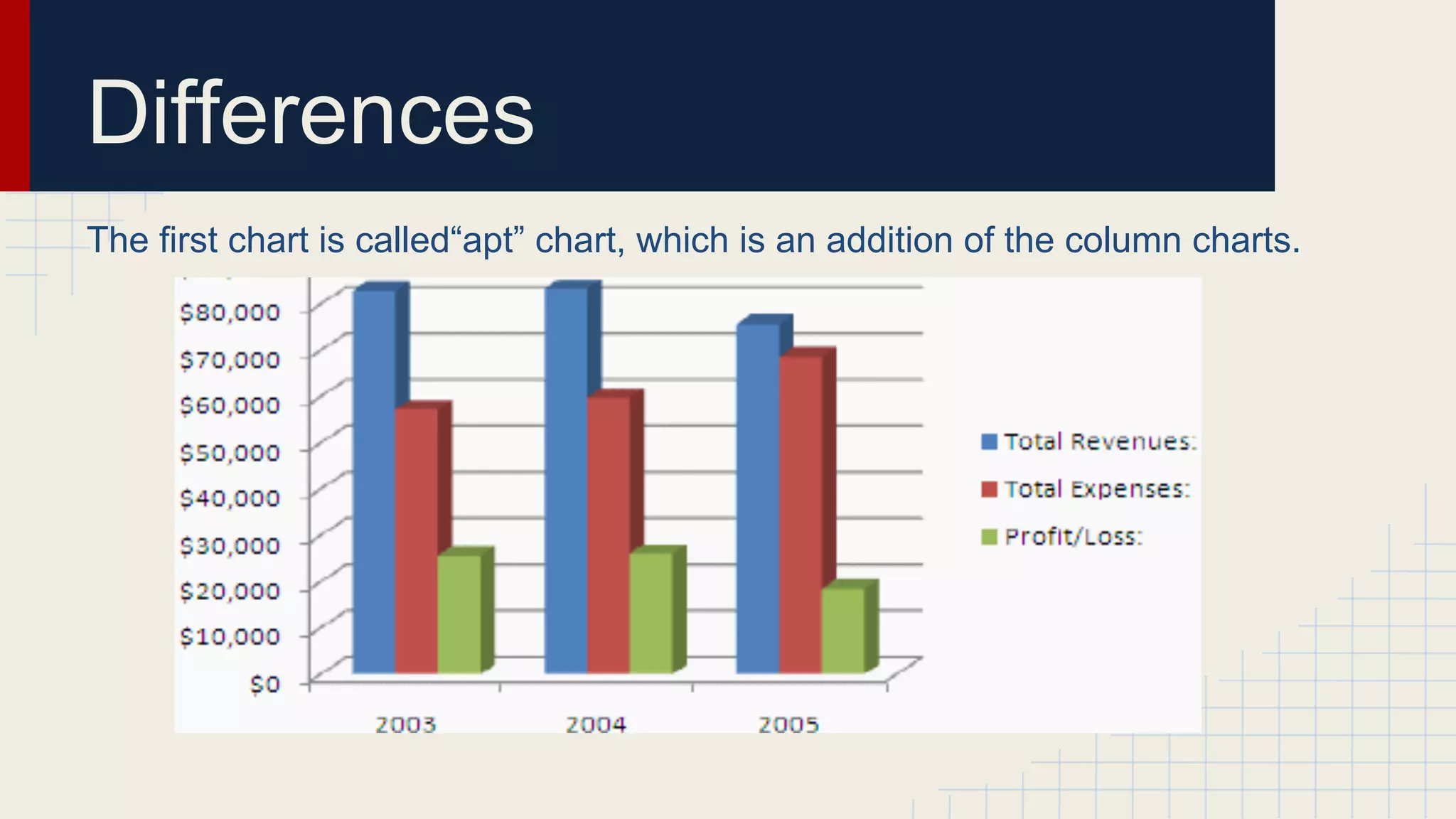
Data Visualization
Authors:
Peter Yochev, Danitsa Andreeva, Plamena Radneva, Ivan Chervenkov
Software Technology and Design
The Paisii Hilendarski University of Plovdiv
Plovdiv, January 30, 2014
Content
●

Patterns Over Time

●

Proportions

●

Relationships

●

Differences
Patterns Over Time
Patterns Over Time
One of the first known
graphics:
Planetary movement
chart, 10th century
Patterns Over Time
The first bar chart,
1786, William Playfair
Patterns Over Time
John Snow’s map of Cholera
outbreaks in the London
epidemic of 1854
Patterns Over Time

Charles Minard’s 1869 chart showing the number of men in
Napoleon’s 1812 infamous Russian campaign army
Proportions
There are many options to visualize
data out there, but it may be hard
simply to find the perfect chart or
the perfect graph that can suit
your data best. To make your
decision clearer and easier there
are lots of proportions available.
Using Different ways to visualize data
with proportions
Graphs and charts:
● Pie chart
● Donut chart
● Stacked area chart
● Treemap
● Voronoi diagram
Pie chart
Pie chart:
● Circular chart divided into sectors
● Illustrates numerical proportions
● Most effective when limited
components are used
● Most effective when limited
components are used
Donut chart
Donut chart:
● Functionally similar to pie charts
● Display data in rigs, where each
ring represents data series
● Can support multiple statistics at
once with its blank center
● Total 100% when percentage is
used
Stacked area chart
Stacked area chart:
● Graphical display of
quantitive data based on
a line chart
● Uses axis and lines
● The area between axis
and lines are colored and
textured to emphasize
changes
● Commonly used to
represent trends over
time
Treemap
Treemap:
● Hierarchical displayed data as
a set of nested rectangles
● Uses branches-rectangles
which tile with smaller subbranches
● Can legibly represent lots of
items because of their simple
construction
Voronoi diagram
Voronoi diagram:
● Visualize magnitude using
convex polygons
● Uses robust algorithms to
sidestep problems when
restricted to rectangles
● Can be found also in
technology, science and even
in art
Relationships
… Or how to visualize data relationships effectively.
The ‘Foundation’: Entity-Relationship (ER)
diagram
> Can be considered as the
‘base’ of all the charts which
display data relationships.

Figure 1: ER Diagram legend

Figure 2: Elaborated (classic) ER diagram (i.e,
contains both entities and properties)
The ‘Foundation’: Entity-Relationship (ER)
diagram

Figure 3: Simplified ER Diagram (i.e, displays relationships only
between entities)
The ‘Classic’: Scatter Plot chart

Figure 4: Simple Scatter Plot chart showing how two
variables/entities correlate

Figure 4: Bubble chart - can be considered as a variation
of the Scatter Plot chart.
Hierarchy chart

Figure 5: Example of a Hierarchy chart

Figure 6: Same idea, different look
Circle/Radial chart

Figure 7: Radial Cycle chart: Shows the relationship to a
central idea and also how the information in the outer
ring contributes to the main idea.

Figure 8: Stacked Venn chart: Best used for visualizing
overlapping relationships.
Differences
In this lesson I will compare a few charts, which will show you the main
difference between them.
Differences
The first chart is called“apt” chart, which is an addition of the column charts.
Differences
The apt chart:
● has small number of categories
● can use shades of a single color
● easiest way to show all bars belong
to same data type
Differences
The next one is the bar chart.
Differences
The bar chart:
● more than 8 but less than 15 categories
● more space for large names
● arranged from lowest to highest
● makes the understanding of the data easier
● connects shape of value faster
Differences
The Line chart:
● when you have a lot of numbers
of data points
● doesn’t show minimum and
maximum
● shows the rate of change of a
population
● best fits for showing trend-based
visualization
● has only 1 value axis
● shows the population with
negative spikes,because of
famines or some infections.
Sources
http://www.dundas.com/blog-post/a-brief-history-of-data-visualization/
http://www.lynda.com/Processing-tutorials/Overview-data-visualization/97578/113145-4.
html
http://www.sas.com/offices/NA/canada/downloads/IT-World2013/Data-VisualizationTechniques.pdf
http://flowingdata.com/2009/11/25/9-ways-to-visualize-proportions-a-guide/
http://www.slideshare.net/idigdata/data-visualization-best-practices-2013
http://xataface.com/documentation/tutorial/getting_started/first_application
http://creately.com/blog/diagrams/er-diagrams-tutorial/
http://book.flowingdata.com/downloads.html
http://0.tqn.com/d/spreadsheets/1/0/z/3/-/-/column_chart6.gif
http://upload.wikimedia.org/wikibooks/en/2/20/BarChartExampleHorizontal.PNG
http://www.tutorial9.net/tutorials/web-tutorials/selecting-the-right-chart-type-for-yourdata/#1
Any questions
Thank you for your
attention

Data visualization, FMIIT, STD