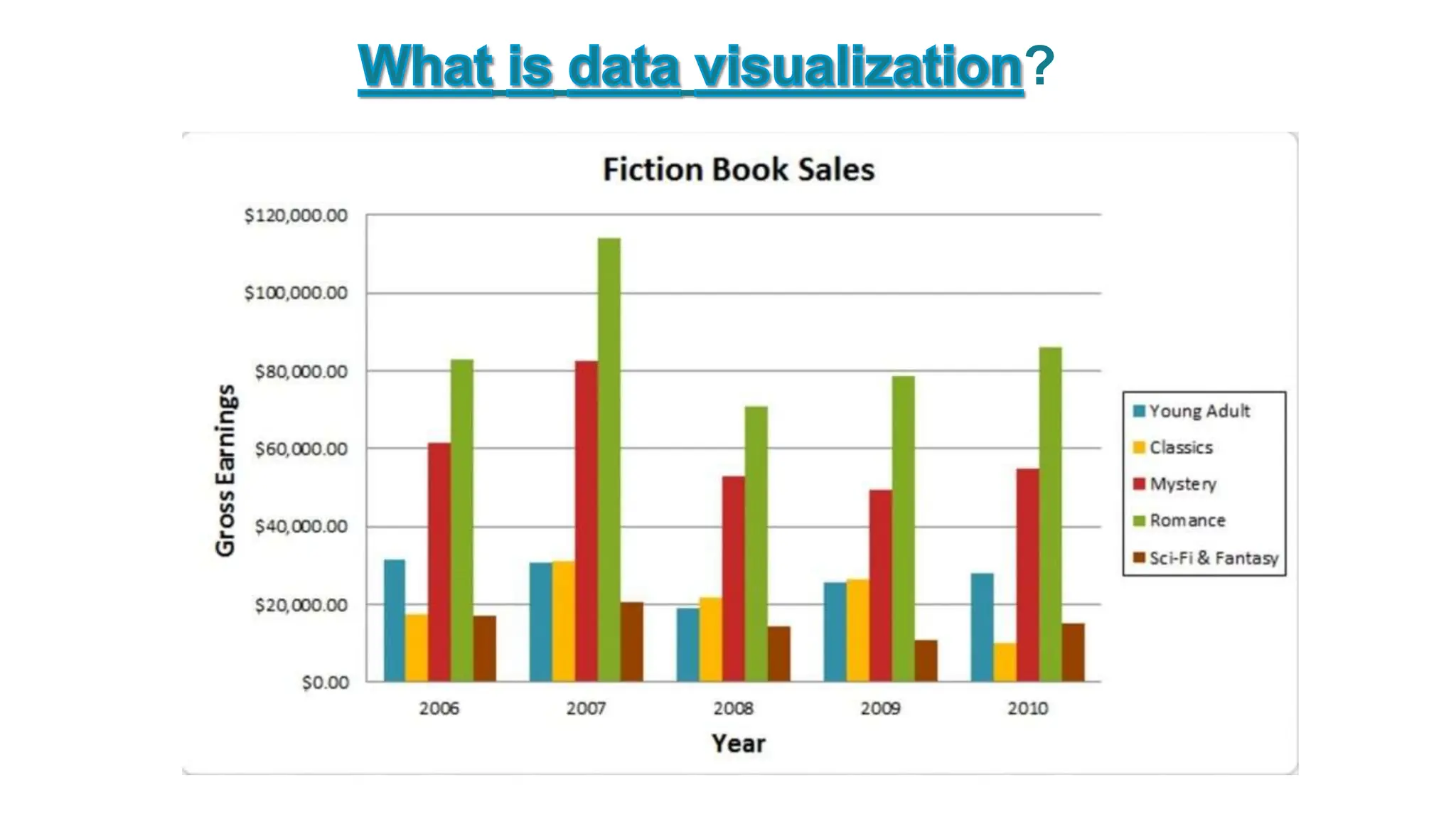
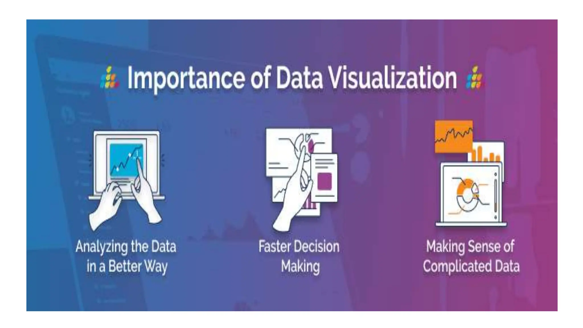
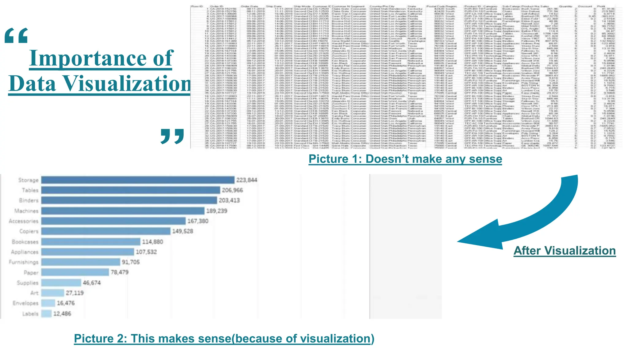
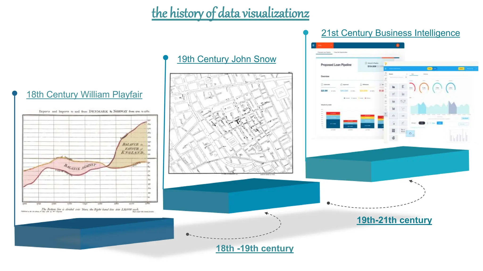
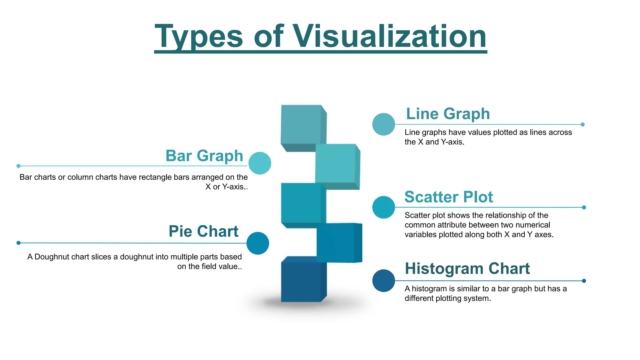
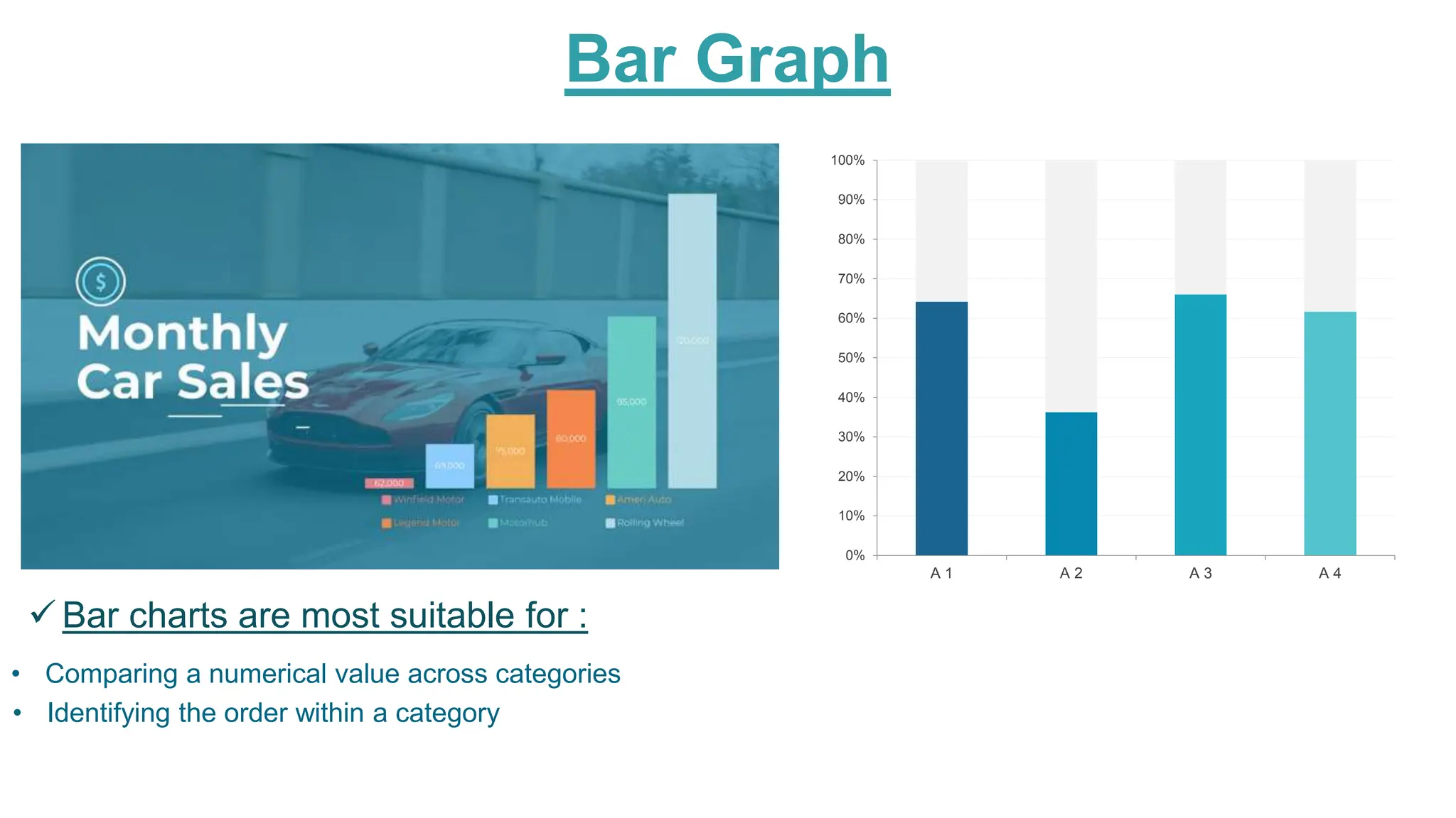
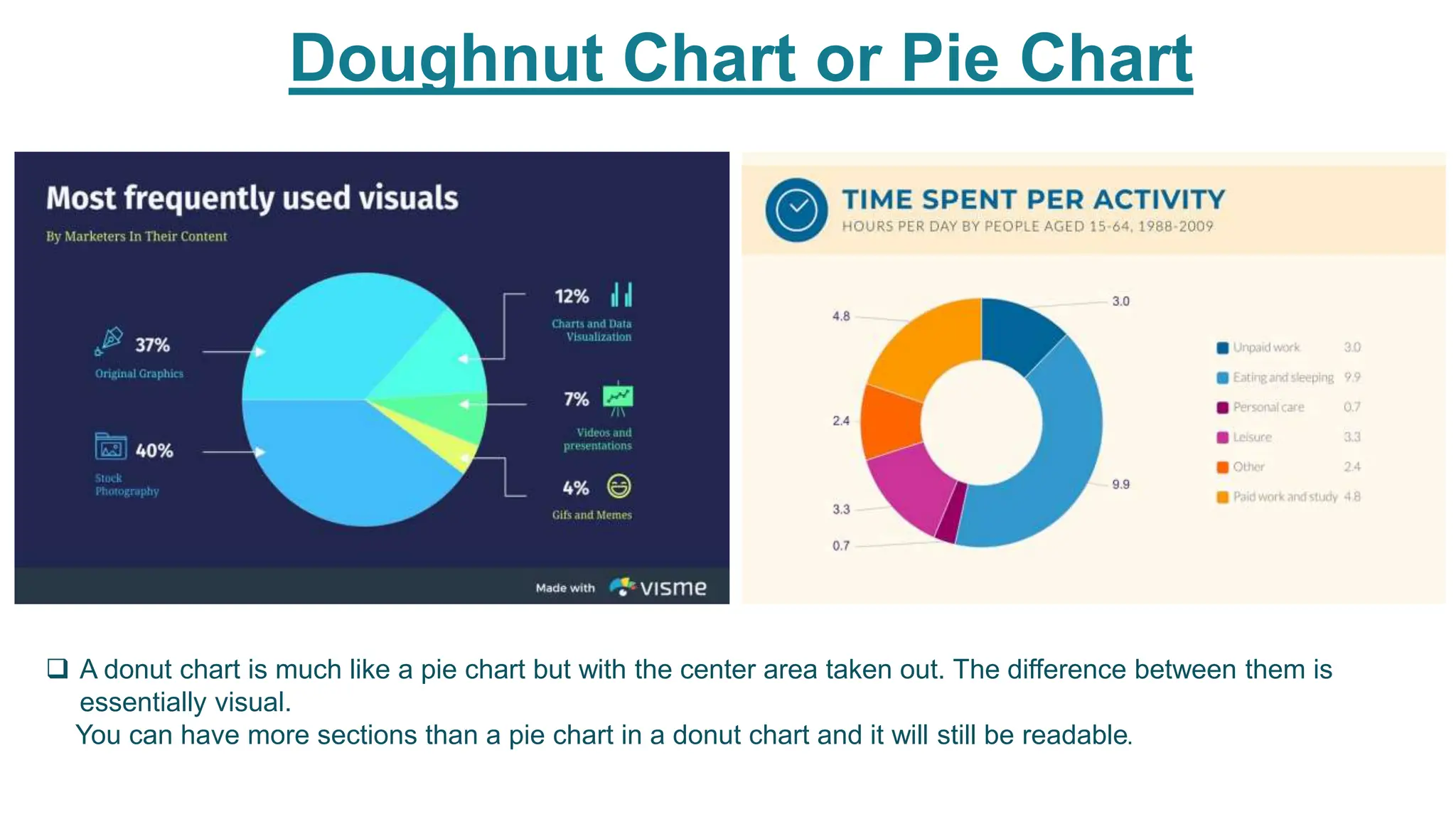
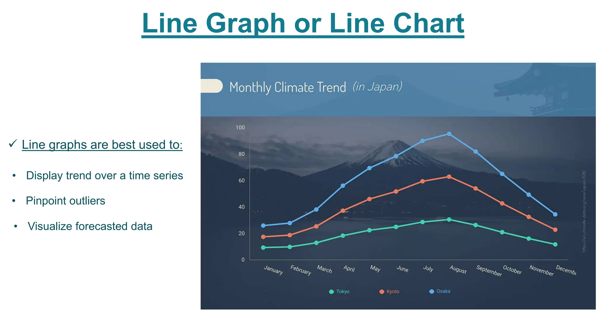
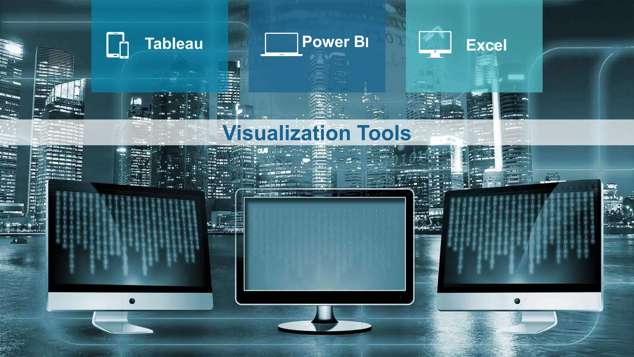
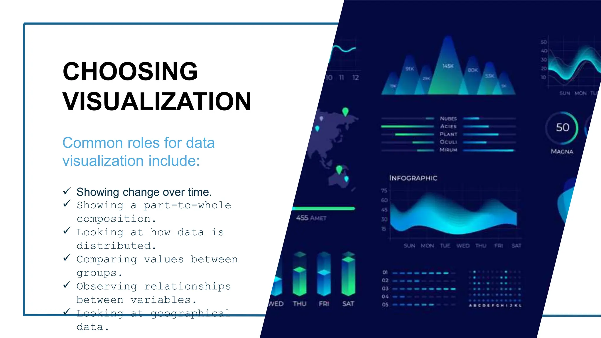
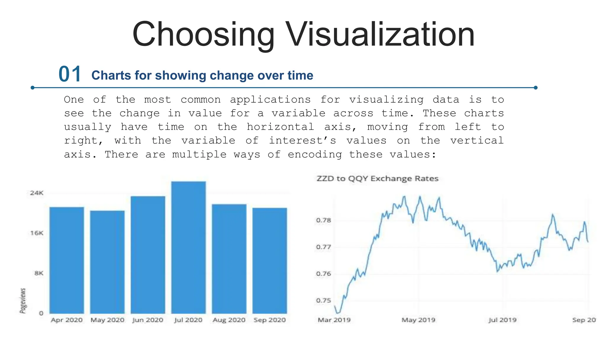
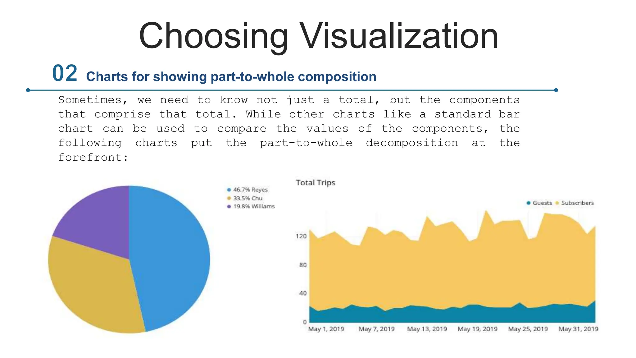
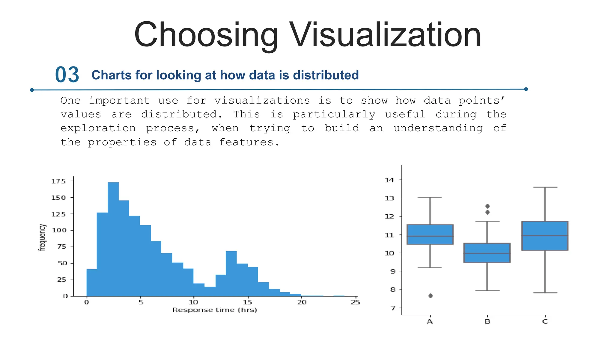
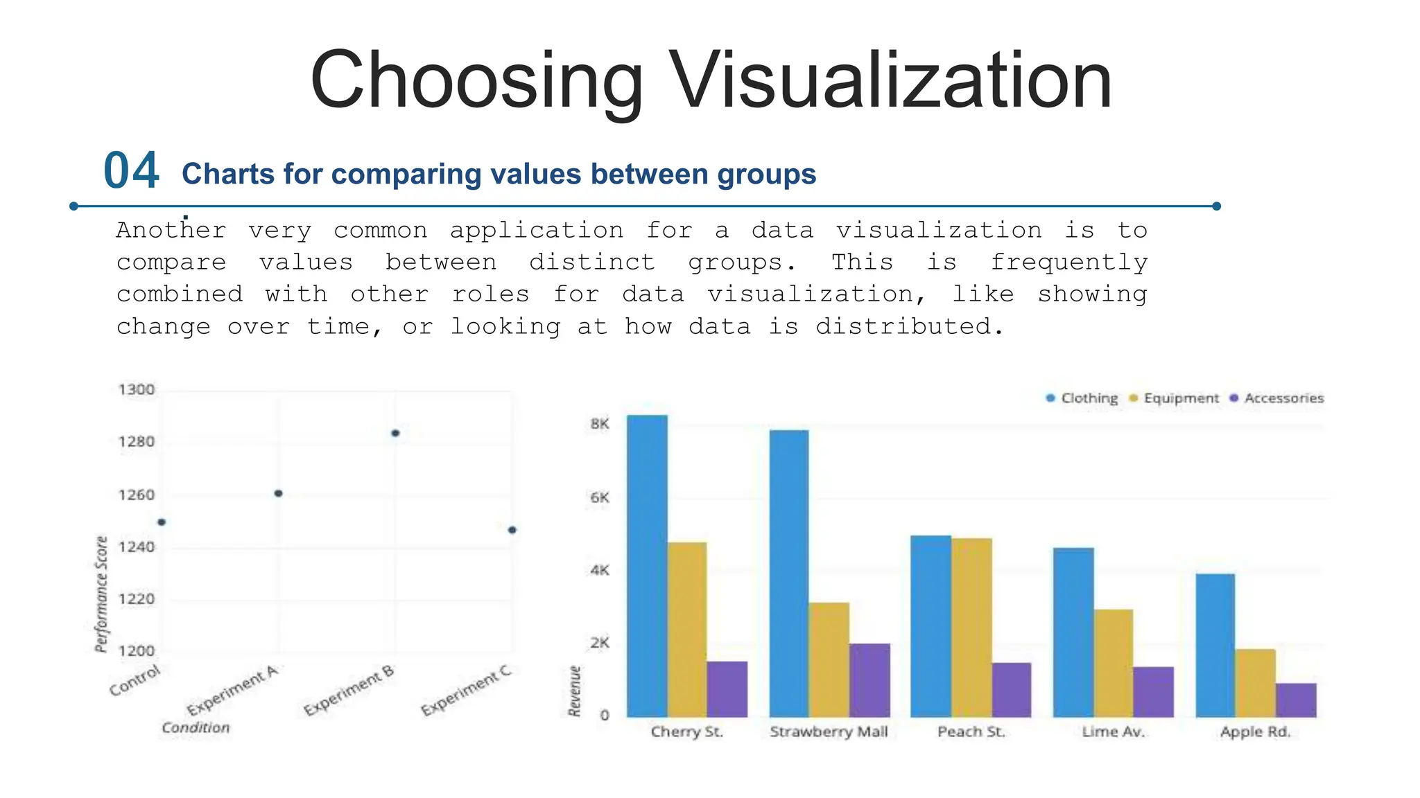
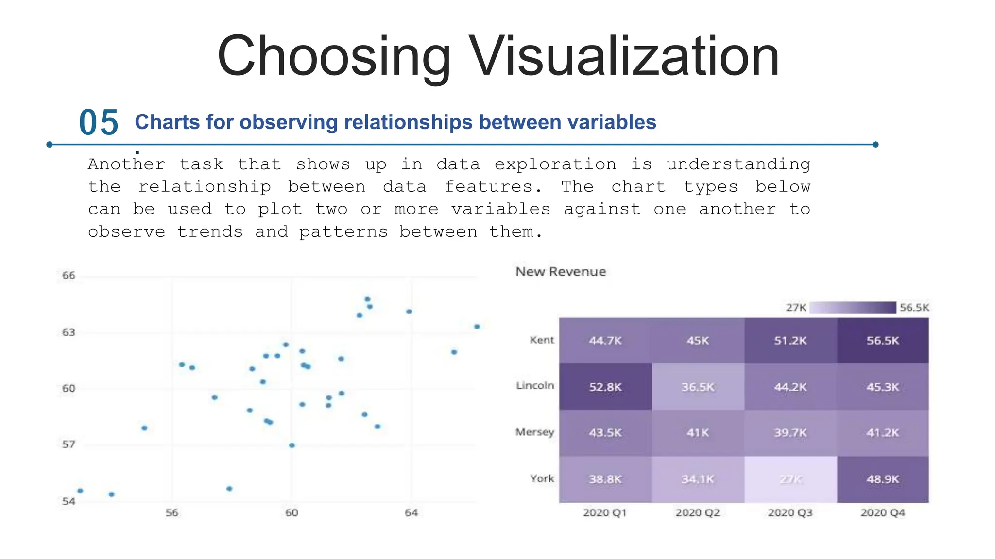
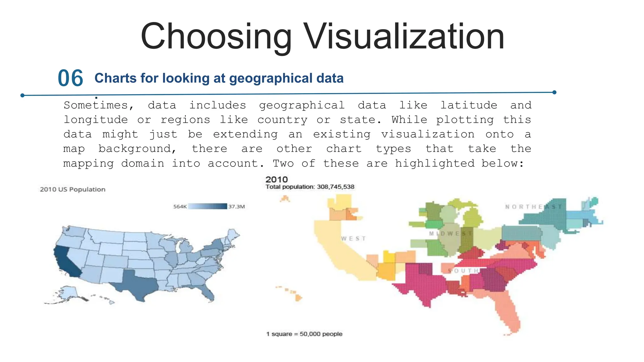
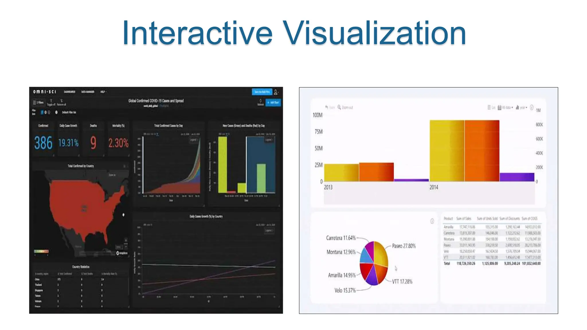
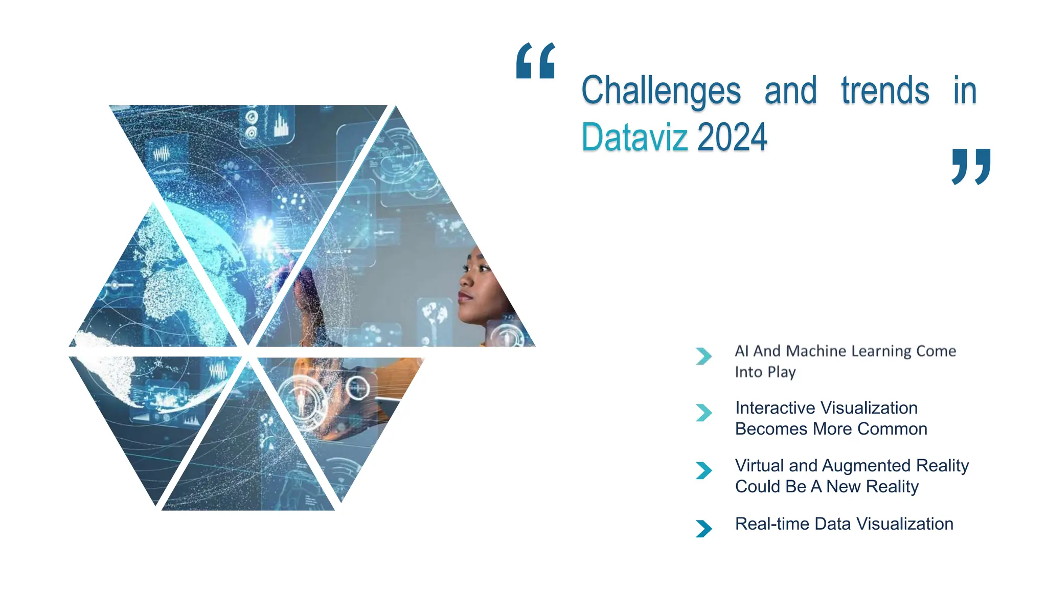
DATA VISUALIZATION
“A picture is worth a
thousand words”
Outline
 Introduction
 Types of Visualization
 Choosing Visualizations
 Visualization Tools
 Interactive Visualization
 Challenges and Trends in
Data Visualization
 Conclusion
?
Importance of
Data Visualization
Picture 1: Doesn’t make any sense
Picture 2: This makes sense(because of visualization)
After Visualization
the historyof data
visualization
the history of data visualizationz
18th -19th century
19th-21th century
18th Century William Playfair
19th Century John Snow
21st Century Business Intelligence
Types of Visualization
Line graphs have values plotted as lines across
the X and Y-axis.
Line Graph
Bar charts or column charts have rectangle bars arranged on the
X or Y-axis..
Bar Graph
Scatter plot shows the relationship of the
common attribute between two numerical
variables plotted along both X and Y axes.
Scatter Plot
A Doughnut chart slices a doughnut into multiple parts based
on the field value..
Pie Chart
A histogram is similar to a bar graph but has a
different plotting system.
Histogram Chart
Bar Graph
0%
10%
20%
30%
40%
50%
60%
70%
80%
90%
100%
A 1 A 2 A 3 A 4
• Comparing a numerical value across categories
• Identifying the order within a category
 Bar charts are most suitable for :
Doughnut Chart or Pie Chart
 A donut chart is much like a pie chart but with the center area taken out. The difference between them is
essentially visual.
You can have more sections than a pie chart in a donut chart and it will still be readable.
Line Graph or Line Chart
 Line graphs are best used to:
• Display trend over a time series
• Pinpoint outliers
• Visualize forecasted data
Tableau Power BI Excel
Visualization Tools
CHOOSING
VISUALIZATION
Common roles for data
visualization include:
 Showing change over time.
 Showing a part-to-whole
composition.
 Looking at how data is
distributed.
 Comparing values between
groups.
 Observing relationships
between variables.
 Looking at geographical
data.
Choosing Visualization
One of the most common applications for visualizing data is to
see the change in value for a variable across time. These charts
usually have time on the horizontal axis, moving from left to
right, with the variable of interest’s values on the vertical
axis. There are multiple ways of encoding these values:
Charts for showing change over time
Choosing Visualization
Sometimes, we need to know not just a total, but the components
that comprise that total. While other charts like a standard bar
chart can be used to compare the values of the components, the
following charts put the part-to-whole decomposition at the
forefront:
Charts for showing part-to-whole composition
Choosing Visualization
One important use for visualizations is to show how data points’
values are distributed. This is particularly useful during the
exploration process, when trying to build an understanding of
the properties of data features.
Charts for looking at how data is distributed
Choosing Visualization
Another very common application for a data visualization is to
compare values between distinct groups. This is frequently
combined with other roles for data visualization, like showing
change over time, or looking at how data is distributed.
Charts for comparing values between groups
.
Choosing Visualization
Another task that shows up in data exploration is understanding
the relationship between data features. The chart types below
can be used to plot two or more variables against one another to
observe trends and patterns between them.
Charts for observing relationships between variables
.
Choosing Visualization
Sometimes, data includes geographical data like latitude and
longitude or regions like country or state. While plotting this
data might just be extending an existing visualization onto a
map background, there are other chart types that take the
mapping domain into account. Two of these are highlighted below:
Charts for looking at geographical data
.
Interactive Visualization
Challenges and trends in
Dataviz 2024
Interactive Visualization
Becomes More Common
Virtual and Augmented Reality
Could Be A New Reality
Real-time Data Visualization
Conclusion
THANK YOU
For your attention!

Presentation de la DATA visualisation.pptx

  • 1.
  • 2.
    “A picture isworth a thousand words”
  • 3.
    Outline  Introduction  Typesof Visualization  Choosing Visualizations  Visualization Tools  Interactive Visualization  Challenges and Trends in Data Visualization  Conclusion
  • 4.
  • 6.
    Importance of Data Visualization Picture1: Doesn’t make any sense Picture 2: This makes sense(because of visualization) After Visualization
  • 7.
  • 8.
    the history ofdata visualizationz 18th -19th century 19th-21th century 18th Century William Playfair 19th Century John Snow 21st Century Business Intelligence
  • 9.
    Types of Visualization Linegraphs have values plotted as lines across the X and Y-axis. Line Graph Bar charts or column charts have rectangle bars arranged on the X or Y-axis.. Bar Graph Scatter plot shows the relationship of the common attribute between two numerical variables plotted along both X and Y axes. Scatter Plot A Doughnut chart slices a doughnut into multiple parts based on the field value.. Pie Chart A histogram is similar to a bar graph but has a different plotting system. Histogram Chart
  • 10.
    Bar Graph 0% 10% 20% 30% 40% 50% 60% 70% 80% 90% 100% A 1A 2 A 3 A 4 • Comparing a numerical value across categories • Identifying the order within a category  Bar charts are most suitable for :
  • 11.
    Doughnut Chart orPie Chart  A donut chart is much like a pie chart but with the center area taken out. The difference between them is essentially visual. You can have more sections than a pie chart in a donut chart and it will still be readable.
  • 12.
    Line Graph orLine Chart  Line graphs are best used to: • Display trend over a time series • Pinpoint outliers • Visualize forecasted data
  • 13.
    Tableau Power BIExcel Visualization Tools
  • 14.
    CHOOSING VISUALIZATION Common roles fordata visualization include:  Showing change over time.  Showing a part-to-whole composition.  Looking at how data is distributed.  Comparing values between groups.  Observing relationships between variables.  Looking at geographical data.
  • 15.
    Choosing Visualization One ofthe most common applications for visualizing data is to see the change in value for a variable across time. These charts usually have time on the horizontal axis, moving from left to right, with the variable of interest’s values on the vertical axis. There are multiple ways of encoding these values: Charts for showing change over time
  • 16.
    Choosing Visualization Sometimes, weneed to know not just a total, but the components that comprise that total. While other charts like a standard bar chart can be used to compare the values of the components, the following charts put the part-to-whole decomposition at the forefront: Charts for showing part-to-whole composition
  • 17.
    Choosing Visualization One importantuse for visualizations is to show how data points’ values are distributed. This is particularly useful during the exploration process, when trying to build an understanding of the properties of data features. Charts for looking at how data is distributed
  • 18.
    Choosing Visualization Another verycommon application for a data visualization is to compare values between distinct groups. This is frequently combined with other roles for data visualization, like showing change over time, or looking at how data is distributed. Charts for comparing values between groups .
  • 19.
    Choosing Visualization Another taskthat shows up in data exploration is understanding the relationship between data features. The chart types below can be used to plot two or more variables against one another to observe trends and patterns between them. Charts for observing relationships between variables .
  • 20.
    Choosing Visualization Sometimes, dataincludes geographical data like latitude and longitude or regions like country or state. While plotting this data might just be extending an existing visualization onto a map background, there are other chart types that take the mapping domain into account. Two of these are highlighted below: Charts for looking at geographical data .
  • 21.
  • 22.
    Challenges and trendsin Dataviz 2024 Interactive Visualization Becomes More Common Virtual and Augmented Reality Could Be A New Reality Real-time Data Visualization
  • 23.
  • 24.

Editor's Notes

  • #3 « They say a picture is worth a thousand words, and this is especially true for data analytics. » Good afternoon, everyone. Today, we invite you to explore the fascinating world of data visualization. Data visualization is all about presenting data in a visual format, using charts, graphs, and maps to tell a meaningful story. It’s a crucial step in the data analysis process—and a technique that all areas of business can benefit from.
  • #4 In this presentation , we’ll tell you everything you need to know about data visualization (also known as data viz). We’ll explain what it is, why it is important ? Some of the most common types, How choosing the right visualizaions, As well as the tools you can use to create them. We’ll also explore Interactive Visualization We’ll then discus the Challenges and Trends in Data Visualization in 2024 Finally we finish our presentation with a conclusion
  • #6 Visualizing the data enable decision makers to innterrelate the data to find better insights and reap the importance of dataviz which are:
  • #7  imagine your presented with a spreadsheet containing rows and rows of data,for exemple picture :1 Now imagine seeing the same data presented as a bar chart,or on a color coded-map picture:2 What do you think, by looking at which picture, you can grasp the insights? Of course, it is the second picture because of the graphical representation of the data. It is much easier to see what the data is telling you,right?
  • #8 Data visualization, has been around for a long time.
  • #9  In the 18th(eighteenth) century, pioneers like William Playfair created the first charts, such as bar graphs and pie charts. Later, Florence Nightingale used charts to show the causes of deaths during the Crimean War. In the 19th (ninetheenth) century, British physician John Snow leve-raged the graphics based on statistical data to tackle cholera epidemic. On the London map, he used dots to refer to each case of cholera. These dots led to the cholera origins, a water pump on Broad Street.  In the 21st (tweny first) century, dataviz became even more popular due to the explosion of data and the internet. Now we have infographics, interactive dashboards, and real-time visualizations. Today, As data visualization continues to evolve with modern trends, it's important to understand the various types of visualizations that play a crucial role in conveying information effectively. Let's now explore the different types of data visualizations available(disponible).“ then, we can present the data in seve-ral forms, for example in the form of a bar ghraph ….
  • #11 Bar charts are among the most frequently used chart types. As the name suggests (seg jast) a bar chart is composed of a series of bars illustrating a variable’s development. Given that bar charts are such a common chart type, Examples like this one are straight-for-ward to read.
  • #12 A pie chart is essentially a circle divided into different “slices,” with each slice representing the percentage it contributes to the whole. Thus, the size of each pie slice is proportional to how much it contributes to the whole “pie.” pie charts are used to visualize just one single variable broken down into percentages or proportions.
  • #13 Line graphs have values plotted as lines across the X and Y-axis. They are used to track changes over a short/long time frame. How do you decide which chart to choose for your problem or your project?”
  • #14 A data visualization tool is specific software that enables users to present and interpret various statistics visually. Here are the 3 most popular tools people around the globe employ to represent data visually. Tableau is a powerful data visualization tool that enables users to connect to various data sources, create interactive and shareable dashboards, and perform in-depth data analysis. It's known for its drag-and-drop interface and extensive  Power BI ,If you want to visualize data, share findings, and embed those in different platforms, Power BI is your go-to tool. Most importantly, it pulls information from various sources together and processes it, turning it into intelligible insights. Excel he first thing that comes to mind when you hear the word Excel is analysis rather than visualization. Indeed, it is a great tool for information preprocessing, especially in terms of multi-layered calculations.
  • #15 In this part of presentation , we will approach the task of choosing a data visualization based on the type of task that you want to perform. Common roles for data visualization include: • showing change over time • showing a part-to-whole composition • looking at how data is distributed • comparing values between groups • observing relationships between variables • looking at geographical data The types of variables you are analyzing and the audience for the visualization can also affect which chart will work best within each role. Certain visualizations can also be used for multiple purposes depending on these factors.
  • #16  One of the most common applications for visualizing data is to see the change in value for a variable across time. These charts usually have time on the horizontal axis, moving from left to right, with the variable of interest’s values on the vertical axis. There are multiple ways of encoding these values:
  • #17  Sometimes, we need to know not just a total, but the components that comprise that total. While other charts like a standard bar chart can be used to compare the values of the components, the following charts put the part-to-whole decomposition at the forefront:
  • #18  One important use for visualizations is to show how data points’ values are distributed. This is particularly useful during the exploration process, when trying to build an understanding of the properties of data features.
  • #19  Another very common application for a data visualization is to compare values between distinct groups. This is frequently combined with other roles for data visualization, like showing change over time, or looking at how data is distributed.
  • #20  Another task that shows up in data exploration is understanding the relationship between data features. The chart types below can be used to plot two or more variables against one another to observe trends and patterns between them.
  • #21  Sometimes, data includes geographical data like latitude and longitude or regions like country or state. While plotting this data might just be extending an existing visualization onto a map background, there are other chart types that take the mapping domain into account. Two of these are highlighted below:
  • #22 Interactive DataViz is a type of data visualization that allows users to interact with data in order to explore and understand it. This can be done through various means—such as allowing users to filter the data or providing interactive elements that allow users to drill down into specific parts of the data. Interactive data viz have become increasingly popular in recent years, as they provide a way to more effectively communicate data and insights.
  • #23 In the dynamic field of data visualization, numerous significant trends and challenges are influencing its future. The integration of AI and Machine Learning promises dynamic and insightful visualizations, enabling users to extract valuable insights from vast datasets in real-time. Interactive visualizations have become the norm, providing users with hands-on exploration capabilities and fostering collaboration within teams. Additionally, the emergence of Virtual Reality (VR) and Augmented Reality (AR) holds the potential to offer immersive data experiences. Moreover, real-time data visualization is becoming a game-changer, as dynamic dashboards provide up-to-the-minute insights and enhance decision-making in today's fast-paced business environment. These trends offer exciting opportunities, but they also present challenges, such as ensuring data security, managing the complexity of real-time data, and making immersive technologies accessible to a broader audience. As we navigate this dynamic landscape, embracing these trends while addressing the associated challenges will be key to unlocking the full potential of data visualization.
  • #24  In conclusion, data visualization is not just a tool but a dynamic lens for gaining insights, making informed decisions, and communicating complex information. The integration of AI, interactivity, immersive technologies, and real-time insights is transforming the field, offering exciting potential. As we step into the future, let's embrace data visualization's dynamic possibilities, using it to empower decision-making, democratize data, and enhance understanding. With each new trend and challenge, we expand our ability to unlock the full potential of data. Thank you for joining us on this exploration of the fascinating world of data visualization.