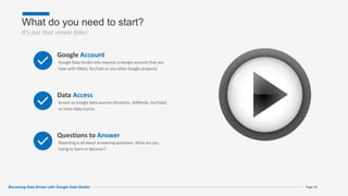
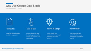
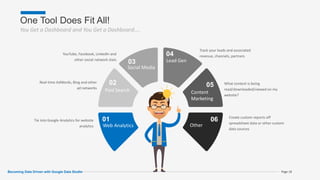
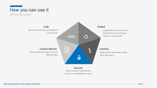
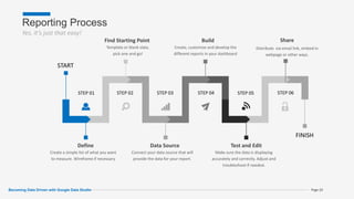
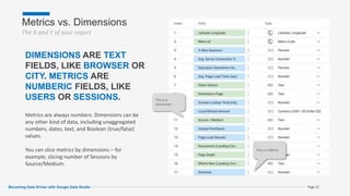
Google Data Studio, The Best Free Tool You're Not Using! Introduction to Google's dashboard and reporting tool for analytics. Presented at NC Tech 4 Good Conference, June 5, 2018 Durham, NC
This document summarizes a webinar about Google Data Studio. The webinar covered:
1) Challenges of deriving value from data and how Data Studio can help overcome them
2) An overview of Data Studio's functionality, interface, and advantages like integration with various data sources and easy sharing
3) Examples of dashboards created in Data Studio and a demo of its interface
Google Data Studio is a free data visualization tool that allows users to connect their raw data sources, visualize that data in customizable dashboards and reports, and then share those visualizations publicly or within their organization. It provides drag-and-drop tools to design and customize reports using connected data on metrics like users, bounce rates, sessions, clicks and more. Originally launched as part of Google Analytics in 2016, Data Studio has since expanded to be freely available for individuals and small teams to analyze and share insights from their data.
A brief introduction on some of the benefits of Google Data Studio, and how it can be used for SEO. Including examples for Editorial professions, technical SEO teams and every day data analysts. https://mjfield.com
Google recently announced a free version of Google Data Studio which is designed for "individuals and smaller teams. Here are the details. Learn how to create beautiful reports using the new Google Data Studio. Data Studio makes it easy to connect to your data, visualize that data, and share and collaborate with colleagues and customers.
Google Data Studio is a free data visualization tool from Google that allows users to connect to data sources, visualize data in dashboards and reports, and share those visualizations. It works by connecting to data sources through connectors, allowing users to generate customizable dashboards and reports from selected datasets. While capable on its own, Google Data Studio is part of Google's larger analytics suite that includes tools like Google Analytics, Google Tag Manager, Google Optimize, and Google Attribution to provide a unified view of customer data and insights.
Google Data Studio is a reporting tool which turn your data into informative dashboards and reports that are easy to read, easy to share, and fully customizable.
Google Data Studio: Data Viz & Integration WizardryBeau Pedraza
Let's cover the basics of Google Data Studio and take awe in the beauty of responsive reporting and full-scale integration across your marketing engine.
How to create a perfect dashboard? Data visualization framework using Google ...Mateusz Muryjas
Mateusz Muryjas @ MeasureCamp Bratislava 2019
-
I've share some thoughts from my experience with data storytelling, visualization and reporting. In 4 easy steps you can create more useful dashboards with meaningful data - learn more how to do it with Google Data Studio.
Advanced Reporting with Google Data Studio - State of Search 2017Adrian Vender
Discover the benefits of using Google Data Studio for free advanced dashboarding and visualizations. Also learn to leverage different tools such as Stitch and SuperMetrics to enhance your Data Studio processes.
Getting Started with Google Data StudioChris Burgess
Presented at the Melbourne SEO Meetup in September 2019, this slide deck offers a broad overview of the Google Data Studio product. It includes a walk through of the main features, resources to help you learn more, as well as some tips to help you with your own custom dashboards and reports.
Reporting on SEO performance is important for any SEO campaign and Google Data Studio can help with streamlining this process
https://manuelmartinez.biz/data-studio-dashboard-templates/
Google Data Studio How to Make Tooltips for Better Data ContextBoost Labs
Google Data Studio is a great tool to visualize data and you can make it even better with tooltips. Make the data easier to understand by making custom tooltips.
With the expertise of our CEO, we've put together a webinar about MVP readiness. If you're low on time, budget, and resources, build a lean solution. A minimum viable product has enough design and development to launch within a shorter time frame. Not only do you save time and money, you'll be able to make iterations and versions post-launch.
See how to prepare for an MVP with Ali Allage, the CEO of Boost Labs.
For more about MVPs, contact us!
Google Data Studio is a free tool from Google that allows users to create reports with data visualizations to share with clients. It is part of Google Analytics 360. Users can access Google Data Studio at https://datastudio.google.com and create data connections to visualize data from sources like Google Analytics, Google Ads, and more. Reports can be made interactive with filters and controls to tell data stories through various chart types and annotations.
How to Optimize Games Based on Firebase Data? | Mariusz GasiewskiJessica Tams
Delivered at Casual Connect Eastern Europe 2018. Data analysis for game does not end at campaign management. How to optimize content of games, onboarding, monetization techniques based on Google Analytics for Firebase? From simple tips and tricks to advanced data mining using BigQuery integration. Presentation based on games case studies and practical examples. Examples of tests and analyses with the goal to improve ARPU and Buyer rate.
14 awesome productivity hacks using google sheets [2020]Adin Alihodzic
Do more with less - 14 of the best productivity hacks using google sheets
Get the complete details here:
https://www.knowingyourcustomers.com/blog/14-awesome-productivity-hacks-with-google-sheets-2020
PowerBi days 20fev2020 session Malang Diedhiou Improve your visualsMohamed Amar ATHIE
This document provides tips and best practices for improving the visual appeal of Power BI reports. It discusses defining metrics and visualizations, mocking up dashboard designs, building reports by connecting to data and adding visualizations, and sharing reports. It also covers avoiding data overload, choosing a color palette, selecting the best visuals, using interactions between visuals, and drafting wireframes. Overall, the document outlines the report design process and offers guidance on data presentation and navigation to create effective and visually appealing Power BI reports.
Building a Marketing Data Warehouse from Scratch - SMX Advanced 202Christopher Gutknecht
This deck covers the journey of starting with BigQuery, adding more data sources and building a process around your data warehouse. It covers the three phases greenfield, dashboards and operational analytics and the necessary data components.
The code for uploading your product feed can be found here:
https://gist.github.com/ChrisGutknecht/fde93092e21039299ab76715596eac01
If you have any questions, reach out to me on Linkedin!
The document discusses Google Docs and its various applications including Google Docs for word processing, Google Presentations for slideshows, Google Spreadsheets for creating data tables and charts, and Google Forms for polls and surveys. It notes that Google Docs allows for simultaneous collaboration in real-time with cloud storage and is free with a Google account.
Crispino Cabral Kako Kamboh has completed the online Specialization "Excel to MySQL: Analytic Techniques for Business" from Coursera, consisting of 5 courses in business metrics, data analysis in Excel, data visualization in Tableau, managing big data with MySQL, and increasing real estate profits through data analytics. The Specialization taught skills to frame business challenges as data questions and use tools like Excel, Tableau, and MySQL to analyze data, create models and forecasts, design visualizations, and communicate insights, culminating in a capstone project applying these skills to a real-world business process.
Don't make reports - tell stories! Six ideas for your next dashboard in Googl...Mateusz Muryjas
If you change your language, you will change others' minds. Learn 4 strategic concepts of data visualization and make your next dashboard more awesome! In the second part you will find some ideas which you can use in Google Data Studio reports.
Miss the Webinar launch of Yellowfin 7.3 – the latest version of our Business Intelligence (BI) and analytics platform? Don’t sweat it.
We thoughtfully recorded the session for your on-demand viewing pleasure.
Discover how to set your data free with Yellowfin 7.3: http://www.yellowfinbi.com/YFCommunityNews-Yellowfin-7-3-Launch-Webinar-Recording-and-Slides-245644
Yellowfin 7.3 will be generally available Friday 25 November. If you’d like to get your hands on a copy, or want a personalized demonstration of Yellowfin 7.3, simply contact sales@yellowfin.bi
Why watch?
Watch the launch of Yellowfin 7.3 and discover how to conduct deeper, faster data analysis and create more compelling BI content in less time. Be among the first to see how we’re adding Data Preparation, Set Analysis and new charting features to substantiate Yellowfin’s position as the broadest end-to-end modern BI and analytics platform on the market.
Yellowfin 7.3 contains major additions and improvements, including:
¥ Data preparation: Quickly and independently prepare trustworthy data for reporting and analysis, without waiting for IT. Be empowered to integrate, access and act on more data sources in less time with Yellowfin’s new Data Preparation Module.
¥ Set Analysis: Enjoy the flexibility to answer complex business questions faster, and with greater ease. Build sophisticated charts, to create comparative analysis, in a few simple steps.
¥ New Content Creation Canvas: Create a culture of data-based decision-making and engage users throughout your organization with BI content built specifically for their particular needs. Experience the freedom and flexibility to quickly create customized analytic content and infographics to suit any user type or situation – no coding required.
¥ Connectors: See how Yellowfin’s latest range of connectors and pre-built dashboards for third-party Web applications are connecting people and their data.
Yellowfin 6.1 - the latest release of Yellowfin's Business Intelligence (BI) software - is focused on making BI even easier. Yellowfin 6.1 enables non-technical business users with the ability to independently receive, share, explore and act on different types and volumes of data from an expansive range of data sources.
MeasureCamp #10 - WTF are Related Products in Google Analytics Ecommerce?Michaela Linhart
Related products in Google Analytics are products that are frequently purchased together based on transaction data. The correlation score represents the statistical relationship between two products purchased together. To access related product data, it must first be enabled in the admin settings and transaction code implemented on the site. The data can then be accessed through the Core Reporting API and analyzed to identify optimal product bundles and recommendations to increase sales through remarketing, email marketing, and internal promotions.
To create a chart from a table or view in SAP Webi, first open a new document and connect to a data source to retrieve data. Select the necessary parameters to build the view or table, create it, and run the query. Then right click the table, select "Turn Into", choose a chart type, and click OK to generate the chart with respect to the underlying table or view.
Google Analytics allows you to track and analyze website traffic. This document provides an overview of key Google Analytics features:
1) It describes how to set up filters, UTM codes, event tracking, tracking pixels, and Google Tag Manager to automate data collection. This provides cleaner data and reduces manual tracking errors.
2) It explains how to set up goals to track conversions, use multi-channel funnels to identify successful paths, and funnel reports to find dropout points. This helps optimize processes like sales funnels.
3) Google Analytics features like advertising reports and demographics help create customer personas by providing audience insights. This allows targeting the right customers.
4) Setting up Google Webmaster Tools
Google Data Studio is a tool for data visualization and analysis. It allows users to connect to various data sources, including Google Sheets, and build interactive reports and dashboards. The document provides an introduction to Google Data Studio and its key building blocks, such as data sources, dimensions, and metrics. It explains how to access and navigate Data Studio, and discusses why users should first manipulate data in Google Sheets before building reports in Data Studio for better performance.
Google analytics and google data studioBrian Pichman
This webinar introduces the basics of Google Analytics – from getting started and understanding how it works so you can get your website running with the powerful tools offered through Google Analytics. This webinar highlights the importance of using it for tracking of your website or marketing campaigns so you can make better informed decisions, understand your users, and use that data to provide a better digital experience. We will also explore how you can incorporate Google Data Studio with your Analytics for amazing interactive reports that are sure to impress any board meeting.
I delivered this presentation to MSc Digital Marketing class of "The UCD Michael Smurfit Graduate Business School - University College Dublin" in February 2015.
The presentation covers some basics and fundamental information about Google Analytics.
Google Analytics is a free tool from Google that provides analytics and insights about visitors to websites. It tracks information like number of visitors, how long they spend on pages, where they come from, and more. To use it, you create a Google Analytics account and insert the tracking code on your website pages. This allows you to see metrics about users and optimize your site. The document provides instructions for setting up accounts, tracking codes, views, goals, and other Google Analytics features to begin analyzing website traffic.
The rise of digital platforms has given marketers the ability to track everything that our customers are doing. Tracking “all the things” presents problems though. What metrics show that a platform is effective? How do we collect the data in the first-place? In this workshop we’ll cover how to combine three Google products into the ultimate data gathering and reporting workflow. One that will save you time while giving you the answers you need and moves beyond “page views.”
Lunch and learn presentation given to the Social Media Association of Michigan on March 15, 2017 at TechTown Detroit. Basics of Google Analytics, as well as other data available in Google Search Console and Google Data Studio.
I was a self-taught Google Analytics user. I thought I was getting by OK.
But, since working with professional analysts, I’ve seen how my data wasn’t as complete or accurate as I thought I was. And with bad data, it’s easy to tell the wrong story.
Now, I’m here to level you up, and share best practices for setting up your Google Analytics accounts.
In this talk, we will:
- provide recommendations on best practices for setting up your views, filters, and goals
- explain the connection between users, sessions and pageviews
- look at the power of Search Console for unlocking SEO insights
- outline strategies for UTM link generation and recording
- demystify (and devalue) bounce rates
- show how to improve the accuracy of your referral traffic
- point to how GTM can be used to unleash features like video tracking, heatmapping, and more
- Demonstrate how you can debug GA tracking in real-time
and more!
Attendees will walk away with a handy and concise 3-page guide to take them from basecamp to summit.
VIDEO: https://youtu.be/zklhTO0tLWs
This document provides an agenda for a Google Analytics training session. The agenda includes topics such as getting started with Google Analytics, navigating the interface, audience, acquisition, behavior, and conversion reports. It also covers account administration, advanced tracking implementations, measuring content, importing and extracting data, and common applications of Google Analytics. The training emphasizes using Google Analytics for analysis rather than just reporting, and how to tell data-driven stories to different audiences. It provides best practices for setting up views and segments, understanding users, tracking campaigns and visitor engagement, and setting up conversion goals.
Build a Foundation for Data Integrity with Analytics AuditingTinuiti
If your data isn’t collected correctly, it will impact everything downstream. Learn the importance of a well-implemented analytics platform and how it can inform your decision making. Discover how Mobius, and partner ObservePoint work together to maintain proactive data integrity.
The document provides an overview of tools for social media marketing and web analytics. It discusses Buffer, HootSuite, Canva, Trello and Hotjar as tools for social media marketing and communication. It also discusses Google Analytics, audience analytics, acquisition analytics, behaviour analytics and conversion analytics as tools for web analytics. The purpose of web analytics is to understand and improve the online user experience and optimize digital marketing campaigns. Data is collected using these various analytics tools and analyzed to gain insights.
Matt Lynch from Vorian Agency presented a seminar on web analytics and online monitoring tools. The presentation introduced tools like Google Analytics, Google Webmaster Tools, Google My Business, Bing Webmaster Tools, and others. It provided overviews and walkthroughs of each tool's features to help understand website traffic, links, rankings, and potential issues. The seminar encouraged participants to connect with Matt after for additional questions and to invite others to future free seminars.
Analytics Configuration Strategies that Add Value for Your Clients - David Vo...WP Engine
Go beyond the basics of analytics and add more value to your clients. In this session, you’ll get tips from Syed Balkhi, founder of WPBeginner, and Anita Carter from The Creative Diva, on how to configure and launch successful Google Analytics strategies. Anita will walk through basic setup for Google Analytics in WordPress, as well as how to configure eCommerce and form tracking. Syed will then share practical tips for thinking through conversion tracking, so you can offer your clients a well-rounded analytics solution.
Google analytics account setup optimization DAVID RAUDALES
This document provides a checklist to help users customize and optimize their Google Analytics account. It includes beginner, intermediate, and advanced steps. The beginner steps focus on setting up the account properly, including defining website objectives, creating views, and installing the tracking code. The intermediate steps delve into customizing the account further, such as identifying key performance indicators and creating additional views. The advanced steps are designed for certified users. The goal is to turn Google Analytics into a customized reporting tool that provides actionable insights.
Speaker: Getting The Most Out of Google Analytics for Higher EducationChristine Osazuwa
Symposium for the Marketing of Higher Education | Dec 2, 2016
Conducted a 45-minute session during this multi-day conference on marketing & higher education regarding Google Analytics and web site optimization.
This document provides an overview of Google Analytics and how it can be used to track website traffic and analyze marketing campaign performance. It discusses how Analytics integrates with AdWords, how to track traffic from all sources, and how to define goals and funnels. The document also outlines some of Analytics' reporting capabilities like custom dashboards, real-time reporting, segmentation, and visualization of data. It emphasizes how Analytics can provide insights to improve marketing efforts and site performance.
Google Analytics Training Seminar - Vorian AgencyVorian Agency
This document provides information about a Google Analytics training seminar to be held on September 3rd, 2014 from 10:00am to 12:00pm. It will be presented by Matt Lynch, General Manager of Vorian Agency, and will cover using Google Analytics to gain insights from website data, including traffic sources, user behavior, and conversions. The document also includes details about the presenter and contact information for Vorian Agency.
Thanks to our sponsors Arrowpointe and RingLead! We saw how our Salesforce data can be mapped and use location aware technology to make Salesforce users more productive. We also learned some tips and tricks to keeping Salesforce data clean. With Dreamforce around the corner, we also looked at some insider tips & tricks and how to get the most out of the conference!
I traveled to Miami to learn SEO from one of the best. Once I was finally home from my deployment I started a meetup in my city. This is the presentation that I gave during that time. Hopefully you can receive some value from it.
This document emphasizes the importance of passion and finding lifelong interests that trigger commitment and effort. It advises the reader to not settle and keep looking until finding their passion, as with matters of the heart you will know when you find it. It also encourages getting started on their passion by failing fast and early, staying true to their passion, asking for feedback, and noting that effort counts twice towards achievement.
This document discusses various tools and strategies for automating and integrating online content to save time, build authority, and engage visitors. It recommends using tools like RSS, email, hashtags, and curation to segment and funnel content across multiple social networks and platforms. Specific automation tools mentioned include IFTTT, Hootsuite, YouTube/Facebook integration, and repurposing old content. The document cautions that over-automation can lead to becoming spammy or off-topic, so human curation is still important.
This document provides an overview of getting started with Wordpress, including downloading and installing the software, setting up the configuration file, and understanding the basic structure of pages, posts, plugins, widgets, and customization options. It outlines the initial steps of getting hosting and a domain, uploading Wordpress files via FTP, and points to documentation resources. Key areas covered are creating a site map, differences between pages and posts, how to find, install and test plugins one by one, and using standard and custom widgets to add content to sidebars and footers.
This document compares two digital business card services, Bump and Poken. Bump allows users to exchange contact information by bumping smartphones together, while Poken integrates with social networks to share information. Both aim to replace physical business cards by making contact sharing digital but offer different approaches to how information is exchanged and accessed.
Creating a Grassroots Network in Downtown RaleighBrian McDonald
This document discusses proposals for a community-driven Wi-Fi network in downtown Raleigh as an alternative to the current city-run system. It outlines the benefits of a grassroots approach over the existing tax-payer funded network, including lower installation and maintenance costs by spreading expenses across users. Potential funding models involving local businesses and non-profit administration are proposed to keep the network free for public use.
Zencos is a leading BI consulting firm that has experienced 350% growth since 2001. They specialize in implementing SAS solutions and technologies. Zencos provides strategic planning, data warehouse architecture, installation and configuration of SAS V9, report and application development, knowledge transfer, and ongoing administrative support. Their services help customers establish BI programs, deploy BI infrastructures, and generate results faster while minimizing risk.
The document provides an overview of the functional areas and capabilities of the Webex demo, including interactive mapping, property searching and comparisons, user personalization, reporting, and site customization for different user types. Key features allow saving property searches and groups, batch database updates, property management, and viewing labor and demographic data around properties.
KALYAN CHART SATTA MATKA DPBOSS KALYAN MATKA RESULTS KALYAN MATKA MATKA RESULT KALYAN MATKA TIPS SATTA MATKA MATKA COM MATKA PANA JODI TODAY BATTA SATKA MATKA PATTI JODI NUMBER MATKA RESULTS MATKA CHART MATKA JODI SATTA COM INDIA SATTA MATKA MATKA TIPS MATKA WAPKA ALL MATKA RESULT LIVE ONLINE MATKA RESULT KALYAN MATKA RESULT DPBOSS MATKA 143 MAIN MATKA KALYAN MATKA RESULTS KALYAN CHART
SATTA MATKA DPBOSS KALYAN MATKA RESULTS KALYAN CHART KALYAN MATKA MATKA RESULT KALYAN MATKA TIPS SATTA MATKA MATKA COM MATKA PANA JODI TODAY BATTA SATKA MATKA PATTI JODI NUMBER MATKA RESULTS MATKA CHART MATKA JODI SATTA COM INDIA SATTA MATKA MATKA TIPS MATKA WAPKA ALL MATKA RESULT LIVE ONLINE MATKA RESULT KALYAN MATKA RESULT DPBOSS MATKA 143 MAIN MATKA KALYAN MATKA RESULTS KALYAN CHART
Adani Group's Active Interest In Increasing Its Presence in the Cement Manufa...Adani case
Time and again, the business group has taken up new business ventures, each of which has allowed it to expand its horizons further and reach new heights. Even amidst the Adani CBI Investigation, the firm has always focused on improving its cement business.
Unlocking WhatsApp Marketing with HubSpot: Integrating Messaging into Your Ma...Niswey
50 million companies worldwide leverage WhatsApp as a key marketing channel. You may have considered adding it to your marketing mix, or probably already driving impressive conversions with WhatsApp.
But wait. What happens when you fully integrate your WhatsApp campaigns with HubSpot?
That's exactly what we explored in this session.
We take a look at everything that you need to know in order to deploy effective WhatsApp marketing strategies, and integrate it with your buyer journey in HubSpot. From technical requirements to innovative campaign strategies, to advanced campaign reporting - we discuss all that and more, to leverage WhatsApp for maximum impact. Check out more details about the event here https://events.hubspot.com/events/details/hubspot-new-delhi-presents-unlocking-whatsapp-marketing-with-hubspot-integrating-messaging-into-your-marketing-strategy/
Tired of chasing down expiring contracts and drowning in paperwork? Mastering contract management can significantly enhance your business efficiency and productivity. This guide unveils expert secrets to streamline your contract management process. Learn how to save time, minimize risk, and achieve effortless contract management.
SATTA MATKA DPBOSS KALYAN MATKA RESULTS KALYAN CHART KALYAN MATKA MATKA RESULT KALYAN MATKA TIPS SATTA MATKA MATKA COM MATKA PANA JODI TODAY BATTA SATKA MATKA PATTI JODI NUMBER MATKA RESULTS MATKA CHART MATKA JODI SATTA COM INDIA SATTA MATKA MATKA TIPS MATKA WAPKA ALL MATKA RESULT LIVE ONLINE MATKA RESULT KALYAN MATKA RESULT DPBOSS MATKA 143 MAIN MATKA KALYAN MATKA RESULTS KALYAN CHART
AI Transformation Playbook: Thinking AI-First for Your BusinessArijit Dutta
I dive into how businesses can stay competitive by integrating AI into their core processes. From identifying the right approach to building collaborative teams and recognizing common pitfalls, this guide has got you covered. AI transformation is a journey, and this playbook is here to help you navigate it successfully.
L'indice de performance des ports à conteneurs de l'année 2023SPATPortToamasina
Une évaluation comparable de la performance basée sur le temps d'escale des navires
L'objectif de l'ICPP est d'identifier les domaines d'amélioration qui peuvent en fin de compte bénéficier à toutes les parties concernées, des compagnies maritimes aux gouvernements nationaux en passant par les consommateurs. Il est conçu pour servir de point de référence aux principaux acteurs de l'économie mondiale, notamment les autorités et les opérateurs portuaires, les gouvernements nationaux, les organisations supranationales, les agences de développement, les divers intérêts maritimes et d'autres acteurs publics et privés du commerce, de la logistique et des services de la chaîne d'approvisionnement.
Le développement de l'ICPP repose sur le temps total passé par les porte-conteneurs dans les ports, de la manière expliquée dans les sections suivantes du rapport, et comme dans les itérations précédentes de l'ICPP. Cette quatrième itération utilise des données pour l'année civile complète 2023. Elle poursuit le changement introduit l'année dernière en n'incluant que les ports qui ont eu un minimum de 24 escales valides au cours de la période de 12 mois de l'étude. Le nombre de ports inclus dans l'ICPP 2023 est de 405.
Comme dans les éditions précédentes de l'ICPP, la production du classement fait appel à deux approches méthodologiques différentes : une approche administrative, ou technique, une méthodologie pragmatique reflétant les connaissances et le jugement des experts ; et une approche statistique, utilisant l'analyse factorielle (AF), ou plus précisément la factorisation matricielle. L'utilisation de ces deux approches vise à garantir que le classement des performances des ports à conteneurs reflète le plus fidèlement possible les performances réelles des ports, tout en étant statistiquement robuste.
SATTA MATKA DPBOSS KALYAN MATKA RESULTS KALYAN MATKA MATKA RESULT KALYAN MATKA TIPS SATTA MATKA MATKA COM MATKA PANA JODI TODAY BATTA SATKA MATKA PATTI JODI NUMBER MATKA RESULTS MATKA CHART MATKA JODI SATTA COM INDIA SATTA MATKA MATKA TIPS MATKA WAPKA ALL MATKA RESULT LIVE ONLINE MATKA RESULT KALYAN MATKA RESULT DPBOSS MATKA 143 MAIN MATKA KALYAN MATKA RESULTS KALYAN CHART KALYAN CHART
Cover Story - China's Investment Leader - Dr. Alyce SUmsthrill
In World Expo 2010 Shanghai – the most visited Expo in the World History
https://www.britannica.com/event/Expo-Shanghai-2010
China’s official organizer of the Expo, CCPIT (China Council for the Promotion of International Trade https://en.ccpit.org/) has chosen Dr. Alyce Su as the Cover Person with Cover Story, in the Expo’s official magazine distributed throughout the Expo, showcasing China’s New Generation of Leaders to the World.
The report *State of D2C in India: A Logistics Update* talks about the evolving dynamics of the d2C landscape with a particular focus on how brands navigate the complexities of logistics. Third Party Logistics enablers emerge indispensable partners in facilitating the growth journey of D2C brands, offering cost-effective solutions tailored to their specific needs. As D2C brands continue to expand, they encounter heightened operational complexities with logistics standing out as a significant challenge. Logistics not only represents a substantial cost component for the brands but also directly influences the customer experience. Establishing efficient logistics operations while keeping costs low is therefore a crucial objective for brands. The report highlights how 3PLs are meeting the rising demands of D2C brands, supporting their expansion both online and offline, and paving the way for sustainable, scalable growth in this fast-paced market.
1. Brian B e c o m i n g D a t a D r i v e n w i t h G o o g l e D a t a S t u d i o
2. Longtime
GeekI’ve been building websites and digital campaigns for over
15 years. In my journeys I’ve been able to discover
awesome tools and processes to automate processes and
make data sing!
I’m a married father of two great teenagers, proud
Wolfpack alumni and AMA Triangle volunteer.
Brian McDonald
@bmcd67
Google Analytics
Marketing Automation
Digital Marketing
16. What do you need to start?
It’s just that simple folks!
Page 16
Google Account
Google Data Studio only requires a Google account that you
have with GMail, YouTube or any other Google property.
Data Access
Access to Google data sources (Analytics, AdWords, YouTube)
or other data source.
Questions to Answer
Reporting is all about answering questions. What are you
trying to learn or discover?
Becoming Data Driven with Google Data Studio
17. Why Use Google Data Studio
Did I mention it’s FREE?
Page 17
Templates
Google has sample templates
and data to help you start
Ease of Use
No scary big data tool here!
Familiar Google user interface
and drag and drop tools make
reporting easy.
Power of Google
Is there another FREE
reporting tool that has Google
engineering and support
behind it?
Community
Large Google user base
provides feedback to keep
improvement and feedback
loop full.
Becoming Data Driven with Google Data Studio
18. One Tool Does Fit All!
You Get a Dashboard and You Get a Dashboard….
Page 18
01
Web Analytics
Tie into Google Analytics for website
analytics
02
Paid Search
Real-time AdWords, Bing and other
ad networks
03
Social Media
YouTube, Facebook, LinkedIn and
other social network stats
04
Lead Gen
Track your leads and associated
revenue, channels, partners
05
Content
Marketing
What content is being
read/downloaded/viewed on my
website?
06
Other
Create custom reports off
spreadsheet data or other custom
data sources
Becoming Data Driven with Google Data Studio
19. How you can use it
All this and more!
Page 19
Links
You can send links for any dashboard
to your team
Custom Reports
Slice and dice your data for all your
different users
Security
Ability to easily change who has
access to any dashboard or report
Controls
Allow users to dynamically change
data in the report
Embed
Using iFrame code you can put
dashboards on your company
internet or your website.
Becoming Data Driven with Google Data Studio
20. Reporting Process
Yes, it’s just that easy!
Page 20
Define
Create a simple list of what you want
to measure. Wireframe if necessary
Data Source
Connect your data source that will
provide the data for your report.
Test and Edit
Make sure the data is displaying
accurately and correctly. Adjust and
troubleshoot if needed.
Build
Create, customize and develop the
different reports in your dashboard
Find Starting Point
Template or blank slate,
pick one and go!
START
FINISH
STEP 01 STEP 02 STEP 03 STEP 04 STEP 05 STEP 06
Share
Distribute via email link, embed in
webpage or other ways.
Becoming Data Driven with Google Data Studio
21. Metrics vs. Dimensions
The X and Y of your report
This is a Metric
This is a
Dimension
Page 21
DIMENSIONS ARE TEXT
FIELDS, LIKE BROWSER OR
CITY. METRICS ARE
NUMBERIC FIELDS, LIKE
USERS OR SESSIONS.
Metrics are always numbers. Dimensions can be
any other kind of data, including unaggregated
numbers, dates, text, and Boolean (true/false)
values.
You can slice metrics by dimensions – for
example, slicing number of Sessions by
Source/Medium.
Becoming Data Driven with Google Data Studio
22. Sharing
Key to Data-Driven Team
Page 22
Via Link
Share by link in same fashion as a Google Doc.
User Permissions
View and edit level permissions similar to Google Doc
sharing.
Embedding Reports
Embedded reports in another site or application lets you
share it with a wide audience.
Becoming Data Driven with Google Data Studio
23. Start with Blank Report or Use Templates
Master Presentation Page 23
Welcome everyone to the Becoming Data Driven with Google Data Studio session.
I’m Brian McDonald
AMA Member
Past High 5 speaker
Digital Marketing and Analytics Manager at Dude Solutions, A SaaS Facility Management company in Cary celebrating our 20th year!We are looking to hire some talented marketing and design folks in the next few months so let me know if you’re interested in learning more about The Dude.
Why are we here?
You’re here to learn about Creating a Data-driven team using Google Data Studio right?
So why am I here?
I believe there is a gap in our marketing management and being data-driven.
And here’s why
This chart shows the extent to which senior executives around the world (half of whom are marketing executives) believe their organizations make decisions based on data or intuition.
Even with all this data we’re still going with our intuition based on experience and how difficult it is to measure the using KPIs.
So we’re still having to rely on intuition in the face of lack of a clear measurement and metric the majority of the time. Data Driven is only higher when we have clear KPIs.
How are we using our data in our journey to be data-driven?
The ability to gain a whole view of the customer depends in part on the integration of data from different sources. So which sources are being used to augment data-driven marketing? According to survey by Adobe, the top 3 ways marketers are adding value include the use of CRM data, real-time data from analytics, and by integrating analytics across channels. (Adobe/Marketing Charts.
How many people say “Our database is junk, terrible, full of dead people”.
Well It can be junk if you’re trying to be data driven. Yes we can see how leads mature in Salesforce. But we can’t market to the known unknowns like we can with our website and digital engagement channels in real time.
the use of CRM data – along with the use of audience definition (33%) – are both down by almost one-third from last year.
So it’s no surprise that CRM and Audience Definition are dropping and Predictive Analytics is rising. Predictive Analytics are being used on the real time data and cross-channel views to drive leads.
Data is everywhere and we have to figure out what do do with it. What it means, how valid is the data? Where did it come from? How accurate is the source?
Understanding customer interactions across all touchpoints is the #1 challenge for marketers. (Forrester and DMA)
68% say improving ROI measurability is the most important goal for a data management strategy. (Ascend2)
Here are 8 traits of data driven teams that you can use to begin your journey.
These are not all exclusive. You may find a trait that works for your team like having a daily standup meeting. It’s about what works for your team. But these 8 traits should apply across the board.
Obsess about data management that it becomes part of your daily routine.
But not too obsessive. And you don’t have to check all the data every day. Instead break up different data reporting into regular schedules. Short flighted campaigns of less than a month may be checked daily or every other day and then daily as the end of the campaign nears.
You want to focus on the end results. For example the approach isn’t to “write a new blog post about data,” it’s “write a new blog post about data that results in 400 clicks to the company website.” Behind every action, there is a number attached to that action which determines performance and informs how they set their priorities.
Data Driven teams avoid hacking the data to prove a pre-determined point. With the massive volumes of data collected you can prove almost anything.
Instead, approach your data with a hypothesis of what you believe to be true and use data and analytics techniques to either prove or disprove your hunch.
For example, mobile users are converting at a lower rate than your desktop visitors. Maybe you change how the mobile user sees the form and test to see if it improves conversion.
Here’s another hypothesis: Mobile users will Click2Call at a higher rate than fill out a form.
Doing so also avoids ‘analysis paralysis’ and ensures that insights are gathered in a reasonable amount of time.
With all this data we can easily get overloaded. Be it the complexity or volume of data or both.
Analysis paralysis can be a common side effect of data overload.
Have a data champion at your company who understands that data is a compass to steer the direction. Not every data-based decision will result in guaranteed success or failure.
Just like any good researcher, you have to have an insatiable curiosity.
Personally I have an insatiable appetite for knowledge. I’m a history geek. I love watching documentaries.
But I’m also curious about how people act.
Why do they make the decisions they do?
What factors do they consider to be most important?
Not only asking questions but asking the right questions.
Removing the bias can be trickier. If you’re trying to show that your campaign was the greatest thing ever you may skew your data points in order to prove your claim.
Good or bad, we have to accept the data.
Tell the story of your data with visualizations that help people understand your data and its significance.
Some people learn by seeing, others listening and others a combination of both. In order to make your data and findings consumable turn the raw numbers into a visualization.
Visualizations can be as simple as bar and pie charts. Or a callout scorecard measure.
By using visualizations you make it easier for your audience to consume data, understand and share the valuable nuggets.
And Stick with It. You will never get ahead if you switch.
Which attribution model is the ‘right’ model?
But the real question is “what story are you trying to tell?” If marketers wanted to identify the superiority of a particular channel, then focusing on its place in the acquisition process should be a priority. If it was that acquisition happens across many channels, then a more complicated attribution model should be considered. (Multi-Touch)
Also, data-driven marketers should consider a channel’s impact across the customer funnel rather than what gets people to the site.
Whatever is chosen, though, a single attribution model should be used consistently across campaigns. Changing attribution models makes it difficult to compare data across various marketing activities and confuses stakeholders.
A single model also makes the inevitable internal dialogues on the subject much more productive.
Picking the right agency is key and you have to insist on data standards upfront. Also don’t be afraid to ask your agency the same questions you would ask your staff. They work for you!
A transparent relationship with agencies means that you are not being kept at a distance from campaign data.
While there is often pressure to get campaigns out the door quickly, data-driven marketers must be strong and insist on knowing:
how audience data is acquired and used,
how well each target segment is performing, and
what steps are being taken to optimize performance.
This is not only to ‘keep an eye’ on agencies, but, as one attendee described, “if there is shared ownership of information, there can be a shared ownership of the outcome, be it positive or negative.”
Roles that you need are:
Database Manager
StrategistDesigner/DeveloperAnalyst
Agency
CMO
CEO C-Suite Buy In
Sales Leadership
Let’s talk aobut how you can use Google Data Studio to become Data Driven
Google Data Studio is easy to use, you only need a Google account. If you have a Gmail, YouTube or Blogger account these work as well as any Google property.
If you are setting this up for a company, I suggest creating a company account and that way it’s not tied to your personal account. Trust me I have several dead Adwords and Analytics accounts tied to my personal Gmail from non-existent companies.
Second do you have access to the data? If you’re reporting on your company’s Google Analytics account do you have access to it? If your admin does not want to grant access tell them you just want reporting permissions only.
Third and most important, do you know what you want to measure? What is your Key Performance Indicator? If you can’t answer this question stop now and figure it out.
Why should you use Google Data Studio?
There are many templates to help get you started and give you ideas. Even if a template is not built for your data set it can give you visual ideas on how to present your data. Ex. World Cup Final Report.
It’s easy to use. Google has been successful in deploying tools because they are not hard to use.
Let’s see a show of hands on how many people have a free reporting tool with hundreds of top notch engineers working on it?
Let’s face it tech support is 90% self-serve. For me it is and if you really want to get ahead in today’s digital age you have to be able to find a path to your solution. Google has a large community of users that can help you when times get tough.
This is the What. What can you track and measure with GDS?
The answer is anything.
First a bit of disclosure. The tool is free when you use Google properties as the source data. So Google Analytics, Google Ads and even Google Drive docs can be your data source.
But with a simple API connection service you can connect to other sources like:
Bing Ads
Social network sites
Partner or channel sales platforms
If you’re using Google Analytics for website tracking then you can break down what content is converting best on your site. Or what pages have the best engagement?
You can also create custom reports for any of these data sources. The templates are just a starting point.
Once you build out dashboards and report sharing is easy.
Like Google Docs you can create a shareable link for the reports.
Or you can assign permissions to an account. Of course Google accounts are required (Gmail, YouTube, any Google property works).
Embedding. Much like the ability to embed YouTube videos on a. webpage you can do the same with Google Data Studio. Real time reports can be embedded on a company webpage, intranet or other network.
Controls are key on how you view data. Be it a filter, or segment, these tools help you drill down to the data you need.
Security is always important. The permissions are easy to configure and change when needed.
This the the How. How do you create a dashboard with reports?
The way to accomplish a difficult task is to break it down into simple steps. This progression shows the steps you need to take in creating useful reports.
The MOST important step is to determine what you are trying to accomplish by defining what you are trying to measure.
Next you need to determine what your report will look like. Be it a knock off of a template or a whole new design.
Where are you sourcing your data from? Determining this and connecting to the source is key.
Now let’s start building. The easy to use drag and drop interface lets you build tables and charts quickly
Testing and editing will fine tune your reports. Show them to others and get feedback as well as let the reports sit a day or so. Much like writing a term paper, it gets better with time.
Once you’re ready, share em!
GTM breaks the data into 2 main areas: Metrics vs. Dimensions.
DIMENSIONS ARE TEXT FIELDS, LIKE BROWSER OR CITY.
METRICS ARE NUMBERIC FIELDS, LIKE USERS OR SESSIONS.
Metrics are always numbers. Dimensions can be any other kind of data, including unaggregated numbers, dates, text, and Boolean (true/false) values.
You can slice metrics by dimensions – for example, slicing number of Sessions by Source/Medium.
No login is required to view a shared report.
A Google login is required to edit a shared report.
Sharing a report does NOT share direct access to any added data sources.
Sharing a report doesn't automatically share any data sources. Data sources must be shared separately.
Other people with whom you share can view or edit the report, even if you don't share its data source(s).
Report editors can use the dimensions and metrics from added data sources to create or edit charts and controls in the report, even if you haven't shared those data sources with them.
Embedding a report in another site or application lets you share it with a wide audience.
These are the templates that come with Google Data Studio. More are added everyday.
Check out the world cup one.