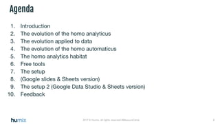
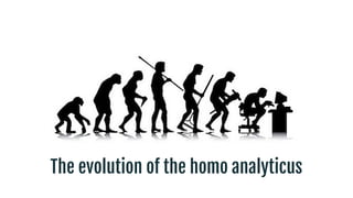
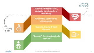
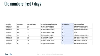
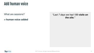
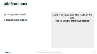
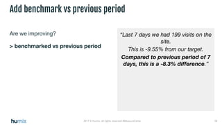
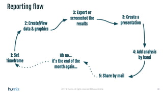
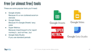
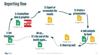
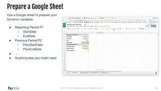
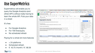
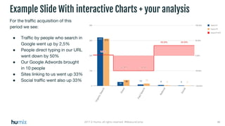
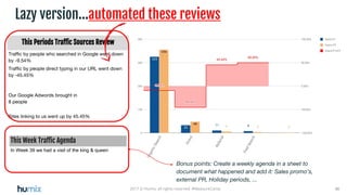
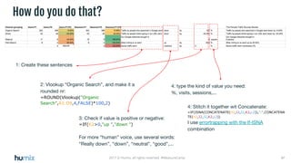
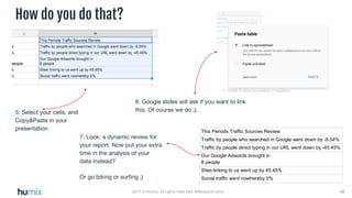
Automated reports
With Google Sheets/Slides/Data Studio
22017 © Humix, all rights reserved #MeasureCamp
Agenda
1. Introduction
2. The evolution of the homo analyticus
3. The evolution applied to data
4. The evolution of the homo automaticus
5. The homo analytics habitat
6. Free tools
7. The setup
8. (Google slides & Sheets version)
9. The setup 2 (Google Data Studio & Sheets version)
10. Feedback
Introduction
Yves Ferket
Humix.be Senior Analyst
I'm digital since ‘95
@Nodesktophero
yves.ferket.com
95 96 97 98 99 00 01 02 03 04 05 06 08 09 10 11 12 13 14 15
Organisation: Im@gic
Task: Freelance Webdesign
Organisation: Hogeschool Antwerpen
Task: Docent Computer Sciences
Organisation: Planet Internet
Task: Head DesignStudio
Organisation: Planet Internet
Task: Portal Manager
Organisation: Edge.be
Task: founder, creative director
Organisation: Telenet
Task: E-care Manager
Organisation: Sanoma Magazines
Task: Project manager - Consultant
Organisation: Nascom
Task: Freelance Business consultant
Organisation: UserPlus
Task: founder startup
16 17
Organisation: Humix + Shimano
Task: Freelance senior analyst
The evolution of the homo analyticus
72017 © Humix, all rights reserved #MeasureCamp
Must know!!
Looking
Back
Export & Create & Mail
Reports
“Look at” the reporting tools
together
Automated Dashboards ,
analysis, benchmarks +
forecasting
Looking
forward
Automated Dashboards
with analysis
The evolution applied to data
92017 © Humix, all rights reserved #MeasureCamp
the numbers: last 7 days
102017 © Humix, all rights reserved #MeasureCamp
the numbers: last 7 days
What are sessions?
Is this good?
Should it be better?
…
112017 © Humix, all rights reserved #MeasureCamp
What are sessions?
> human voice added
Add human voice
“Last 7 days we had 199 visits on
the site.”
122017 © Humix, all rights reserved #MeasureCamp
Is this good or bad?
> benchmark added
Add Benchmark
“Last 7 days we had 199 visits on the
site.
This is -9.55% from our target.”
132017 © Humix, all rights reserved #MeasureCamp
Are we improving?
> benchmarked vs previous period
Add benchmark vs previous period
“Last 7 days we had 199 visits on the
site.
This is -9.55% from our target.
Compared to previous period of 7
days, this is a -8.3% difference.”
142017 © Humix, all rights reserved #MeasureCamp
I’m more like a visual kind of
person….?
> Add big numbers
Make it more visual
152017 © Humix, all rights reserved #MeasureCamp
Is this last week or last 7 days?
> Add period
Make it clear so there’s no doubt
162017 © Humix, all rights reserved #MeasureCamp
I’m like a really visual person?
> Add Gauge
Make it really visual
172017 © Humix, all rights reserved #MeasureCamp
Did we have good or bad days?
> Add Sparkline
Add context
182017 © Humix, all rights reserved #MeasureCamp
Tell me again…what is this?
> Add explanation
Add context
192017 © Humix, all rights reserved #MeasureCamp
I see what you did there...
10 10
The evolution of the homo automaticus
212017 © Humix, all rights reserved #MeasureCamp
Telling stories with data
works better in custom
environments
222017 © Humix, all rights reserved
The IT departement has it’s own idea for your best tools...
…. if your IT departement is Penny Wise, Dollar stupid?
Bounce rate you say...it’s
that that thingy you
explained last week?
“We may have more
than one language...”
“We may have more
than one site...”
“Can
you do 2
weekly...”
“Drop
Italy &
France...”
“I want
segment
data +90
days...”
“Where
is my SEO
data...”
“Compare
to last
summer””
“Change
that to our
corporate
style”
“You always
run into a certain
level of
customisation”
The homo analytics habitat
“Are you an
export
>graphic
> cut & paste
> powerpoint
Report
Monkey?”
302017 © Humix, all rights reserved #MeasureCamp
Reporting flow
1: Set
Timeframe
2: Create/View
data & graphics
3: Create a
presentation
4: Add analysis
by hand
5: Share by mail
Oh no…
it’s the end of the
month again...
3: Export or
screenshot the
results
Free tools
322017 © Humix, all rights reserved #MeasureCamp
These are some popular tools you’ll need:
● Google sheets:
Because it’s a non cluttered excel on
steroids
● Google Slides:
Because it’s Google Sheets’ sexy
sister
● Super Metrics:
Because import/export is for report
monkey’s...and not free...but
● Google Data Studio:
If you use standard periods
Free (or almost free) tools
The setup
(Google slides & Sheets version)
342017 © Humix, all rights reserved #MeasureCamp
Reporting flow
1: Set
Timeframe
2: Create/View
data & graphics
3: Create a
presentation
4: Add analysis
by hand
5: Share by mail
Oh no…
it’s the end of the
month again...
3: Export or
screenshot the
results
352017 © Humix, all rights reserved #MeasureCamp
Use a Google sheet to prepare your
Dynamic variables:
● Reporting Period P1
○ StartDate
○ EndDate
● Previous Period P2
○ PrevStartDate
○ PrevEndDate
● …
● Anything else you might need
Prepare a Google Sheet
362017 © Humix, all rights reserved #MeasureCamp
Supermetrics will enable you to
query the Google Analytics (and
other) API’s without really having to
learn the whole API. Puts your data
in a sheet
It’s free:
● For Google Analytics
● For 100 lines/query
● No scheduled refresh
Paying for a whole lot more features
● + 24 platforms
● Scheduled refresh
● € 43.75 /month // € 88.39
Use SuperMetrics
372017 © Humix, all rights reserved #MeasureCamp
You can now pull your data in
Google Sheets through the
supermetrics Add-on
● Just select your GA account
● Build a query by selecting
○ Dates (just pick the
period you need, we’ll fix
this later)
○ Metrics (sessions,
users,...)
○ Dimensions (date/time,
segment,...)
● Get the data to the Table in a
sheet: GeneralSiteData-P1
Create your Query in Supermetrics
382017 © Humix, all rights reserved #MeasureCamp
Duplicate your Query for Previous Period P2
Now duplicate your query in
Supermetrics, and get the data to
the Table in a sheet:
GeneralSiteData-P2
Notice I created an extra sheet :
GeneralSiteData-Calcs.
This I will use to calculate
differences and create my chart
392017 © Humix, all rights reserved #MeasureCamp
Make your Dates Dynamic
Remember the start & end period in
our SheetVariables?
We will now use them to adapt our
queries to the periods we like, to
make this setup re-usable, for your
next reporting
Point the cells in the SuperMetrics
query for start & end date to the
variables for the P1 start & end date
in your variables sheet
402017 © Humix, all rights reserved #MeasureCamp
Refresh your Data
You can now refresh your queries by
selecting them, and pushing
refresh...
412017 © Humix, all rights reserved #MeasureCamp
The Data Calculation & Graph Sheets
Prepare the sheet
GeneralSiteData-Calcs , where you
will :
1. align your data:
a. The dates from P1
b. The values for P1
c. The values for P2
2. calculate differences
3. create graphs,using the
charting possibilities of Google
Sheets to create a graph that
tells a story with your data
...and this all without it being
overwritten by your dynamic data
from SuperMetrics
01
02
03
422017 © Humix, all rights reserved #MeasureCamp
Create a Google Slides presentation
You can now embed these charts in your
presentation
1. Insert Chart
2. From Google Slides
432017 © Humix, all rights reserved #MeasureCamp
Create a Google Slides presentation
You can now embed these charts in
your presentation. (Be sure to check
“link to spreadsheet”)
Export as PDF to create a snapshot
version of your presentation...or
copy the presentation to create a
new version...
442017 © Humix, all rights reserved #MeasureCamp
Create a Google Slides presentation
Every time you change your date
parameters in the Google Sheets
and refresh the queries in
SuperMetrics, the Google slides will
update with a click.
452017 © Humix, all rights reserved #MeasureCamp
For the traffic acquisition of this
period we see:
● Traffic by people who search in
Google went up by 2,5%
● People direct typing in our URL
went down by 50%
● Our Google Adwords brought
in 10 people
● Sites linking to us went up 33%
● Social traffic went also up 33%
Example Slide With interactive Charts + your analysis
462017 © Humix, all rights reserved #MeasureCamp
Lazy version...automated these reviews
This Periods Traffic Sources Review
Traffic by people who searched in Google went down
by -9.54%
Traffic by people direct typing in our URL went down
by -45.45%
Our Google Adwords brought in
8 people
Sites linking to us went up by 45.45%
This Week Traffic Agenda
In Week 39 we had a visit of the king & queen
Bonus points: Create a weekly agenda in a sheet to
document what happened and add it: Sales promo’s,
external PR, Holiday periods, ...
472017 © Humix, all rights reserved #MeasureCamp
1: Create these sentences
How do you do that?
2: Vlookup “Organic Search”, and make it a
rounded nr:
=ROUND(Vlookup("Organic
Search",A1:D9,4,FALSE)*100,2)
3: Check if value is positive or negative:
=IF(K2>0,"up ","down ")
For more “human” voice, use several words:
“Really down”, “down”, “neutral”, “good”,...
4: type the kind of value you need:
%, visits, sessions,...
4: Stitch it together wit Concatenate:
=IF(ISNA(CONCATENATE(H2,I2,J2,K2,L2)),"-",CONCATENA
TE(H2,I2,J2,K2,L2))
I use errortrapping with the If-ISNA
combination
482017 © Humix, all rights reserved #MeasureCamp
5: Select your cells, and
Copy&Paste in your
presentation
How do you do that?
6: Google slides will ask if you want to link
this. Of course we do ;).
This Periods Traffic Sources Review
Traffic by people who searched in Google went down by -9.54%
Traffic by people direct typing in our URL went down by -45.45%
Our Google Adwords brought in
8 people
Sites linking to us went up by 45.45%
Social traffic went nowhereby 0%
7: Look: a dynamic review for
your report. Now put your extra
time in the analysis of your
data instead?
Or go biking or surfing ;)
The setup 2
(Google Data Studio & Sheets version)
502017 © Humix, all rights reserved #MeasureCamp
Google Data Studio
Google Data Studio makes the job a
lot easier:
● You will create your visuals +
analysis in one tool
But….Google Data Studio has more
restrictions in
● Customization
● Auto refresh (use a chrome plugin)
But…Is changing every month (or faster)
Standard (limited) version of the
graph native in Google Data
Studio Enhanced version from the
Google sheet data, with an
automated (table graph) report

Automated reporting with With Google Sheets/Slides/Data Studio

  • 1.
    Automated reports With GoogleSheets/Slides/Data Studio
  • 2.
    22017 © Humix,all rights reserved #MeasureCamp Agenda 1. Introduction 2. The evolution of the homo analyticus 3. The evolution applied to data 4. The evolution of the homo automaticus 5. The homo analytics habitat 6. Free tools 7. The setup 8. (Google slides & Sheets version) 9. The setup 2 (Google Data Studio & Sheets version) 10. Feedback
  • 3.
  • 4.
    Yves Ferket Humix.be SeniorAnalyst I'm digital since ‘95 @Nodesktophero yves.ferket.com
  • 5.
    95 96 9798 99 00 01 02 03 04 05 06 08 09 10 11 12 13 14 15 Organisation: Im@gic Task: Freelance Webdesign Organisation: Hogeschool Antwerpen Task: Docent Computer Sciences Organisation: Planet Internet Task: Head DesignStudio Organisation: Planet Internet Task: Portal Manager Organisation: Edge.be Task: founder, creative director Organisation: Telenet Task: E-care Manager Organisation: Sanoma Magazines Task: Project manager - Consultant Organisation: Nascom Task: Freelance Business consultant Organisation: UserPlus Task: founder startup 16 17 Organisation: Humix + Shimano Task: Freelance senior analyst
  • 6.
    The evolution ofthe homo analyticus
  • 7.
    72017 © Humix,all rights reserved #MeasureCamp Must know!! Looking Back Export & Create & Mail Reports “Look at” the reporting tools together Automated Dashboards , analysis, benchmarks + forecasting Looking forward Automated Dashboards with analysis
  • 8.
  • 9.
    92017 © Humix,all rights reserved #MeasureCamp the numbers: last 7 days
  • 10.
    102017 © Humix,all rights reserved #MeasureCamp the numbers: last 7 days What are sessions? Is this good? Should it be better? …
  • 11.
    112017 © Humix,all rights reserved #MeasureCamp What are sessions? > human voice added Add human voice “Last 7 days we had 199 visits on the site.”
  • 12.
    122017 © Humix,all rights reserved #MeasureCamp Is this good or bad? > benchmark added Add Benchmark “Last 7 days we had 199 visits on the site. This is -9.55% from our target.”
  • 13.
    132017 © Humix,all rights reserved #MeasureCamp Are we improving? > benchmarked vs previous period Add benchmark vs previous period “Last 7 days we had 199 visits on the site. This is -9.55% from our target. Compared to previous period of 7 days, this is a -8.3% difference.”
  • 14.
    142017 © Humix,all rights reserved #MeasureCamp I’m more like a visual kind of person….? > Add big numbers Make it more visual
  • 15.
    152017 © Humix,all rights reserved #MeasureCamp Is this last week or last 7 days? > Add period Make it clear so there’s no doubt
  • 16.
    162017 © Humix,all rights reserved #MeasureCamp I’m like a really visual person? > Add Gauge Make it really visual
  • 17.
    172017 © Humix,all rights reserved #MeasureCamp Did we have good or bad days? > Add Sparkline Add context
  • 18.
    182017 © Humix,all rights reserved #MeasureCamp Tell me again…what is this? > Add explanation Add context
  • 19.
    192017 © Humix,all rights reserved #MeasureCamp I see what you did there... 10 10
  • 20.
    The evolution ofthe homo automaticus
  • 21.
    212017 © Humix,all rights reserved #MeasureCamp Telling stories with data works better in custom environments
  • 22.
    222017 © Humix,all rights reserved The IT departement has it’s own idea for your best tools... …. if your IT departement is Penny Wise, Dollar stupid?
  • 23.
    Bounce rate yousay...it’s that that thingy you explained last week?
  • 24.
    “We may havemore than one language...”
  • 25.
    “We may havemore than one site...”
  • 26.
    “Can you do 2 weekly...” “Drop Italy& France...” “I want segment data +90 days...” “Where is my SEO data...” “Compare to last summer”” “Change that to our corporate style”
  • 27.
    “You always run intoa certain level of customisation”
  • 28.
  • 29.
    “Are you an export >graphic >cut & paste > powerpoint Report Monkey?”
  • 30.
    302017 © Humix,all rights reserved #MeasureCamp Reporting flow 1: Set Timeframe 2: Create/View data & graphics 3: Create a presentation 4: Add analysis by hand 5: Share by mail Oh no… it’s the end of the month again... 3: Export or screenshot the results
  • 31.
  • 32.
    322017 © Humix,all rights reserved #MeasureCamp These are some popular tools you’ll need: ● Google sheets: Because it’s a non cluttered excel on steroids ● Google Slides: Because it’s Google Sheets’ sexy sister ● Super Metrics: Because import/export is for report monkey’s...and not free...but ● Google Data Studio: If you use standard periods Free (or almost free) tools
  • 33.
    The setup (Google slides& Sheets version)
  • 34.
    342017 © Humix,all rights reserved #MeasureCamp Reporting flow 1: Set Timeframe 2: Create/View data & graphics 3: Create a presentation 4: Add analysis by hand 5: Share by mail Oh no… it’s the end of the month again... 3: Export or screenshot the results
  • 35.
    352017 © Humix,all rights reserved #MeasureCamp Use a Google sheet to prepare your Dynamic variables: ● Reporting Period P1 ○ StartDate ○ EndDate ● Previous Period P2 ○ PrevStartDate ○ PrevEndDate ● … ● Anything else you might need Prepare a Google Sheet
  • 36.
    362017 © Humix,all rights reserved #MeasureCamp Supermetrics will enable you to query the Google Analytics (and other) API’s without really having to learn the whole API. Puts your data in a sheet It’s free: ● For Google Analytics ● For 100 lines/query ● No scheduled refresh Paying for a whole lot more features ● + 24 platforms ● Scheduled refresh ● € 43.75 /month // € 88.39 Use SuperMetrics
  • 37.
    372017 © Humix,all rights reserved #MeasureCamp You can now pull your data in Google Sheets through the supermetrics Add-on ● Just select your GA account ● Build a query by selecting ○ Dates (just pick the period you need, we’ll fix this later) ○ Metrics (sessions, users,...) ○ Dimensions (date/time, segment,...) ● Get the data to the Table in a sheet: GeneralSiteData-P1 Create your Query in Supermetrics
  • 38.
    382017 © Humix,all rights reserved #MeasureCamp Duplicate your Query for Previous Period P2 Now duplicate your query in Supermetrics, and get the data to the Table in a sheet: GeneralSiteData-P2 Notice I created an extra sheet : GeneralSiteData-Calcs. This I will use to calculate differences and create my chart
  • 39.
    392017 © Humix,all rights reserved #MeasureCamp Make your Dates Dynamic Remember the start & end period in our SheetVariables? We will now use them to adapt our queries to the periods we like, to make this setup re-usable, for your next reporting Point the cells in the SuperMetrics query for start & end date to the variables for the P1 start & end date in your variables sheet
  • 40.
    402017 © Humix,all rights reserved #MeasureCamp Refresh your Data You can now refresh your queries by selecting them, and pushing refresh...
  • 41.
    412017 © Humix,all rights reserved #MeasureCamp The Data Calculation & Graph Sheets Prepare the sheet GeneralSiteData-Calcs , where you will : 1. align your data: a. The dates from P1 b. The values for P1 c. The values for P2 2. calculate differences 3. create graphs,using the charting possibilities of Google Sheets to create a graph that tells a story with your data ...and this all without it being overwritten by your dynamic data from SuperMetrics 01 02 03
  • 42.
    422017 © Humix,all rights reserved #MeasureCamp Create a Google Slides presentation You can now embed these charts in your presentation 1. Insert Chart 2. From Google Slides
  • 43.
    432017 © Humix,all rights reserved #MeasureCamp Create a Google Slides presentation You can now embed these charts in your presentation. (Be sure to check “link to spreadsheet”) Export as PDF to create a snapshot version of your presentation...or copy the presentation to create a new version...
  • 44.
    442017 © Humix,all rights reserved #MeasureCamp Create a Google Slides presentation Every time you change your date parameters in the Google Sheets and refresh the queries in SuperMetrics, the Google slides will update with a click.
  • 45.
    452017 © Humix,all rights reserved #MeasureCamp For the traffic acquisition of this period we see: ● Traffic by people who search in Google went up by 2,5% ● People direct typing in our URL went down by 50% ● Our Google Adwords brought in 10 people ● Sites linking to us went up 33% ● Social traffic went also up 33% Example Slide With interactive Charts + your analysis
  • 46.
    462017 © Humix,all rights reserved #MeasureCamp Lazy version...automated these reviews This Periods Traffic Sources Review Traffic by people who searched in Google went down by -9.54% Traffic by people direct typing in our URL went down by -45.45% Our Google Adwords brought in 8 people Sites linking to us went up by 45.45% This Week Traffic Agenda In Week 39 we had a visit of the king & queen Bonus points: Create a weekly agenda in a sheet to document what happened and add it: Sales promo’s, external PR, Holiday periods, ...
  • 47.
    472017 © Humix,all rights reserved #MeasureCamp 1: Create these sentences How do you do that? 2: Vlookup “Organic Search”, and make it a rounded nr: =ROUND(Vlookup("Organic Search",A1:D9,4,FALSE)*100,2) 3: Check if value is positive or negative: =IF(K2>0,"up ","down ") For more “human” voice, use several words: “Really down”, “down”, “neutral”, “good”,... 4: type the kind of value you need: %, visits, sessions,... 4: Stitch it together wit Concatenate: =IF(ISNA(CONCATENATE(H2,I2,J2,K2,L2)),"-",CONCATENA TE(H2,I2,J2,K2,L2)) I use errortrapping with the If-ISNA combination
  • 48.
    482017 © Humix,all rights reserved #MeasureCamp 5: Select your cells, and Copy&Paste in your presentation How do you do that? 6: Google slides will ask if you want to link this. Of course we do ;). This Periods Traffic Sources Review Traffic by people who searched in Google went down by -9.54% Traffic by people direct typing in our URL went down by -45.45% Our Google Adwords brought in 8 people Sites linking to us went up by 45.45% Social traffic went nowhereby 0% 7: Look: a dynamic review for your report. Now put your extra time in the analysis of your data instead? Or go biking or surfing ;)
  • 49.
    The setup 2 (GoogleData Studio & Sheets version)
  • 50.
    502017 © Humix,all rights reserved #MeasureCamp Google Data Studio Google Data Studio makes the job a lot easier: ● You will create your visuals + analysis in one tool But….Google Data Studio has more restrictions in ● Customization ● Auto refresh (use a chrome plugin) But…Is changing every month (or faster) Standard (limited) version of the graph native in Google Data Studio Enhanced version from the Google sheet data, with an automated (table graph) report