


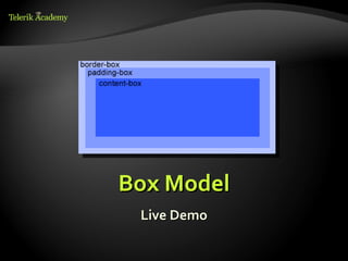
![Attribute Selectors
E[foo^="bar"]
An E element whose "foo" attribute value
begins exactly with the string "bar"
Example: a[src^="https://"]
E[foo$="bar"]
An E element whose "foo" attribute value ends
exactly with the string "bar"
E[foo*="bar"]
An E element whose "foo" attribute value
contains the substring "bar"
6](https://image.slidesharecdn.com/8-css-3-120524085340-phpapp01/85/CSS-3-6-320.jpg)


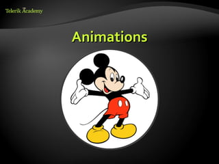
![Border radius
Allows web developers to easily utilize rounder
corners in their design elements
Widespread browser support
Syntax:
border-*-*-radius: [<length>|<%>][<length>|<%>]?
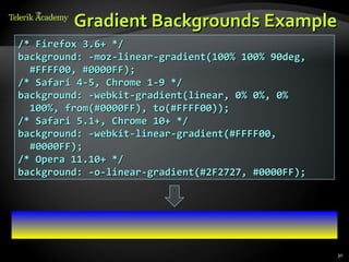
Example:
-moz-border-radius: 15px;
border-radius: 15px;
background-color: #FF00FF;
35](https://image.slidesharecdn.com/8-css-3-120524085340-phpapp01/85/CSS-3-35-320.jpg)


CSS 3 is the most recent iteration of Cascading Style Sheets. It is divided into modules and supports new selectors, properties for animation, transitions, transforms, and flexible box layout. Many CSS 3 features are already supported in modern browsers even though CSS 3 has not been fully approved as a specification.


![[Worskhop Summits] CSS3 Workshop](https://cdn.slidesharecdn.com/ss_thumbnails/schmitt-css3-v4-100114155033-phpapp02-thumbnail.jpg?width=640&height=640&fit=bounds)

![[WebVisions 2010] CSS3 Workshop (Afternoon)](https://cdn.slidesharecdn.com/ss_thumbnails/2010-webvisions-css3-100521114422-phpapp01-thumbnail.jpg?width=640&height=640&fit=bounds)
![[heweb11] CSS3 Makeover](https://cdn.slidesharecdn.com/ss_thumbnails/css3-makeover-111027113114-phpapp01-thumbnail.jpg?width=640&height=640&fit=bounds)