The document provides an overview of CSS3 as it relates to the Microsoft certification exam 70-480, detailing various selectors, properties, and methods for styling elements. It covers selectors such as element, class, and id selectors, as well as combinators and pseudo-classes, in addition to properties for color, text, and layout management like flexbox and grid. The document also explains advanced techniques like animations, transitions, and handling visibility, with references to learning resources.
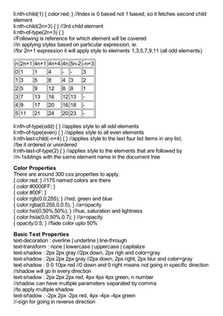
![Articles from Jinal Desai .NET
Exam 70-480 CSS3
2013-01-19 14:01:28 Jinal Desai
The article is targeted for Microsoft Certification exam 70-480, the CSS3 described
in the article is limited to the exam point of view only.
Selectors
Element Selector: li { color: red; }
Class Selector: .fancyClass { color: red; }
Universal Selector: *.fancyClass { color: red; }
Combination of element selector and class selector to limit the scope: div
.fancyClass { color:red; }
Identifier Selector: #contactForm { color:blude; }
Attribute Selector []:
*[data-author] { color:red; } <div data-author></div>
*[data-author=”Dan Brown”]{ } <div data-author="Dan Brown"></div>
*[data-author*=Brown]{ }
<div data-author="Dan Brown"></div>
//*=contains
*[data-author^=Dan]{ }
<div data-author="Dan Brown"></div>
//^=starts with
*[data-author$=Brown]{ }
<div data-author="Dan Brown"></div>
//$=ends with
Selector Chaining
table, ul { color:red; } //all tabl and ul elements
div table, div ul { color:red; } //all table and ul elements which are inside div
Pseudo Element Selectors
p::first-letter { color:red; } //Apply style to first character of every paragraph
p::first-line { color:red; } //Apply style to first line of every paragraph
p:hover { color:red; } //Apply style when hover on every paragraph
Combinators
Combinators are simple selectors in your css, which when combined it targets to
group or individual elements.
#Div1 div { } //All the divs inside div with id Div1
#Div1 p { } //All the paragraphs inside div with id Div1
#Div1 > p { } //All the immediate paragraphs inside the div with id Div1
#Div1 ~ p { } //All the sibling paragraphs to the div with id Div1
ul + div { } //Immediate succeeding div siblings of all ul
Pseudo Classes
li:first-child { color:red; }](https://image.slidesharecdn.com/exam70-480css3atjinaldesai-net-130119085035-phpapp01/85/Exam-70-480-CSS3-at-Jinal-Desai-NET-1-320.jpg)
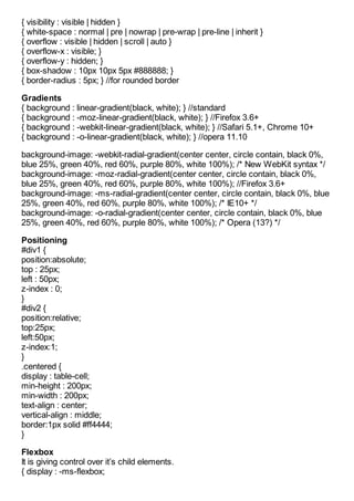
![Articles from Jinal Desai .NET
Exam 70-480 CSS3
2013-01-19 14:01:28 Jinal Desai
The article is targeted for Microsoft Certification exam 70-480, the CSS3 described
in the article is limited to the exam point of view only.
Selectors
Element Selector: li { color: red; }
Class Selector: .fancyClass { color: red; }
Universal Selector: *.fancyClass { color: red; }
Combination of element selector and class selector to limit the scope: div
.fancyClass { color:red; }
Identifier Selector: #contactForm { color:blude; }
Attribute Selector []:
*[data-author] { color:red; } <div data-author></div>
*[data-author=”Dan Brown”]{ } <div data-author="Dan Brown"></div>
*[data-author*=Brown]{ }
<div data-author="Dan Brown"></div>
//*=contains
*[data-author^=Dan]{ }
<div data-author="Dan Brown"></div>
//^=starts with
*[data-author$=Brown]{ }
<div data-author="Dan Brown"></div>
//$=ends with
Selector Chaining
table, ul { color:red; } //all tabl and ul elements
div table, div ul { color:red; } //all table and ul elements which are inside div
Pseudo Element Selectors
p::first-letter { color:red; } //Apply style to first character of every paragraph
p::first-line { color:red; } //Apply style to first line of every paragraph
p:hover { color:red; } //Apply style when hover on every paragraph
Combinators
Combinators are simple selectors in your css, which when combined it targets to
group or individual elements.
#Div1 div { } //All the divs inside div with id Div1
#Div1 p { } //All the paragraphs inside div with id Div1
#Div1 > p { } //All the immediate paragraphs inside the div with id Div1
#Div1 ~ p { } //All the sibling paragraphs to the div with id Div1
ul + div { } //Immediate succeeding div siblings of all ul
Pseudo Classes
li:first-child { color:red; }](https://image.slidesharecdn.com/exam70-480css3atjinaldesai-net-130119085035-phpapp01/75/Exam-70-480-CSS3-at-Jinal-Desai-NET-1-2048.jpg)


