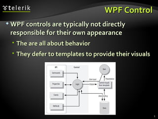
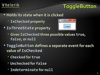
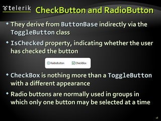
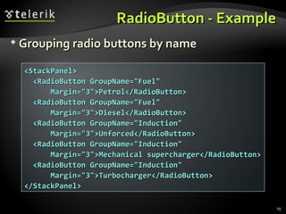
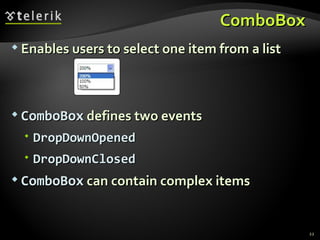
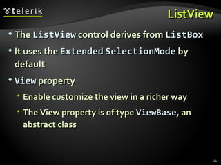
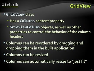
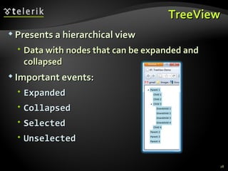
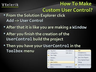
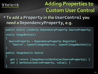
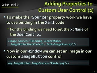
WPF Controls Basic WPF Controls Doncho Minkov Telerik School Academy schoolacademy.telerik.com   Technical Trainer http://www.minkov.it
Table of Contents WPF Controls Text controls Buttons List controls GroupBox  and  Expander Menus Toolbars
Table of Contents Other controls Slider  and  S croll  controls ProgressBar ToolTip Custom User Controls
WPF Controls
WPF Control WPF controls are typically not directly responsible for their own appearance The are all about behavior They defer to templates to provide their visuals
WPF Controls (2) Controls may use commands to represent supported operations Controls offer properties to provide a means of modifying either behavior Controls raise events when something important happens WPF provides a range of built-in controls Most of these correspond to standard Windows control types
Text  C ontrols
Label The purpose of the  Label  control is to provide a place to put a caption with an access key How does the  Label  know to which control it should redirect its access key? Target  property, indicating the intended target of the access key In the absence of this property, the  Label  control does nothing useful
Label Live Demo
TextBox
TextBox TextBox  is control for editing and displaying text By setting  AcceptsReturn  to true, it can edit multiple lines <TextBox Margin=&quot;5&quot; VerticalAlignment=&quot;Center&quot; Text=&quot;Single line textbox&quot; /> <TextBox AcceptsReturn=&quot;True&quot; Margin=&quot;5&quot; Height=&quot;50 VerticalScrollBarVisibility=&quot;Visible&quot; VerticalAlignment=&quot;Center&quot; Text=&quot;Multiline textbox&quot; /> <!--The result is-->
RichTextBox RichTextBox  supports all of the commands defined by the  EditingCommands  class R ecognize   the  RTF  format Paste formatted text from Internet Explorer and Word Both  TextBox  and  RichTextBox  offer built-in spellchecking SpellCheck.IsEnabled  attached property
RichTextBox Live Demo
Buttons
Button s Buttons are controls that a user can click An  XAML  attribute specifies the handler for the  Click  event Buttons derive from the common  ButtonBase  base class <Button Click=&quot;ButtonClicked&quot;>Click</Button> void ButtonClicked(object sender, RoutedEventArgs e) { MessageBox.Show(&quot;Button was clicked&quot;); } ButtonsWindow.xaml ButtonsWindow.xaml.cs
ToggleButton Holds its state when it is clicked IsChecked  property IsThreeState  property G ives  IsChecked  three possible values  true ,  false , or  null ToggleButton  defines a separate event for each  value of  IsChecked Checked  for  true Unchecked  for  false Indeterminate  for  null
ToggleButton Live Demo
CheckButton  and  RadioButton  They derive from  ButtonBase   indirectly via the  ToggleButton  class IsChecked  property, indicating whether the user has checked the button CheckBox  is nothing more than a  ToggleButton  with a different appearance Radio buttons are normally used in groups in which only one button may be selected  at a time
RadioButton  - Example Grouping radio buttons by name <StackPanel> <RadioButton GroupName=&quot;Fuel&quot; Margin=&quot;3&quot;>Petrol</RadioButton> <RadioButton GroupName=&quot;Fuel&quot; Margin=&quot;3&quot;>Diesel</RadioButton> <RadioButton GroupName=&quot;Induction&quot; Margin=&quot;3&quot;>Unforced</RadioButton> <RadioButton GroupName=&quot;Induction&quot; Margin=&quot;3&quot;>Mechanical supercharger</RadioButton> <RadioButton GroupName=&quot;Induction&quot; Margin=&quot;3&quot;>Turbocharger</RadioButton> </StackPanel>
RadioButton Live Demo
List  C ontrols
ComboBox  Enables users to select one item from a list ComboBox  defines two events DropDownOpened DropDownClosed ComboBox  can contain complex items
ComboBox Live Demo
ListView The  ListView  control derives from  ListBox It uses the  Extended   SelectionMode  by default View  property E nable  customize the view in a richer way The View property is of type  ViewBase , an abstract class
GridView GridView  class Has a  Columns  content property GridViewColumn  objects, as well as other properties to control the behavior of the  column headers Columns can be reordered by dragging and dropping them in the built application Columns can be resized Columns can automatically resize to &quot;just fit&quot;
ListView  and  GridView Live Demo
TreeView
TreeView Presents a hierarchical view Data with nodes that can be expanded and collapsed Important events: Expanded Collapsed Selected Unselected
TreeView Live Demo
GroupBox  and Expander
GroupBox  and Expander Both provide a container for arbitrary content and a place for a header on top Expander  can be expanded and collapsed GroupBox  always shows its content Both controls derive from  HeaderedContentControl We can place whatever content we like directly inside the control
GroupBox  and Expander Live Demo
Menus
Menu Menu  simply stacks its items horizontally <Menu Height=&quot;23&quot; VerticalAlignment=&quot;Top&quot; > <MenuItem Header=&quot;_File&quot;> <MenuItem Header=&quot;_New...&quot;/> <MenuItem Header=&quot;_Open...&quot;/> <Separator/> <MenuItem Header=&quot;Sen_d To&quot;> <MenuItem Header=&quot;Mail Recipient&quot;/> <MenuItem Header=&quot;My Documents&quot;/> </MenuItem> </MenuItem> <!--(the example continues)-->
Menu  (2) <MenuItem Header=&quot;_Edit&quot;> … </MenuItem> <MenuItem Header=&quot;_View&quot;> … </MenuItem> </Menu>  <!--  The result is  -->
MenuItem MenuItem  is a  headered  items control The  Header  is actually the main object MenuItem  contains many properties for customizing Icon IsCheckable InputGestureText Can handle events or  assign a command to  MenuItem ’s   Command  property
Menus Live Demo
ContextMenu Works just like  Menu It’s a simple container designed to hold  MenuItems  and  Separators Must attach it to a control via  ContextMenu  property When a user right-clicks on the control the context menu is displayed <ListBox> <ListBox.ContextMenu> <ContextMenu> … </ContextMenu> </ListBox.ContextMenu> … </ListBox>
Toolbars
Toolbars Toolbars provide faster access for frequently used operations WPF supports toolbars through the  ToolBarTray  and  ToolBar  controls StatusBar  behaves just like  Menu It’s typically used along the bottom of a  Window
Toolbars Live Demo
Other  C ontrols
Slider and Scroll Controls Allow a value to be selected from a range  They show a track, indicating the range and a  draggable  &quot;thumb&quot; The  ScrollBar  control is commonly used in conjunction with some scrolling viewable area Control the size of a scroll bar’s thumb with the  ViewportSize  property
Slider and Scroll Controls  (2) Slider  control is used to adjust values Slider  and  ScrollBar   have an  Orientation   property They both derive from a  common base class,  RangeBase Provides  Minimum  and  Maximum ,  SmallChange  and  LargeChange   properties
ProgressBar H elps  user  realize that  progress is indeed being made ProgressBar  has a default  Minimum  of 0 and a default  Maximum  of 100 IsIndeterminate   property True  -  ProgressBar  shows a generic animation Orientation  property Horizontal  by default
ToolTip Allows a floating label to be displayed above some part of the  user interface To associate a  ToolTip  with its target element set it as the  ToolTip  property of its  target <TextBox Width=&quot;147&quot; Height=&quot;25&quot;> <TextBox.ToolTip> <ToolTip Content=&quot;Type something here&quot; /> </TextBox.ToolTip>  <!--The result is--> </TextBox>
Creating Custom User Controls
How To Make  Custom User Control? From the Solution Explorer click  Add  –>  User Control After that it is like you are making a  Window After you finish the creation of the  UserControl   build the project Then you have your  UserControl   in the  Toolbox  menu
Adding Properties to  Custom User Control To add a  Property  in the  UserControl   you need a  DependencyProperty , e.g. public static readonly DependencyProperty SourceProperty; static ImageButton() { SourceProperty = DependencyProperty.Register( &quot;Source&quot;, typeof(ImageSource), typeof(ImageButton))); } public ImageSource Source { get { return (ImageSource)GetValue(SourceProperty); } set { SetValue(SourceProperty, value); } }
Adding Properties to  Custom User Control (2) To make the &quot; Source &quot; property work we have to use binding in the  Xaml   code For the binding we need to set the  x:Name   of the  UserControl Now in our  Window  we can set an image in our custom  ImageButton  control <Image Source=&quot;{Binding  ElementName= ImageButtonUserControl ,  Path=ImageSource }&quot;/> < my:ImageButton   ImageSource =&quot;Panda.png&quot;/>
Custom User Controls Live Demo
WPF Controls Questions?
Exercises Write a program that show the simple window with one  Tex t Box . Add text to the  Tex t Box.  If you select some text in the  TextBox   – display the current selection information. Write a program with a  Button  and a  Label . The label should show the number of clicks on the button. Write a program that visualize which one of the items collection are checked. Write a program that shows a  ComboBox  with various elements added to its Items. For example – add text, ellipse and picture.
Exercises (2) Write a program that  shows   ListView  with   columns that contain controls such as checkboxes and text boxes. The name of the columns are ID, Enabled, Value. Write a text editing user control that is like simple WordPad. It should have at least a  TextWrap  property,  Scrollbar ,  Buttons   for Save and Load,  ComboBoxes   for choosing  FontFamily   and  FontSize .
Exercises (3) Implement a specialized editor of text document libraries. A library is a number of text documents, organized as a tree in folders. In a folder there can be documents and other folders (as in Windows). Every document is some text with formatting. The editor must be able to create libraries, to open/save libraries, to read/write libraries from/to XML files. When a library is open the editor can edit the documents inside (changing the text and the formatting) and can create/delete/rename folders and documents. Use a  TreeView  for the folder tree and  RichTextBox  for the active document.
Exercises (4) The editor should have a  main menu, 2  context  menus (for  the folder tree and for the active document area), 3 tool bars (to open/save a library, to facilitate working with the folder tree and one for the active document), a status bar and appropriate shortcuts for the most frequently used

WPF Controls

  • 1.
    WPF Controls BasicWPF Controls Doncho Minkov Telerik School Academy schoolacademy.telerik.com Technical Trainer http://www.minkov.it
  • 2.
    Table of ContentsWPF Controls Text controls Buttons List controls GroupBox and Expander Menus Toolbars
  • 3.
    Table of ContentsOther controls Slider and S croll controls ProgressBar ToolTip Custom User Controls
  • 4.
  • 5.
    WPF Control WPFcontrols are typically not directly responsible for their own appearance The are all about behavior They defer to templates to provide their visuals
  • 6.
    WPF Controls (2)Controls may use commands to represent supported operations Controls offer properties to provide a means of modifying either behavior Controls raise events when something important happens WPF provides a range of built-in controls Most of these correspond to standard Windows control types
  • 7.
    Text Controls
  • 8.
    Label The purposeof the Label control is to provide a place to put a caption with an access key How does the Label know to which control it should redirect its access key? Target property, indicating the intended target of the access key In the absence of this property, the Label control does nothing useful
  • 9.
  • 10.
  • 11.
    TextBox TextBox is control for editing and displaying text By setting AcceptsReturn to true, it can edit multiple lines <TextBox Margin=&quot;5&quot; VerticalAlignment=&quot;Center&quot; Text=&quot;Single line textbox&quot; /> <TextBox AcceptsReturn=&quot;True&quot; Margin=&quot;5&quot; Height=&quot;50 VerticalScrollBarVisibility=&quot;Visible&quot; VerticalAlignment=&quot;Center&quot; Text=&quot;Multiline textbox&quot; /> <!--The result is-->
  • 12.
    RichTextBox RichTextBox supports all of the commands defined by the EditingCommands class R ecognize the RTF format Paste formatted text from Internet Explorer and Word Both TextBox and RichTextBox offer built-in spellchecking SpellCheck.IsEnabled attached property
  • 13.
  • 14.
  • 15.
    Button s Buttonsare controls that a user can click An XAML attribute specifies the handler for the Click event Buttons derive from the common ButtonBase base class <Button Click=&quot;ButtonClicked&quot;>Click</Button> void ButtonClicked(object sender, RoutedEventArgs e) { MessageBox.Show(&quot;Button was clicked&quot;); } ButtonsWindow.xaml ButtonsWindow.xaml.cs
  • 16.
    ToggleButton Holds itsstate when it is clicked IsChecked property IsThreeState property G ives IsChecked three possible values true , false , or null ToggleButton defines a separate event for each value of IsChecked Checked for true Unchecked for false Indeterminate for null
  • 17.
  • 18.
    CheckButton and RadioButton They derive from ButtonBase indirectly via the ToggleButton class IsChecked property, indicating whether the user has checked the button CheckBox is nothing more than a ToggleButton with a different appearance Radio buttons are normally used in groups in which only one button may be selected at a time
  • 19.
    RadioButton -Example Grouping radio buttons by name <StackPanel> <RadioButton GroupName=&quot;Fuel&quot; Margin=&quot;3&quot;>Petrol</RadioButton> <RadioButton GroupName=&quot;Fuel&quot; Margin=&quot;3&quot;>Diesel</RadioButton> <RadioButton GroupName=&quot;Induction&quot; Margin=&quot;3&quot;>Unforced</RadioButton> <RadioButton GroupName=&quot;Induction&quot; Margin=&quot;3&quot;>Mechanical supercharger</RadioButton> <RadioButton GroupName=&quot;Induction&quot; Margin=&quot;3&quot;>Turbocharger</RadioButton> </StackPanel>
  • 20.
  • 21.
    List Controls
  • 22.
    ComboBox Enablesusers to select one item from a list ComboBox defines two events DropDownOpened DropDownClosed ComboBox can contain complex items
  • 23.
  • 24.
    ListView The ListView control derives from ListBox It uses the Extended SelectionMode by default View property E nable customize the view in a richer way The View property is of type ViewBase , an abstract class
  • 25.
    GridView GridView class Has a Columns content property GridViewColumn objects, as well as other properties to control the behavior of the column headers Columns can be reordered by dragging and dropping them in the built application Columns can be resized Columns can automatically resize to &quot;just fit&quot;
  • 26.
    ListView and GridView Live Demo
  • 27.
  • 28.
    TreeView Presents ahierarchical view Data with nodes that can be expanded and collapsed Important events: Expanded Collapsed Selected Unselected
  • 29.
  • 30.
    GroupBox andExpander
  • 31.
    GroupBox andExpander Both provide a container for arbitrary content and a place for a header on top Expander can be expanded and collapsed GroupBox always shows its content Both controls derive from HeaderedContentControl We can place whatever content we like directly inside the control
  • 32.
    GroupBox andExpander Live Demo
  • 33.
  • 34.
    Menu Menu simply stacks its items horizontally <Menu Height=&quot;23&quot; VerticalAlignment=&quot;Top&quot; > <MenuItem Header=&quot;_File&quot;> <MenuItem Header=&quot;_New...&quot;/> <MenuItem Header=&quot;_Open...&quot;/> <Separator/> <MenuItem Header=&quot;Sen_d To&quot;> <MenuItem Header=&quot;Mail Recipient&quot;/> <MenuItem Header=&quot;My Documents&quot;/> </MenuItem> </MenuItem> <!--(the example continues)-->
  • 35.
    Menu (2)<MenuItem Header=&quot;_Edit&quot;> … </MenuItem> <MenuItem Header=&quot;_View&quot;> … </MenuItem> </Menu> <!-- The result is -->
  • 36.
    MenuItem MenuItem is a headered items control The Header is actually the main object MenuItem contains many properties for customizing Icon IsCheckable InputGestureText Can handle events or assign a command to MenuItem ’s Command property
  • 37.
  • 38.
    ContextMenu Works justlike Menu It’s a simple container designed to hold MenuItems and Separators Must attach it to a control via ContextMenu property When a user right-clicks on the control the context menu is displayed <ListBox> <ListBox.ContextMenu> <ContextMenu> … </ContextMenu> </ListBox.ContextMenu> … </ListBox>
  • 39.
  • 40.
    Toolbars Toolbars providefaster access for frequently used operations WPF supports toolbars through the ToolBarTray and ToolBar controls StatusBar behaves just like Menu It’s typically used along the bottom of a Window
  • 41.
  • 42.
    Other Controls
  • 43.
    Slider and ScrollControls Allow a value to be selected from a range They show a track, indicating the range and a draggable &quot;thumb&quot; The ScrollBar control is commonly used in conjunction with some scrolling viewable area Control the size of a scroll bar’s thumb with the ViewportSize property
  • 44.
    Slider and ScrollControls (2) Slider control is used to adjust values Slider and ScrollBar have an Orientation property They both derive from a common base class, RangeBase Provides Minimum and Maximum , SmallChange and LargeChange properties
  • 45.
    ProgressBar H elps user realize that progress is indeed being made ProgressBar has a default Minimum of 0 and a default Maximum of 100 IsIndeterminate property True - ProgressBar shows a generic animation Orientation property Horizontal by default
  • 46.
    ToolTip Allows afloating label to be displayed above some part of the user interface To associate a ToolTip with its target element set it as the ToolTip property of its target <TextBox Width=&quot;147&quot; Height=&quot;25&quot;> <TextBox.ToolTip> <ToolTip Content=&quot;Type something here&quot; /> </TextBox.ToolTip> <!--The result is--> </TextBox>
  • 47.
  • 48.
    How To Make Custom User Control? From the Solution Explorer click Add –> User Control After that it is like you are making a Window After you finish the creation of the UserControl build the project Then you have your UserControl in the Toolbox menu
  • 49.
    Adding Properties to Custom User Control To add a Property in the UserControl you need a DependencyProperty , e.g. public static readonly DependencyProperty SourceProperty; static ImageButton() { SourceProperty = DependencyProperty.Register( &quot;Source&quot;, typeof(ImageSource), typeof(ImageButton))); } public ImageSource Source { get { return (ImageSource)GetValue(SourceProperty); } set { SetValue(SourceProperty, value); } }
  • 50.
    Adding Properties to Custom User Control (2) To make the &quot; Source &quot; property work we have to use binding in the Xaml code For the binding we need to set the x:Name of the UserControl Now in our Window we can set an image in our custom ImageButton control <Image Source=&quot;{Binding ElementName= ImageButtonUserControl , Path=ImageSource }&quot;/> < my:ImageButton ImageSource =&quot;Panda.png&quot;/>
  • 51.
  • 52.
  • 53.
    Exercises Write aprogram that show the simple window with one Tex t Box . Add text to the Tex t Box. If you select some text in the TextBox – display the current selection information. Write a program with a Button and a Label . The label should show the number of clicks on the button. Write a program that visualize which one of the items collection are checked. Write a program that shows a ComboBox with various elements added to its Items. For example – add text, ellipse and picture.
  • 54.
    Exercises (2) Writea program that shows ListView with columns that contain controls such as checkboxes and text boxes. The name of the columns are ID, Enabled, Value. Write a text editing user control that is like simple WordPad. It should have at least a TextWrap property, Scrollbar , Buttons for Save and Load, ComboBoxes for choosing FontFamily and FontSize .
  • 55.
    Exercises (3) Implementa specialized editor of text document libraries. A library is a number of text documents, organized as a tree in folders. In a folder there can be documents and other folders (as in Windows). Every document is some text with formatting. The editor must be able to create libraries, to open/save libraries, to read/write libraries from/to XML files. When a library is open the editor can edit the documents inside (changing the text and the formatting) and can create/delete/rename folders and documents. Use a TreeView for the folder tree and RichTextBox for the active document.
  • 56.
    Exercises (4) Theeditor should have a main menu, 2 context menus (for the folder tree and for the active document area), 3 tool bars (to open/save a library, to facilitate working with the folder tree and one for the active document), a status bar and appropriate shortcuts for the most frequently used

Editor's Notes

  • #2 * 02/25/12 07/16/96 (c) 2005 National Academy for Software Development - http://academy.devbg.org. All rights reserved. Unauthorized copying or re-distribution is strictly prohibited.* ##
  • #3 * 02/25/12 07/16/96 (c) 2005 National Academy for Software Development - http://academy.devbg.org. All rights reserved. Unauthorized copying or re-distribution is strictly prohibited.* ##
  • #4 * 02/25/12 07/16/96 (c) 2005 National Academy for Software Development - http://academy.devbg.org. All rights reserved. Unauthorized copying or re-distribution is strictly prohibited.* ##
  • #5 * 02/25/12 07/16/96 (c) 2005 National Academy for Software Development - http://academy.devbg.org. All rights reserved. Unauthorized copying or re-distribution is strictly prohibited.* ##
  • #8 * 02/25/12 07/16/96 (c) 2005 National Academy for Software Development - http://academy.devbg.org. All rights reserved. Unauthorized copying or re-distribution is strictly prohibited.* ##
  • #10 * 02/25/12 07/16/96 (c) 2005 National Academy for Software Development - http://academy.devbg.org. All rights reserved. Unauthorized copying or re-distribution is strictly prohibited.* ##
  • #11 * 02/25/12 07/16/96 (c) 2005 National Academy for Software Development - http://academy.devbg.org. All rights reserved. Unauthorized copying or re-distribution is strictly prohibited.* ##
  • #14 * 02/25/12 07/16/96 (c) 2005 National Academy for Software Development - http://academy.devbg.org. All rights reserved. Unauthorized copying or re-distribution is strictly prohibited.* ##
  • #15 * 02/25/12 07/16/96 (c) 2005 National Academy for Software Development - http://academy.devbg.org. All rights reserved. Unauthorized copying or re-distribution is strictly prohibited.* ##
  • #18 * 02/25/12 07/16/96 (c) 2005 National Academy for Software Development - http://academy.devbg.org. All rights reserved. Unauthorized copying or re-distribution is strictly prohibited.* ##
  • #21 * 02/25/12 07/16/96 (c) 2005 National Academy for Software Development - http://academy.devbg.org. All rights reserved. Unauthorized copying or re-distribution is strictly prohibited.* ##
  • #22 * 02/25/12 07/16/96 (c) 2005 National Academy for Software Development - http://academy.devbg.org. All rights reserved. Unauthorized copying or re-distribution is strictly prohibited.* ##
  • #24 * 02/25/12 07/16/96 (c) 2005 National Academy for Software Development - http://academy.devbg.org. All rights reserved. Unauthorized copying or re-distribution is strictly prohibited.* ##
  • #27 * 02/25/12 07/16/96 (c) 2005 National Academy for Software Development - http://academy.devbg.org. All rights reserved. Unauthorized copying or re-distribution is strictly prohibited.* ##
  • #28 * 02/25/12 07/16/96 (c) 2005 National Academy for Software Development - http://academy.devbg.org. All rights reserved. Unauthorized copying or re-distribution is strictly prohibited.* ##
  • #31 * 02/25/12 07/16/96 (c) 2005 National Academy for Software Development - http://academy.devbg.org. All rights reserved. Unauthorized copying or re-distribution is strictly prohibited.* ##
  • #33 * 02/25/12 07/16/96 (c) 2005 National Academy for Software Development - http://academy.devbg.org. All rights reserved. Unauthorized copying or re-distribution is strictly prohibited.* ##
  • #34 * 02/25/12 07/16/96 (c) 2005 National Academy for Software Development - http://academy.devbg.org. All rights reserved. Unauthorized copying or re-distribution is strictly prohibited.* ##
  • #38 * 02/25/12 07/16/96 (c) 2005 National Academy for Software Development - http://academy.devbg.org. All rights reserved. Unauthorized copying or re-distribution is strictly prohibited.* ##
  • #40 * 02/25/12 07/16/96 (c) 2005 National Academy for Software Development - http://academy.devbg.org. All rights reserved. Unauthorized copying or re-distribution is strictly prohibited.* ##
  • #42 * 02/25/12 07/16/96 (c) 2005 National Academy for Software Development - http://academy.devbg.org. All rights reserved. Unauthorized copying or re-distribution is strictly prohibited.* ##
  • #43 * 02/25/12 07/16/96 (c) 2005 National Academy for Software Development - http://academy.devbg.org. All rights reserved. Unauthorized copying or re-distribution is strictly prohibited.* ##
  • #54 * 02/25/12 07/16/96 (c) 2005 National Academy for Software Development - http://academy.devbg.org. All rights reserved. Unauthorized copying or re-distribution is strictly prohibited.* ##
  • #55 * 02/25/12 07/16/96 (c) 2005 National Academy for Software Development - http://academy.devbg.org. All rights reserved. Unauthorized copying or re-distribution is strictly prohibited.* ##
  • #57 * 02/25/12 07/16/96 (c) 2005 National Academy for Software Development - http://academy.devbg.org. All rights reserved. Unauthorized copying or re-distribution is strictly prohibited.* ##