Downloaded 23 times


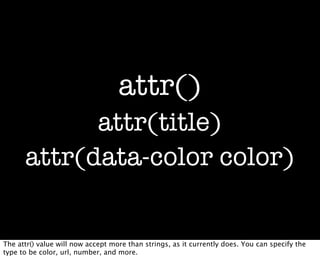
![border-clip: [x y];
border-clip: [visible invisible];
border-clip: 10px 1fr 10px;
Custom border shapes; clip the border to show the areas you want.](https://image.slidesharecdn.com/lws120312-120313080625-phpapp01/85/CSS-The-Boring-Bits-11-320.jpg)
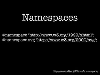
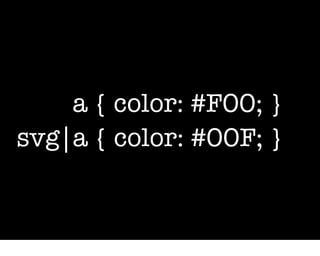
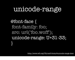

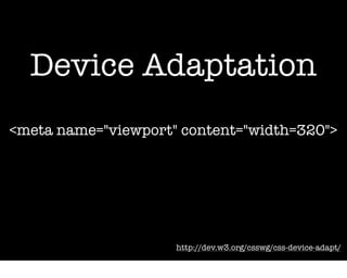


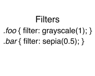
The document discusses various CSS3 features and updates, emphasizing both boring and exciting aspects of CSS. It covers topics like CSS filters, background positioning, custom borders, namespaces, media queries, length units, and selectors. The author illustrates how these features enhance creativity in web design, despite their seemingly mundane nature.


![Introduction to Pandas and Time Series Analysis [PyCon DE]](https://cdn.slidesharecdn.com/ss_thumbnails/introductiontopandasandtimeseriesanalysispyconde-170617163724-thumbnail.jpg?width=640&height=640&fit=bounds)


