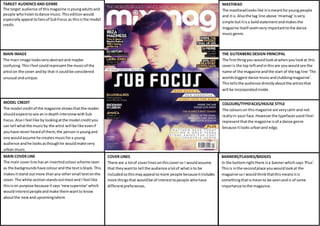
1. TARGET AUDIENCE AND GENRE
The target audience of this magazine is young adults and
people who listen to dance music. This edition would
especially appeal to fans of Sub Focus as this is the model
credit.
MASTHEAD
The masthead looks like it is meant for young people
and it is. Also the tag line above ‘mixmag’ is very
simple but it is a bold statement and makes the
magazine itself seem very important to the dance
music genre.
THE GUTENBERG DESIGN PRINCIPAL
The first thing you would look at when you look at this
cover is the top left and in this are you would see the
name of the magazine and the start of the tag line ‘The
worlds biggest dance music and clubbing magazine’.
This tells the audience directly about the artists that
will be incorporated inside.
MAIN IMAGE
The main image looks very abstract and maybe
confusing. This I feel could represent the music of the
artist on the cover and by that it could be considered
unusual and unique.
COVER LINES
There are a lot of cover lines on this cover so I would assume
that they want to tell the audience a lot of what is to be
included so this may appeal to more people because it includes
more things that would be of interest to people who have
different preferences.
MODEL CREDIT
The model credit of the magazine shows that the reader
should expect to see an in depth interview with Sub
Focus. Also I feel like by looking at the model credit you
can tell what the music by the artist will be like even if
you have never heard of them; the person is young and
one would assume he creates music for a young
audience and he looks as though he would make very
urban music.
MAIN COVER LINE
The main cover line has an inverted colour scheme seen
as the backgrounds have colour and the text is black. This
makes it stand out more than any other small text on the
cover. The white section stands out most and I feel like
this is on purpose because it says ‘new superstar’ which
would interest people and make them want to know
about the new and upcoming talent.
COLOURS/TYPEFACES/HOUSE STYLE
The colours on this magazine are very calm and not
really in-your-face. However the typefaces used I feel
represent that the magazine is of a dance genre
because it looks urban and edgy.
BANNERS/FLASHES/BADGES
In the bottom right there is a banner which says ‘Plus’.
This is in the second place you would look at the
magazine so I would think that this means it is
something that is mean to be seen and is of some
importance to the magazine.