
Recommended
More Related Content
What's hot
What's hot (19)
Similar to Magazine analysis 3
Similar to Magazine analysis 3 (20)
Recently uploaded
Recently uploaded (20)
Magazine analysis 3
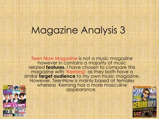
- 1. Magazine Analysis 3 Teen Now Magazine is not a music magazine however in contains a majority of music related features. I have chosen to compare this magazine with ‘Kerrang’ as they both have a similar target audience to my own music magazine. However, TeenNow is mainly based at females whereas Kerrang has a more masculine appearance.
- 2. Why is the title called what it is? TeenNow has abbreviated the word 'Teenager' to 'Teen' which gives the audience and magazine a closer bond. It is short and catchy which means that it is memorable and therefore marketable. The use of 'Teen' in the title allows the target audience to immediately know the magazine is based for them, thus instantly attracting them towards the magazine. On the other hand, onomatopoeia has been used in the title of ‘Kerrang’ as it is quite harsh sounding. This defines the link between the genre of the magazine, which is rock music and its raucous house style.
- 3. The Masthead analysis The masthead has been written the biggest on the page of TeenNow, this allows it to stand out and immediately attract the reader. The graphics of the title has been split into two colours, 'Teen' is portrayed in bright pink whereas 'Now' is in white. This shows a clear separation from the two words and it gives more significance to the word 'Teen' as that has been used in the brighter colour. There is a faint shadow lurking in the title which just gives that extra depth and detail. A medium blue background has been issued beneath the title to allow it to project clearer. In contrast to this, Kerrang! has placed its title at the top of the magazine and is not as big as the banner in the middle of the magazine. It has an allwhite one colour masthead which stands out against the murky blue magazine background. There are smudges, crackles and lines going through the title giving it a rough look. Unlike TeenNow there is an exclamation mark used in the title which connotes a louder atmosphere and also adding more energy into the masthead.
- 4. Main Image analysis The main image of TeenNow consists of 4 members of the British Pop Rock group 'The Vamps'. Using a famous group like 'The Vamps' increases the chance of purchasers as fans, or people who are fond of the music/members are more likely to buy the magazine if their favourite band or artist is featured on the front cover. Furthermore, they are all dressed in black and white attire, which makes them stand out against the vibrant colour scheme and also it's iconography linking in with their group name 'Vamps' as vampires are usually said to wear dark/black clothing. They are all standing in a line with a stern facial expression so there is not much body language. All four members are making direct eye contact with the audience which is more likely to intrigue and reel the audience in. The camera angle of which the medium shot has been taken includes the streak of lighting from the left which adds detail to the image. They are all made to look desirable, which gives the main image a sort of sex appeal as the audience or perhaps fans of this particular group may be allured to read the magazine. Additionally, a banner has been placed across the main image stating 'The Vamps' in white block capital letters. This strikingly stands out against the hot pink text background and is also circulation to anchor the image. The banner allows the group to be easily recognised.
- 5. Main Image Analysis Similarly, Kerrang! has also used a medium shot of celebrity former band member Gerard Way from My Chemical Romance to be on the front cover of their magazine. This is a way of intriguing the target audience who may know or are fond of Gerard Way. His body language and facial expression are very relaxed and connote a laid back attitude. He may be wearing sun glasses but the audience can slightly see that he is making direct eye contact with them, thus making the reader feel chosen. Most of his body in the medium shot has been covered up by the numerous cover lines however it is noticeable he is wearing a camouflage green jacket which fits in with the house style of the magazine. Furthermore, a large banner has also been placed across this main image as well as TeenNow’s main image, drawing attention to both their front covers.
- 6. What other images are on the cover & why? There are many other images of artists on the front page of TeenNow magazine. This includes worldwide famous male pop singer Justin Bieber has been situated in the top left hand corner of the magazine. On the top right hand corner there is an image of the boy band Union J and the boy band One Direction, above this there is a cover line stating 'FREE POSTER'. This is sort of a way to attract readers and fans especially the female ones to purchase the magazine as they get a good deal for their money. After all, the target audience is for teenagers who do not have that much money. Over a bright yellow background the word 'FREE' which is in pink and the word 'POSTER' which is in black are very contrasting yet allows the text to project. Lastly, there is an image of Ariana Grande, who gained fame and a singing career through her popularity as a former Disney Actress. The cover line states '60 winter warmers, stay snug like Ariana' and this explains why she is dressed in warm winter clothing. All these images of other artists allow a wider range of audience members to want the read the magazine as it gives them an insight to what is featured on the inside.
- 7. What other images are on the cover & why? On the contrary, Kerrang! does not have any many images situated all over the magazine. Instead there is a section at the bottom which states ‘6 Amazing Posters’ and then it gives a preview of what the posters look like. The 6 bands/artists are Fall Out Boy, Of Mice and Men, Issues, Metallica, Alter Bridge and Panic! At The Disco. All of pictures have a circulation written in black bold capital letters on top of a white background, on their individual posters. This way the reader can clearly see who is likely to be featured inside the magazine. The posters would entice the reader because it contains free merchandise that would help sell the magazine.
- 8. What content is promoted by the cover lines? The cover lines in TeenNow are used to hint the content featured inside the magazine. Issued in the top right hand corner the cover line text 'Free Poster' split between colours of pink and black with a yellow background beneath, promotes the poster contents inside the magazine. There is a small preview image of the posters that include the boy bands 'Union J' and 'One Direction'. Furthermore, one of the cover lines placed on the bottom left corner of the magazine, featuring Ariana Grande is promoting winter clothing. '60 winter warmers', 'Stay snug like Ariana' The number '60' has been written massive in comparison to the rest of the cover line text. It is in white with a hot pink over line. 'Winter Warmers' is in a bright yellow with a pink background box and the 'stay snug like Ariana' is in white with a pink background. The pink background allows the text to stand out. The use of personal language when mentioning Ariana Grande as 'Ariana' emphasizes the close bond between the magazine and its readers. This cover line promotes the fashion side of the magazine and using a famous singer in the promotion increases their chance of purchasers.
- 9. What content is promoted by the cover lines? Likewise, Kerrang! also states what is going to be featured inside the magazine by stating ‘6 Amazing Posters!’. The exclamation mark adds energy and the fact that the 6 is bigger than the rest of the text draws immediate attention to it. In contrast to TeenNow who are only giving away 2 magazine, Kerrang is giving away 6 which is most likely why they want to draw specific attention to the number. At the top of Kerrang magazine it states ‘A Day To Remember’ and beneath this ‘The album that almost destroyed them – the true story’ Notice how the ‘True’ has been underlined, thus encourages the readers to feel the need to find out what exactly is the true story of the event. This is an exclusive feature.
- 10. Explain the connotations of typefaces, graphics and colour. In TeenNow there is an easy noticeable colour scheme consisting of, Pink, Blue, White, Yellow, Lime Green and Black. These colours convey that the magazine is mainly towards females however the explosion of colour is very attractive and makes the magazine stand out. The colours are all vibrant which convey a happy atmosphere. The typeface of all the text in the magazine are all in sansserif, this gives the magazine a bolder appearance. Some of the text has been issued in italic which just gives the magazine a fun, enjoyable look and feel to it. On the other hand, the main colours used on the front cover of Kerrang!, are red, black, white and yellow which all stand out against the murky blue background. These colours are all very striking and visible thus making it attractive to the reader. The colour scheme give the magazine are masculine appearance and there is a continuous theme of violence. All of the magazine has been written in bold capital letters which connote a loud atmosphere. The key words in the cover line texts have been issued in bright yellow so that they can stand out easily. There are crackles in the typefaces and the text has been written in the font sansserif.
- 11. What sort of language/language features/language devices can you identify? How does the cover "talk" to its reader? The mode of address in TeenNow uses colloquial and personal language this way the magazine is talking directly to its audience. The target audience is also young adolescents which are more likely to prefer a magazine that talks in the same sort informal language as them. An example in the magazine is 'Are you is BIGGEST FAN?' This is obviously a rhetorical question which gets the audience to think about whether they are or not. The 'You' has been underlined and a reader would feel selected out from the audience as though they are special. Another example of colloquial personal language in the magazine is 'Want to be part of Team 1D?' again the cover line is talking directly at the reader, making the reader feel chosen. Kerrang! has used colloquial and personal language too, ‘As you’ve never seen them before’. It adds closeness between the magazine and the audience in which the magazine company gain likeability. Speech marks have been used to portray a quote from the main image and the ellipsis at the end builds interest to the story. The frequent use of punctuation, eg: capital letters and exclamation marks emphasises the words to feel as though they ‘boom’ in the readers minds, thus linking with the continuous house style of aggression.
- 12. Does the cover look similar to other magazines & why? Is there anything distinctive about the cover/format? Both magazines have a similar layout to other magazines such as: We Love Pop, NME and Q. The colours are similarly vibrant and there is a consistent house style. There are many images of other singers as well as the main image on the magazine front cover which makes it appeal to a wider range of audience members. Both magazines entice the audience with free posters. The distinctive thing about TeenNow’s front cover is that in the top left corner there is a sticker effect shape which says '20% of Claire's' which is an accessories shop based for young adolescents. Whereas, Kerrang! uses circulation to convey a text saying ‘Win! A £500 Guitar’ so the reader would feel they have a chance to gain something.
- 13. The Inside How many pages are there? There are 66 pages in TeenNow magazine and there are 63 pages in Kerrang!, this implies that they are weekly magazines. How many pages of adverts? TeenNow has 16 pages of advertisements and Kerrang! has 15, this means they both have about less than a quarter’s worth of advertisements.
- 14. The Inside Categorise the products advertised into types For TeenNow: Downloading the Now app Follow the TeenNow magazine on twitter Clothing Beauty Shoes Subscribing to TeenNow Claires Voucher For Kerrang!: Gaming Tour Dates Concert Tickets Subscriptions Social Networking Albums Small Ads
- 15. The Inside Make a list of the features/articles into types For TeenNow: Bands - One direction, The Vamps and Neon Jungle. Justin Bieber Quiz 20% off on Claires News - Xfactor, Daniel Radcliffe, Tom Daley, Football,Sesame street Ones to Watch in 2014 - promoting new artists, Double Page Spread on Ollie. Jingle Bell Ball - backstage, pictures of artists & Tweets by them Advice section Youtubers Letters & Emails Posters Fashion & Beauty For Kerrang!: News Feedback Band Interviews Live Gigs Albums Gig Guide The Ultimate Rockstar Test Posters
- 16. How many double page spreads are they? What are they about? Teen Now has 5, one is an advice column by two actors in Waterloo road a tv drama based on secondary school children. Another two is an interview with a new artist 'Ollie Garland' and the girl group 'Neon Jungle' One is on the famous boy band One Direction and a bit about their music careers eg Security, Hair, PR & Publicity, Simon Cowell, Management etc. Kerrang! has 6, they are mostly all interviews with rock artists such as: Aussie Pop Punks, A Day to Remember, James Veck-Gildolfi, Gerard Way, Mutley Crue and You Me At Six.
- 17. Are there are advertorials where is not clear if something is an article or an advert or a mixture of both? There is a beauty tester section in TeenNow magazine where different celebrities are talking about their experiences with some every day beauty products, thus promoting the beauty product by using the celebrities to talk about them but is also an article on celebrities. On the other side, ‘See/Hear the official Kerrang! Rock Chart’, which was advertising the Kerrang! Website and radio.
- 18. How does the magazine achieve a unified house style? Why is the house style appropriate to the target audience? What does it imply about the target audience? The house style of both magazines is very clear. There is a vibrant, striking colour scheme in both magazines. However, the colours used in both magazines are what separates and conveys the difference of genre and target audience. Using vibrant colours would intrigue the reader towards the magazine as it is clearly noticeable. Furthermore, there is a link between the masthead of both magazines and the target audience. 'TeenNow' it is in fact an abbreviation of the teenage target audience and ‘Kerrang!’ connotes a rough masculine target audience. The artists used in both magazines are well known to their target audiences, this helps reel in any members of the public familiar to the celebrities portrayed on the front cover. There is a use of sex appeal with the male members portrayed in the front cover of both of the magazines, which again is attracting the reader towards the magazine. Both magazines have a niche audience which means they are aimed at a specific group of people.