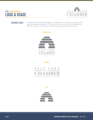
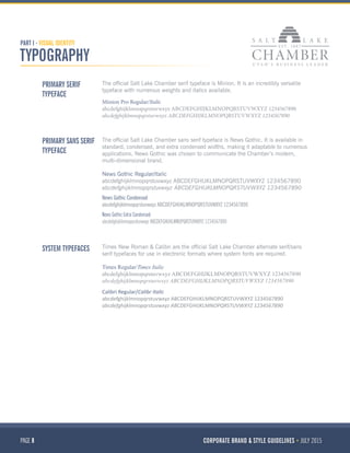
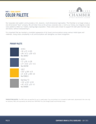
“Collaborative and productive: Moving Utah forward together.” As a Chamber, we challenge the preconceptions and possibilities of business. We search for smarter ways to do things; we
bring new partners together in a productive and innovative way to discover ideas to help Utah grow economically. We use our
knowledge and experience to continually improve and consistently deliver results for our community and stakeholders. And we
do everything responsibly and considerately to help support our members and the businesses we work with.
Code for America's style guide offers information on brand usage, language and tone. If you're planning on using this for a community press event please also contact lr[at]codeforamerica.org for assistance.
This document provides branding guidelines for Sourcefire, including their logo, color palette, typography, icons and styles for various branding elements like their website, presentations, illustrations and collateral. It specifies the correct uses of their logo and secondary mark. The primary colors are Sourcefire red, black and grey. The main fonts are ClanOT for titles and Ultimate for body copy. Website designs feature dynamic graphic elements and a balanced layout. Illustration styles are also outlined.
The document provides guidelines for creating consistent communications for the Marine Stewardship Council (MSC). It outlines the MSC's style including its primary and secondary typefaces, logo usage, language style, and design elements like color and imagery. The guidelines are intended to help anyone working with the MSC to effectively express the brand's identity and build a recognizable image.
VisionsLive Style Guide November 2014_v1Barry McLeod
This document provides guidelines for communicating the VisionsLive brand consistently, including:
- The primary and secondary logos in various color versions, with minimum size and exclusion zone requirements.
- Guidelines on using the logo properly and not distorting, stretching, or altering it.
- Information on the brand's tone of voice being simple, engaging, respectful, and plain talking.
- Contact details for the brand guardians responsible for upholding the style guide.
This document provides updates and guidelines for the international use of the KFC brand identity standards. Key updates include the removal of tilted bucket art from apparel internationally, addition of new "It's Finger Lickin' Good" script formats, KFC delivery logos, and KFC express logos. Color specifications are also added for signage color matching samples. The document is intended to provide additional branded artwork and guidelines tailored for international KFC locations.
The document provides branding guidelines for Cority including:
- Logo usage guidelines specifying preferred color, minimum size, and prohibited alterations
- Color palette specifying primary and secondary colors to be used consistently
- Typography guidelines specifying primary and secondary font families (Raleway and Open Sans) to be used for headers, body text, etc.
- Brand elements including guidelines for using the Cority ring and circle graphics elements consistently across materials
This document outlines Symantec's brand identity standards, including their values, design philosophy, voice, signature, symbol, logotype, color palette, typography and image style. The key points are:
- Symantec's core values that guide their brand are being customer-driven, trust, innovation and action.
- Their design philosophy aims for simplicity, sophistication and harmony across all communications.
- Their signature combines their logotype and symbol to represent the company and must never be separated or altered.
- Their colors of yellow, white and black serve as the primary corporate colors to ensure brand consistency.
This document provides guidelines for using Adobe's corporate brand and logo. It outlines the mission, brand promise to enable engaging experiences, and brand personality of being exceptional, involved, genuine and innovative.
There are two versions of the Adobe logo - a red "tag" logo and standard logo. The red tag is reserved for internal Adobe use and should occur only once on a piece, while the standard can be used by third parties. Logo specifications are provided for minimum sizes, color, and clear space. Guidelines are given for usage in print, online, and tradeshow graphics, as well as incorrect uses to avoid. Additional sections cover visual identity elements like color, imagery, typography, and templates.
This document is a branding design manual created in May 2016 for Connor Menerey's culinary consulting business, Menerey Culinary Consulting. It outlines the business logo, including acceptable formats, constructions, and applications. It also details the primary and secondary fonts to be used, the color system, and examples of stationery like the letterhead and business cards. The manual provides visual examples and specifications to ensure consistent branding across all business materials.
This document provides branding guidelines for Foursquare's logo, icon, colors, typography, crown usage, badge usage, iconography, and trademark usage. It emphasizes maintaining a consistent brand look and feel across all uses and contexts. Specific dos and don'ts are outlined for proper usage of each branding element to preserve Foursquare's fun and playful identity.
The document provides ShopperTrak's brand identity guidelines. It outlines rules for proper usage of the ShopperTrak logo, brand mark, color palette, typography and trademarks to promote a consistent brand identity. The guidelines are intended to position the brand, convey strengths with clear communications, maximize brand asset value and provide a uniform strategy. While some rules are fixed, creative expression is allowed if consistency and simplicity are maintained.
The logo, colors, typography, visuals, and stationery are outlined with specifications on correct usage to ensure consistency across Inatech's materials. Guidelines cover logo variations and placement, color variations, approved typefaces and sizes, using the grid for layouts, approved imagery using chevrons and shapes, and examples of business cards, envelopes, letterhead, folders, and other materials. Adherence to these brand identity guidelines is important to maintain Inatech's visual style.
This document provides brand identity guidelines for sCoolMeal. It includes sections on the logo, colors, typography, voice and tone. The logo section describes the primary and secondary logos, proportions, sizes and variations. The colors section outlines the brand color palette. The typography section specifies the primary and secondary typefaces, including usage guidelines. The voice and tone section defines the brand's voice as approachable, caring, reliable and young. It provides examples of tones for different scenarios like instructions, faults, apologies and social media posts.
This document provides PayPal's corporate master brand guidelines for using their logo and other branding elements consistently. It outlines PayPal's brand promise to make payments simpler, their brand personality traits of being helpful, human, innovative, vigilant, and courageous. It also describes their customer-focused tone of voice. The guidelines explain proper uses of their logo, color palette, typeface, photography style, and other visual branding assets. It aims to help PayPal present a unified brand identity that resonates with customers.
This design project aimed to create a word cloud based on the author's LinkedIn profile. The word cloud was generated using Wordle.net and displays words from the profile in different sizes based on frequency. Larger words that appear include the author's name, degree in Information Technology, and job titles related to IT support. While the word cloud lacks a specific shape as suggested, it effectively visualizes key terms from the author's online profile and establishes relationships between the most prominent words.
This document provides branding guidelines for Foursquare, including summaries of their logo, icon, colors, copy tone of voice, typography, and trademark usage. The guidelines emphasize maintaining a consistent fun and playful brand identity across all uses of the Foursquare assets and ensuring proper usage of their logo, icon, colors and other trademarks.
This document provides branding guidelines for Nabo, including:
- Allowable uses of the Nabo logo in different contexts and with/without the tagline
- Approved typefaces, colors, and graphic elements
- Examples of how to layout the logo on various collateral like letterhead, business cards, presentations, etc.
- Instructions for designers and developers to ensure branding consistency across all communication materials
The document provides an overview of branding basics for small businesses. It discusses what branding is, the history of branding, and key branding elements like logos, tone of voice, imagery, and consistency. It emphasizes that consistency across touchpoints like business cards, websites, and collateral is critical for building brand identity and recognition. Creating brand guidelines that specify style, colors, fonts, and more helps ensure consistency and keeps the brand message clear.
The document provides guidelines for using the Emailbidding brand identity. It establishes rules for proper usage of the logo, colors, typography, exclusion zones, and minimum sizes. The identity was carefully designed so that all elements like color, typography and composition contribute to graphical coherence. The guidelines are meant to ensure consistency in applying the brand to help develop consistency in words and imagery.
The document presents brand guidelines for Real-Time Consultants (RTC) that detail the new visual identity system including logos, fonts, colors, imagery styles and examples of printed stationery. The consistent application of the brand identity across all communications will allow RTC to effectively communicate its image and message, and create a strong and unified brand.
The document provides brand guidelines for The Snapys, including their logo, colors, fonts and tone of voice. The Snapys is an engagement platform launched in 2015 to make the world more beautiful through photos. The guidelines explain the logo elements and proper uses, approved colors, primary and secondary fonts, applications of the logo for partnerships and social media, naming conventions and an informal tone of voice for communicating with the Instagram community.
The Design Squid brandbook is not only an in depth look at our services and projects that define us, it's also an example for other design companies to use to create their own.
Open To Create... Brand guidelines
Following our branding re-fresh in summer 2016 with Ellen Stewart we are proud to share our family of brands
Open To Create...
Everyday Creativity
Anna B Sexton
For more information contact Anna B. Sexton, founder of Open To Create... 07941 655 856
This document provides branding guidelines for SFC Plus. It outlines the proper use of the brandmark, colors, typography and other branding elements. The guidelines are intended to ensure consistency across all communication and touchpoints representing the SFC Plus brand. The document includes sections on the brand platform, brandmark, typography, colors, applications and backgrounds. Specific rules are provided for using the logo, fonts, and colors to maintain clear and accurate representation of the brand.
This doctor dumped US job to build integrated medicine platform Syncremediesvinay vinu
Syncremedies is an integrated medicine service that brings together the best of Allopathy, Ayurveda and Homeopathy to offer the most effective treatment for any chronic ailment.
We are the only provider bringing together 3 forms of medicine for treatment of patients’ health concern. With importance given to overall health and wellness, each treatment plan is customized with recommendations around diet, exercise and medication aspects to improve well-being.
But why is integrated medicine the “right” treatment choice?
Syncremedies was born out of empathy after seeing numerous patients struggle through their illness without knowing how or what would be the best option for their ailment. Patients’ today struggle through their illness without knowing how or what would be the best option for their ailment.
Despite all the existing knowledge and ease of access to information they are often victim to long term ill health. Patients rarely know, what form of medicine might be best suited for them. They most often go with what people advise them on, rather than any objective information. Eventually getting stuck in a circle of medications, therapies and treatments, giving them sub-par relief.
Syncremedies answers all your questions!
– Will the Ayurveda doctor know about my Allopathic medicines?
– Is Allopathy the BEST Option for me?
– Can I take Allopathic & Homeopathy/Ayurveda medicines together?
– Will I have side effects due to the medicines?
– Should I consult Allopathy doctor or try Ayurveda/ Homeopathy?
– Is there anything I can do to maintain my health & wellness?
On the flip-side, the amount of medical knowledge that exists also is paramount. Knowledge based on history, research, wisdom, and years of education – knowledge always intended to heal; however, since the healers came from various backgrounds and different schools of thought, knowledge became limited within their circles.
Each form of medicine, be it Ayurveda, Homeopathy or Allopathy has a “best” we could leverage to our benefit, thereby taking stride in the wonderful world of integrated medicine. We at Syncremedies are here to offer the advantages of “all the good” from various modalities, minimize side effects, use more effective medications and use therapies that have a long term goal.
We are here to help you take your path to better health!
The document is a graphic standards manual that outlines the branding guidelines for The CARE Center. It summarizes that the logo features a lion symbolizing courage and bravery. It establishes the primary colors, typefaces, spacing guidelines, and photography styles to create a cohesive brand identity. The manual instructs on correctly using the logo and prohibits recreating or modifying it.
This company offers services such as Amazon Consulting and Services, SEO, PPC, Photography, A+ content, and Trademark registration.
Credits of project:
Advertiser: ES Distributions
Project: Brand Identity
Software: Adobe Illustrator / Adobe Photoshop.
Art Director: Mark Zuniga
Graphic Designer: Mark Zuniga
Copywriter: Jaime Escobar
This document provides branding guidelines for Credit Car Sales, including specifications for proper usage of their logo, typography, colors and other graphical elements. The logo is described as simple, attractive and balanced, representing a premium brand. Strict rules are outlined for logo placement, sizing, color usage and background compatibility to ensure consistency. A sans serif font called Lato is selected as the primary body text font for marketing materials, alongside the logo font Cocon Light. Typography guidelines address font sizes and styles to maximize readability and clarity.
The document provides brand guidelines for representing an organization's visual identity consistently. It includes the organization's logo in multiple versions, guidelines on minimum logo size, exclusion zone around the logo, and proper logo usage including using the correct color version and not modifying the logo. The document aims to help manage how the brand is visually represented in different situations to maintain its integrity.
Logos are texts, images, shapes, or a combination of the three that convey the identity and work of a brand. Logos, at a single glance, may come across as mere symbols indicating something about the brand, but they serve a greater purpose. A good logo can help your brand establish credibility, attract the attention of potential customers, give an important message relevant to your business and even help you stay a step ahead of competitors.
Brand Manual Guide US Letter size for corporatesJosé Ramón Ortiz
The document provides visual brand guidelines for Connect Company. It includes details on the corporate logo, including acceptable color variants and minimum size. It also covers corporate typography, specifying primary and secondary typefaces. Additionally, it outlines the corporate color palette and codes. Finally, it provides specifications for corporate stationery items like letterhead, envelopes, business cards, and email signatures. The guidelines are intended to ensure consistent branding across all communication materials.
This document outlines brand identity guidelines for Solidarity Takaful. It covers the brand strategy in section 1, including brand promise, values and voice. Section 2 covers basic logo usage and misuses. Section 3 details visual identity elements such as the logo, color palette, fonts and graphic elements. Section 4 provides guidelines for corporate communications materials like letterhead, business cards and envelopes. Section 5 addresses applications of the brand identity such as signage, brochures, and digital materials. The guidelines are intended to create a consistent brand impression across all touchpoints.
The document provides brand guidelines for TSA, including:
- Logo construction and usage guidelines to maintain brand integrity.
- Color palette with Pantone, RGB, CMYK and hex values for primary and secondary colors.
- Typography guidelines specifying font family, styles and sizes for headlines, body copy and more.
- Photographic style guidelines recommending black and white or single color images focusing on people.
- Support graphic guidelines and examples of internal documents like presentations and info sheets applying the brand standards.
This document provides PayPal's corporate master brand guidelines. It outlines the core elements of PayPal's identity, including the brand promise, personality, voice, logo assets, visual assets, and guidelines for using branded materials properly and consistently. The guidelines are designed to help PayPal and its partners present the brand in a unified way that will resonate with customers.
This document provides branding guidelines for Best Shawarma. It includes:
- Details on the Best Shawarma logo, including acceptable variations for different backgrounds.
- Specifications for the brand's color palette and acceptable usage.
- Information on the primary and secondary typefaces to be used for headlines and body text.
- Additional branding elements that can be used to support the visual identity such as the "juicy" underline.
The document provides brand guidelines for Coinsecure, an Indian company connecting India to Bitcoin. It outlines the brand identity including the logo, typefaces, colors, and graphic elements. The logo consists of a symbol and typeface in Junction Regular font. Open Sans Regular is used as the secondary typeface. The primary colors are royal blue and bright yellow. Guidelines are provided for proper usage of the logo, typefaces, and colors in business collaterals like letterheads and stationery. The brand aims to educate, simplify and enable Bitcoin usage in India.
Hawke & Co provides brand identity guidelines for logo usage, colors, typography, and imagery. The document includes sections on the brand overview, logos in various formats, proper logo sizing and placement, main and supporting color palettes, font usage and examples, and lifestyle and product imagery. It aims to create a unified brand identity and appearance across all communication channels.
RKCO Group provides the complete manpower services, manpower consultants and payroll outsourcing services in Delhi, Noida, Gurgaon, Ghaziabad, Faridabad and India, under the manpower services RKCO Group provides the security guards, housekeeping, facility management, temporary labor, catering and garden maintenance and office support services.
This document provides branding guidelines for Lane Gorman Trubitt, PLLC (LGT). It includes sections on the company's story, brand essence focusing on "the power of the right people beside you", core values of accountability, honesty, striving for excellence, commitment and quality service. The visual identity section describes how the swoosh logo represents LGT's energy, direction and beliefs. It also outlines rules for proper usage of the logo, colors, typography and photography to create a consistent brand identity.
This document provides information and guidelines about logo design. It states that logos represent the identity of an organization and should be simple, effective at both large and small scales, and in color or black and white. Good logos clearly identify the organization. Logos can be descriptive by depicting what the organization does through images or symbols, or symbolic by representing concepts like knowledge. Fonts and colors used in logos should fit the brand's personality. The logo design process involves research, brainstorming, developing concepts, choosing fonts and colors, and finalizing the design. Logos can be redesigned over time to represent changes to an organization or to distinguish new services while keeping the core identity.
The document outlines the visual identity branding for the 2014 Student Leadership Conference (SLC). It includes the concept of taking the "Next Step" theme and applying it through various branding elements like the wordmark, typography, colour palette, and sample applications. The wordmark is the main branding element and is designed to be bold, clear and draw attention to "Next Step" to challenge delegates. A flexible pegboard texture, bright colours and bold fonts further empower delegates. The visual identity aims to create a unified look and feel across collateral through consistent usage of these elements.
The document provides information on logo design basics. It defines what a logo is and discusses golden rules for logo design, such as keeping it simple, being effective at different scales, and working in color and black and white. The document explores how logos can be descriptive or symbolic and looks at how fonts and color can represent an idea. It outlines the logo design process, including research, brainstorming, developing fonts and forms, and finalizing the design. The document also discusses how existing logos can be reimagined to reshape an identity, distinguish services, or apply a theme.
The document discusses logo design basics. It defines a logo as an identifying symbol that represents an organization's identity. It provides golden rules for logo design: keep it simple, be effective at large and small scales, and in color and black and white. Logos can be descriptive by depicting what an organization does or symbolic by representing an idea. Effective logo design involves research, brainstorming, exploring fonts and forms, selecting colors, and finalizing the design. Logos can be redesigned over time to reshape an identity, distinguish new services, or apply a theme while staying loyal to the original design.
1. The document provides branding guidelines for Empirico, including their visual identity, logo usage, colors, imagery, typography, and applications of the brand identity.
2. The logo rationale explains that the logo represents Empirico protecting its customers, with two curved shapes resembling arms holding a dot in the center representing customers.
3. Guidelines are provided for proper and improper usage of the logo, colors, tagline, and applying the brand identity across various applications and platforms.
This document provides branding guidelines for Solavei, including:
- The Solavei positioning statement and core values that emphasize relationships, goodwill, and initiative.
- Guidelines for expressing the Solavei brand through its optimistic, smart, friendly and purposed personality.
- Direction on visual style including simple, contemporary, and youthful look and feel, and a social, non-corporate tone.
- Specifications for proper use of the Solavei logo and branding assets like colors, fonts, imagery, and language.
Similar to Corporate Brand & Style Guidelines (20)
The amendment would allow the state to prudently increase distributions from the School Trust Lands Program by up to 50% over the next few years, adding millions to the educational system. It would let school community councils continue meaningful school improvement by deciding how to best use the additional funds. The amendment also updates the distribution policy to consider factors like enrollment growth and inflation, allowing the School and Institutional Trust Fund Board of Trustees to grow the fund while increasing distributions. It includes a 4% cap to continue growing the fund's principal and provide more money for schools now and in the future. The State Board of Education, Governor, Treasurer, and other state officials and organizations all support the amendment.
Constitutional Amendment B proposes three changes to the Utah Constitution relating to the State School Fund: 1) It replaces the term "interest and dividends" with "earnings" to describe funds that can be distributed, allowing a wider range of investment returns to support schools. 2) It limits annual distributions to 4% of the Fund's average value over the past 12 quarters. 3) It replaces the requirement that the Fund be "safely" invested with "prudently" invested, aligning with standard investment terminology. The amendment aims to modernize provisions while maintaining the Fund's purpose of benefitting public education.
Constitutional Amendment B proposes to amend the Utah Constitution regarding the State School Fund by: modifying the description of distributions from the fund from "interest and dividends" to "earnings"; limiting annual distributions from the fund to 4% of the total fund; and modifying the standard for how the state invests money in the fund.
The Salt Lake Chamber is a capital city chamber with a statewide mission and reach. The Chamber works as Utah’s business leader to stand as the voice of business, support our members’ success and champion community prosperity on hundreds of bills every session
The document provides an overview of Utah's proactive approach to economic development and workforce planning. Key points include Utah having one of the most diverse economies in the country, the Governor's Office of Economic Development focusing on six strategic industry clusters, and the STEM Action Center working to strengthen science, technology, engineering, and math education statewide.
The 2014-2015 annual report of the Salt Lake Chamber summarizes the organization's accomplishments over the previous year. It highlights that the Chamber stood as the voice of business, supported members' success, and championed community prosperity. Key events included awarding Gail Miller as the "Giant in Our City" and engaging over 400,000 business professionals through programs. The Chamber also demonstrated leadership on important policy issues, provided resources to hundreds of local businesses, and reduced emissions through its transportation initiatives.
The Salt Lake Chamber's 2016 Public Policy Guide outlines the business community's policy priorities for the 2016 legislative session and calendar year
This document provides a summary of items related to the state of Utah in the Library of Congress collection. It includes maps, photographs, and other materials showing the early Mormon settlement of Salt Lake City and journey to Utah, as well as documents, music, and films depicting various aspects of Utah's history, geography, and culture over time.
This document presents a five-year plan to improve Utah's education system and economic prosperity. It proposes targeted investments in K-12 education totaling $592.8 million, including $79 million to improve reading achievement, $67.5 million for math achievement, $20 million for high school graduation and college readiness, and $80 million for teacher compensation. It also proposes $125 million for higher education completion rates and $70 million to increase college affordability and financial aid. The plan aims to boost Utah's national rankings and student outcomes in order to attract skilled workers and businesses to the state.
This document presents a five-year education plan for Utah with the goal of improving economic prosperity through education. It discusses how communities with more college-educated residents have stronger economies and outlines objectives and funding to improve K-12 outcomes in math, reading and graduation rates and increase higher education degree attainment in Utah. The plan calls for over $500 million in strategic investments in teacher compensation, technology, counseling and other programs to help Utah rank higher nationally in key education metrics and build a skilled workforce.
The Salt Lake Chamber is a capital city chamber with a statewide mission and reach. The Chamber works as Utah’s business leader to stand as the voice of business, support our members’ success and champion community prosperity on hundreds of bills every session.
The document describes a sponsorship package for a 2015 Washington D.C. trip from September 29th to October 2nd. It includes major sponsorship for $10,000 which provides one participant and logo recognition. It also describes 5 track sponsorships for $5,000 each that allow small groups of business leaders to meet with officials on topics like innovation, regulation, trade, tax reform, and business advocacy. Dinner sponsorships are also available for $2,500.
The Salt Lake Chamber's 2015 Public Policy Guide outlines the business community's policy priorities for the 2015 legislative session and calendar year.
Utah has a thriving economy with low unemployment and strong job growth, driven by a diverse mix of industries beyond the state's historical foundations in mining and agriculture. The state targets strategic industry clusters like aerospace and defense, life sciences, and technology through the Governor's Office of Economic Development. Salt Lake City is a hub of economic and cultural activity as the capital, home to many corporate headquarters and a vibrant arts scene.
The Salt Lake Chamber's annual Public Policy Guide, outlining the policy issues that the business community will be focused on during the 2014 Legislative Session.
The document discusses the importance of transportation to the U.S. and Utah economies. It notes that annual U.S. transportation spending is $2.4 trillion and accounts for 17% of GDP. Utah's transportation system supports 1.3 million jobs from truck-based trade and $130 billion in goods transported annually. Investing in Utah's Unified Transportation Plan is estimated to generate over 180,000 new jobs, $183.6 billion in additional GDP, and $130.5 billion in tax revenue through 2040. The plan identifies $54.7 billion in needed projects through 2040 but has an $11.3 billion funding gap.
The document is the 2012-2013 annual report of the Salt Lake Chamber. It summarizes that over the past year, Utah has continued to be an economic leader through consistent decision making and an entrepreneurial spirit. It outlines the Chamber's role in providing economic leadership, supporting policies that help businesses thrive, and strengthening Utah's economy. It also highlights some of the Chamber's accomplishments over the past year and its strategic partnerships.
FIA officials brutally tortured innocent and snatched 200 Bitcoins of worth 4...jamalseoexpert1978
Farman Ayaz Khattak and Ehtesham Matloob are government officials in CTW Counter terrorism wing Islamabad, in Federal Investigation Agency FIA Headquarters. CTW and FIA kidnapped crypto currency owner from Islamabad and snatched 200 Bitcoins those worth of 4 billion rupees in Pakistan currency. There is not Cryptocurrency Regulations in Pakistan & CTW is official dacoit and stealing digital assets from the innocent crypto holders and making fake cases of terrorism to keep them silent.
Unveiling the Dynamic Personalities, Key Dates, and Horoscope Insights: Gemin...my Pandit
Explore the fascinating world of the Gemini Zodiac Sign. Discover the unique personality traits, key dates, and horoscope insights of Gemini individuals. Learn how their sociable, communicative nature and boundless curiosity make them the dynamic explorers of the zodiac. Dive into the duality of the Gemini sign and understand their intellectual and adventurous spirit.
Zodiac Signs and Food Preferences_ What Your Sign Says About Your Tastemy Pandit
Know what your zodiac sign says about your taste in food! Explore how the 12 zodiac signs influence your culinary preferences with insights from MyPandit. Dive into astrology and flavors!
Company Valuation webinar series - Tuesday, 4 June 2024FelixPerez547899
This session provided an update as to the latest valuation data in the UK and then delved into a discussion on the upcoming election and the impacts on valuation. We finished, as always with a Q&A
LA HUG - Video Testimonials with Chynna Morgan - June 2024Lital Barkan
Have you ever heard that user-generated content or video testimonials can take your brand to the next level? We will explore how you can effectively use video testimonials to leverage and boost your sales, content strategy, and increase your CRM data.🤯
We will dig deeper into:
1. How to capture video testimonials that convert from your audience 🎥
2. How to leverage your testimonials to boost your sales 💲
3. How you can capture more CRM data to understand your audience better through video testimonials. 📊
Understanding User Needs and Satisfying ThemAggregage
https://www.productmanagementtoday.com/frs/26903918/understanding-user-needs-and-satisfying-them
We know we want to create products which our customers find to be valuable. Whether we label it as customer-centric or product-led depends on how long we've been doing product management. There are three challenges we face when doing this. The obvious challenge is figuring out what our users need; the non-obvious challenges are in creating a shared understanding of those needs and in sensing if what we're doing is meeting those needs.
In this webinar, we won't focus on the research methods for discovering user-needs. We will focus on synthesis of the needs we discover, communication and alignment tools, and how we operationalize addressing those needs.
Industry expert Scott Sehlhorst will:
• Introduce a taxonomy for user goals with real world examples
• Present the Onion Diagram, a tool for contextualizing task-level goals
• Illustrate how customer journey maps capture activity-level and task-level goals
• Demonstrate the best approach to selection and prioritization of user-goals to address
• Highlight the crucial benchmarks, observable changes, in ensuring fulfillment of customer needs
Industrial Tech SW: Category Renewal and CreationChristian Dahlen
Every industrial revolution has created a new set of categories and a new set of players.
Multiple new technologies have emerged, but Samsara and C3.ai are only two companies which have gone public so far.
Manufacturing startups constitute the largest pipeline share of unicorns and IPO candidates in the SF Bay Area, and software startups dominate in Germany.
3 Simple Steps To Buy Verified Payoneer Account In 2024SEOSMMEARTH
Buy Verified Payoneer Account: Quick and Secure Way to Receive Payments
Buy Verified Payoneer Account With 100% secure documents, [ USA, UK, CA ]. Are you looking for a reliable and safe way to receive payments online? Then you need buy verified Payoneer account ! Payoneer is a global payment platform that allows businesses and individuals to send and receive money in over 200 countries.
If You Want To More Information just Contact Now:
Skype: SEOSMMEARTH
Telegram: @seosmmearth
Gmail: seosmmearth@gmail.com
Top mailing list providers in the USA.pptxJeremyPeirce1
Discover the top mailing list providers in the USA, offering targeted lists, segmentation, and analytics to optimize your marketing campaigns and drive engagement.
SATTA MATKA SATTA FAST RESULT KALYAN TOP MATKA RESULT KALYAN SATTA MATKA FAST RESULT MILAN RATAN RAJDHANI MAIN BAZAR MATKA FAST TIPS RESULT MATKA CHART JODI CHART PANEL CHART FREE FIX GAME SATTAMATKA ! MATKA MOBI SATTA 143 spboss.in TOP NO1 RESULT FULL RATE MATKA ONLINE GAME PLAY BY APP SPBOSS
How to Implement a Real Estate CRM SoftwareSalesTown
To implement a CRM for real estate, set clear goals, choose a CRM with key real estate features, and customize it to your needs. Migrate your data, train your team, and use automation to save time. Monitor performance, ensure data security, and use the CRM to enhance marketing. Regularly check its effectiveness to improve your business.
2. PAGE 2 CORPORATE BRAND & STYLE GUIDELINES JULY 2015
TABLE OF CONTENTS
INTRO: OUR BRAND.............................................. 3
PART I: VISUAL IDENTITY......................................... 4
LOGO & USAGE............................................ 5
TYPOGRAPHY............................................. 8
COLOR PALETTE........................................... 9
PART II: EDITORIAL VOICE......................................10
OUR VOICE..............................................11
AP STYLE - HELPFUL HINTS...............................14
PART III: RESOURCES...........................................22
3. PAGE 3 CORPORATE BRAND & STYLE GUIDELINES JULY 2015
INTRO: OUR BRAND
thoroughly managed and well-implemented brand identity system will help preserve, protect and carry our brand message
to our members, our community and beyond. These guidelines are provided to ensure the correct and consistent use of our
brand identity system.
What is a brand?
A brand is what a person thinks and feels about a product or service. The words, imagery, and communications materials
developed for or about an organization or a product forms its brand.
We sum up the Chamber’s brand like this:
“Collaborative and productive: Moving Utah forward together.”
As a Chamber, we challenge the preconceptions and possibilities of business. We search for smarter ways to do things; we
bring new partners together in a productive and innovative way to discover ideas to help Utah grow economically. We use our
knowledge and experience to continually improve and consistently deliver results for our community and stakeholders. And we
do everything responsibly and considerately to help support our members and the businesses we work with.
Specific directions are included for you to manage your commnunication materials including logo, typography, color palette and
tone of voice for all visual and written elements. By accurately implementing this brand identity system, you help protect the
equity of the Salt Lake Chamber brand and better support its positioning.
OUR BRAND CAPTURES WHO WE ARE, HOW WE WORK
AND HOW PEOPLE THINK AND FEEL ABOUT US.
A
4. PAGE 4 CORPORATE BRAND & STYLE GUIDELINES JULY 2015
PART I - VISUAL IDENTITY
5. PAGE 5 CORPORATE BRAND & STYLE GUIDELINES JULY 2015
PART I - VISUAL IDENTITY
LOGO & USAGE
MINIMUM SIZE
BREAKDOWN
LOGO
To ensure proper legibility, the Salt Lake Chamber primary logo should not be used a
size smaller than 1” in width.
The Salt Lake Chamber primary logo is comprised of three major components: the
wordmark, the icon and the tagline.
The preferred use of the Salt Lake Chamber logo is a one-color application with
a horizontal orientation. The use of silver (PMS Cool Gray 7) is preferred when
production allows. Only substitue alternative logos when use of the primary logo
would result in an unprofessional application.
ICON
WORDMARK
TAGLINE
1”
6. PAGE 6 CORPORATE BRAND & STYLE GUIDELINES JULY 2015
PART I - VISUAL IDENTITY
LOGO & USAGE
CLEAR SPACE To ensure legibility and consistency, the Salt Lake Chamber primary logo should
always appear with a minimum amount of clear space around it; free of other graphics
and type. This space is equal to the cap height of the Chamber “H” as shown. The
same distance is maintained on all sides as indicated by the graphic below:
100
100
100
SPACE TYPE TO OPTICALLY JUSTIFY
MATCH TYPE SIZE – MINION REGULAR ALL CAPS
EQUAL LINE SPACING
7. PAGE 7 CORPORATE BRAND & STYLE GUIDELINES JULY 2015
PART I - VISUAL IDENTITY
LOGO & USAGE
ALTERNATE LOGOS In situations where the primary logo is not suitable for use, the below variations of the
logo are acceptable substitutes. The same rules for the primary mark including color
treatment, tagline, minimum size and clear space apply to these logos as well.
SECONDARY LOGO
WORDMARK
ICON
8. PAGE 8 CORPORATE BRAND & STYLE GUIDELINES JULY 2015
PART I - VISUAL IDENTITY
TYPOGRAPHY
PRIMARY SERIF
TYPEFACE
PRIMARY SANS SERIF
TYPEFACE
SYSTEM TYPEFACES
The official Salt Lake Chamber serif typeface is Minion. It is an incredibly versatile
typeface with numerous weights and italics available.
The official Salt Lake Chamber sans serif typeface is News Gothic. It is available in
standard, condensed, and extra condensed widths, making it adaptable to numerous
applications. News Gothic was chosen to communicate the Chamber’s modern,
multi-dimensional brand.
Times New Roman & Calibri are the official Salt Lake Chamber alternate serif/sans
serif typefaces for use in electronic formats where system fonts are required.
Minion Pro Regular/Italic
abcdefghijklmnopqrstuvwxyz ABCDEFGHIJKLMNOPQRSTUVWXYZ 1234567890
Times Regular/Times Italic
abcdefghijklmnopqrstuvwxyz ABCDEFGHIJKLMNOPQRSTUVWXYZ 1234567890
Calibri Regular/Calibr Italic
abcdefghijklmnopqrstuvwxyz ABCDEFGHIJKLMNOPQRSTUVWXYZ 1234567890
News Gothic Regular/Italic
abcdefghijklmnopqrstuvwxyz ABCDEFGHIJKLMNOPQRSTUVWXYZ 1234567890
News Gothic Extra Condensed
abcdefghijklmnopqrstuvwxyz ABCDEFGHIJKLMNOPQRSTUVWXYZ 1234567890
News Gothic Condensed
abcdefghijklmnopqrstuvwxyz ABCDEFGHIJKLMNOPQRSTUVWXYZ 1234567890
9. PAGE 9 CORPORATE BRAND & STYLE GUIDELINES JULY 2015
PART I - VISUAL IDENTITY
COLOR PALETTE
2378 C
r 56 g 73 b 103
c 84 m 71 y 38 k 23
Hex 384967
2374 C
r 77 g 95 b 128
c 77 m 62 y 31 k 11
Hex 4D5F80
130 C
r 253 g 184 b 19
c 0 m 30 y 100 k 0
Hex FDB813
Cool Gray 7 C
r 153 g 152 b 153
c 42 m 35 y 35 k 1
Hex 999899
PRIMARY PALETTE
Our corporate color system communicates a rich, dynamic, multi-dimensional orginization. The Chamber is no longer simply a
one-dimensional “blue” company. We will retain blue as the primary corporate color, a nod to our history, but integrate a wider
color palette to reflect our modern, leading-edge corporation. These colors were chosen to support the Salt Lake Chamber logo
and brand, without overpowering it.
It is important that we maintain a consistent appearance of all visual communications across various media types and
materials. Using colors consistently in all communications will strengthen our brand recognition.
PRODUCTION NOTES: The PMS colors are specified for use on coated paper. If you are printing on an uncoated or matte sheet, adjustments to the color may
be necessary. PMS color equivalents are derived from PANTONE Plus Color Bridge Coated recommended values.
10. PAGE 10 CORPORATE BRAND & STYLE GUIDELINES JULY 2015
PART II - EDITORIAL VOICE
11. PAGE 11 CORPORATE BRAND & STYLE GUIDELINES JULY 2015
hen we put words and images together, they create a strong and consistent brand, as well as a “tone of voice.”
A “Tone of voice” refers to the words we choose and the appearance they give to the people who hear or read them. For our
employees, volunteers, community leaders and other stakeholders, a common tone of voice means they can recognize us. The
more consistently we use our tone of voice, the stronger our brand is.
These guidelines show us how to use our tone of voice. They’re especially useful for writing that appears in publications like
magazines and newsletters, or internal communications and email.
Below, there is also guidance on writing for the web, newsletters, speeches and presentations. And we’ve also included our
style guide, bringing all of our writing and tone of voice information together into one document.
TONE OF VOICE
What is it?
Why does it matter?
How we talk, the words we choose and tone we use reflect our brand values. It’s not only about the message we want to get
across, but also about the way we deliver that message in a consistent and effective way.
The Salt Lake Chamber tone of voice is engaging, straightforward and transparent. This tone of voice is a part of our brand that
matters just as much as the visual elements such as, our logo, typography, imagery and design.
Writing with this tone of voice helps us bring the energy and positivity of our brand to life. Writing clearly embodies our values.
It gives us accountability by making us transparent. It makes for better teamwork by cutting through confusion. It shows respect
for our members and stakeholders by being open and straightforward. By being consistently clear and engaging we earn the
trust those we work with and so enhance our ability to create positive, lasting change.
Our tone of voice is:
Engaging: Be personal and be direct
Straightforward and transparent: Be clear, be concise and be honest
How to be engaging:
Being personal in our writing cuts the distance between the writer and the audience. It makes us sound approachable and easy
to engage with.
You can add a more personal touch to your writing by:
• Using natural, conversational phrases & simple words–this will help you tell a story and connect with your audiences.
• Adding contractions – these will help make your writing less formal
• Using personal pronouns like “we” and “us” involve your audience
PART II - EDITORIAL VOICE
OUR VOICE
W
12. PAGE 12 CORPORATE BRAND & STYLE GUIDELINES JULY 2015
How to be positive and direct:
By writing in a positive and direct way you’re helping to keep things interesting for your audience. And that keeps them reading
– right to the end.
• Keep it simple – mix sentence lengths
• Be active, not passive, use verbs rather than nouns
• Start sentences differently (it’s okay to start sentences with “and”, “but”, “because” and “so”)
• Use various writing techniques
How to be straightforward and transparent:
The clearer your writing is, the more likely people are to understand what you’re saying.
• Get to the point
• Break up your information with subheadings
• Avoid redundant adjectives
Be Concise
The more concise your writing is, the more honest you’ll seem. Here’s how you do it:
• Avoid jargon
• Know your facts and establish clear context
• Be consistent
PART II - EDITORIAL VOICE
OUR VOICE
13. PAGE 13 CORPORATE BRAND & STYLE GUIDELINES JULY 2015
PART II - EDITORIAL VOICE
AP STYLE - HELPFUL HINTS
The Salt Lake Chamber uses the AP Style for written communications. This style will remain consistent through all mediums
of communications, including print, web and other digital forms of communication.
Below you will find helpful references as you draft written communications.
ADDRESSES
Use the abbreviations Ave., Blvd. and St. only with a numbered address:
• 1600 Pennsylvania Ave.
Spell them out and capitalize when part of a formal street name without a number:
• Pennsylvania Avenue.
Lowercase and spell out when used alone or with more than one street name:
• Massachusetts and Pennsylvania avenues.
Alley, drive, road, terrace and similar words are always are spelled out, even if in a name or address.
Always use figures for an address number:
• 9 Morningside Circle.
Do not use st, nd, rd or th with dates. Do use them if part of a street name over 10:
• 32nd Street, Fifth Avenue.
Spell out and capitalize First through Ninth when used as street names: use figures with two letters for 10th and above:
• 7 Fifth Ave., 100 21st St.
Abbreviate directionals in Utah addresses with a specific address, with no comma between:
• 3200 S. 4800 W., Salt Lake City, and 123 E. 400 S., Murray
For addresses with a suite number, put a comma between the address and suite number:
• 400 S. 600 W., Suite 450, Salt Lake City
Spell out directional street names if not noting a specific numbered address:
• The intersection of 3200 West and 450 South.
• Exceptions include 203 S. West Temple, 203 W. South Temple and the like.
Put the numerical street name in parentheses if the street has a generic name:
• 175 S. University Blvd. (400 S.), Salt Lake City.
Capitalize Room when used with a number (such as Room 211) Use the two-letter Postal Service abbreviations only with full addresses,
including ZIP code.
14. PAGE 14 CORPORATE BRAND & STYLE GUIDELINES JULY 2015
PART II - EDITORIAL VOICE
AP STYLE - HELPFUL HINTS
BOOKS, PERIODICALS, REFERENCE WORKS AND OTHER TYPES OF COMPOSITIONS
Use quotation marks around the titles of books, songs, television shows, computer games, poems, lectures, speeches and works of art.
• Examples: Author Porter Shreve read from his new book, “When the White House Was Ours.” They sang “The Star-Spangled
Banner” before the game.
Do not use quotations around the names of magazine, newspapers, the Bible or books that are catalogues of reference materials.
• Examples: The Washington Post first reported the story. He reads the Bible every morning.
Italicize the names of magazines and newspapers, including “The” if part of the official title:
• The New York Times is working on a story with The Washington Post.
• The Forbes 500 List of Big Companies.
CAPITALIZATION
Generally, capitalize formal titles when they appear before a person’s name, but lowercase titles if they are informal, appear without a
person’s name, follow a person’s name or are set off before a name by commas. Also, lowercase adjectives that designate the status of a title.
If a title is long, place it after the person’s name, or set it off with commas before the person’s name.
• Examples: President Bush; President-elect Obama; Sen. Harry Reid; Evan Bayh, a senator from Indiana; the senior senator from
Indiana, Dick Lugar; former President George H.W. Bush; Paul Schneider, deputy secretary of homeland security.
Capitalize proper nouns and proper names. Avoid random capitalization. Do not capitalize for emphasis.
1. In a headline.
Capitalize all words in a title or headline except articles (a, an, the) and prepositions (of, on, to, at, in). Do not use all caps. (Students Engage
in Community Outreach)
2. Of a title.
Capitalize only when they precede a name. (Provost John Smith) Lowercase in all other instances. (John Smith, provost of the university)
3. Names.
Proper names should always be capitalized. Capitalize university when it is part of a proper name.
• Example: University of San Diego.
Lowercase in all other references.
• Example: There are more than 7,000 students at the university.
Lowercase school when referring to more than one of the university’s schools or when referencing anything other than the formal names of
the schools.
• Example: Students applied to the schools of law and business.
15. PAGE 15 CORPORATE BRAND & STYLE GUIDELINES JULY 2015
PART II - EDITORIAL VOICE
AP STYLE - HELPFUL HINTS
Formal name of a degree is capitalized.
• Example: John Smith received a Bachelor of Science in chemistry.
4. Church.
Capitalize as part of a formal name of a building, a congregation or a Denomination, St. Mary’s Church, The Roman Catholic Church.
Lowercase in phrases where church is used in an institutional sense:
• The church teaches that God is love.
5. Religious titles (treat like all titles).
Spell out and capitalize in front of name:
• Father John Smith, Sister Anne Smith, Monsignor John Smith, Brother John Smith.
COMPANY NAMES
Capitalize the first letter of a company name that begins with a lowercase letter (eBay, for example) only if it begins a sentence.
Do not “all-caps” a company name unless the letters are individually pronounced (CRX, IBM, etc.).
LLC and PC and such after a company name require no periods:
• Holland & Hart LLC.
Use “&” when part of a company name:
• Holland & Hart LLC.
MONTHS/DATES
When a month is used with a specific date, abbreviate only Jan., Feb., Aug., Sept., Oct., Nov. and Dec.
Spell out when using alone, or with a year alone:
• February 2002, for example, with no comma between
Place a comma before and after the year of a specific date
• Jan. 1, 1961, was the day in question. However, January 2010 was a special month.
NUMBERS/NUMERALS
Generally, spell out whole numbers below 10, and use figures for 10 and above.
Generally, use numerals for the following:
• Academic courses (Calculus 2, English 101)
• Ages
• Days of the month
16. PAGE 16 CORPORATE BRAND & STYLE GUIDELINES JULY 2015
PART II - EDITORIAL VOICE
AP STYLE - HELPFUL HINTS
• Degrees of temperature
• Dimensions
Spell out amounts in indefinite and casual uses:
Examples: Thanks a million! He walked a quarter of a mile. One at a time. A thousand members. One day we will know. An eleventh-hour
decision. Dollar store.
Avoid two sets of numbers back-to-back. If it is necessary to use them consecutively, spell one of the numbers out:
• She cut 20 three-inch sections for the project.
AGES
For ages, always use figures. If the age is used as an adjective or as a substitute for a noun, then it should be hyphenated. Don’t use
apostrophes when describing an age range.
• Examples: A 21-year-old student. The boy is 5 years old. The student is 21 years old. The girl, 8, has a brother, 11. The contest
is for 18-year-olds. He is in his 20s. The race is for 3-year-olds. The woman is in her 30s.
DATES, YEARS, DECADES, ERAS
If numerals are left out of a date range:
• In the ’70s. He was in his 60s. He was in his 60s in the ’60s. 21st century, fifth century (note lowercases).
Exception is when used in property name:
• 20th Century Fox, Twentieth Century Fund
DECIMALS, PERCENTAGES AND FRACTIONS WITH NUMBERS LARGER THAN 1
For amounts less than 1, precede the decimal with a zero:
• The cost of living rose 0.05 percent.
Spell out fractions less than 1, using hyphens between the words.
• For example, two-thirds, three-fifths.
In quotations, use figures for fractions:
• He was 3 1/2 seconds behind with 2 laps to go.
DIMENSIONS
When writing about height, weight or other dimensions, use figures and spell out words such as feet, miles, etc.
Examples:
• She is 5-foot-3
• He wrote with a 2-inch pencil
• He is 5 feet 6 inches tall
• The 5-foot-6 man is here (“inch” is understood)
• The 5-foot man
17. PAGE 17 CORPORATE BRAND & STYLE GUIDELINES JULY 2015
PART II - EDITORIAL VOICE
AP STYLE - HELPFUL HINTS
• The basketball team signed a 7-footer
• The car is 17 feet long, 6 feet wide, and 5 feet high
• The rug is 9 feet by 12 feet
• The 9-by-12 rug
• A 9-inch snowfall
• Exception: a two-by-four
DISTANCES
Use figures for any distances over 10. For any distances below 10, spell out the distance.
Examples:
• My flight covered 1,113 miles
• The airport runway is five miles long
• She walked 5 miles
• He missed a 10-foot jump shot
Spell out amounts in formal language, rhetorical quotations and figures of speech:
• Fourscore and seven years ago...
• Ten Commandments
• High-five
• Day One
Use numerals for legislative bills with no space:
• SB115, HB134, SJR10, SB4
MILLIONS, BILLIONS, TRILLIONS DOLLARS
Use a figure-word combination:
• 1 million people, $2 billion.
For ranges, use the word twice:
• from $12 million to $14 million, not $12 to $14 million
MONEY
When referring to money, use numerals. For cents or amounts of $1 million or more, spell the words cents, million, billion, trillion etc.
Examples:
• $26.52, $100, 200, $8 million, 6 cents.
• Do not ever say $5 dollars (the dollar element would be redundant).
Convert $0.02 (sometimes seen in company earning reports) to 2 cents.
Spell out cents after an amount under $1, and always use a numeral:
• 5 cents, 2 cents, etc.
For amounts of $1 or more, use this: $1, $1.02, $5, $5.12.
18. PAGE 18 CORPORATE BRAND & STYLE GUIDELINES JULY 2015
PART II - EDITORIAL VOICE
AP STYLE - HELPFUL HINTS
For amounts of money or anything else over a million (dollars), write it with a dollar sign, then a numeral, then the word “million,” like this:
• $1 million, $1.23 million, $100 million (same applies to billion or trillion).
Use “million” if used in a generic sense without a figure in front of it (He owes me a million bucks.).
NUMERALS
Never begin a sentence with a figure, except for sentences that begin with a year.
Examples:
• Two hundred freshmen attended.
• Five actors took the stage. 1776 was an important year.
Use roman numerals to describe wars and to show sequences for people.
Examples:
• World War II, Pope John Paul II, Elizabeth II.
For ordinal numbers, spell out first through ninth and use figures for 10th and above when describing order in time or location.
Examples:
• second base
• 10th in a row
Some ordinal numbers, such as those indicating political or geographic order, should use figures in all cases.
Examples:
• 3rd District Court
• 9th ward
For cardinal numbers, consult individual entries in the Associated Press Stylebook. If no usage is specified, spell out numbers below 10 and
use figures for numbers 10 and above.
Example:
• The man had five children and 11 grandchildren.
• Rank
• He was my No. 1 choice.
• Speeds
• 7 mph, winds of 5 to 10 mph, winds of 7 to 9 knots
• State names
• Spell out state names, even if used after a city name.
• Technology References and Words
• A/V (for audio/video)
• Cellphone
• CEO is acceptable in all references to a chief executive officer.
• fundraiser
• e-book
• e-book reader
19. PAGE 19 CORPORATE BRAND & STYLE GUIDELINES JULY 2015
PART II - EDITORIAL VOICE
AP STYLE - HELPFUL HINTS
• e-reader
• email
• Facebook
• Google, Googling, Googled
• hashtag
• healthcare
• IM (IMed, IMing; for first reference, use instant messenger)
• Internet (after first reference, the Net)
• iPad, iPhone, iPod (use IPad, IPhone, or IPod when the word begins a sentence)
• LinkedIn
• nonprofits and nonprofit organizations, but not-for-profit organizations
• onsite
• social media
• smartphone
• the Net
• Totaled, totaling (note only one “l”)
• Twitter, tweet, tweeted, retweet
• underway
• World Wide Web, website (see the AP’s tweet about the change), Web page
• webmaster
• website
• Wi-Fi
• YouTube
TEMPERATURES
Use figures, except zero:
• It was 8 degrees below zero or minus 8.
• The temperature dropped from 38 to 8 in two hours.
TIMES
Spell out noon and midnight, and never say 12 noon or 12:00 midnight.
Use a colon to separate hours from minutes, but do not use :00.
Examples:
• 1 p.m., 3:30 a.m.
• For a range, do this: 1-3:30 p.m., 10 a.m.-5:15 p.m.
Spell out numbers less than 10 standing alone and in modifiers:
• I’ll be there in five minutes.
• He scored with two seconds left. An eight-hour day.
• The two-minute warning
Appropriate AP style: a.m. and p.m.
PUNCTUATION
Colon
20. PAGE 20 CORPORATE BRAND & STYLE GUIDELINES JULY 2015
PART II - EDITORIAL VOICE
AP STYLE - HELPFUL HINTS
Capitalize the first word after a colon only if it is a proper noun or the start of a complete sentence:
• She promised this: The team will go to nationals this year
• But: There were three issues with the project: expense, time and feasibility.
Colons go outside quotation marks unless they are part of the quoted material.
COMMA
Do not use commas before a conjunction in a simple series.
Example:
• In art class, they learned that red, yellow and blue are primary colors.
• His brothers are Tom, Joe, Frank and Pete.
However, a comma should be used before the terminal conjunction in a complex series, if part of that series also contains a conjunction.
Example:
• Purdue University’s English Department offers doctoral majors in Literature, Second Language Studies, English Language and
Linguistics, and Rhetoric and Composition.
Commas and periods go within quotation marks.
Example:
• “I did nothing wrong,” he said.
• She said, “Let’s go to the Purdue game.”
In AP style, omit the comma before the last item in a simple series, such as “Joe, John and Steve.” If the series includes internal commas
that necessitate semicolons or uses a conjunction such as “and,” include the comma. For instance, AP would use the “serial” comma in this
sentence: “The school offers courses titled Arts and Entertainment, Geology, History and Human Development, and Algebra.”
When writing dialogue, place commas inside end quotation marks: “Nobody was home,” he said.
Put commas between the day and year in specific dates, as in “Jan. 3, 2015.” Leave out a comma between a person’s name and the title
“Jr.” or “Sr.,” as in “John Jones Jr.” With the exception of street numbers and dates, use commas in numbers 1,000 and greater, as in
“23,444 people.”
Do not put a comma before the conjunction in a simple series: Boston, Newton, Cambridge and Lexington.
Use a comma to set off a person’s hometown and age
PERIOD
Use a single space after a period.
THAT, WHICH.
AP says to use that and which in referring to inanimate objects or animals without names.
Use that for essential clauses, important to the meaning of the sentence.
• I remember the day that we met.
Use which for nonessential clauses, where the pronoun is less necessary, and use commas.
21. PAGE 21 CORPORATE BRAND & STYLE GUIDELINES JULY 2015
PART II - EDITORIAL VOICE
AP STYLE - HELPFUL HINTS
• The team, which won the championship last year, begins its new season next month.
TITLES
Only capitalize formal titles when they precede an individual’s name. If it falls after, lowercase.
• Mayor John Appleseed signed the proclamation.
• John Appleseed, mayor of Leominster, Mass., attended the banquet.
UNITED STATES, U.S.
An easy way to remember the difference:
United States as a noun; U.S. as an adjective.
• The United States is a country.
22. PAGE 22 CORPORATE BRAND & STYLE GUIDELINES JULY 2015
PART III - RESOURCES
23. PAGE 23 CORPORATE BRAND & STYLE GUIDELINES JULY 2015
PART III - RESOURCES
SHARED SERVICES FORMS
For your convenience, and to promote the overall branding mission of the Chamber, we ask that staff utilize a Shared
Services Form for graphic design content that they need developed. This form will be sent to the Chamber’s graphic
designer. You can access the Shared Services Form on the K drive under Chamber Common/Shared Services Form
Shared Services Job Request Form
Date Submitted:
Requested Employee:
Name of Job:
Date Due:
Estimated Hours:
Approval:
Internal Use Only:
Job and Timeline Approved by COO:
Handled by:
Department:
Project Description:
Date Assigned:
Your Name:
175 E. University Blvd. (400 S.), Suite 600 Salt Lake City, Utah 84111
slchamber.com
Please fill out the requested information including a detailed project description,
save the PDF and either print or email to mnelson@slchamber.com.
.
SUBMIT BY EMAIL
Actual Time Spent: Date Completed:
24. PAGE 24 CORPORATE BRAND & STYLE GUIDELINES JULY 2015
WWW.SLCHAMBER.COM
175 E. UNIVERSITY BLVD. (400 S) #600
SALT LAKE CITY, UTAH 84111
801.364.3611
FOR QUESTIONS, CONTACT MATT LUSTY:
MLUSTY@SLCHAMBER.COM