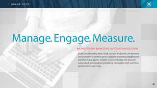
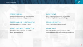
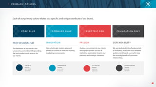
Brand standards for Distribion to help the company understand the use of logos, colors, and typography. This helps keep collateral cohesive for brand recognition when sales and marketing teams produce items to clients during sales calls and events.
Cross device applications have become more common among major companies in the last few years. It's a real challenge to preserve Agility and to keep your lead time short enough over 10 or 20 applications which also have to grow together… Were shall we start, how can we organize the team to make it work flawlessly? Rock bands from the late 60's and early 70's are a reference for a lot of people across several domains: Artists, Inventors, Scientists, and many more. Led Zeppelin, Pink Floyd, The Doors,… So many great examples of people creating amazing work together and also a wonderful source of inspiration. Let's take a deeper look at Led Zeppelin. A mythic rock band with charismatic members and a lot of interesting patterns with many similarities to Scrum. They that helped us to make our teams rock and build powerful, complex yet really Agile products.
Vertical Nerve (now Belo and Co) is a full service digital marketing agency. The brand standards help employees create on brand collateral that is outward face to help maintain the integrity of the brand.
Hello, my name is Mickey and I'm a UX / UI Designer. From my portfolio you will see some of the projects I've completed for my User Experience Immersive course at General Assembly. Thanks for reading!
Accessible Customer Experience Design for the 'Frozen Survivor'David Haddow
A UX case study project illustrating the methods used to identify gaps in health service provision for people after a major health event.
The presentation covers identifying customer persona's and how design systems and styles were modified for those 'hardest to reach' - the frozen survivors.
Wire-framing and prototyping are explored alongside a form of moderated user testing. The area of accessibility and accessible design is also touched upon.
Level the Playing Field: How Technology and Design Empower Businesses to Tak...Veronica Belmont
My presentation on best practices and tips for competing with big brands on social media, including how to increase your design velocity, and how to support your social audiences.
Map making for kids to help support #VisualizeNoMalariaAnya A'Hearn
Over the last couple of months, I was fortunate to have the opportunity to meet with the 4th and 5th Grade Girls Club at a San Francisco school and get them excited about all things data visualization and mapping. In a couple lunches and after school workshops we learned about cartography, map construction, and design, built our own outrageously fun custom maps of San Francisco using Mapbox, and finally contributed to the #VisualizeNoMalaria project by tracing buildings for Humanitarian OpenStreetMap. Here is my presentation for all the lessons.
Can AI do good? at 'offtheCanvas' India HCI preludeAlan Dix
Invited talk at 'offtheCanvas' IndiaHCI prelude, 29th June 2024.
https://www.alandix.com/academic/talks/offtheCanvas-IndiaHCI2024/
The world is being changed fundamentally by AI and we are constantly faced with newspaper headlines about its harmful effects. However, there is also the potential to both ameliorate theses harms and use the new abilities of AI to transform society for the good. Can you make the difference?
Dive into the innovative world of smart garages with our insightful presentation, "Exploring the Future of Smart Garages." This comprehensive guide covers the latest advancements in garage technology, including automated systems, smart security features, energy efficiency solutions, and seamless integration with smart home ecosystems. Learn how these technologies are transforming traditional garages into high-tech, efficient spaces that enhance convenience, safety, and sustainability.
Ideal for homeowners, tech enthusiasts, and industry professionals, this presentation provides valuable insights into the trends, benefits, and future developments in smart garage technology. Stay ahead of the curve with our expert analysis and practical tips on implementing smart garage solutions.
Between Filth and Fortune- Urban Cattle Foraging Realities by Devi S Nair, An...Mansi Shah
This study examines cattle rearing in urban and rural settings, focusing on milk production and consumption. By exploring a case in Ahmedabad, it highlights the challenges and processes in dairy farming across different environments, emphasising the need for sustainable practices and the essential role of milk in daily consumption.
Hello everyone! I am thrilled to present my latest portfolio on LinkedIn, marking the culmination of my architectural journey thus far. Over the span of five years, I've been fortunate to acquire a wealth of knowledge under the guidance of esteemed professors and industry mentors. From rigorous academic pursuits to practical engagements, each experience has contributed to my growth and refinement as an architecture student. This portfolio not only showcases my projects but also underscores my attention to detail and to innovative architecture as a profession.
White wonder, Work developed by Eva TschoppMansi Shah
White Wonder by Eva Tschopp
A tale about our culture around the use of fertilizers and pesticides visiting small farms around Ahmedabad in Matar and Shilaj.
Book Formatting: Quality Control Checks for DesignersConfidence Ago
This presentation was made to help designers who work in publishing houses or format books for printing ensure quality.
Quality control is vital to every industry. This is why every department in a company need create a method they use in ensuring quality. This, perhaps, will not only improve the quality of products and bring errors to the barest minimum, but take it to a near perfect finish.
It is beyond a moot point that a good book will somewhat be judged by its cover, but the content of the book remains king. No matter how beautiful the cover, if the quality of writing or presentation is off, that will be a reason for readers not to come back to the book or recommend it.
So, this presentation points designers to some important things that may be missed by an editor that they could eventually discover and call the attention of the editor.
Unleash Your Inner Demon with the "Let's Summon Demons" T-Shirt. Calling all fans of dark humor and edgy fashion! The "Let's Summon Demons" t-shirt is a unique way to express yourself and turn heads.
https://dribbble.com/shots/24253051-Let-s-Summon-Demons-Shirt
Expert Accessory Dwelling Unit (ADU) Drafting ServicesResDraft
Whether you’re looking to create a guest house, a rental unit, or a private retreat, our experienced team will design a space that complements your existing home and maximizes your investment. We provide personalized, comprehensive expert accessory dwelling unit (ADU)drafting solutions tailored to your needs, ensuring a seamless process from concept to completion.
2. The following pages are
more than just colors, fonts
and layouts; they are the essence of our brand – who we are and how we
do business. As an industry leader, we are committed to maintaining the
highest standards for responsible and consistent marketing practices, and
we have proactively established these brand standards to ensure that we
deliver on that commitment for our own brand.
Get toknowus
4. 4
B R A N D V O I C E
AN END-TO-END MARKETING AUTOMATION SOLUTION
Email, social media, direct mail, surveys and more, on demand
and in tandem. Distribion gives corporate marketing departments
and their local agents a better way to manage and execute
automated, personalized marketing campaigns with real-time
performance reporting.
Manage.Engage.Measure.
5. 5
B R A N D V O I C E
Expandyour reachSPEND MORE TIME WITH CUSTOMERS AND LESS TIME ON SOFTWARE
Innovation isatourcoreTECHNOLOGYBUILTFORCHANGE
6. 6
B R A N D V O I C E
Marketing
A PLATFORM AS UNIQUE ASYOUR BRAND
DISTRIBUTED
FRANCHISE
MULTI-CHANNEL
LOCAL
made easy
7. 7
C O R E VA L U E S
PROFESSIONAL
We will conduct ourselves as professionals in
our actions, demeanor and appearance.
DEPENDABLE & TRUSTWORTHY
We say we will do it – consider it done.
100% CUSTOMER COMMITTED
We will ensure all customers are ecstatic
about being a reference.
INNOVATIVE
Every employee is committed to finding and
implementing better ways to do things.
PROBLEM SOLVER
There is no problem we cannot solve.
RELENTLESS
We are the hardest working company in the
industry. We will always out-hustle our competitors.
8. 8
L O G O U S A G E
Minimum spacing around logo
CORRECT USAGE
CORRECT USAGE
INCORRECT USAGE
INCORRECT USAGE
L O G O
S P A C I N G
CORRECT USAGE INCORRECT USAGE
I C O N
Versions of the logo preceding 2015 should no longer be used
9. 9
L O G O U S A G E
L O G O W I T H D M N m e d i a TA G L I N E
L O G O W I T H TA G L I N E
P A R T N E R S H I P S
CORRECT USAGE
CORRECT USAGE
CORRECT USAGE
INCORRECT USAGE
INCORRECT USAGE
INCORRECT USAGE
Local marketing made easy
Equal visual weight and spacing for Distribion and partner logos
a DMNmedia company
a DMNmedia company a DMNmedia company
Distribion logo is too small with too little space around the dividing line Distribion logo is too large with too much space around the dividing line
10. 10
CORE BLUE
#003c5a
0/72/100/0
255/107/0
FORWARD BLUE
#009bbe
81/21/17/0
0/155/191
ELECTRIC RED
#e44045
5/90/75/0
228/65/69
FOUNDATION GRAY
#262626
0/0/0/85
38/38/38
C O R E B LU E F O R WA R D B LU E E L E C T R I C R E D F O U N D AT I O N G R AY
PROFESSIONALISM
The backbone of our brand is our
unwavering commitment to providing
the best products and services for
our clients.
INNOVATION
Our refreshingly modern approach
allows us to thrive in new and exciting
marketing environments.
PASSION
Zealous commitment to our clients
through the proven success of
marketing automation inspires our
planning and strategic initiatives.
DEPENDABILITY
We are dedicated to the fundamentals
of marketing that build trust between
audience and brand, paving the way
for mutually beneficial consumer
relationships.
Each of our primary colors relates to a specific and unique attribute of our brand.
P R I M A R Y C O L O R S
11. 11
S E C O N D A R Y C O L O R S
G R A P H I C C O LO R S
CHAR TS, GRAPHS & INFOGRAPHICS
ICONS
DARK BLUE
#0082a0
81/21/17/20
0/130/160
FORWARD BLUE
#009bbe
81/21/17/0
0/155/191
MEDIUM BLUE
#52b4cd
63/10/15/0
83/180/205
POWDER BLUE
#94c7d0
41/7/16/0
149/200/208
LIGHT BLUE
#aedfe4
30/0/10/0
175/223/228
CORE BLUE
#003c5a
0/72/100/0
255/107/0
WHITE
#ffffff
0/0/0/0
255/255/255
LIGHT GRAY
#bbbdc0
0/0/0/30
188/190/192
LIME GREEN
#bed63a
30/0/95/0
190/215/59
LIGHT BLUE
#aedfe4
30/0/10/0
175/223/228
ORANGE
#fcba63
0/30/70/0
253/186/99
FORWARD BLUE
#009bbe
81/21/17/0
0/155/191
ELECTRIC RED
#e44045
5/90/75/0
228/65/69
MEDIUM GRAY
#6d6e70
0/0/0/0
109/110/113
LO G O C O LO R S
13. 13
T Y P E FA C E S
CAPLINE
Helvetica LT STD Roman
UPPERCASE
MEANLINE
X-HEIGHT
WIDTH
BASELINE
LEFT APEX
Helvetica is one of the most popular typefaces in the world. It’s a
sans serif Grotesque typeface inspired by the Akzidenz-Grotesk
typeface created by Berthold around 1898.1
1 The original Helvetica was designed in Switzerland in 1957 by Max Miedinger
and Eduard Hoffmann at the Haas type foundry (Haas’sche Schriftgiesserei).
NEUE THIN
abcdefghijklmnopqrstuvwxyz 1234567890
LIGHT
abcdefghijklmnopqrstuvwxyz 1234567890
ROMAN
abcdefghijklmnopqrstuvwxyz 1234567890
CONDENSED
abcdefghijklmnopqrstuvwxyz 1234567890
CONDENSED BOLD
abcdefghijklmnopqrstuvwxyz 1234567890
MEDIUM
abcdefghijklmnopqrstuvwxyz 1234567890
SEMIBOLD
abcdefghijklmnopqrstuvwxyz 1234567890
H E LV E T I C A
R A L E WAY
LIGHT
abcdefghijklmnopqrstuvwxyz 1234567890
REGULAR
abcdefghijklmnopqrstuvwxyz 1234567890
CONDENSED LIGHT
abcdefghijklmnopqrstuvwxyz 1234567890
CONDENSED BOLD
abcdefghijklmnopqrstuvwxyz 1234567890
O P E N S A N S
Alternative Font
14. 14
T I T L E S , H E A D I N G S & S U B H E A D I N G S
R A L E WAY S E M I B O L D • all caps, open spacing, Electric Red
S L I D E H E A D E R
T I T L E H E A D L I N E S U B H E A D I N G 1
S U B H E A D I N G 2
C H A R T S , G R A P H S & I N F O G R A P H I C S
R A L E WAY M E D I U M
• all caps, open spacing
• thin enclosing box and arrows
• all caps, open spacing
• thin Electric Red arrow to the left of title
HELVE TICA CONDENSED • all caps, medium spacing, Forward Blue
HELVE TICA CONDENSED • all caps, medium spacing, Core Blue
HELVE TICA CONDENSED • all caps, medium spacing, Foundation Gray
HELVETICA CONDENSED BOLD • all caps, medium spacing, Forward Blue
R A L E WAY S E M I B O L D
• all caps, open spacing, reversed out
of graphic colors (see page 10)
Dark Blue Forward Blue MediumBlue Powder Blue
15. 15
PA R A G R A P H S T Y L I N G
H E R O P A R A G R A P H C O P Y 1
H E R O P A R A G R A P H C O P Y 2
B O D Y C O P Y
Nam fugiatiundis suntemquate deles vereicid
quid quia es int as aut elluptaturem et oditat rest,
niae simusam, con nitempe rionse nam hariam in
con earumquibus aut et fugitias eatis doloremque
doluptas cus, consequid quat et aut mo es mossi
derem faccatusa errum natiund andebit, ilit,
eseque sam eos a que es voles modio. Ut autatur,
inveles ipsum la et rerae pror
Faccatia de nonseque eosam que sandaesciis dolorrorem
idellaboriae asped estentia sa aut viducipis int que dolorem
dolo ditiberit apedio exped es sin re id et elis elluptate nobis
est et untisimos de eos quos assinum quam sed maiore libus
earionsequae vella venderferum vent
Magnis saped minum eniment quis as ex earchil iatinto ommol ese alia
ipiditatios ani untio odictem quam velecersped maximo cumIrionsup
icivehebus. Sa iaedio, patum dii peceri ingullabis moltorivivid deo, et
acrum ia inatu sedes? Publibus omne is An aciestrum in Etrit fachice
rioriondam senatil icernius.
B U L L E T P O I N T C O P Y ( P H R A S E )
B U L L E T P O I N T C O P Y ( L I S T )
D E S C R I P T I O N C O P Y
• Ote, qui es, Palest am pro constuu
• Edees comnit vis rescepere, mo prit
Dacredo nequam
• Verursulius hilne molis ficaudacia inat
audela mei pero.
• Em nonsinaris, uterivatrae ac tum
Romnes, utus converum.
• Edees comnit vis rescepere,
• Hilne molis ficaudacia inat
• Em nonsinaris
• Uterivatrae ac tum romnes
• Palest am pro constuu
• Ficaudacia inat
• Verursulius hilne molis
• Iqui optatias excepro
• Od eat iusant doluptati
• Dolor sita nis pa qui
• Helvetica Light
• medium spacing
• open leading
• Helvetica Light
• tight spacing
• tight leading between double lines
• open leading between bullet points
• Helvetica Light
• tight spacing
• open leading between bullet points
• Helvetica Condensed Light
• medium spacing
• open leading between bullet points
• Helvetica Light
• tight spacing
• medium leading
• Helvetica Condensed
• medium spacing
• medium leading
optional callouts–
Electric Red or Forward Blue
Forward Blue
Foundation Gray
Foundation Gray
Foundation Gray
Foundation Gray
body copy– Foundation Gray
16. 16
P R E S E N TAT I O N S T Y L I N G
I N T R O P A G E C O N T E N T
C O N T E N T P A G E W I T H I M A G ES E C T I O N B R E A K
N O N E S E Q U I R E P E L I S S I M U S A M
T I T L E PA G E S U B H E A D I N G
Sus abore nonesequi repelis simusam nis doluptat que
suntur? HenieneOtate sus, solo es simetus sent adit
moloris ute endempe enihiciam.
Sus abore nonesequi repelis simusam nis doluptat que
suntur? HenieneOtate sus, solo es simetus sent adit
moloris ute endempe enihiciam.
Sus abore nonesequi repelis simusam
nis doluptat que suntur? HenieneOtate
sus, solo es simetus sent adit
moloris ute endempe enihiciam.
Helvetica Condensed
open spacing
Helvetica Thin
Helvetica Light
HelveticaCondensedLight
Helvetica Condensed Bold
reversed out logo
Forward Blue bar
Forward Blue
Forward Blue
Core Blue
Helvetica Condensed
Helvetica Condensed Bold
(for emphasis)
Loremipsum
Loremipsum
Raleway Bold
open spacing
Core Blue bar
Electric Red arrow
HelveticaCondensedLight
Helvetica Condensed Bold
Core Blue
reversed out Core Blue bar
18. 18
S T Y L E & T R E AT M E N T
• thin strokes (1-2 pt.)
• thin strokes
• Raleway Medium
• open spacing
• used to separate sections of content
• 1 pt. stroke (enlarged here)
• used to separate larger sections of content
• footer usage
• icons
• photo overlays
• headings
A R R O W S
R E C TA N G L E H O L D I N G S H A P E
I L L AC E S VO LU P TA S
P E R S P I C I AT I S C O N S E C T E T U R
C I R C L E T R I A N G L E
D O T T E D L I N E
D O T S
ElectricRed
LimeGreen
Orange
Forward Blue
19. 19
I C O N S
W I T H C I R C L E
W I T H O U T C I R C L E
T I T L E O F I C O N
LightBlue
LightBlue
CoreBlueWhite White
Electric Red
Raleway Semibold all caps
STYLE A STYLE C STYLE DSTYLE B
CoreBluegradient
CoreBluegradient
• Helvetica Condensed Bold
• all caps
• two lines
Light BlueCore Blue Forward Blue
20. 20
C H A R T S & I N F O G R A P H I C S
equal visual weight for each logo
thin dotted line
disconnected corners to add space
headings can be flipped vertically
C H A R T S C L I E N T L O G O U S A G E
SUPPORT
COMMENTSINCLUDED? CATEGORY DETAILS
Powder Blue
Medium Blue
Forward Blue
Dark Blue
HOSPITALITY
FINANCIALSERVICES/
INSURANCE
HEALTHCARE/
PHARMACEUTICAL
TECHNOLOGYHOSPITALITY
grayscale logos for consistency
white space, centered logo
separated by
white bars
spacearound
type
dotted line
21. 21
I L L U S T R AT I O N S T Y L E
• simple, clean lines and shapes
• use of Electric Red to highlight
• cross hatch to show content area
• white space
• anonymity in people and places
• arrows in Forward Blue
A P P L I C AT I O N S C O M M O N E L E M E N T S
LOCAL AGENT POTENTIAL CUSTOMER
your company
Local Producer chooses an
email template which is
automatically personalized
and sends the email to a
potential customer.
System automatically
sends a confirmation email
to the local agent
system automatically
sends a follow up
after 5 days
system moves
lead to a
cold lead folder
your company
your company
RESPONSE
NO
RESPONSE
RESPONSE
NO
RESPONSE
23. 23
C AT E G O R I E S
MOVEMENT
Colorful images with a sense of energy
and movement provide visual interest while
conveying the speed and performance of
our product.
WORKSPACE
Interesting angles and crops of workspace
environments bring a sense of authenticity,
style and collaboration. Bright woodgrain
desks used against our blue tones provide
a warm, dynamic contrast.
TECH
Clean, smooth, technological-based
images reflect our digital platform
conveying innovation and efficiency.
High depth of field images provide
variance for a wide-range of uses.
CITY
Images of compelling cityscapes provide
visual texture symbolizing the detailed
and orderly framework of our platform.
PEOPLE
A human element brings personality
and approachability to our technology
acknowledging that every brand’s goal
is to connect with real people.
24. 24
• 85-90% Core Blue with multiply effect
• asymmetrical placement
• 100% Forward Blue with multiply effect
• asymmetrical placement
• asymmetrical layout • asymmetrical layout
• centered layout
• image too dark
• Electric red overlay on full page
• using Light Blue
• image too light
• centered layout
F U L L P A G E C I R C L E T R E AT M E N T
P H O T O G R A P H Y T R E AT M E N T
Core Blue Forward Blue
Electric Red Forward Blue
CORRECT USAGE CORRECT USAGE
INCORRECT USAGE INCORRECT USAGE
25. 25
F U L L C O L O R G R I D
prominent logo
with offset subhead
Core Blue stripe when
reversing out content
icontreatment
withoutcircles
70% of background area uses
blue duotone overlay treatment
icon overlay
• asymmetricalimageplacement
• colorful images from different
categories based on usage
transparent Forward Blue overlays
A P P L I C AT I O N S C O M M O N E L E M E N T S
Email Marketing Best Practices Guide
360THINK
Support local agents by providing one simple distributed
marketing automation platform that allows users to create, customize,
distribute and measure multi-channel marketing campaigns.
26. 26
M O N O T O N E G R I D
grayscale image
white transparent squaresCore Gray
transparent
squares
image fades
to white
A P P L I C AT I O N S C O M M O N E L E M E N T S
Email Marketing Best Practices Guide