Download as PDF, PPTX


![typography
Our two official fonts are Lobster Two Bold Italics – a lovely condensed script –
and Helvetica Neue Light – a neutral sans serif font. The later has stood the
test of time and set new standards in design. It can be used for all types of
communication, while Lobster Two is limited to headings and eye-catching
expressions.
HELVETICA NEUE LIGHT & BOLD
A B C D E F G H I J K L M N O P Q R S T U V W X Y Z Bold
a b c d e f g h i j k l m n o p q r s t u v w x y z
A B C D E F G H I J K L M N O P Q R S T U V W X Y Z Light
a b c d e f g h i j k l m n o p q r s t u v w x y z
Special Characters
Figures
0 1 2 3 4 5 6 7 8 9 0
! “ § $ % & / ( ) = ? ` ; : ¡ “ ¶ ¢ [ ] | { } ≠ ¿ ‘
« ∑ € ® † Ω ¨ ⁄ ø π • ± ‘ æ œ @ ∆ º ª © ƒ ∂ ‚ å ¥
≈ ç
Lobster Two Bold Italic
A B C D E F G H I J K L M N O P Q R S T U V W X Y Z Bold Italic
a b c d e f g h i j k l m n o p q r s t u v w x y z
Special Characters
Figures
0 1 2 3 4 5 6 7 8 9 0
! “ § $ % & / ( ) = ? ` ; : ¡ “ ¶ ¢ [ ] | { } ≠ ¿ ‘
« ∑ € ® † Ω ¨ ⁄ ø π • ± ‘ æ œ @ ∆ º ª © ƒ ∂ ‚ å ¥ ≈ ç
ARIAL REGULAR & BOLD
A B C D E F G H I J K L M N O P Q R S T U V W X Y Z Bold
a b c d e f g h i j k l m n o p q r s t u v w x y z
A B C D E F G H I J K L M N O P Q R S T U V W X Y Z Regular
a b c d e f g h i j k l m n o p q r s t u v w x y z
Special
Characters
Figures
0 1 2 3 4 5 6 7 8 9 0
! “ § $ % & / ( ) = ? ` ; : ¡ “ ¶ ¢ [ ] | { } ≠ ¿ ‘
« ∑ € ® † Ω ¨ ⁄ ø π • ± ‘ æ œ @ ∆ º ª © ƒ ∂ ‚ å ¥
≈ ç
Usage:
First-choice for heading
& copy in print, ppt,
web, NL & mail.
Usage
First-choice for titles in print, ppt,
web, NL & mail.
Always bold, italics & lower case.
Headings limited to 10 words.
Usage:
Second-choice for
heading & body in print,
ppt, web, NL & mail.](https://image.slidesharecdn.com/brandguidelines-managerslides-171115131143/85/Brand-Guidelines-managerslides-18-320.jpg)


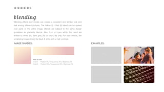


The document outlines brand guidelines for Managerslides, detailing the visual and verbal elements that constitute the corporate identity, including the use of logo, colors, typography, and imagery. It emphasizes the importance of consistency and quality in communication to establish a strong brand image, outlining specific rules for color usage, logo integrity, and design hierarchy. The guidelines serve as a comprehensive resource for ensuring that all brand representations align with the company's values and mission.


