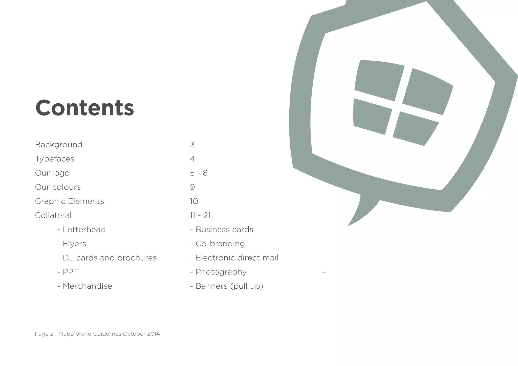
This document provides branding guidelines for Nabo, including:
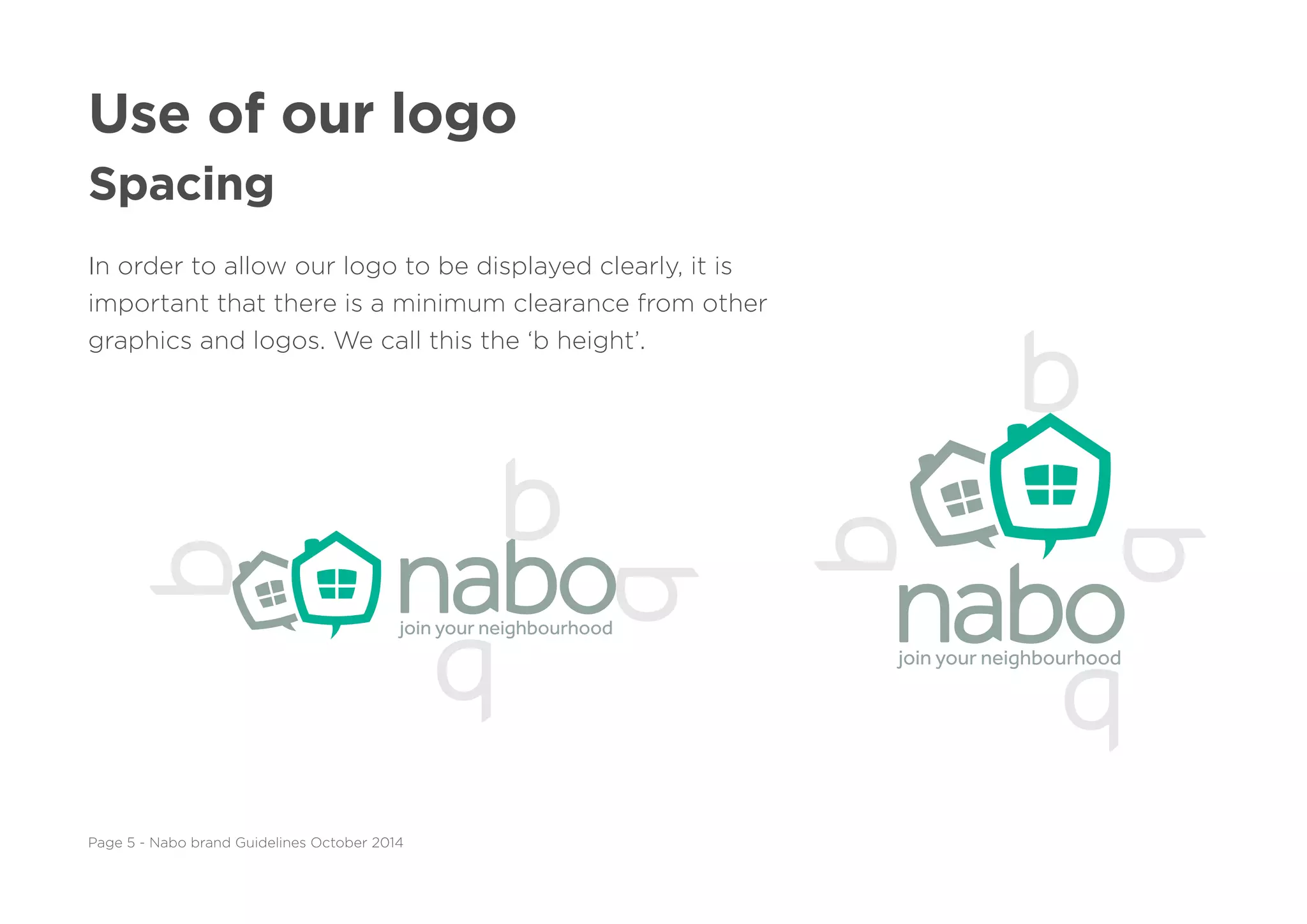
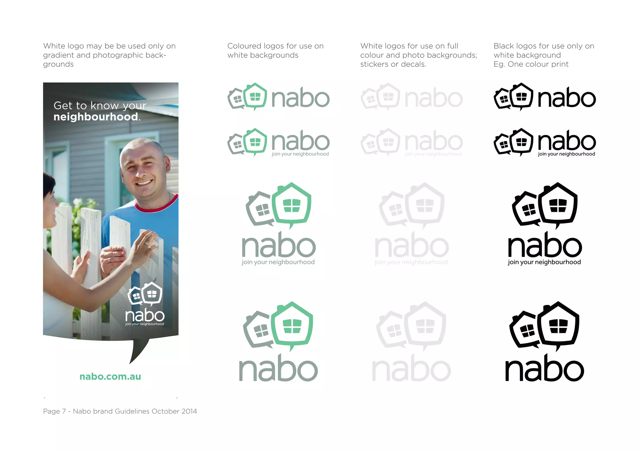
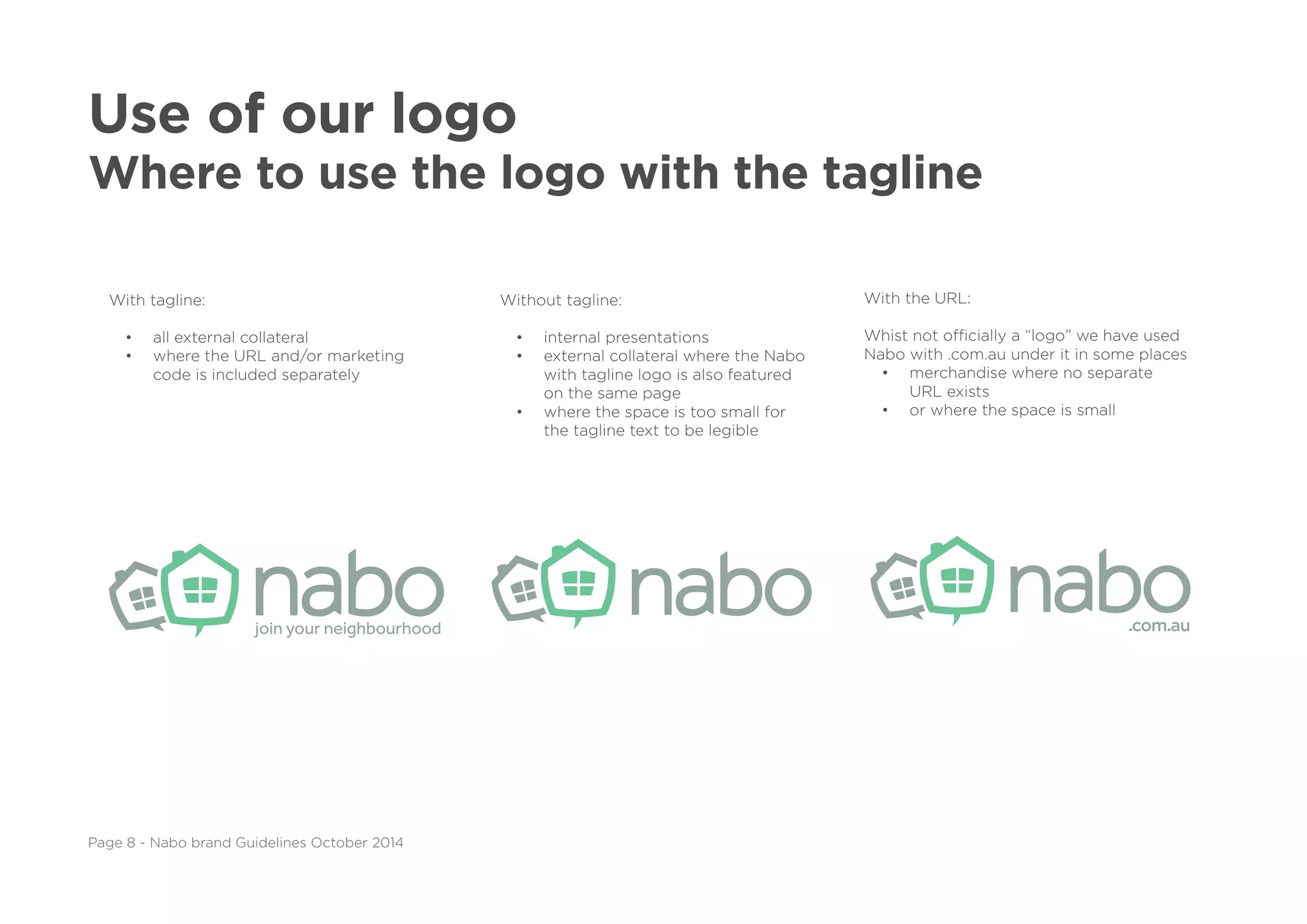
- Allowable uses of the Nabo logo in different contexts and with/without the tagline
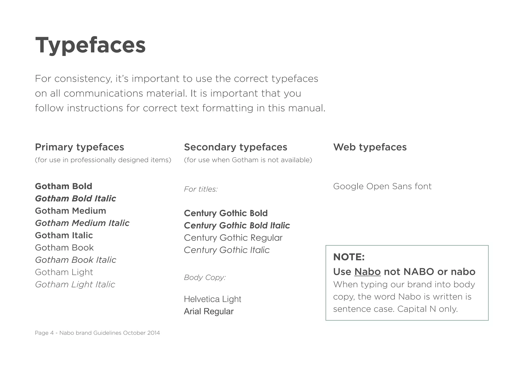
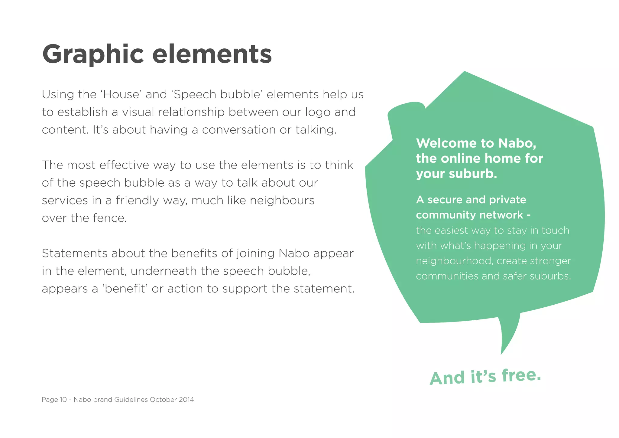
- Approved typefaces, colors, and graphic elements
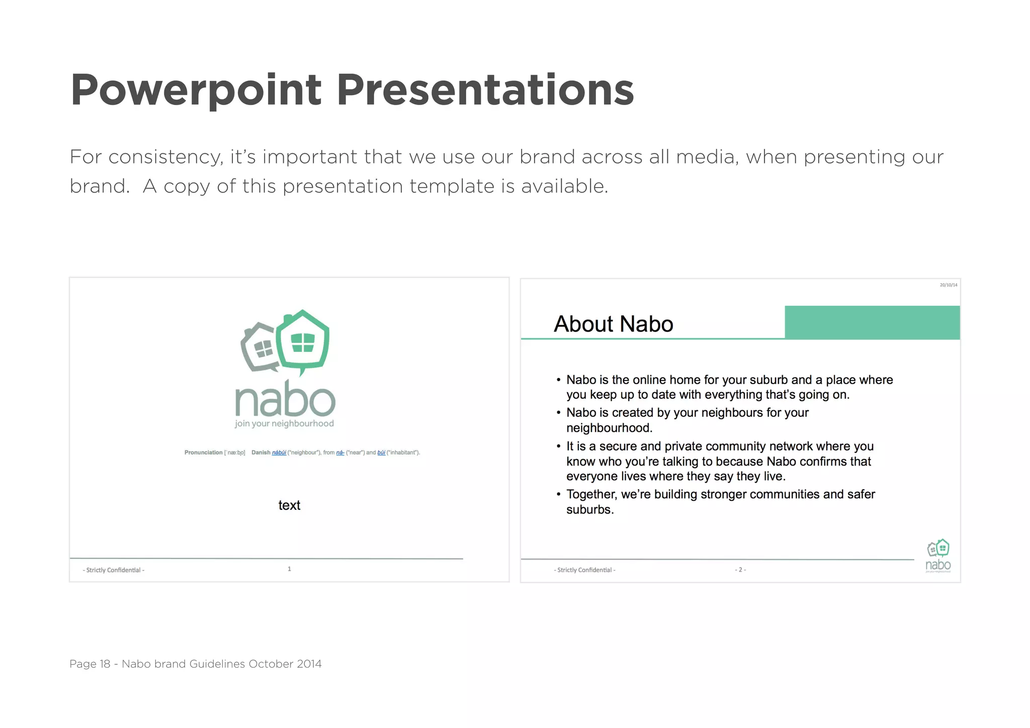
- Examples of how to layout the logo on various collateral like letterhead, business cards, presentations, etc.
- Instructions for designers and developers to ensure branding consistency across all communication materials