Vermillion - Brand Manual
•
3 likes•1,243 views

This document provides a design manual and branding guidelines for the Vermillion Group. It outlines the corporate logo, including approved formats, constructions, and incorrect usages. It also establishes typography guidelines, specifying primary and secondary fonts. Finally, it defines the corporate color system, including primary and secondary colors to be used consistently across all communication materials. The guidelines are intended to ensure a cohesive brand identity and visual style is maintained.

Recommended
More Related Content
Similar to Vermillion - Brand Manual
Similar to Vermillion - Brand Manual (20)
More from Hershey Desai
More from Hershey Desai (18)
Recently uploaded
Recently uploaded (20)
Vermillion - Brand Manual
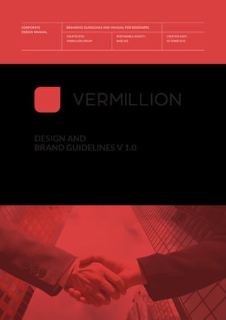
- 1. CORPORATE DESIGN MANUAL CREATED FOR : VERMILLION GROUP RESPONSIBLE AGENCY : BASE 501 CREATION DATE : OCTOBER 2015 BRANDING GUIDELINES AND MANUAL FOR DESIGNERS DESIGN AND BRAND GUIDELINES V 1.0
- 3. VERMILLIONBRANDGUIDELINES >>PAGE3//40 TABLE OF CONTENTS DESIGN AND BRAND GUIDELINES Sec. 01 | Introduction Sec. 02 | Corporate logo Sec. 03 | Corporate Typography Sec. 04 | Corporate Color System Sec. 05 | Corporate Stationery Sec. 06 | Corporate Images Sec. 07 | Iconography Sec. 08 | Summary and Contact Sec. 09 | Downloads ISSUE 01 VERMILLION DESIGN AND BRAND GUIDELINES CREATED FOR : VERMILLION GROUP RESPONSIBLE AGENCY : BASE 501 >> TABLE OF CONTENTSSECTION ONE : INTRODUCTION TO GUIDELINES
- 4. >>PAGE4//40 VERMILLIONBRANDGUIDELINES ISSUE 01 VERMILLION DESIGN AND BRAND GUIDELINES CREATED FOR : VERMILLION GROUP RESPONSIBLE AGENCY : BASE 501 >> INTRODUCTIONSECTION ONE : INTRODUCTION INTO GUIDELINES USING THE DESIGN GUIDELINES These guidelines describe the visual and verbal elements that represent Vermillion‘s corporate identity. This includes our name, logo and other elements such as color, type and graphics. Sending a consistent and controlled message of who we are is essential to presenting a strong, unified image of our company. The Vermillion brand, including the logo, name, colors and identifying elements, are valuable company assets and each of us are responsible for protecting the company’s inte- rests by preventing unauthorized or incorrect use of the Vermillion name and marks. This guide will serve as a handy tool to ensure the Vermillion branding remains consistent throughout its usage across mediums to reflect our commitment to quality, consistency and style.
- 5. VERMILLIONBRANDGUIDELINES >>PAGE5//40 01 / A INTRODUCTION TO OUR DESIGN GUIDELINES AND BRAND MANUAL ISSUE 01 VERMILLION DESIGN AND BRAND GUIDELINES CREATED FOR : VERMILLION GROUP RESPONSIBLE AGENCY : BASE 501 >> INTRODUCTIONSECTION ONE : INTRODUCTION INTO GUIDELINES
- 6. >>PAGE6//40 VERMILLIONBRANDGUIDELINES ISSUE 01 VERMILLION DESIGN AND BRAND GUIDELINES CREATED FOR : VERMILLION GROUP RESPONSIBLE AGENCY : BASE 501 >> THE VERMILLION LOGO THE LOGO CONSTRUCTION CLEARSPACE & COMPUTATION THE LOGO APPLICATION INCORRECT LOGO USAGE SECTION TWO : LOGO AND GUIDELINES 02 / CORPORATE LOGO RECOMMENDED FORMATS ARE: .eps | .ai | .png | .jpg | .tiff ATTENTION: Use of any stylized, animated, hand drawn or other versions of a inofficial logo is not permitted. This under- mines the logo system and brand consistency. THE FULL LOGOTYPE Our Logo is the key building block of our identity, the primary visual element that identifies us. The signature is a combination of the the logo symbol itself and our company name as the logotype. They have a fixed relationship that should never be changed in any way. The Logo Symbol is a minimal shape evoking the simplicity of services offered - the connection between the strength of communication and the different points that influence. The Logotype has been chosen for its modern, refined, highly legible style, which has been further enhanced by the use of upper case letters. The typeface is CakeSans and Aquatico with a modified letter R and it balances perfectly with the logo symbol. The corporate logo is presented through the use of colour as well as shape and form. The corporate colours are Red and Grey. It is a fresh blend of co- lours chosen for their strong combination - modern - classic - timeless.
- 7. VERMILLIONBRANDGUIDELINES >>PAGE7//40 ISSUE 01 VERMILLION DESIGN AND BRAND GUIDELINES CREATED FOR : VERMILLION GROUP RESPONSIBLE AGENCY : BASE 501 >> THE VERMILLION LOGO THE LOGO CONSTRUCTION CLEARSPACE & COMPUTATION THE LOGO APPLICATION INCORRECT LOGO USAGE SECTION TWO : LOGO AND GUIDELINES 1 THE GENERAL LOGO The main logo to be used on white or colored backround. For darker backrounds you will find an alter- native below. 2 THE LOGO SYMBOL Consists of a powerful element evoking the simplicity of services in a bright vermillion red. 3 THE LOGO TITLE Chosen for its modern and yet refined, highly legible style, which has been further enhanced by the use of upper case letters in gray tone of the chosen corporate color. The font that is used here is CakeSans with a variant on the letter R. 2 3 1 THE GENERAL LOGO a THE LOGO ON RED VERSION b THE LOGO ON GREY VERSION
- 8. CAPITAL ADVISORS = 1x 1x 0.5x 2x 2x 1x >>PAGE8//40 VERMILLIONBRANDGUIDELINES ISSUE 01 VERMILLION DESIGN AND BRAND GUIDELINES CREATED FOR : VERMILLION GROUP RESPONSIBLE AGENCY : BASE 501 THE VERMILLION LOGO >> THE LOGO CONSTRUCTION >> CLEARSPACE & COMPUTATION THE LOGO APPLICATION INCORRECT LOGO USAGE SECTION TWO : LOGO AND GUIDELINES LOGO CONSTRUCTION, CLEARSPACE AND COMPUTATION It is important to keep corporate marks clear of any other graphic elements. To regulate this, an exclusion zone has been established around the corporate mark. This exclusion zone indicates the closest any other graphic element or message can be positioned in relation to the mark.of the the symbol itself and our company name – they have a fixed relationship that should never be changed in any way. 02 / CORPORATE LOGO
- 9. 1x 1x 1x1x 1x 1x 1x1x VERMILLIONBRANDGUIDELINES >>PAGE9//40 ISSUE 01 VERMILLION DESIGN AND BRAND GUIDELINES CREATED FOR : VERMILLION GROUP RESPONSIBLE AGENCY : BASE 501 THE VERMILLION LOGO >> THE LOGO CONSTRUCTION >> CLEARSPACE & COMPUTATION THE LOGO APPLICATION INCORRECT LOGO USAGE SECTION TWO : LOGO AND GUIDELINES CLEARSPACE - Full Logo DEFINITION - Whenever you use the logo, it should be surrounded with clear space to ensure its visibility and impact. No graphic elements of any kind should invade this zone. COMPUTATION - To work out the clearspace take the height of the logo and divide it in half. (Space = Height / 2). CLEARSPACE - Logo Symbol
- 10. >>PAGE10//40 VERMILLIONBRANDGUIDELINES ISSUE 01 VERMILLION DESIGN AND BRAND GUIDELINES CREATED FOR : VERMILLION GROUP RESPONSIBLE AGENCY : BASE 501 THE VERMILLION LOGO THE LOGO CONSTRUCTION CLEARSPACE & COMPUTATION >> THE LOGO APPLICATION INCORRECT LOGO USAGE SECTION TWO : LOGO AND GUIDELINES 02 / CORPORATE LOGO APPLICATION ON A BACKGROUND
- 11. VERMILLIONBRANDGUIDELINES >>PAGE11//40 ISSUE 01 VERMILLION DESIGN AND BRAND GUIDELINES CREATED FOR : VERMILLION GROUP RESPONSIBLE AGENCY : BASE 501 THE VERMILLION LOGO THE LOGO CONSTRUCTION CLEARSPACE & COMPUTATION THE LOGO APPLICATION >> INCORRECT LOGO USAGE SECTION TWO : LOGO AND GUIDELINES 5 3 4 1 2 6 FULL LOGO SIZES Minimum Size: 30 mm x 5.04 mm MINIMUM LOGO SIZES LOGO SYMBOL Minimum Size: 6 mm x 6 mm INCORRECT APPLICATIONS - DO NOT - 1 Do not rotate the logo symbol 2 Do not change placement of the logo symbol 3 Do not change size relationship between the logo and logotype 4 Do not change the proportions of the logo and logotype. 5 Do not change color of the logotype 6 Do not place the logo on top of logotype 30 mm 06 mm
- 12. >>PAGE12//40 VERMILLIONBRANDGUIDELINES 03 / CORPORATE TYPOGRAPHY LOGO FONT CAKE SANS DESIGNER : reghardt & Andrew Herndon - CLASSIFICATION : San Serif - THE FONT Cake Sans is a simple rounded sans serif for when life get to complicated. Uppercase, lowercase, numbers and some punctuation, available in light, regular and bold. Aquatico is a new typeface inspired by the sea creatures of the lowest point on earth. This Ty- peface comes with Aquatico Regular, Oblique, Light & Light Oblique. ISSUE 01 VERMILLION DESIGN AND BRAND GUIDELINES CREATED FOR : VERMILLION GROUP RESPONSIBLE AGENCY : BASE 501 >> THE CORPORATE FONTS >> PRIMARY FONT SECONDARY FONT TYPOGRAPHY HIERARCHY SECTION THREE : CORPORATE TYPORGRAPHY THE CORPORATE FONTS AND TYPOGRAPHY Typography plays an important role in communicating an overall tone and quality. Careful use of typography reinforces our personality and ensures clarity and harmony in all Vermillion communications. We have selected Cake Sans & Aquatico as primary typfaces and Lato as secondary corporate typeface, which helps inject energy and enthusiasm into the entire Vermillion communications.
- 13. VERMILLIONBRANDGUIDELINES >>PAGE13//40 A B C D E F G H I J K L M N O P Q R S T U V W X Y Z a b c d e f g h i j k l m n o p q r s t u v w x y z A B C D E F G H I J K L M N O P Q R S T U V W X Y Z a b c d e f g h i j k l m n o p q r s t u v w x y z 0 1 2 3 4 5 6 7 8 9 0 0 1 2 3 4 5 6 7 8 9 0 CAKESANS REGULAR : - AQUATICO REGULAR : - FIGURES : - FIGURES : - ISSUE 01 VERMILLION DESIGN AND BRAND GUIDELINES CREATED FOR : VERMILLION GROUP RESPONSIBLE AGENCY : BASE 501 >> THE CORPORATE FONTS >> PRIMARY FONT SECONDARY FONT TYPOGRAPHY HIERARCHY SECTION THREE : CORPORATE TYPORGRAPHY
- 14. >>PAGE14//40 VERMILLIONBRANDGUIDELINES 03 / CORPORATE TYPOGRAPHY ISSUE 01 VERMILLION DESIGN AND BRAND GUIDELINES CREATED FOR : VERMILLION GROUP RESPONSIBLE AGENCY : BASE 501 THE CORPORATE FONTS PRIMARY FONT >> SECONDARY FONT TYPOGRAPHY HIERARCHY SECTION THREE : CORPORATE TYPORGRAPHY LATO BOLD LATO LIGHT LATO BLACK LATO REGULAR THE SECONDARY FONT AND THE TYPOGRAPHY
- 15. VERMILLIONBRANDGUIDELINES >>PAGE15//40 A B C D E F G H I J K L M N O P Q R S T U V W X Y Z a b c d e f g h i j k l m n o p q r s t u v w x y z A B C D E F G H I J K L M N O P Q R S T U V W X Y Z a b c d e f g h i j k l m n o p q r s t u v w x y z 0 1 2 3 4 5 6 7 8 9 0 ! “ § $ % & / ( ) = ? ` ; : ¡ “ ¶ ¢ [ ] | { } ≠ ¿ ‘ « ∑ € ® † Ω ¨ ⁄ ø π • ± ‘ æ œ @ ∆ º ª © ƒ ∂ ‚ å ¥ ≈ ç LATO REGULAR : - LATO BOLD : - FIGURES : - SPECIAL CHARACTERS : - SECONDARY FONT LATO DESIGNER : Łukasz Dziedzic - CLASSIFICATION : Sans Serif - THE FONT Lato carefully balances some potentially conflicting priorities. It seems quite “transparent” when used in body text but would display some original traits when used in larger sizes, using classical pro- portions (particularly visible in the uppercase) to give the letterforms familiar harmony and elegance. The semi-rounded details of the letters give Lato a feeling of warmth, while the strong structure provides stability and seriousness, ”with the feeling of the Summer,” says Łukasz. ISSUE 01 VERMILLION DESIGN AND BRAND GUIDELINES CREATED FOR : VERMILLION GROUP RESPONSIBLE AGENCY : BASE 501 THE CORPORATE FONTS PRIMARY FONT >> SECONDARY FONT TYPOGRAPHY HIERARCHY SECTION THREE : CORPORATE TYPORGRAPHY
- 16. >>PAGE16//40 VERMILLIONBRANDGUIDELINES TYPOGRAPHY AND TEXT HIERARCHY Typographic hierarchy is another form of visual hierarchy, a sub-hierarchy per se in an overall design project. Typographic hierarchy presents lettering so that the most important words are displayed with the most impact so users can scan text for key information. Typographic hierarchy creates contrast between elements. There are a variety of ways you can create a sense of hierarchy. Here are some of the most common techniques for Vermillion layouts. 03 / CORPORATE TYPOGRAPHY CONTEXT TEXT AND INNER HEADLINES - Vermillion Type Captions - Lato Regular 6.5 pt Type / 12 pt Leading Vermillion Type Copy text - Lato Regular 9 pt Type / 12 pt Leading CAPTION TEXT : - COPY TEXT : - VERMILLION TYPE HEADLINE - Lato Regular - Capital Letters 14 pt Type / 18 pt Leading SUBLINES SECTIONS : - ISSUE 01 VERMILLION DESIGN AND BRAND GUIDELINES CREATED FOR : VERMILLION GROUP RESPONSIBLE AGENCY : BASE 501 THE CORPORATE FONTS PRIMARY FONT SECONDARY FONT >> TYPOGRAPHY HIERARCHY SECTION THREE : CORPORATE TYPORGRAPHY
- 17. VERMILLIONBRANDGUIDELINES >>PAGE17//40 CONTEXT TEXT AND INNER HEADLINES - HEADLINES AND TYPOBREAKS - VERMILLION TYPE - Lato Bold - Capital Letters 22 pt Type / 22 pt Leading HEADLINE 01 : - VERMILLION TYPE- Lato Bold - Capital Letters 35 pt Type / 35 pt Leading VERMILLION TYPE- Lato Black - Capital Letters 35 pt Type / 35 pt Leading HEADLINE 02 : - HEADLINE 03 : - ISSUE 01 VERMILLION DESIGN AND BRAND GUIDELINES CREATED FOR : VERMILLION GROUP RESPONSIBLE AGENCY : BASE 501 THE CORPORATE FONTS PRIMARY FONT SECONDARY FONT >> TYPOGRAPHY HIERARCHY SECTION THREE : CORPORATE TYPORGRAPHY
- 18. >>PAGE18//40 VERMILLIONBRANDGUIDELINES THE PRIMARY COLOR SYSTEM AND COLOR CODES Color plays an important role in the Vermillion corporate identity program. The colors below are recommendations for various media. A palette of primary colors has been developed, which comprise the “One Voice” color scheme. Consistent use of these colors will contribute to the cohesive and harmonious look of the Vermillion brand identity across all relevant media. Check with your designer or printer when using the corporate colors that they will be always be consistent. PRIMARY COLOR SYSTEM - EXPLANATION: The Vermillion Brand has two official colors: Red and Gray. These colors have become a recognizable identifier for the company. USAGE: Use them as the dominant color palette for all internal and external visual presentations of the company. 04 / CORPORATE COLOR SYSTEM ISSUE 01 VERMILLION DESIGN AND BRAND GUIDELINES CREATED FOR : VERMILLION GROUP RESPONSIBLE AGENCY : BASE 501 >> THE COLOR SYSTEM >> THE PRIMARY COLORS THE SECONDARY COLORS SECTION FOUR : CORPORATE COLOR SYSTEM
- 19. VERMILLIONBRANDGUIDELINES >>PAGE19//40 PRIMARY COLOR RED - COLOR CODES CMYK : C000 M088 Y073 K009 Pantone : 52-15C RGB : R215 G055 B056 Web : #d73637 PRIMARY COLOR GREY - COLOR CODES CMYK : C060 M054 Y048 K060 Pantone : 172-16C RGB : R068 G064 B066 Web : #3b3a3e VERMILLION RED VERMILLION GREY 100 % 60 %80 % 40 % 20 % Red Gradient 100 % 60 %80 % 40 % 20 % Gray Gradient COLOR TONES COLOR TONES ISSUE 01 VERMILLION DESIGN AND BRAND GUIDELINES CREATED FOR : VERMILLION GROUP RESPONSIBLE AGENCY : BASE 501 >> THE COLOR SYSTEM >> THE PRIMARY COLORS THE SECONDARY COLORS SECTION FOUR : CORPORATE COLOR SYSTEM
- 20. >>PAGE20//40 VERMILLIONBRANDGUIDELINES THE SECONDARY COLOR SYSTEM AND COLOR CODES SECONDARY COLOR SYSTEM - EXPLANATION: The Secondary colors are complementary to our official colors, but are not recognizable identifiers for Vermillion brand. Secondary colors should be used sparingly, that is, in less than 10 percent of the palette in one piece. USAGE: Use them to accent and support the primary color palette. 04 / CORPORATE COLOR SYSTEM ISSUE 01 VERMILLION DESIGN AND BRAND GUIDELINES CREATED FOR : VERMILLION GROUP RESPONSIBLE AGENCY : BASE 501 THE COLOR SYSTEM THE PRIMARY COLORS >> THE SECONDARY COLORS SECTION FOUR : CORPORATE COLOR SYSTEM
- 21. VERMILLIONBRANDGUIDELINES >>PAGE21//40 COLOR CODES CMYK : C100 M000 Y000 K024 Pantone : 116-8C RGB : R000 G131 B187 Web : #0083ba COLOR CODES CMYK : C000 M057 Y100 K000 Pantone : 24-8C HKS : 02K RGB : R240 G131 B000 Web : #f08300 60 % 40 % 20 % 60 % 40 % 20 % COLOR CODES CMYK : C059 M078 Y000 K028 Pantone : 94-13C RGB : R105 G062 B122 Web : #693d7a COLOR CODES CMYK : C100 M000 Y079 K000 Pantone : 136-8C RGB : R000 G151 B096 Web : #009660 60 % 40 % 20 % 60 % 40 % 20 % ISSUE 01 VERMILLION DESIGN AND BRAND GUIDELINES CREATED FOR : VERMILLION GROUP RESPONSIBLE AGENCY : BASE 501 THE COLOR SYSTEM THE PRIMARY COLORS >> THE SECONDARY COLORS SECTION FOUR : CORPORATE COLOR SYSTEM
- 22. >>PAGE22//40 VERMILLIONBRANDGUIDELINES ISSUE 01 VERMILLION DESIGN AND BRAND GUIDELINES CREATED FOR : VERMILLION GROUP RESPONSIBLE AGENCY : BASE 501 >> THE BUSINESS LETTERHEAD THE BUSINESS CARDS THE BUSINESS ENVELOPE SECTION FIVE : CORPORATE STATIONERY THE COMPANY LETTERHEAD EXPLANATION: This shows the approved layouts with the primary elements of the Vermillion stationery system for the letter- heads. DIMENSIONS 297 x 210 mm DIN A4 WEIGHT 120g/m Uncoated white PRINT CMYK USAGE: The letterhead will be used for all official com- munication that is going out of Vermillion brand. 05 / CORPORATE STATIONERY VERMILLION CAPITAL ADVISORS PVT LTD Email: info@vermillioncapital.in Website: www.vermillioncapital.in Regd Office: F/801, Jai Balaji CHS Ltd, Sector 6, Nerul, Mumbai – 400 706 CIN: U67190MH2008PTC180658 CAPITAL ADVISORS Corporate Office: 4C & D, Siddhivinayak Chambers, Gandhi Nagar, Bandra (E), Mumbai – 400 051 Lorem Ipsum is simply dummy text of the printing and typesetting industry. Lorem Ipsum has been the industry's standard dummy text ever since the 1500s, when an unknown printer took a galley of type and scrambled it to make a type specimen book. It has survived not only five centuries, but also the leap into electronic typesetting, remaining essentially unchanged. It was popularised in the 1960s with the release of Letraset sheets containing Lorem Ipsum passages, and more recently with desktop publishing software like Aldus PageMaker including versions of Lorem Ipsum. Contrary to popular belief, Lorem Ipsum is not simply random text. It has roots in a piece of classical Latin literature from 45 BC, making it over 2000 years old. Richard McClintock, a Latin professor at Hampden-Sydney College in Virginia, looked up one of the more obscure Latin words, consectetur, from a Lorem Ipsum passage, and going through the cites of the word in classical literature, discovered the undoubtable source. Lorem Ipsum comes from sections 1.10.32 and 1.10.33 of „de Finibus Bonorum et Malorum“ (The Extremes of Good and Evil) by Cicero, written in 45 BC. This book is a treatise on the theory of ethics, very popular during the Renaissance. The first line of Lorem Ipsum, „Lorem ipsum dolor sit amet..“, comes from a line in section 1.10.32.
- 23. VERMILLION CAPITAL ADVISORS PVT LTD Email: info@vermillioncapital.in Website: www.vermillioncapital.in Regd Office: F/801, Jai Balaji CHS Ltd, Sector 6, Nerul, Mumbai – 400 706 CIN: U67190MH2008PTC180658 CAPITAL ADVISORS Corporate Office: 4C & D, Siddhivinayak Chambers, Gandhi Nagar, Bandra (E), Mumbai – 400 051 VERMILLIONBRANDGUIDELINES >>PAGE23//40 ISSUE 01 VERMILLION DESIGN AND BRAND GUIDELINES CREATED FOR : VERMILLION GROUP RESPONSIBLE AGENCY : BASE 501 >> THE BUSINESS LETTERHEAD THE BUSINESS CARDS THE BUSINESS ENVELOPE SECTION FIVE : CORPORATE STATIONERY LETTERHEAD DOWNLOAD LINK http://www.vermillion.com/ branding/letterhead Lorem Ipsum is simply dummy text of the printing and typesetting industry. Lorem Ipsum has been the industry's standard dummy text ever since the 1500s, when an unknown printer took a galley of type and scrambled it to make a type specimen book. It has survived not only five centuries, but also the leap into electronic typesetting, remaining essentially unchanged. It was popularised in the 1960s with the release of Letraset sheets containing Lorem Ipsum passages, and more recently with desktop publishing software like Aldus PageMaker including versions of Lorem Ipsum. Contrary to popular belief, Lorem Ipsum is not simply random text. It has roots in a piece of classical Latin literature from 45 BC, making it over 2000 years old. Richard McClintock, a Latin professor at Hampden-Sydney College in Virginia, looked up one of the more obscure Latin words, consectetur, from a Lorem Ipsum passage, and going through the cites of the word in classical literature, discovered the undoubtable source. Lorem Ipsum comes from sections 1.10.32 and 1.10.33 of „de Finibus Bonorum et Malorum“ (The Extremes of Good and Evil) by Cicero, written in 45 BC. This book is a treatise on the theory of ethics, very popular during the Renaissance. The first line of Lorem Ipsum, „Lorem ipsum dolor sit amet..“, comes from a line in section 1.10.32. It is a long established fact that a reader will be distracted by the readable content of a page when looking at its layout. The point of using Lorem Ipsum is that it has a more-or-less normal distribution of letters, as opposed to using ‚Content here, content here‘, making it look like readable English. Many desktop publishing packages and web page editors now use Lorem Ipsum as their default model text, and a search for ‚lorem ipsum‘ will uncover many web sites still in their infancy. Various versions have evolved over the years, sometimes by accident, sometimes on purpose (injected humour and the like). There are many variations of passages of Lorem Ipsum available, but the majority have suffered alteration in some form, by injected humour, or randomised words which don‘t look even slightly believable. If you are going to use a passage of Lorem Ipsum, you need to be sure there isn‘t anything embarrassing hidden in the middle of text. All the Lorem Ipsum generators on the Internet tend to repeat predefined chunks as necessary, making this the first true generator on the Internet. It uses a dictionary of over 200 Latin words, combined with a handful of model sentence structures, to generate Lorem Ipsum which looks reasonable. The generated Lorem Ipsum is therefore always free from repetition, injected humour, or non-characteristic words etc.
- 24. Pratapsingh Nathani Managing Director pratap@vermillioncapital.in 4C & D, Siddhivinayak Chambers, Gandhi Nagar, Opp MIG Cricket Club, Bandra (E), Mumbai – 400051 www.vermillioncapital.in+91 9820 408 784 +91-22-26557500 VERMILLION CAPITAL ADVISORS PVT LTD >>PAGE24//40 VERMILLIONBRANDGUIDELINES ISSUE 01 VERMILLION DESIGN AND BRAND GUIDELINES 05 / CORPORATE STATIONERY CREATED FOR : VERMILLION GROUP RESPONSIBLE AGENCY : BASE 501 THE BUSINESS LETTERHEAD >> THE BUSINESS CARDS THE BUSINESS ENVELOPE SECTION FIVE : CORPORATE STATIONERY EXPLANATION: This shows the approved layouts with the primary elements of the Vermillion stationery for business cards. DIMENSIONS 90 x 50 mm WEIGHT 350g/m Uncoated white PRINT CMYK FRONTSIDE: BACKSIDE: THE COMPANY BUSINESS CARDS BLANK
- 25. VERMILLIONBRANDGUIDELINES >>PAGE25//40 COMPANY ENVELOPE EXPLANATION: This shows the approved layouts with the primary elements of the Vermillion stationery system for the envelope DIMENSIONS Big Envelope: 12 x 9 in Small Envelope: 10.75 x 4.75 in ISSUE 01 VERMILLION DESIGN AND BRAND GUIDELINES CREATED FOR : VERMILLION GROUP RESPONSIBLE AGENCY : BASE 501 THE BUSINESS LETTERHEAD THE BUSINESS CARDS >> THE BUSINESS ENVELOPE SECTION FIVE : THE BUSINESS ENVELOPE PRINT CMYK VERMILLION CAPITAL ADVISORS PVT LTD Email: info@vermillioncapital.in Website: www.vermillioncapital.in CAPITAL ADVISORS Corporate Office: 4C & D, Siddhivinayak Chambers, Gandhi Nagar, Bandra (E), Mumbai – 400 051 CAPITAL ADVISORS VERMILLION CAPITAL ADVISORS PVT LTD Email: info@vermillioncapital.in Website: www.vermillioncapital.in Corporate Office: 4C & D, Siddhivinayak Chambers, Gandhi Nagar, Bandra (E), Mumbai – 400 051
- 26. >>PAGE26//40 VERMILLIONBRANDGUIDELINES ISSUE 01 VERMILLION DESIGN AND BRAND GUIDELINES CREATED FOR : VERMILLION GROUP RESPONSIBLE AGENCY : BASE 501 >> THE CORPORATE IMAGES >> COLORED IMAGES BLACK AND WHITE IMAGES BLENDING MODES SECTION SIX : IMAGES AND BLENDING MODES VERMILLION CORPORATE IMAGE : COLORED IMAGES EXPLANATION: Corporate Images are responsible to transfer the values of Vermillion to our customers and our potential customers. It is a composite psychological impression that continually changes with the firm’s circumstances, media coverage, performance, pronouncements, etc. Vermillion uses various corporate advertising techniques to enhance their public image in order to improve their desirability as a supplier, employer, customer, borrower, partner, etc. 06 / IMAGES AND BLENDING MODES
- 27. VERMILLIONBRANDGUIDELINES >>PAGE27//40 EXAMPLES FOR VERMILLION CORPORATE IMAGE - REQUIREMENTS: - high contrast - sharp images - Minimal style - modern and businesslike - Preferably close up photos ISSUE 01 VERMILLION DESIGN AND BRAND GUIDELINES CREATED FOR : VERMILLION GROUP RESPONSIBLE AGENCY : BASE 501 >> THE CORPORATE IMAGES >> COLORED IMAGES BLACK AND WHITE IMAGES BLENDING MODES SECTION SIX : IMAGES AND BLENDING MODES
- 28. >>PAGE28//40 VERMILLIONBRANDGUIDELINES VERMILLION CORPORATE IMAGE : BLACK & WHITE EXAMPLES FOR VERMILLION CORPORATE IMAGE - 06 / IMAGES AND BLENDING MODES ISSUE 01 VERMILLION DESIGN AND BRAND GUIDELINES CREATED FOR : VERMILLION GROUP RESPONSIBLE AGENCY : BASE 501 THE CORPORATE IMAGES COLORED IMAGES >> BLACK AND WHITE IMAGES BLENDING MODES SECTION SIX : IMAGES AND BLENDING MODES
- 29. VERMILLIONBRANDGUIDELINES >>PAGE29//40 REQUIREMENTS: - black and white colours - high contrast - sharp images - minimalistic look - modern and businesslike ISSUE 01 VERMILLION DESIGN AND BRAND GUIDELINES CREATED FOR : VERMILLION GROUP RESPONSIBLE AGENCY : BASE 501 THE CORPORATE IMAGES COLORED IMAGES >> BLACK AND WHITE IMAGES BLENDING MODES SECTION SIX : IMAGES AND BLENDING MODES
- 30. YOUR SLOGAN OR TAGLINE CAN COME IN THIS AREA >>PAGE30//40 VERMILLIONBRANDGUIDELINES VERMILLION BLENDING MODES FOR IMAGES EXPLANATION: Image effects and blending modes raise the concision and the recognizability of a brand. Also they are able to divide content and other graphical elements that are used in layouts. In the same way the support statement of the used images and raise application possibilities. 06 / IMAGES AND BLENDING MODES SAMPLE IMAGE STYLE1 SAMPLE IMAGE STYLE2 ISSUE 01 VERMILLION DESIGN AND BRAND GUIDELINES CREATED FOR : VERMILLION GROUP RESPONSIBLE AGENCY : BASE 501 THE CORPORATE IMAGES COLORED IMAGES BLACK AND WHITE IMAGES >> BLENDING MODES SECTION SIX : IMAGES AND BLENDING MODES
- 31. SHORT TAGLINE VERMILLIONBRANDGUIDELINES >>PAGE31//40 EXAMPLES FOR VERMILLION BLENDING MODES - HOW TO: 1) use it in black and white images colours 2) use a placeholder with a yellow back 3) adjust the layer style to “Multiply” and opa- city at 70% (only if image is too dark) 4) in case of color images, desaturate & use. ISSUE 01 VERMILLION DESIGN AND BRAND GUIDELINES CREATED FOR : VERMILLION GROUP RESPONSIBLE AGENCY : BASE 501 THE CORPORATE IMAGES COLORED IMAGES BLACK AND WHITE IMAGES >> BLENDING MODES SECTION SIX : IMAGES AND BLENDING MODES
- 32. >>PAGE32//40 VERMILLIONBRANDGUIDELINES ISSUE 01 VERMILLION DESIGN AND BRAND GUIDELINES CREATED FOR : VERMILLION GROUP RESPONSIBLE AGENCY : BASE 501 >> THE ICONOGRAPHY >> ICON PARAMETER APPLICATION DONT´S SECTION SEVEN : ICONOGRAPHY AND APPLICATION VERMILLION CORPORATE ICONOGRAPHY EXPLANATION: An icon is a pictogram displayed on a screen or print layout in order to help the user navigate through the content in a easier way. The icon itself is a small picture or symbol serving as a quick, “intuitive” representation of a software tool, function or a data file. Following are sample icons to depict the style desired for any iconography to be used for Vermillion Brand. ICON PARAMETER - - Minimum: 26 px x 26 px - minimum stroke size: 0.5 pt - upscale only proportional - Only 100 % color 100 % 75 % 50 % 25 % 07 / CORPORATE ICONOGRAPHY
- 33. VERMILLIONBRANDGUIDELINES >>PAGE33//40 ICON WITH BACKROUND - - Minimum: 26 px x 26 px - minimum stroke size: 0.5 pt - upscale only proportional ICON WITHOUT A BACKROUND - - Minimum: 26 px x 26 px - minimum stroke size: 0.5 pt - upscale only proportional DONT´S - ISSUE 01 VERMILLION DESIGN AND BRAND GUIDELINES CREATED FOR : VERMILLION GROUP RESPONSIBLE AGENCY : BASE 501 THE ICONOGRAPHY ICON PARAMETER >> APPLICATION >> DONT´S SECTION SEVEN : ICONOGRAPHY AND APPLICATION
- 34. >>PAGE34//40 VERMILLIONBRANDGUIDELINES NOTE FROM THE DESIGN AGENCY WE HOPE YOU FIND THE BRAND GUIDELINES USEFUL AND FOLLOW THEM TO MAKE THE VERMILLION BRANDING CONSISTENT ACROSS ALL COMMUNICATION MEDIUMS - THE PURPOSE OF A BRAND: Brand is our audience’s perception of what we do, what we stand for, and what makes us relevant. When the elements of our brand identity—how we look and how we sound—are aligned with what we do and what we say, we can connect with our audience in a way that is authentic and meaningful. VERMILLION Brand and Design Manual 2016 08 / SUMMARY AND CONTACT ISSUE 01 VERMILLION DESIGN AND BRAND GUIDELINES CREATED FOR : VERMILLION GROUP RESPONSIBLE AGENCY : BASE 501 >> SUMMARY CONTACT SECTION EIGHT : SUMMARY AND CONTACT
- 35. VERMILLIONBRANDGUIDELINES >>PAGE35//40 ISSUE 01 VERMILLION DESIGN AND BRAND GUIDELINES CREATED FOR : VERMILLION GROUP RESPONSIBLE AGENCY : BASE 501 SUMMARY >> CONTACT SECTION EIGHT : SUMMARY AND CONTACT FOR FURTHER QUESTIONS DO NOT HESITATE TO CONTACT US - CONTACT: Harshal Desai Co-Founder, BASE 501 E: hershey@base501.com P: +91-981-981-1985 RESPONSIBLE AGENCY AND DESIGNERS - AGENCY: BASE 501 CO-FOUNDERS AND DESIGNERS: Harshal Desai Shefali Desai JUNIOR DESIGNER : Jheel Goradia
- 36. >>PAGE36//40 VERMILLIONBRANDGUIDELINES ISSUE 01 VERMILLION DESIGN AND BRAND GUIDELINES CREATED FOR : VERMILLION GROUP RESPONSIBLE AGENCY : BASE 501 >> THE DOWNLOAD SECTION >> THE LOGO THE STATIONERY ICONOGRAPHY SECTION NINE : FILES AND DOWNLOADS VERMILLION BRAND REPOSITORY EXPLANATION: All branded assets are available on the following links. Please email branding@vermillioncapital.in or our Marketing De- partment if you have more questions pertaining the usage of these assets. WEB LINK Link : http://www.vermillioncapital.com/branding/logo.zip VERMILLION LOGO - 09 / DOWNLOAD OF THE MANUAL CONTENT
- 37. VERMILLIONBRANDGUIDELINES >>PAGE37//40 WEB LINK Link : http://www.vermillioncapital.com/branding/stat.zip WEB LINK Link : http://www.vermillioncapital.com/branding/icon.zip WEB LINK Link : http://www.vermillioncapital.com/branding/full.zip VERMILLION STATIONERY - VERMILLION ICONOGRAPHY - VERMILLION FULL MANUAL PDF - ISSUE 01 VERMILLION DESIGN AND BRAND GUIDELINES CREATED FOR : VERMILLION GROUP RESPONSIBLE AGENCY : BASE 501 THE DOWNLOAD SECTION THE LOGO >> THE STATIONERY >> ICONOGRAPHY SECTION NINE : FILES AND DOWNLOADS
- 38. THANK YOU.
- 39. Design is the silent ambassador for your brand Paul Rand If you have additional questions you are unable to answer with the help of this guide, please contact the Marketing Department CONTACT: Isha Inamdar Manager - Group Corporate Communica- tions E: isha@vermillioncapital.in P: +91-22-26557500 M: +91-9987-665-583
- 40. CORPORATE BRAND MANUAL CREATED FOR : VERMILLION GROUP RESPONSIBLE AGENCY : BASE 501 CREATION DATE : OCTOBER 2015 BRANDING GUIDELINES AND MANUAL FOR DESIGNERS