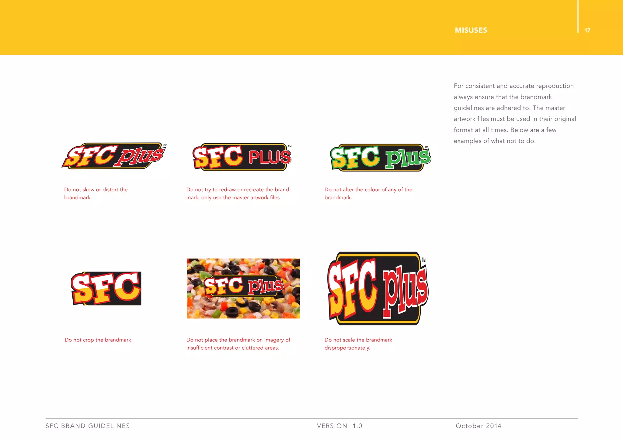
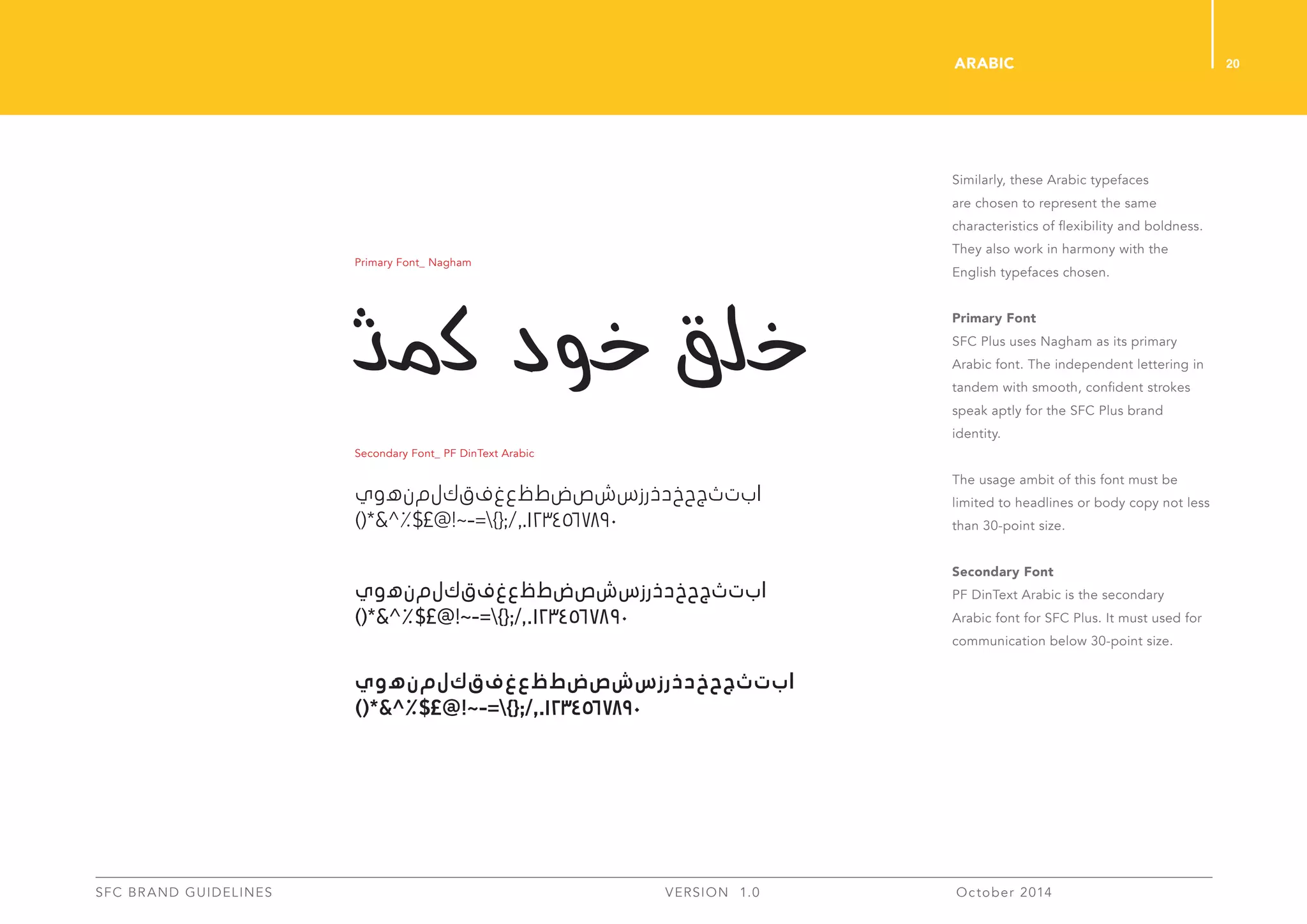
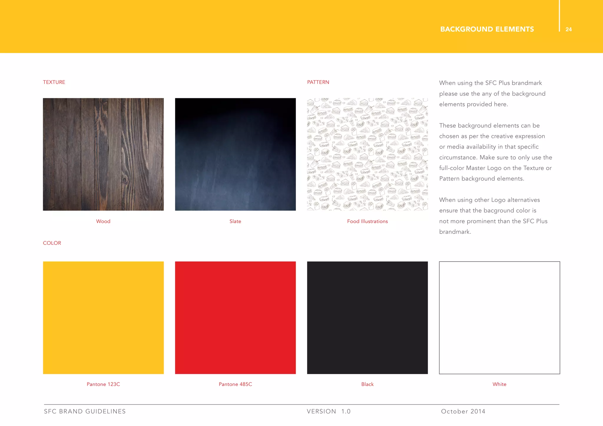
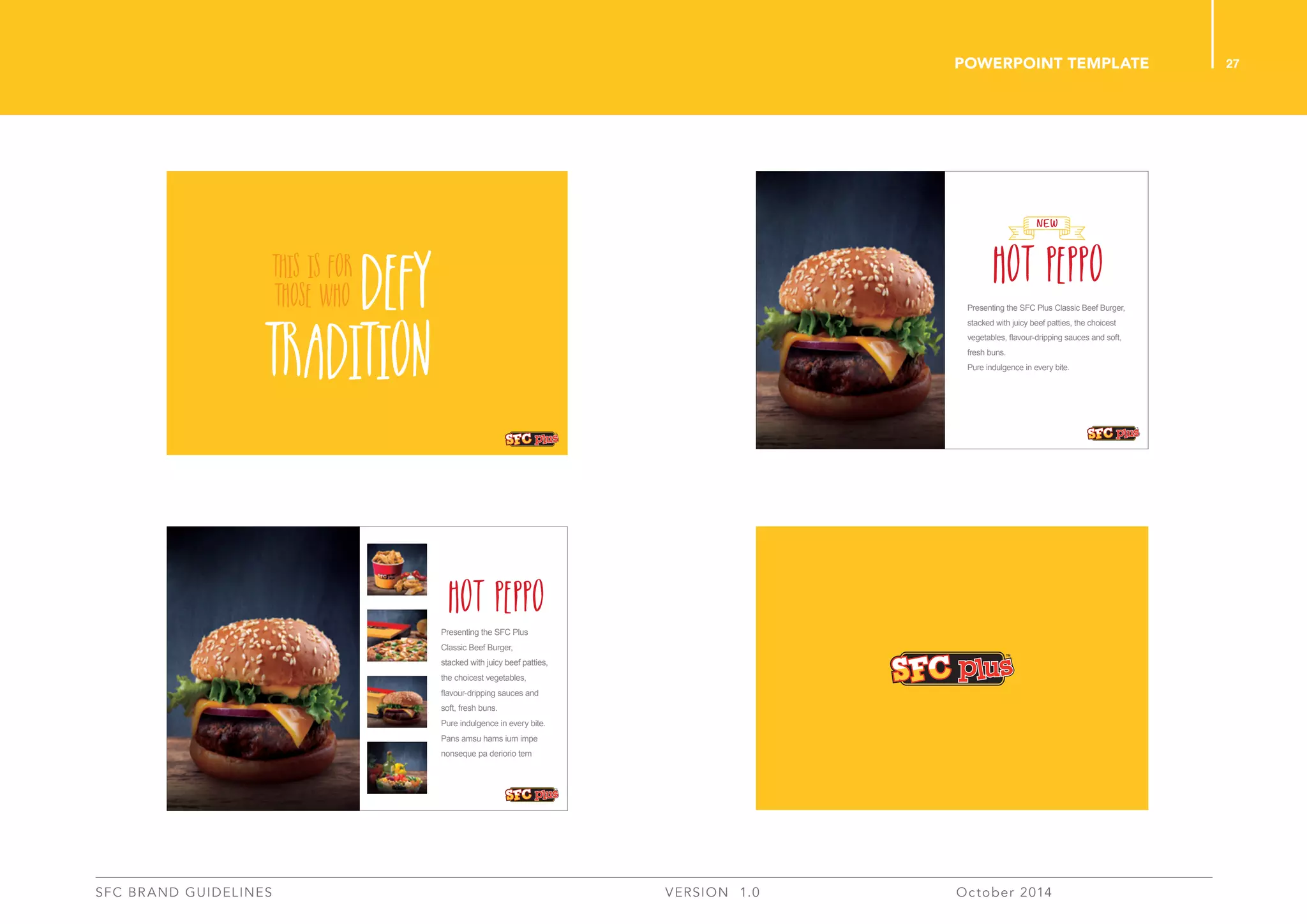
This document provides branding guidelines for SFC Plus. It outlines the proper use of the brandmark, colors, typography and other branding elements. The guidelines are intended to ensure consistency across all communication and touchpoints representing the SFC Plus brand. The document includes sections on the brand platform, brandmark, typography, colors, applications and backgrounds. Specific rules are provided for using the logo, fonts, and colors to maintain clear and accurate representation of the brand.
The document provides branding guidelines for Cority including:
- Logo usage guidelines specifying preferred color, minimum size, and prohibited alterations
- Color palette specifying primary and secondary colors to be used consistently
- Typography guidelines specifying primary and secondary font families (Raleway and Open Sans) to be used for headers, body text, etc.
- Brand elements including guidelines for using the Cority ring and circle graphics elements consistently across materials
These guidelines summarize the fundamental technical characteristics of the Fontech brand, serving as a guide for any material produced under the brand Fontech. We face the future with a new brand that represents the technology arm of the company. After many exciting years consolidating our brand in the WiFi market with a young, casual attitude that confronted the topics of the telecommunications industry in a fresh way, we now evolve to demonstrate our maturity, capacity, and know-how as a company!
The document provides brand guidelines for The Snapys, including their logo, colors, fonts and tone of voice. The Snapys is an engagement platform launched in 2015 to make the world more beautiful through photos. The guidelines explain the logo elements and proper uses, approved colors, primary and secondary fonts, applications of the logo for partnerships and social media, naming conventions and an informal tone of voice for communicating with the Instagram community.
This document provides brand guidelines for Countingup, including sections on logo usage, colour palette, typography, and applications of the brand elements. The logo comes in 3 versions for different backgrounds and an icon is used for social media. Roboto and Nunito Sans typfaces are used. Colour palette includes primary and secondary colours. Examples show using the brand elements in documents, photography choices, and email layouts.
This document provides branding guidelines for Sourcefire, including their logo, color palette, typography, icons and styles for various branding elements like their website, presentations, illustrations and collateral. It specifies the correct uses of their logo and secondary mark. The primary colors are Sourcefire red, black and grey. The main fonts are ClanOT for titles and Ultimate for body copy. Website designs feature dynamic graphic elements and a balanced layout. Illustration styles are also outlined.
This document provides updates and guidelines for the international use of the KFC brand identity standards. Key updates include the removal of tilted bucket art from apparel internationally, addition of new "It's Finger Lickin' Good" script formats, KFC delivery logos, and KFC express logos. Color specifications are also added for signage color matching samples. The document is intended to provide additional branded artwork and guidelines tailored for international KFC locations.
VisionsLive Style Guide November 2014_v1Barry McLeod
This document provides guidelines for communicating the VisionsLive brand consistently, including:
- The primary and secondary logos in various color versions, with minimum size and exclusion zone requirements.
- Guidelines on using the logo properly and not distorting, stretching, or altering it.
- Information on the brand's tone of voice being simple, engaging, respectful, and plain talking.
- Contact details for the brand guardians responsible for upholding the style guide.
Newark Office of Film + Television Brand Manual & GuideIgor Alves
This document is a 27-page brand identity manual for the Newark Office of Film + Television (NOFT) that provides guidelines for applying the organization's visual identity consistently. It covers the logo, color palette, typography, stationery system, applications for print, web and merchandise, and provides unacceptable uses and a glossary. The manual aims to communicate NOFT's vision and values through proper use of its branding elements.
All organizations have a brand or corporate identity and the way in which it is perceived is often vital to the way in which clients and employees respond to that organization. The key to good brand identity design is the simple communication of the client's public image. Brand should reflect the company, and the products or services that company provides. A good brand identity enables a company to position itself visually in the market alongside its competitors.
My overall task is to create such a brand identity and brand identity program - from the logo through appropriate design applications, such as stationery, menus, napkins, uniforms, web home page and signage. I must choose one of the particular culturally-based themes to reflect the bistro's personality - give it a name and design a brand identity (logo) and set of brand guidelines. It is important to have an idea of how the concept of a particular country and culture will work as a space where people will be spending some time eating and drinking. The brand identity for the chosen bistro must reflect this concept. Each of these bistros should also reflect the area they are located in, basing on my demographic and style research.
Of all the options, I chose British Colonial themed bistro of which will be located in the area of Bangsar, Kuala Lumpur. Designed in Adobe InDesign and Adobe Illustrator, this is the brand identity manual for the bistro, showing a set of consistent and flexible guidelines and rules so that future items can be designed using these guidelines and rules and remain part of a growing consistent brand identity.
The document provides ShopperTrak's brand identity guidelines. It outlines rules for proper usage of the ShopperTrak logo, brand mark, color palette, typography and trademarks to promote a consistent brand identity. The guidelines are intended to position the brand, convey strengths with clear communications, maximize brand asset value and provide a uniform strategy. While some rules are fixed, creative expression is allowed if consistency and simplicity are maintained.
The logo, colors, typography, visuals, and stationery are outlined with specifications on correct usage to ensure consistency across Inatech's materials. Guidelines cover logo variations and placement, color variations, approved typefaces and sizes, using the grid for layouts, approved imagery using chevrons and shapes, and examples of business cards, envelopes, letterhead, folders, and other materials. Adherence to these brand identity guidelines is important to maintain Inatech's visual style.
This brand guide for Furever Home provides guidelines for using the company's branding elements consistently. It outlines the primary and secondary logos in different colors and minimum sizes. The color palette specifies the brand's primary, secondary and black/white colors. Typography guidelines specify using Century Gothic for all materials. Iconography elements from the logo are also presented. Examples show applying the branding to advertising and web banners. The guide aims to ensure Furever Home's branding delivers a unified experience.
This document provides branding guidelines for Nabo, including:
- Allowable uses of the Nabo logo in different contexts and with/without the tagline
- Approved typefaces, colors, and graphic elements
- Examples of how to layout the logo on various collateral like letterhead, business cards, presentations, etc.
- Instructions for designers and developers to ensure branding consistency across all communication materials
Varsity | The Official Mark of CheerleadingGirlapproved
This document provides brand guidelines for the Varsity identity system. It includes sections on the Varsity brandmark and logos, color palette, typography, advertising applications, sub-brand applications, and photographic style. The guidelines establish rules for proper usage of the brand elements to create a consistent brand expression.
The document provides graphical guidelines for Quotiply's brand identity. It outlines the proper uses of the logo, which consists of an inverted Q emblem and logotype. The logo must always maintain strict proportions and colors, and cannot be modified. Two shades of blue are used as the primary and secondary colors. Univers is used for headlines and Lucida Sans for body copy, to provide a clean, readable style. No other typefaces can substitute these without permission.
Code for America's style guide offers information on brand usage, language and tone. If you're planning on using this for a community press event please also contact lr[at]codeforamerica.org for assistance.
This document provides branding guidelines for Turbo Coffee Roasting Company. It outlines the proper usage of the logo, color palette, typefaces, icons, and patterns. The guidelines are intended to ensure brand consistency and accuracy across various applications such as packaging, apparel, and stationery.
This document provides branding guidelines for the Beyondsoft brand. It outlines the logo, colors, typography, icons and other visual elements that make up the brand identity. The logo signature includes the wordmark and tagline together, and guidelines specify minimum sizes for print and screen use. Corporate colors are defined, along with secondary and accent colors. Typography styles are designated for headers, subheaders and body text. Icon design specifications cover sizing, spacing and color usage. The guidelines aim to maintain a consistent brand message across all channels.
This document outlines Symantec's brand identity standards, including their values, design philosophy, voice, signature, symbol, logotype, color palette, typography and image style. The key points are:
- Symantec's core values that guide their brand are being customer-driven, trust, innovation and action.
- Their design philosophy aims for simplicity, sophistication and harmony across all communications.
- Their signature combines their logotype and symbol to represent the company and must never be separated or altered.
- Their colors of yellow, white and black serve as the primary corporate colors to ensure brand consistency.
These guidelines provide information on Salford City's new "IN Salford" branding logo, including its design, colors, placement and proper usage. The magenta logo features white keylining and must be used as-is without alteration. It can be placed in the corners of pages while maintaining clear space around it. The document outlines logo rules and provides contact information for any other branding questions.
The document is an ACC brand guideline manual that provides guidance on proper usage of the ACC brand identity. It covers topics such as the logo rationale, logo specifications for size and color, acceptable typography, proper applications of the logo on business materials like business cards and letterhead, and examples of correct and incorrect uses of the logo. The purpose is to present a consistent brand image when applying the ACC logo to various materials.
Municipal Water District of Orange County Brand Style Guide or Logo and Brand Identity Guidelines. In 2017, after nearly 47 years with the same visual identity, the District began a complete rebranding effort starting with a new, modernized logo. This guide was created and implemented in 2018 for both internal and external customers.
The document provides brand guidelines for "The Magic Wand" digital education series. It outlines rules for proper usage of the logo, including only using the primary vertical logo on stationery and web graphics. Color and typography guidelines specify using "The Magic Wand Blue" and Proxima Nova or Helvetica Neue fonts. The newsletter anatomy section demonstrates how to structure newsletters with ample spacing, large call-to-action buttons and a masthead with contact details.
The document provides guidelines for using the Cambridge Arts & Cultural Leaders (CA,CL) brand identity. It outlines the core branding elements including the primary and secondary logos, approved color palette, minimum and maximum logo sizes, clear space requirements, co-sponsorship logo usage, and template examples. Typography guidelines specify using Adobe Caslon Pro for body text, subtitles, and titles. The document concludes with examples of incorrect logo usage that should be avoided to maintain branding consistency.
The document provides guidelines for using the Emailbidding brand identity. It establishes rules for proper usage of the logo, colors, typography, exclusion zones, and minimum sizes. The identity was carefully designed so that all elements like color, typography and composition contribute to graphical coherence. The guidelines are meant to ensure consistency in applying the brand to help develop consistency in words and imagery.
Mail Chimp is a free email marketing software that allows users to create, send and track email newsletters. It provides tools to build signup forms, import contacts, create and send email campaigns, and analyze detailed reports on campaign performance. Mail Chimp's features include list segmentation, A/B testing, and spam filter checking to help users send emails that land in inboxes rather than spam folders.
Why are guidelines a good idea? By creating and reinforcing a consistent ‘look’, ‘feel’ and ‘tone of voice’ everything that is produced online or in print will be instantly identified. In this case it is a visitor destination brand for Lancashire that is being implemented. These guidelines have been designed to help Lancashire and Blackpool Tourist Board (LBTB) and its partners put
the messages together by working within a clear set of rules. A consistent approach will strengthen the brand and help it become recognised and trusted by the people we want to reach - our visitors.
The brand guidelines document provides information on the Lime Company logo, colors, and fonts. The logo represents a lime fruit with a leaf and comes in various versions including full color, icon only, full white, and full black. Lime green is the primary color and should be used prominently, while lime purple is only for strong calls-to-action. Helvetica Neue is the primary font in light weight with bold used sparingly and other styles like italic and underline prohibited.
These brand guidelines establish a consistent identity for artist Georgie's brand across all promotional materials. The logo must always use the master artwork and cannot be altered. Specific typefaces, colors, and usage instructions are provided to maintain brand consistency worldwide. The guidelines apply to all employees, partners, promoters, and agencies involved in promoting Georgie.
Slidedeck for my presentation at the 2009 PRSA Digital Impact Conference in NY City. Title of the presentation: Tweet Your Way to Success: How to Use Twitter to Connect With Your Audiences. Presenter: Corinne Weisgerber, Ph.D., Assist. Prof. of Communication at St. Edward's University in Austin, TX.
This document provides strategies for using Twitter for various business purposes, including customer relations, crisis management, corporate reputation management, event activation, product promotion and sales, issue advocacy, and internal communication. Specific examples are given for how companies like Comcast, JetBlue, Zappos, Dell, and the Red Cross have effectively used Twitter for customer service, crisis response, thought leadership, event coverage, deals/sales, and advocacy. The strategies recommend following others on Twitter to listen, regularly creating useful content, and engaging with your followers through responses and questions.
The document discusses how people use social media, specifically Facebook, to share information online. It provides statistics on Facebook usage and notes that Facebook has over 400 million active users. It then gives tips for businesses on creating Facebook pages to promote their brand, such as using pages instead of profiles to allow multiple administrators and access to analytics. The document also reviews best practices for posting content and promoting pages on Facebook.
The Samsung Mobile USA Brand Guidelines document provides branding standards and guidelines for marketing communications. It outlines the brand's statement, target audience, personality, proof points, archetypes, and marketing objectives. It also details branding elements like logos, color palette, typography, backgrounds, and photography standards. Guidelines are provided for voice, product presentation, and sample executions. The document is intended to promote consistency across all marketing channels.
After writing the book, Twitter Marketing for Dummies, we decided to throw out the 140 different pieces of marketing advice given to us by the many AWESOME users of Twitter!
The document provides tips for using Twitter effectively. Some of the key tips include: engaging in conversations with your followers rather than just promoting your brand; sharing useful industry information and expertise rather than just talking about your products; and listening to what others are discussing in order to contribute meaningfully to conversations on Twitter. Building relationships and interacting with others on Twitter is emphasized over just broadcasting messages about your own business.
20 Facebook, Twitter, Linkedin & Pinterest Features You Didn't Know Existed (...HubSpot
The document outlines 20 hidden or lesser-known features of popular social media platforms like Facebook, Twitter, LinkedIn, and Pinterest. Some of the featured tips include saving links and articles to access later on Facebook, replacing ads with baby animal pictures on Facebook using a Chrome extension, embedding SlideShare presentations directly into tweets, and creating a photo collage directly in a single tweet on Twitter. The document also provides tips for adding hidden relationship notes on LinkedIn profiles and using trackable links on Pinterest that won't get flagged as spam.
This document is a branding design manual created in May 2016 for Connor Menerey's culinary consulting business, Menerey Culinary Consulting. It outlines the business logo, including acceptable formats, constructions, and applications. It also details the primary and secondary fonts to be used, the color system, and examples of stationery like the letterhead and business cards. The manual provides visual examples and specifications to ensure consistent branding across all business materials.
The document provides guidelines for proper usage of the Compaq logo to maintain brand identity and maximize recognition. It specifies that the logo must be surrounded by a protection zone of at least one "M" of clear space on all sides. The preferred color is Compaq Red, but black may be used if necessary. Backgrounds should be solid white, black or red to ensure legibility, without overlaying text or graphics. Specific color values are given for print and digital versions to ensure consistent reproduction. Examples demonstrate correct and incorrect uses of the logo on backgrounds.
details to dewa dubai
All of the details are copyrighted.
Used for Design Competition
Handle with care
A pDF is attached in case of further details.
Csn also be found on the dewa website.
This document provides branding guidelines for Furever Home, including guidelines for proper usage of the logo, color palette, typefaces, and other visual elements. The document outlines three versions of the logo - primary, secondary, and tertiary - and provides rules for coloring, sizing, and formatting the logo. It also presents the approved color palette and provides examples of applying colors to the different logo versions. Further sections describe the approved typefaces, Abside and Bell MT, and provide guidance on using typography and visual elements to create hierarchy. The overall purpose is to ensure Furever Home's brand is represented consistently across marketing and design materials.
This document provides branding guidelines for a company. It summarizes the purpose and importance of branding guidelines in establishing a consistent visual identity. It then outlines sections on the logo, fonts, colors, proper logo usage, logo formats, resizing guidelines, accessing brand assets, and includes a mockup logo example. The overall purpose is to ensure visual consistency of the brand across all communication materials and platforms.
The document provides branding guidelines for "if it barks" including specifications for their logo, color palette, typography and web styles. The master logo should always be used and logo variations can be used with the primary and secondary color palettes. Font families, heading styles, body copy styles, and combinations are also defined to ensure consistent branding across communications.
This document provides branding guidelines for Furever Home, including specifications for logo usage, colors, typography, and visual style. It outlines the primary, secondary and tertiary logo versions and rules for proper usage, spacing, sizing and color application. Color palettes are defined, including rules for using colors on the logo versus as accents. Approved typefaces, Abside and Bell MT, are identified for consistent branding. Visual hierarchy and ways to structure information are also addressed. The goal is to ensure Furever Home's brand is represented consistently across all marketing materials.
Our brand reflects our identity, values, and behaviors. We have developed graphic standards to promote consistency across all materials and build brand recognition. These standards include logo usage and variations, color palettes, typography, photography styles, and application guidelines for materials like presentations, websites, and icons. Strict adherence to these standards will create a unified brand identity.
This document provides branding and design guidelines for Tribune affiliate FOX NEWS stations. It outlines the FOX brand identity, including the FOX BOX logo, approved colors and fonts. Detailed guidelines are given for template applications in news packages, promotions and broadcasts, including lower thirds, full screen images and studio setups. Animation and photography styles are also addressed. The goal is to build and protect the FOX brand through consistent visual identity across all communication channels.
The document provides guidelines for maintaining a consistent visual identity for the SMC brand, including:
- The SMC logo consists of specific elements that must be used as designed without modification.
- The logo should only be reproduced in Pantone 647 and black colors, following specific CMYK formulas.
- Clear space must surround the logo and it should not be reproduced smaller than 10mm.
- Stationery, business cards, the website address, and other materials must follow strict formatting and color guidelines.
Unipart Car Care Centre brand guidelinesAndy Thornley
This document outlines brand identity guidelines for the Unipart Car Care Centre (UCCC) brand, including specifications for logo usage, colors, fonts, and applying the brand visually to vehicles, clothing, signage and other materials. The guidelines are intended to ensure consistent application of the brand elements and provide UCCC with a uniform identity. The primary font for the brand is Gill Sans and the key colors are Aircraft Blue, Signal Red and UCCC Silver. Contact information is provided for questions or to request brand artwork files.
This document provides branding guidelines for SparkPerform, including:
- Logo guidelines on color versions, writing out the brand name, and restrictions.
- Color palette details for primary, secondary, and supplementary colors.
- Typography guidelines specifying Ubuntu as the primary typeface in regular, bold, italic styles.
This document provides style guidelines for Cherriots branding and communications, including colors, logos, photos, fonts, templates for various materials, writing tips, terminology, and formatting standards. It aims to ensure a consistent look and message across all of Cherriots' public-facing materials. Adhering to these guidelines helps build brand recognition and a positive public association with Cherriots.
This document provides branding and visual guidelines for Central Turf & Irrigation Supply. It outlines the proper uses of the company logo, approved typefaces, color palette, product icons, design elements and image choices to maintain a consistent brand identity across all communications. Adhering to these guidelines will ensure the company's identity remains strong and a consistent image is promoted to audiences.
This document provides branding guidelines for MPC, including:
- The primary MPC logo and allowed color variations. Proper usage, sizing, and clear space requirements are defined.
- Secondary "sub-brand" logos are introduced for specific business segments.
- Allowed colors for the logo are specified, including reverse/white versions.
- Typography standards are introduced, designating Avenir and GarageNeu as primary typefaces, with Arial as secondary for digital.
- Sections provide guidance on improper logo usage, like modification or placing over textures.
- The purpose is to present a consistent brand image through adhering to logo, color, and typography
PORT is an emergency service and supply company that provides assistance and supplies before, during, and after storms. The document outlines PORT's brand guidelines, including the logo, colors, fonts, and icon usage. The core blue, orange, and grey colors form the primary palette and should be used prominently. Pontiac Regular is reserved for the logo, while Conduit and Trade Gothic are the body text fonts. All designs using the logo must be approved.
This document provides guidelines for FOSS' visual identity including:
1. The FOSS logo exists in two color versions and guidelines are given for proper usage.
2. Color specifications are defined for print and digital usage along with a color hierarchy.
3. Typography guidelines introduce Frutiger/Google Hind for body text and Purista for display text, with font samples.
4. Photography style and categories are described to set the visual tone for FOSS communications.
This document provides branding guidelines for ACID Marketing, including their logo, brand elements, color palette, typography, and graphic elements. It outlines specifications for proper usage of their logo, such as acceptable color variations, minimum sizes, and clear space around the logo. The document also identifies their primary, secondary, and tertiary typefaces and specifies when each should be used. Color specifications are given for their primary and secondary brand palettes, including PANTONE colors, CMYK, RGB, and hex values. Lastly, the document shows different graphic elements like patterns that can be incorporated into marketing materials.
This document provides branding guidelines for the Business Formula logo and identity. It specifies the logo design including the meaning of elements, allowed colours, typefaces, acceptable usage variations, and best practices. The logo consists of a flask containing a dollar sign solution in two colours with the company name. Typography uses the Exo font in medium and light weights. Acceptable uses include full colour, greyscale, solid black, and social media versions. Guidelines aim to maintain visual consistency when applying the logo.
This document provides branding guidelines for the town of Nanton, Alberta. It outlines the logo design, including the primary and secondary logos depicting local landmarks. Guidelines are provided for proper usage, including maintaining clear space around the logo, minimum size thresholds, and color variations. The document also establishes the official color palette, approved typefaces, photographic styles, and general rules for applying the identity across applications. Adhering to these standards ensures brand integrity and consistency in representing Nanton.
2. Welcome to SFC Plus. When
implementing our brand in any medium of
communication, it is necessary to observe
these guidelines to ensure coherency and
consistency across all touch points.
2
SFC BRAND GUIDELINES VERSION 1.0 October 2014
Introduction
3. 3
SFC BRAND GUIDELINES VERSION 1.0 October 2014
01 BRAND PlaTFORM
1.1 Brand Platform 05
05 Background
5.1 Background Elements 24
02 Brandmark
2.1 Master Logo 07
2.2 Full Color 08
2.3 Spot Color 09
2.4 Web Color 10
2.5 Two Color 11
2.6 Single Color 12
2.7 Greyscale 13
2.8 Black & White 14
2.9 Colored Backgrounds 15
2.10 Clear Space 16
2.11 Misuses 17
03 TYPOGRAPHY
3.1 English 19
3.2 Arabic 20
04 Color
4.1 Primary Color Palette 22
Table of contents
i Introduction 02
ii Table of Contents 03
06 APPLICATIONS
6.1 Stationaries 26
6.2 Powerpoint Template 27
6.3 Email Signature 28
6.4 Packaging 29
6.5 External Signage 30
6.6 Traymat 31
6.7 Poster 32
6.8 Menu 33
6.9 Menu Board 34
6.10 Vehicle Branding 35
5. In a market populated with brands that
all look the same, SFC Plus believes in
breaking away from the ordinary. While the
rest follow the norm, we pull out from the
crowd to set our own standards. Through
every element that makes up the SFC Plus
brand, from our products to our services to
our communication to our design, we offer
something that’s different.
Daringly Different.
5
SFC BRAND GUIDELINES VERSION 1.0 October 2014
BRAND PLATFORM
7. 7
SFC BRAND GUIDELINES VERSION 1.0 October 2014
This is the SFC Plus brandmark.
The brandmark is a fundamental
representation of the brand’s identity and
it must never be altered in any way.
This master logo is the primary and
preferred format of the brandmark and
must be used wherever possible.
Master Logo
English Brandmark
Arabic Brandmark
8. 8
SFC BRAND GUIDELINES VERSION 1.0 October 2014
This is the 4-color CMYK alternative for
the SFC Plus brandmark. These color
formats must be used in the event when
the Pantone colors are not accesible for
use.
Full color
English Brandmark
Arabic Brandmark
M - 20
Y - 90
M - 100
Y - 100
K - 100
9. 9
SFC BRAND GUIDELINES VERSION 1.0 October 2014
The SFC Plus brandmark uses Pantone
123C, Pantone 485C and Pantone Black.
spot color
English Brandmark
Arabic Brandmark
Pantone
123C
Pantone
485C
Black
10. 10
SFC BRAND GUIDELINES VERSION 1.0 October 2014
When using the SFC Plus brandmark for
online/on-screen media applications,
these color formats must be used. We
have provided values for RGB as well
as HTML color formats. Please adhere
to these values and formats to keep
the brand’s identity consistent with
applications in other media.
web color
English Brandmark
Arabic Brandmark
R - 253
G - 200
B - 47
HTML
D52B1E
HTML
D52B1E
HTML
231F20
R - 213
G - 43
B - 30
R - 35
G - 31
B - 32
11. 11
SFC BRAND GUIDELINES VERSION 1.0 October 2014
In exceptional circumstances where
printing techniques, media or budget
restrict the usage of the full-color SFC Plus
brandmark, this two-color version can be
used. Here, we retain the SFC Plus Red
and Black. The colors for the brandmark
must be used only as shown here and they
cannot be replaced or redesignated ever.
This brandmark version must be used
sparingly and only where absolutely
necessary.
two ColoR
English Brandmark
Arabic Brandmark
Pantone
485C
Black
12. 12
SFC BRAND GUIDELINES VERSION 1.0 October 2014
This layout shows variations of the SFC
Plus brandmark with only one color. Here,
we retain only the SFC Plus Red. This
single-color version must used only as
shown here and cannot be alternated for
any other color.
This version of the brandmark must be
used only in special circumstances where
restrictions in media do not allow the full
or two color variations.
SINGLE ColoR
English Brandmark
Pantone
485C
English Brandmark
Arabic Brandmark
13. 13
SFC BRAND GUIDELINES VERSION 1.0 October 2014
This layout shows variations of the
brandmark in greyscale when other
options are not possible.
This version of the brandmark must
be used sparingly and only in special
circumstances where no other variation is
possible.
GREYSCALE
English Brandmark
Arabic Brandmark
14. 14
SFC BRAND GUIDELINES VERSION 1.0 October 2014
This layout shows variations of the SFC
Plus brandmark in only black and white
colors.
This version of the brandmark must
be used sparingly and only in special
circumstances where no other variation is
possible.
Black & White
English Brandmark
Arabic Brandmark
15. 15
SFC BRAND GUIDELINES VERSION 1.0 October 2014
colored backgrounds
The SFC Plus brandmark provides
versatility to be placed on several
backgrounds. However, white, red,
yellow, black and grey are the preferred
background colors for use.
The SFC brandmark should never be
placed on a disturbing background. Care
should be taken to make sure that it does
not interfere with the image. Always place
the logo in a clear area of the image
devoid of any subject matter.
16. 16
SFC BRAND GUIDELINES VERSION 1.0 October 2014
2X
xx
x x
2X
xx
x x
The brandmark is surrounded by an area
of mandatory clearspace. For SFC Plus,
the designated clearspace is determined
by the half the height of the brandmark.
This space should be kept clear of all
other graphic elements and typography
to maintain clarity and prominence for the
mark on all applications.
Shown here is a diagram of how the
clearspace has been created. This area
is a minimum and should be increased
wherever possible. The clearspace has
been built into the master artworks and
should be adhered to at all times. Using
smaller sizes for each will compromise the
readability of the brandmark.
The brandmark should be prominently
visible on all applications. To make sure
it is clear, legible and identifiable the
size of thr brandmakrk must be kept at a
minimum of 30 mm.
minimum size 30 mm
30 mm 30 mm
CLEAR SPACE
17. 17
SFC BRAND GUIDELINES VERSION 1.0 October 2014
For consistent and accurate reproduction
always ensure that the brandmark
guidelines are adhered to. The master
artwork files must be used in their original
format at all times. Below are a few
examples of what not to do.
MISUSES
Do not skew or distort the
brandmark.
Do not try to redraw or recreate the brand-
mark, only use the master artwork files
Do not place the brandmark on imagery of
insufficient contrast or cluttered areas.
Do not crop the brandmark.
Do not alter the colour of any of the
brandmark.
Do not scale the brandmark
disproportionately.
20. 20
SFC BRAND GUIDELINES VERSION 1.0 October 2014
Similarly, these Arabic typefaces
are chosen to represent the same
characteristics of flexibility and boldness.
They also work in harmony with the
English typefaces chosen.
Primary Font
SFC Plus uses Nagham as its primary
Arabic font. The independent lettering in
tandem with smooth, confident strokes
speak aptly for the SFC Plus brand
identity.
The usage ambit of this font must be
limited to headlines or body copy not less
than 30-point size.
Secondary Font
PF DinText Arabic is the secondary
Arabic font for SFC Plus. It must used for
communication below 30-point size.
Arabic
يوهنملكقفغعظطضصشسزرذدخحجثتبا
)(*&^%$£@!~-=}{;/,.1234567890
يوهنملكقفغعظطضصشسزرذدخحجثتبا
)(*&^%$£@!~-=}{;/,.1234567890
يوهنملكقفغعظطضصشسزرذدخحجثتبا
)(*&^%$£@!~-=}{;/,.1234567890
Primary Font_ Nagham
Secondary Font_ PF DinText Arabic
22. 22
SFC BRAND GUIDELINES VERSION 1.0 October 2014
SFC Plus is daringly different. And
that identity must be showcased in all
expressions of the brand.
Color is an integral part of the brand’s
identity. The Sunlight Yellow and Scarlet
Red manifest vibrancy and energy.
Laid together on Black, they make the
brand stand out amongst the market
competition.
Our three principal colors are found in
the SFC Plus Master Logo and are
displayed on the right. We have defined
the SFC Plus colors in various colour
formats with values beside each colour
swatch.
PRIMARY COLOR PALETTE
Pantone123C
Pantone485C
Black
Spot Color
Pantone 123C
Process Color
M - 20
Y - 90
RGB Color
R: 253 G: 200 B: 47
HTML
D52B1E
Spot Color
Pantone 485C
Process Color
M - 100
Y - 100
RGB Color
R: 213 G: 43 B: 30
HTML
D52B1E
Spot Color
Black
Process Color
K - 100
RGB Color
R: 35 G: 31 B: 32
HTML
231F20
24. 24
SFC BRAND GUIDELINES VERSION 1.0 October 2014
When using the SFC Plus brandmark
please use the any of the background
elements provided here.
These background elements can be
chosen as per the creative expression
or media availability in that specific
circumstance. Make sure to only use the
full-color Master Logo on the Texture or
Pattern background elements.
When using other Logo alternatives
ensure that the bacground color is
not more prominent than the SFC Plus
brandmark.
BACKGROUND ELEMENTS
TEXTURE
Wood
Pantone 123C
Slate
Pantone 485C
Food Illustrations
Black White
COLOR
PATTERN
26. 26
SFC BRAND GUIDELINES VERSION 1.0 October 2014
STATIONARIES
P.O.Box 01234, Dubai, UAE
T 009714 123 4567
F 009714 123 4567
www.sfcgroup.com
June 30, 2014
Trenz Puca
4321 First Street
Anytown, State ZIP
Dear Trenz,
Lorem ipsum dolor sit amet, ligula suspendisse nulla pretium, rhoncus tempor fermentum, enim integer
ad vestibulum volutpat. Nisl rhoncus turpis est, vel elit, congue wisi enim nunc ultricies sit, magna
tincidunt. Maecenas aliquam maecenas ligula nostra, accumsan taciti. Sociis mauris in integer, a dolor
netus non dui aliquet, sagittis felis sodales, dolor sociis mauris, vel eu libero cras. Faucibus at. Arcu
habitasse elementum est, ipsum purus pede porttitor class.
Ac dolor ac adipiscing amet bibendum nullam, lacus molestie ut libero nec, diam et, pharetra sodales,
feugiat ullamcorper id tempor id vitae. Mauris pretium aliquet, lectus tincidunt. Porttitor mollis
imperdiet libero senectus pulvinar. Etiam molestie mauris ligula laoreet, vehicula eleifend. Repellat orci
erat et, sem cum, ultricies sollicitudin amet eleifend dolor.
Consectetuer arcu ipsum ornare pellentesque vehicula, in vehicula diam, ornare magna erat felis wisi a
risus. Justo fermentum id. Malesuada eleifend, tortor molestie, a a vel et. Mauris at suspendisse, neque
aliquam faucibus adipiscing, vivamus in. Wisi mattis leo suscipit nec amet, nisl fermentum tempor ac a,
augue in eleifend in venenatis, cras sit id in vestibulum felis in, sed ligula.
Sincerely yours,
Urna Semper
BUSINESS CARDS
ENVELOPE
LETTERHEAD
P.O.Box 01234, Dubai, UAE
T 009714 123 4567 F 009714 123 4567
E mail@sfcgroup.com www.sfcgroup.com
P.O.Box 01234, Dubai, UAE
T 009714 123 4567 F 009714 123 4567
www.sfcgroup.com
M 009715 0123 4567
E omar@sfcgroup.com
Managing Director
Ahmed
BADGE
27. 27
SFC BRAND GUIDELINES VERSION 1.0 October 2014
POWERPOINT TEMPLATE
HOT PEPPO
NEW
Presenting the SFC Plus Classic Beef Burger,
stacked with juicy beef patties, the choicest
vegetables, flavour-dripping sauces and soft,
fresh buns.
Pure indulgence in every bite.
Presenting the SFC Plus
Classic Beef Burger,
stacked with juicy beef patties,
the choicest vegetables,
flavour-dripping sauces and
soft, fresh buns.
Pure indulgence in every bite.
Pans amsu hams ium impe
nonseque pa deriorio tem
HOT PEPPO
32. 32
SFC BRAND GUIDELINES VERSION 1.0 October 2014
POSTER
Presenting the SFC Plus
Classic Beef Burger, stacked
with juicy beef patties, the
choicest vegetables,
flavour-dripping sauces and
soft, fresh buns. Pure
indulgence in every bite.
There’s More than Meats the Eye
HOTPEPPO
NEW