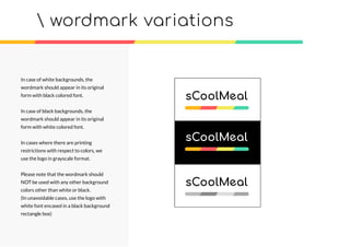
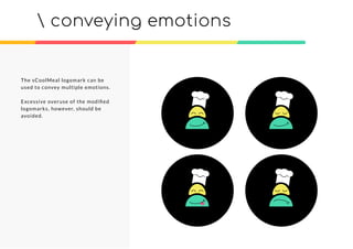
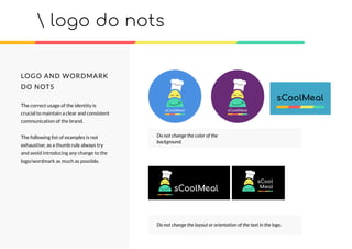
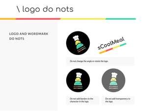
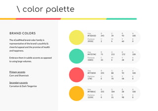
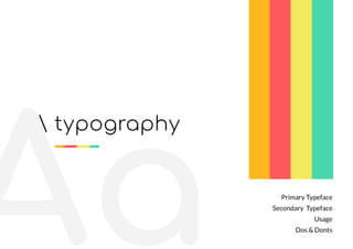
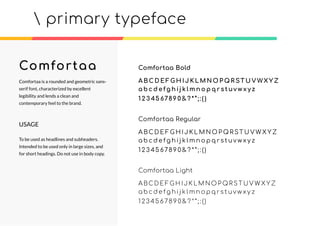
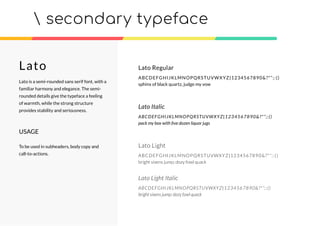
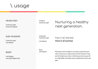
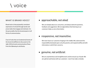
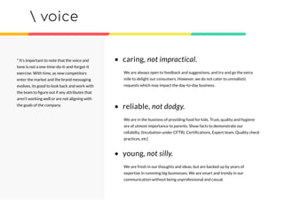
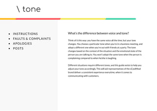
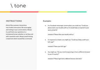
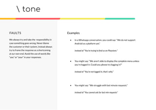
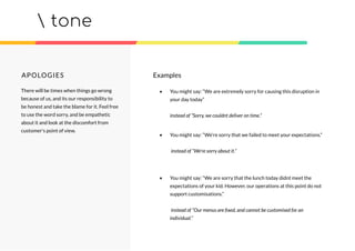
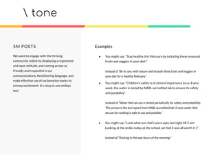
What’s in this?
LOGO
COLORS
TYPOGRAPHY
VOICE AND TONE
brand identity
guidelines
brand Mission
Motivation is the key to positivity in our lives. If we were not
motivated enough, we would just not have the will in us to go about
our daily lives.
Its motivation that helps us get through the most mundane things –
motivation for working harder, motivation to have a healthy
relationship, motivation to earn more, motivation to have a happy
family. And yet sometimes we find ourselves lacking in motivation; I
think we have all had days when getting out of bed to get ready to go
to work seemed like a Herculean task.
Adopt sCoolmeal, transform lives.
logo
Primary logo
Logo proportions
Wordmark
Wordmark proportions
Logo & Wordmark sizes
Conveying emotions
Do nots
primary logo
PRIMARY LOGO
Our Identity reflects sCoolMeal’s
mission to transform lives by spreading
well-being and happiness through better
food.
The colors capture the fun and playful
emotions that the users can relate to.
The soft and soothing accent colors
evoke feelings of happiness, warmth and
optimism and freshness. The slightly
angulated ‘e’ signifies a smile, and also
helps break the monotony of the
letterforms.
x
x
xx
x
x
EXCLUSION ZONES
The exclusion zone is defined as the
minimum safe space around the logo
that needs to be maintained.
The minimum space required to be
maintained around the logo has to
equate to the spacing between the
character (symbol) and the accent
border.
It is strongly suggested to maintain this
minimum space around the logo for
better visibility.
 proportions and spacing
x
x x
WORDMARK
The wordmark Identity of sCoolMeal
captures the essence of the brand in the
most simple and minimalistic fashion.
The secondary logo is used where brand
name visibility is important but the
spacing is a constraint or in case where
the logo has to be reproduced on a
variety of surfaces.
Example:
1)Rear end of the packaging
2)Etching on wood
3)Screen printing
4)Reproduction on metal surface
 secondary logo (wordmark)
EXCLUSION ZONES
The exclusion zone is defined as the
minimum safe space around the logo
that needs to be maintained.
The minimum space required to be
maintained around the logo has to
equate to the height of the letter “a”
used in the wordmark.
It is strongly suggested to maintain this
minimum space around the logo for
better visibility.
 proportions and spacing
xxx
xx
x
xx
x
MINIMUM SIZE
The logo can be reproduced upto a
minimum size of 35mm.
As an exception for digital medium,
minimum size of the logo can go upto
25mm.
It is suggested that the wordmark be
reproduced upto a minimum size of 8mm
for clear legibility.
In rare cases, it can go upto 4mm.
MAXIMUM SIZE
The logo and the wordmark can be
reproduced in any size beyond the
minimum sizes.
 logo sizes
35mm
25mm
8mm
6mm
4mm
The logo must have the circular black
background in all scenarios.
In case of white and colored
backgrounds, the logo should appear in
its original form without any alterations.
In case of black (or very dark)
backgrounds, the logo should be have a
white border, with a width slightly less
than or equal to the width of the accent
colors bar at the bottom.
In cases where there are printing
restrictions with respect to colors, we
use the logo in grayscale format.
 logo variations
wordmark variations
In case of white backgrounds, the
wordmark should appear in its original
form with black colored font.
In case of black backgrounds, the
wordmark should appear in its original
form with white colored font.
In cases where there are printing
restrictions with respect to colors, we
use the logo in grayscale format.
Please note that the wordmark should
NOT be used with any other background
colors other than white or black.
(In unavoidable cases, use the logo with
white font encased in a black background
rectangle box)
The sCoolMeal logomark can be
used to convey multiple emotions.
Excessive overuse of the modified
logomarks, however, should be
avoided.
 conveying emotions
logo do nots
sCool
Meal
Do not change the color of the
background.
Do not change the layout or orientation of the text in the logo.
LOGO AND WORDMARK
DO NOTS
The correct usage of the identity is
crucial to maintain a clear and consistent
communication of the brand.
The following list of examples is not
exhaustive; as a thumb rule always try
and avoid introducing any change to the
logo/wordmark as much as possible.
LOGO AND WORDMARK
DO NOTS
 logo do nots
Do not change the angle or rotate the logo.
Do not add borders to the
character in the logo.
Do not add transparency to
the logo.
colors
color palette
BRAND COLORS
The sCoolMeal brand color family is
representative of the brand’s youthful &
cheerful appeal and the promise of health
and happiness.
Embrace them in subtle accents as opposed
to using large volumes.
Primary accents
Corn and Shamrock
Secondary accents
Carnation & Dark Tangerine
Hex
#F3EA5D
R G B A
243 34 93 100
C M Y K
2 0 60 0
Pantone
3935C
Hex
#47D7AC
R G B A
71 215 172 100
C M Y K
43 0 28 0
Pantone
3385C
Hex
#FF585D
R G B A
255 88 93 100
C M Y K
0 70 58 0
Pantone
178C
Hex
#FFB81C
R G B A
255 184 28 100
C M Y K
0 31 98 0
Pantone
1235C
Aa
 typography
Primary Typeface
Secondary Typeface
Usage
Dos & Donts
primary typeface
Comfortaa
Comfortaa Regular
A BC D E F G H I J K L M N O P Q R ST U V W X Y Z
a b c d e f g h i j k l m n o p q r s t uv w x y z
1 2 3 45 6789 0 & ? * ” ; : ( )
Comfortaa Bold
A BC D E F G H I J K L M N O P Q R ST U V WX Y Z
a b c d e fg h i j k l m n o p q r s t uv w x y z
1 2 3 45 6789 0 & ? * ” ; : ( )
Comfortaa Light
A BC D E F G H I J K L M N O P Q R ST U V W X Y Z
a b c d e f g h i j k l m n o p q r s t uv w x y z
1 2 3 45 678 9 0 & ? * ” ; : ( )
Comfortaa is a rounded and geometric sans-
serif font, characterized by excellent
legibility and lends a clean and
contemporary feel to the brand.
USAGE
To be used as headlines and subheaders.
Intended to be used only in large sizes, and
for short headings. Do not use in body copy.
secondary typeface
Lato Regular
ABCDEFGHIJKLMNOPQRSTUVWXYZ|1234567890&?*”;:()
sphinx of black quartz, judge my vow
Lato Italic
ABCDEFGHIJKLMNOPQRSTUVWXYZ|1234567890&?*”;:()
pack my box with five dozen liquor jugs
Lato Light
ABCDEFGHIJKLMNOPQRSTUVWXYZ|1234567890&?*”;:()
bright vixens jump; dozy fowl quack
Lato Light Italic
ABCDEFGHIJKLMNOPQRSTUVWXYZ|1234567890&?*”;:()
bright vixens jump; dozy fowl quack
Lato
Lato is a semi-rounded sans serif font, with a
familiar harmony and elegance. The semi-
rounded details give the typeface a feeling
of warmth, while the strong structure
provides stability and seriousness.
USAGE
To be used in subheaders, body copy and
call-to-actions.
usage
Headline
Comfortaa Light Nurturing a healthy
next generation.
HEADLINES
Comfortaa Light
Comfortaa Regular
SUB-HEADERS
Comfortaa Light
Lato Regular
BODY
Lato Regular
Lato Light (Digital only)
Planning to visit Las Vegas or any other vacational resort
where casinos are a major portion of their business? I have
just the thing for you. Here, I will show you how to pass off
as a High Roller and collect many complimentary items and
gifts.
Body
Lato Regular
how it all started.
Subheader
Comfortaa Light
Lato Regular How it all started.
What is Brand Voice?
Fundamental Traits
What is Brand Tone?
Different scenarios
Examples
 voice & tone
voice
Brand voice is the purposeful, consistent
expression of a brand through words and
prose styles that engage and motivate. It is
the personality that the brand projects in all
forms of communication.
A set of traits that are fundamental tenets of
the brand sCoolMeal are discussed on the
right. All the brand communications flows
from the following six attributes.
WHAT IS BRAND VOICE? • approachable, not aloof.
We care deeply about our consumers, and always welcome questions,
feedback and suggestions. We strongly believe that listening to our
customers helps us serve them better.
• responsive, not insensitive.
We never leave our customers hanging in the middle. We understand the
responsibility bestowed upon us by the parents, and respond swiftly and with
information, to all of their concerns.
• genuine, not artificial.
We are unpretentious and straightforward, and do not put up a facade. We
are upfront and honest with our customers - even if we make a mistake.
voice
* It’s important to note that the voice and
tone is not a one-time-do-it-and-forget-it
exercise. With time, as new competitors
enter the market and the brand messaging
evolves, its good to look back and work with
the team to figure out if any attributes that
aren’t working well or are not aligning with
the goals of the company.
• caring, not impractical.
We are always open to feedback and suggestions, and try and go the extra
mile to delight our consumers. However, we do not cater to unrealistic
requests which may impact the day-to-day business.
• reliable, not dodgy.
We are in the business of providing food for kids. Trust, quality and hygiene
are of utmost importance to parents. Show facts to demonstrate our
reliabilty. (Incubation under CFTRI, Certifications, Expert team, Quality check
practices, etc)
• young, not silly.
We are fresh in our thoughts and ideas, but are backed up by years of
expertise in runnning big businesses. We are smart and trendy in our
communication without being unprofessional and casual.
tone
• INSTRUCTIONS
• FAULTS & COMPLAINTS
• APOLOGIES
• POSTS
Think of it this way: you have the same voice all the time, but your tone
changes. You choose a particular tone when you’re in a business meeting, and
adopt a different one when you’re out with friends at a party. The tone
changes based on the context of the situation and the emotional state of the
person you are talking to. You won’t adopt the same tone when the person is
complaining compared to when he/she is laughing.
Different situations require different tones, and this guide exists to help you
adjust your tone accordingly. This will aid representatives of the sCoolMeal
brand deliver a consistent experience everytime, when it comes to
communicating with customers.
What’s the difference between voice and tone?
tone
INSTRUCTIONS Examples
• In a Facebook messenger conversation, you could say: “Could you
please share your locality with us? It would help us respond to your
query properly.”
instead of “Please share your locality with us.”
• In response to a tweet, you might say: “Could you help us with your
kid’s age?”
instead of “Share your kid’s age.”
• You might say: “Do you mind trying to log in from a different browser
to see if it works?”
instead of “Please login from a different browser and check.”
A lot of the customer interactions
may involve instructions. Be encouraging
and inviting in your conversations. Always
try and frame your questions in a
invitational format, whether or not they end
with a question mark. Always avoid framing
a statement which sounds like a command.
tone
FAULTS
We always try and take the responsibility in
case something goes wrong. Never blame
the customer or their system, instead always
try to frame the response as a shortcoming
at our own end. Avoid the use of words like
“you” or “your” in your responses.
• In a Whatsapp conversation, you could say: “We do not support
Android as a platform yet.”
instead of “You’re trying to find us on Playstore.”
• You might say: “We aren’t able to display the complete menu unless
you’re logged in. Could you please try logging in?”
instead of “You’re not logged in, that’s why.”
• You might say: “We struggle with last minute requests.”
instead of “You cannot ask for last min requests”
Examples
tone
APOLOGIES
There will be times when things go wrong
because of us, and its our responsibility to
be honest and take the blame for it. Feel free
to use the word sorry, and be empathetic
about it and look at the discomfort from
customer’s point of view.
• You might say: “We are extremely sorry for causing this disruption in
your day today”
instead of “Sorry, we couldnt deliver on time.”
• You might say: “We’re sorry that we failed to meet your expectations.”
instead of “We’re sorry about it.”
• You might say: “We are sorry that the lunch today didnt meet the
expectations of your kid. However, our operations at this point do not
support customisations.”
instead of “Our menus are fixed, and cannot be customised for an
individual.”
Examples
tone
SM POSTS
We want to engage with the thriving
community online by displaying a responsive
and open attitude, and coming across as
friendly and respectful in our
communications. Avoid boring language, and
make effective use of exclamation marks to
convey excitement. It’s okay to use smileys
too!
• You might say: “Stay healthy this February by including these seasonal
fruits and veggies in your diet!”
instead of “Be in sync with nature and include these fruits and veggies in
your diet for a healthy February.”
• You might say: “Children’s safety is of utmost importance to us. Every
week, the water is tested by NABL accredited lab to ensure its safety
and potability”
instead of “Water that we use is tested periodically for safety and potability.
The picture is the test report from NABL accredited lab. It says water that
we use for cooking is safe to use and potable.”
• You might say: “Look what our chef’s were upto last night till 3 am!
Looking at the smiles today at the school, we feel it was all worth it :)”
instead of “Packing in the wee hours of the morning.”
Examples
Designed by
turingLabs
B R A N D I N G A N D U X S T U D I O
42@turinglabs.in
TuringLabs Technologies Private Limited. Copyright 2017
brand identity guidelines

Brand identity

  • 1.
    What’s in this? LOGO COLORS TYPOGRAPHY VOICEAND TONE brand identity guidelines
  • 2.
    brand Mission Motivation isthe key to positivity in our lives. If we were not motivated enough, we would just not have the will in us to go about our daily lives. Its motivation that helps us get through the most mundane things – motivation for working harder, motivation to have a healthy relationship, motivation to earn more, motivation to have a happy family. And yet sometimes we find ourselves lacking in motivation; I think we have all had days when getting out of bed to get ready to go to work seemed like a Herculean task. Adopt sCoolmeal, transform lives.
  • 3.
    logo Primary logo Logo proportions Wordmark Wordmarkproportions Logo & Wordmark sizes Conveying emotions Do nots
  • 4.
    primary logo PRIMARY LOGO OurIdentity reflects sCoolMeal’s mission to transform lives by spreading well-being and happiness through better food. The colors capture the fun and playful emotions that the users can relate to. The soft and soothing accent colors evoke feelings of happiness, warmth and optimism and freshness. The slightly angulated ‘e’ signifies a smile, and also helps break the monotony of the letterforms.
  • 5.
    x x xx x x EXCLUSION ZONES The exclusionzone is defined as the minimum safe space around the logo that needs to be maintained. The minimum space required to be maintained around the logo has to equate to the spacing between the character (symbol) and the accent border. It is strongly suggested to maintain this minimum space around the logo for better visibility. proportions and spacing x x x
  • 6.
    WORDMARK The wordmark Identityof sCoolMeal captures the essence of the brand in the most simple and minimalistic fashion. The secondary logo is used where brand name visibility is important but the spacing is a constraint or in case where the logo has to be reproduced on a variety of surfaces. Example: 1)Rear end of the packaging 2)Etching on wood 3)Screen printing 4)Reproduction on metal surface secondary logo (wordmark)
  • 7.
    EXCLUSION ZONES The exclusionzone is defined as the minimum safe space around the logo that needs to be maintained. The minimum space required to be maintained around the logo has to equate to the height of the letter “a” used in the wordmark. It is strongly suggested to maintain this minimum space around the logo for better visibility. proportions and spacing xxx xx x xx x
  • 8.
    MINIMUM SIZE The logocan be reproduced upto a minimum size of 35mm. As an exception for digital medium, minimum size of the logo can go upto 25mm. It is suggested that the wordmark be reproduced upto a minimum size of 8mm for clear legibility. In rare cases, it can go upto 4mm. MAXIMUM SIZE The logo and the wordmark can be reproduced in any size beyond the minimum sizes. logo sizes 35mm 25mm 8mm 6mm 4mm
  • 9.
    The logo musthave the circular black background in all scenarios. In case of white and colored backgrounds, the logo should appear in its original form without any alterations. In case of black (or very dark) backgrounds, the logo should be have a white border, with a width slightly less than or equal to the width of the accent colors bar at the bottom. In cases where there are printing restrictions with respect to colors, we use the logo in grayscale format. logo variations
  • 10.
    wordmark variations In caseof white backgrounds, the wordmark should appear in its original form with black colored font. In case of black backgrounds, the wordmark should appear in its original form with white colored font. In cases where there are printing restrictions with respect to colors, we use the logo in grayscale format. Please note that the wordmark should NOT be used with any other background colors other than white or black. (In unavoidable cases, use the logo with white font encased in a black background rectangle box)
  • 11.
    The sCoolMeal logomarkcan be used to convey multiple emotions. Excessive overuse of the modified logomarks, however, should be avoided. conveying emotions
  • 12.
    logo do nots sCool Meal Donot change the color of the background. Do not change the layout or orientation of the text in the logo. LOGO AND WORDMARK DO NOTS The correct usage of the identity is crucial to maintain a clear and consistent communication of the brand. The following list of examples is not exhaustive; as a thumb rule always try and avoid introducing any change to the logo/wordmark as much as possible.
  • 13.
    LOGO AND WORDMARK DONOTS logo do nots Do not change the angle or rotate the logo. Do not add borders to the character in the logo. Do not add transparency to the logo.
  • 14.
  • 15.
    color palette BRAND COLORS ThesCoolMeal brand color family is representative of the brand’s youthful & cheerful appeal and the promise of health and happiness. Embrace them in subtle accents as opposed to using large volumes. Primary accents Corn and Shamrock Secondary accents Carnation & Dark Tangerine Hex #F3EA5D R G B A 243 34 93 100 C M Y K 2 0 60 0 Pantone 3935C Hex #47D7AC R G B A 71 215 172 100 C M Y K 43 0 28 0 Pantone 3385C Hex #FF585D R G B A 255 88 93 100 C M Y K 0 70 58 0 Pantone 178C Hex #FFB81C R G B A 255 184 28 100 C M Y K 0 31 98 0 Pantone 1235C
  • 16.
    Aa typography Primary Typeface SecondaryTypeface Usage Dos & Donts
  • 17.
    primary typeface Comfortaa Comfortaa Regular ABC D E F G H I J K L M N O P Q R ST U V W X Y Z a b c d e f g h i j k l m n o p q r s t uv w x y z 1 2 3 45 6789 0 & ? * ” ; : ( ) Comfortaa Bold A BC D E F G H I J K L M N O P Q R ST U V WX Y Z a b c d e fg h i j k l m n o p q r s t uv w x y z 1 2 3 45 6789 0 & ? * ” ; : ( ) Comfortaa Light A BC D E F G H I J K L M N O P Q R ST U V W X Y Z a b c d e f g h i j k l m n o p q r s t uv w x y z 1 2 3 45 678 9 0 & ? * ” ; : ( ) Comfortaa is a rounded and geometric sans- serif font, characterized by excellent legibility and lends a clean and contemporary feel to the brand. USAGE To be used as headlines and subheaders. Intended to be used only in large sizes, and for short headings. Do not use in body copy.
  • 18.
    secondary typeface Lato Regular ABCDEFGHIJKLMNOPQRSTUVWXYZ|1234567890&?*”;:() sphinxof black quartz, judge my vow Lato Italic ABCDEFGHIJKLMNOPQRSTUVWXYZ|1234567890&?*”;:() pack my box with five dozen liquor jugs Lato Light ABCDEFGHIJKLMNOPQRSTUVWXYZ|1234567890&?*”;:() bright vixens jump; dozy fowl quack Lato Light Italic ABCDEFGHIJKLMNOPQRSTUVWXYZ|1234567890&?*”;:() bright vixens jump; dozy fowl quack Lato Lato is a semi-rounded sans serif font, with a familiar harmony and elegance. The semi- rounded details give the typeface a feeling of warmth, while the strong structure provides stability and seriousness. USAGE To be used in subheaders, body copy and call-to-actions.
  • 19.
    usage Headline Comfortaa Light Nurturinga healthy next generation. HEADLINES Comfortaa Light Comfortaa Regular SUB-HEADERS Comfortaa Light Lato Regular BODY Lato Regular Lato Light (Digital only) Planning to visit Las Vegas or any other vacational resort where casinos are a major portion of their business? I have just the thing for you. Here, I will show you how to pass off as a High Roller and collect many complimentary items and gifts. Body Lato Regular how it all started. Subheader Comfortaa Light Lato Regular How it all started.
  • 20.
    What is BrandVoice? Fundamental Traits What is Brand Tone? Different scenarios Examples voice & tone
  • 21.
    voice Brand voice isthe purposeful, consistent expression of a brand through words and prose styles that engage and motivate. It is the personality that the brand projects in all forms of communication. A set of traits that are fundamental tenets of the brand sCoolMeal are discussed on the right. All the brand communications flows from the following six attributes. WHAT IS BRAND VOICE? • approachable, not aloof. We care deeply about our consumers, and always welcome questions, feedback and suggestions. We strongly believe that listening to our customers helps us serve them better. • responsive, not insensitive. We never leave our customers hanging in the middle. We understand the responsibility bestowed upon us by the parents, and respond swiftly and with information, to all of their concerns. • genuine, not artificial. We are unpretentious and straightforward, and do not put up a facade. We are upfront and honest with our customers - even if we make a mistake.
  • 22.
    voice * It’s importantto note that the voice and tone is not a one-time-do-it-and-forget-it exercise. With time, as new competitors enter the market and the brand messaging evolves, its good to look back and work with the team to figure out if any attributes that aren’t working well or are not aligning with the goals of the company. • caring, not impractical. We are always open to feedback and suggestions, and try and go the extra mile to delight our consumers. However, we do not cater to unrealistic requests which may impact the day-to-day business. • reliable, not dodgy. We are in the business of providing food for kids. Trust, quality and hygiene are of utmost importance to parents. Show facts to demonstrate our reliabilty. (Incubation under CFTRI, Certifications, Expert team, Quality check practices, etc) • young, not silly. We are fresh in our thoughts and ideas, but are backed up by years of expertise in runnning big businesses. We are smart and trendy in our communication without being unprofessional and casual.
  • 23.
    tone • INSTRUCTIONS • FAULTS& COMPLAINTS • APOLOGIES • POSTS Think of it this way: you have the same voice all the time, but your tone changes. You choose a particular tone when you’re in a business meeting, and adopt a different one when you’re out with friends at a party. The tone changes based on the context of the situation and the emotional state of the person you are talking to. You won’t adopt the same tone when the person is complaining compared to when he/she is laughing. Different situations require different tones, and this guide exists to help you adjust your tone accordingly. This will aid representatives of the sCoolMeal brand deliver a consistent experience everytime, when it comes to communicating with customers. What’s the difference between voice and tone?
  • 24.
    tone INSTRUCTIONS Examples • Ina Facebook messenger conversation, you could say: “Could you please share your locality with us? It would help us respond to your query properly.” instead of “Please share your locality with us.” • In response to a tweet, you might say: “Could you help us with your kid’s age?” instead of “Share your kid’s age.” • You might say: “Do you mind trying to log in from a different browser to see if it works?” instead of “Please login from a different browser and check.” A lot of the customer interactions may involve instructions. Be encouraging and inviting in your conversations. Always try and frame your questions in a invitational format, whether or not they end with a question mark. Always avoid framing a statement which sounds like a command.
  • 25.
    tone FAULTS We always tryand take the responsibility in case something goes wrong. Never blame the customer or their system, instead always try to frame the response as a shortcoming at our own end. Avoid the use of words like “you” or “your” in your responses. • In a Whatsapp conversation, you could say: “We do not support Android as a platform yet.” instead of “You’re trying to find us on Playstore.” • You might say: “We aren’t able to display the complete menu unless you’re logged in. Could you please try logging in?” instead of “You’re not logged in, that’s why.” • You might say: “We struggle with last minute requests.” instead of “You cannot ask for last min requests” Examples
  • 26.
    tone APOLOGIES There will betimes when things go wrong because of us, and its our responsibility to be honest and take the blame for it. Feel free to use the word sorry, and be empathetic about it and look at the discomfort from customer’s point of view. • You might say: “We are extremely sorry for causing this disruption in your day today” instead of “Sorry, we couldnt deliver on time.” • You might say: “We’re sorry that we failed to meet your expectations.” instead of “We’re sorry about it.” • You might say: “We are sorry that the lunch today didnt meet the expectations of your kid. However, our operations at this point do not support customisations.” instead of “Our menus are fixed, and cannot be customised for an individual.” Examples
  • 27.
    tone SM POSTS We wantto engage with the thriving community online by displaying a responsive and open attitude, and coming across as friendly and respectful in our communications. Avoid boring language, and make effective use of exclamation marks to convey excitement. It’s okay to use smileys too! • You might say: “Stay healthy this February by including these seasonal fruits and veggies in your diet!” instead of “Be in sync with nature and include these fruits and veggies in your diet for a healthy February.” • You might say: “Children’s safety is of utmost importance to us. Every week, the water is tested by NABL accredited lab to ensure its safety and potability” instead of “Water that we use is tested periodically for safety and potability. The picture is the test report from NABL accredited lab. It says water that we use for cooking is safe to use and potable.” • You might say: “Look what our chef’s were upto last night till 3 am! Looking at the smiles today at the school, we feel it was all worth it :)” instead of “Packing in the wee hours of the morning.” Examples
  • 28.
    Designed by turingLabs B RA N D I N G A N D U X S T U D I O 42@turinglabs.in TuringLabs Technologies Private Limited. Copyright 2017 brand identity guidelines