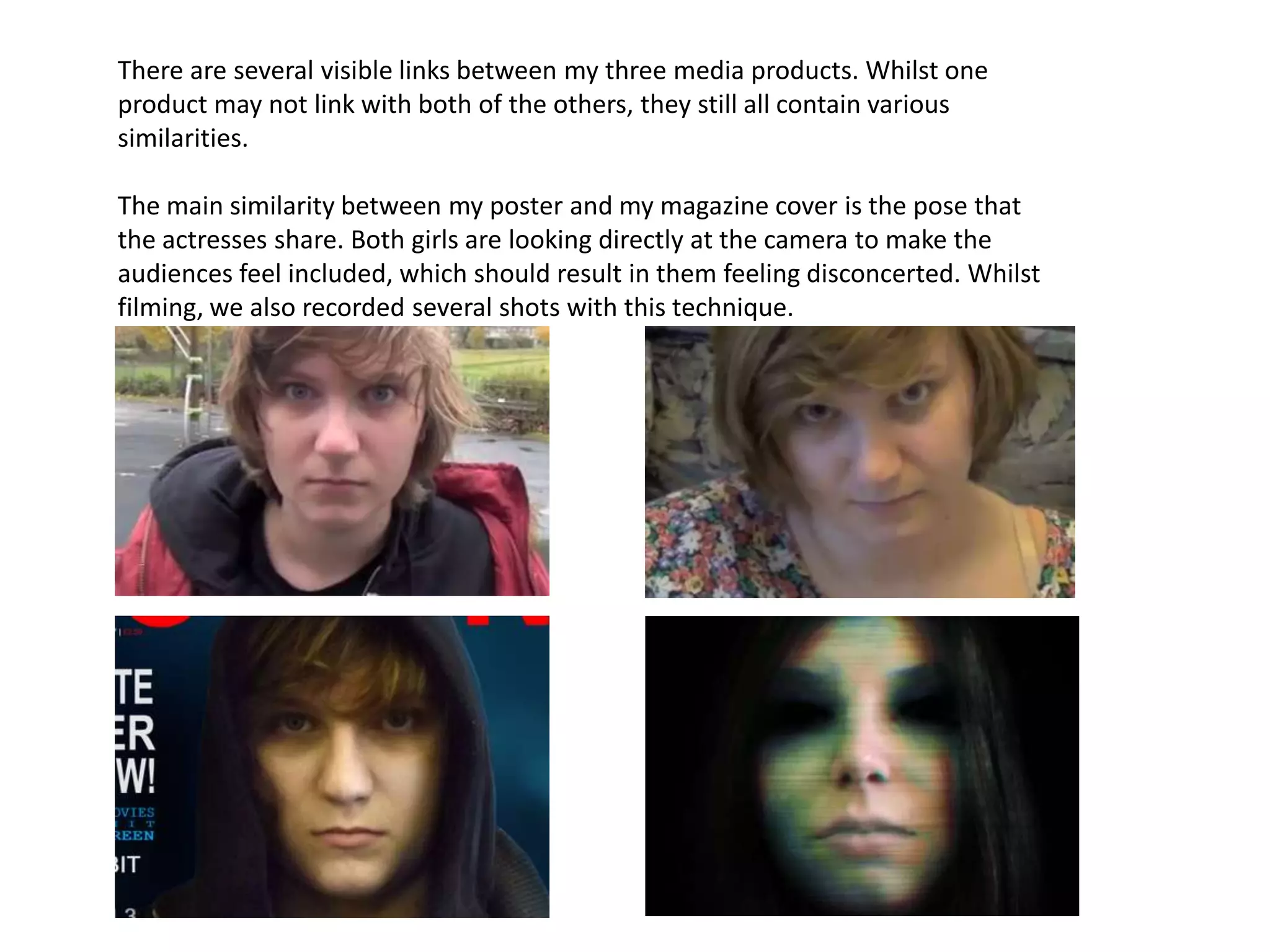
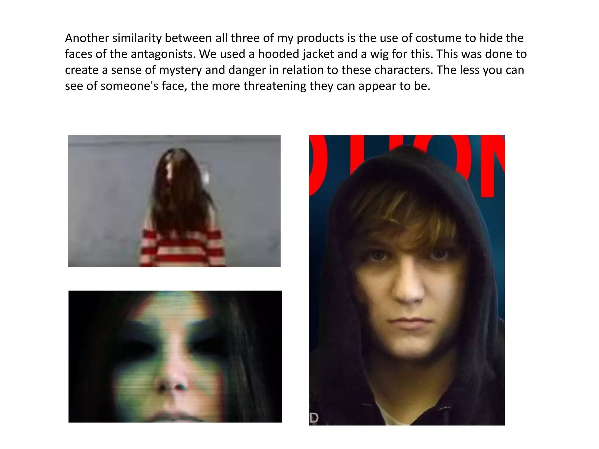
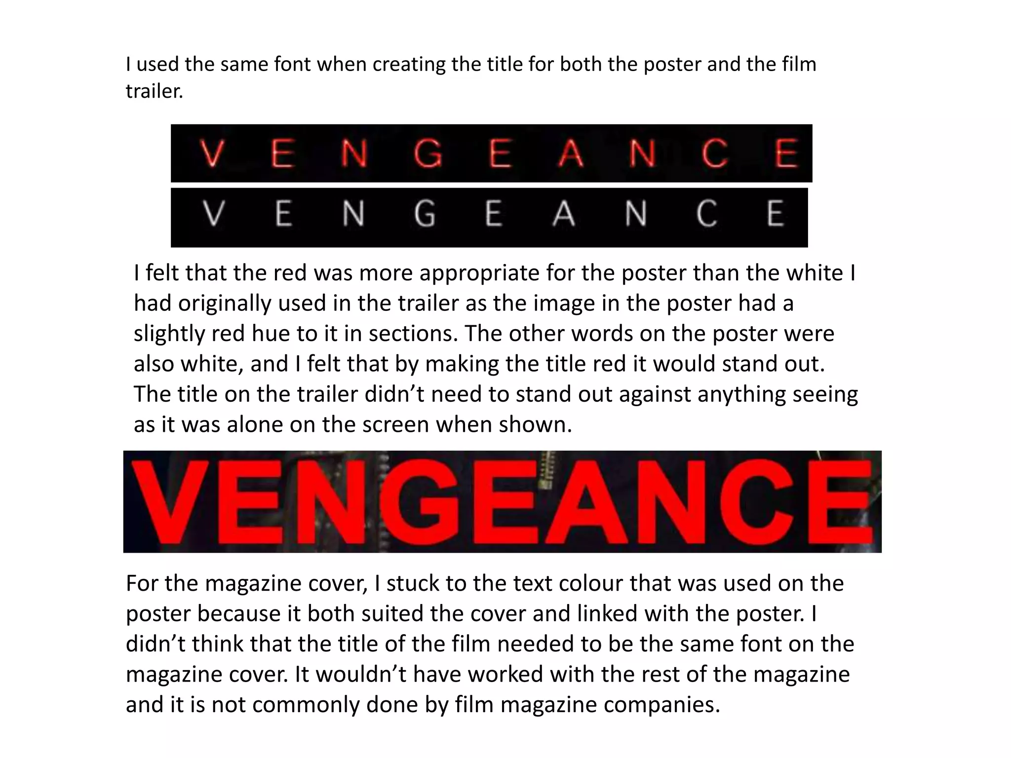
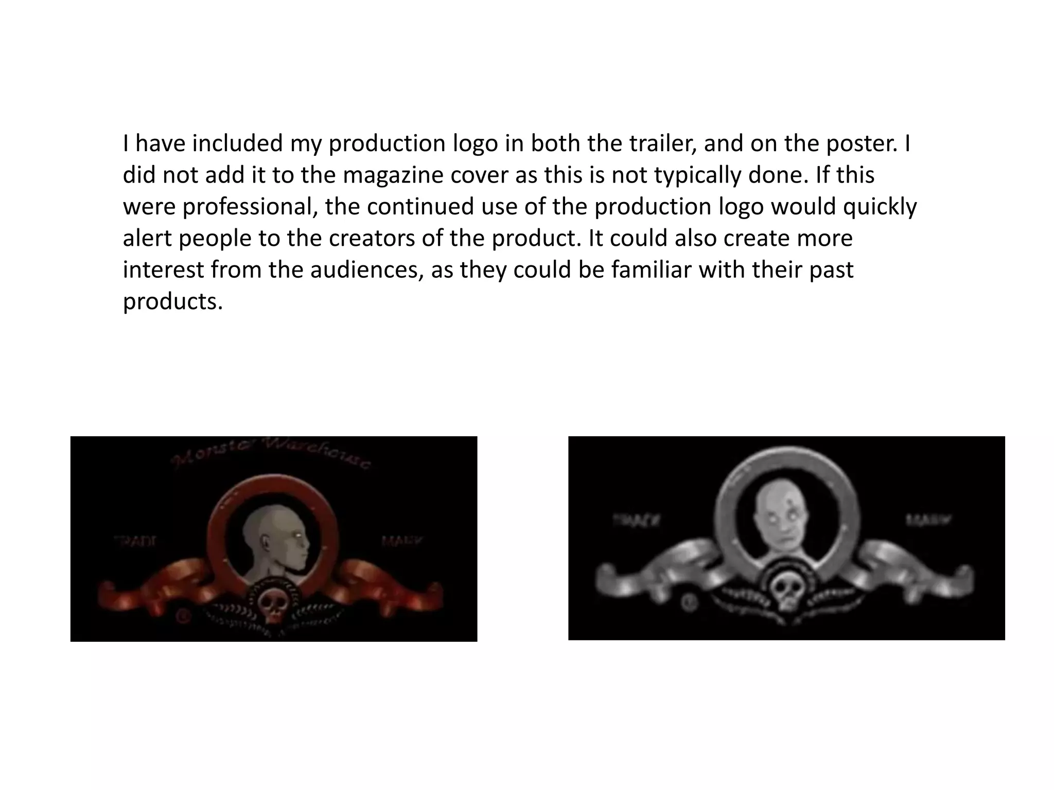
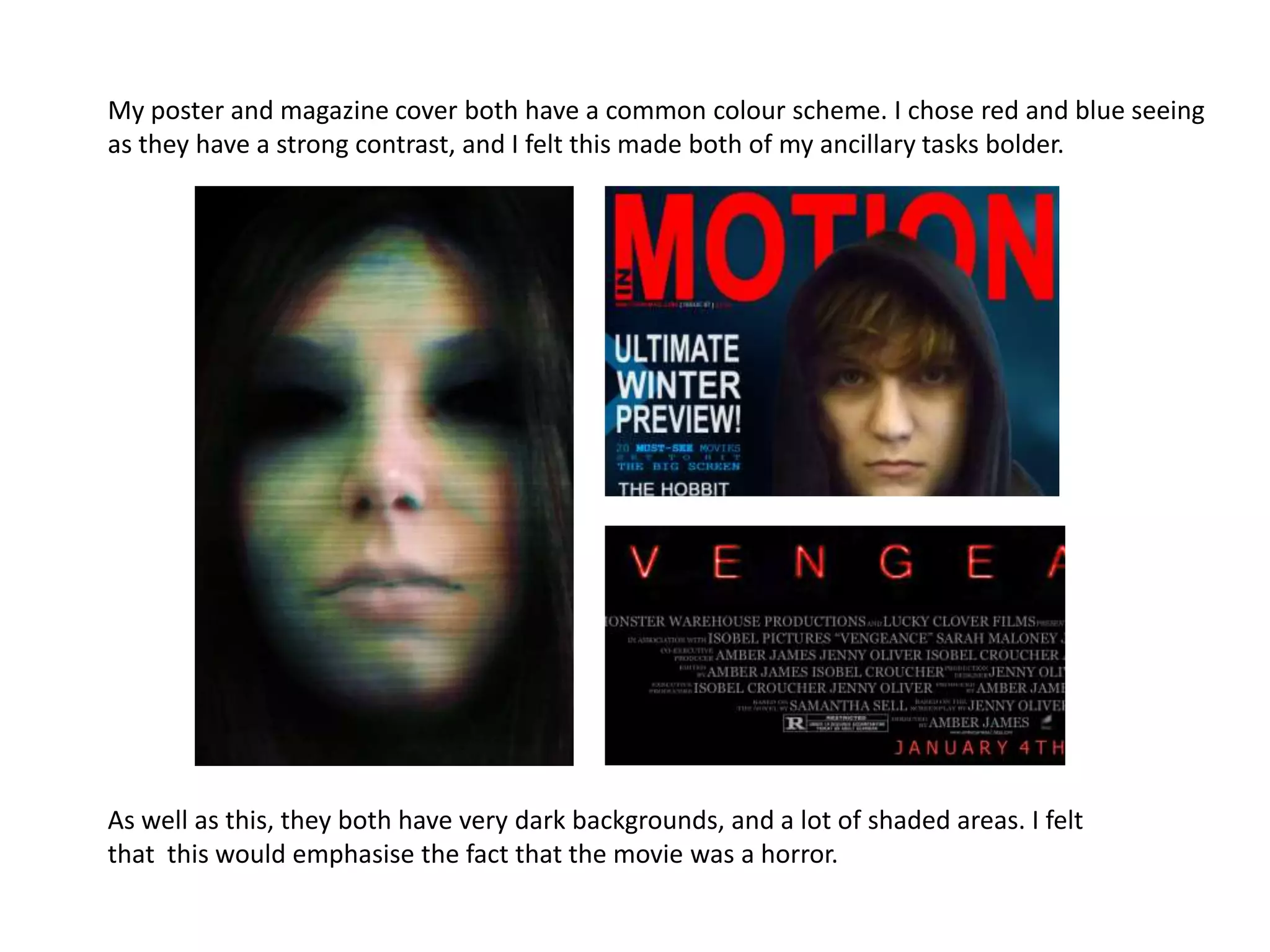
The document discusses the links and similarities between the main product and ancillary texts created by the author. There are similarities in posing of actresses, use of costumes to hide faces and create mystery, and use of the same font for the title in the poster and film trailer. Color schemes and use of logos are also linked between the products to consistently brand them and tie them together visually.
This is my A2 Media Studies Evaluation Question 2 where I am answering the question, 'How effective is the combination of your main product and ancillary texts?'
for my advanced media coursework portfolio. In this I evaluate how effectively my three media products work together- one main video and two printed media texts
1. How Effective Is The Combination of
Your Main Product And Ancillary
Texts?
2. There are several visible links between my three media products. Whilst one
product may not link with both of the others, they still all contain various
similarities.
The main similarity between my poster and my magazine cover is the pose that
the actresses share. Both girls are looking directly at the camera to make the
audiences feel included, which should result in them feeling disconcerted. Whilst
filming, we also recorded several shots with this technique.
3. Another similarity between all three of my products is the use of costume to hide the
faces of the antagonists. We used a hooded jacket and a wig for this. This was done to
create a sense of mystery and danger in relation to these characters. The less you can
see of someone's face, the more threatening they can appear to be.
4. I used the same font when creating the title for both the poster and the film
trailer.
I felt that the red was more appropriate for the poster than the white I
had originally used in the trailer as the image in the poster had a
slightly red hue to it in sections. The other words on the poster were
also white, and I felt that by making the title red it would stand out.
The title on the trailer didn’t need to stand out against anything seeing
as it was alone on the screen when shown.
For the magazine cover, I stuck to the text colour that was used on the
poster because it both suited the cover and linked with the poster. I
didn’t think that the title of the film needed to be the same font on the
magazine cover. It wouldn’t have worked with the rest of the magazine
and it is not commonly done by film magazine companies.
5. I have included my production logo in both the trailer, and on the poster. I
did not add it to the magazine cover as this is not typically done. If this
were professional, the continued use of the production logo would quickly
alert people to the creators of the product. It could also create more
interest from the audiences, as they could be familiar with their past
products.
6. My poster and magazine cover both have a common colour scheme. I chose red and blue seeing
as they have a strong contrast, and I felt this made both of my ancillary tasks bolder.
As well as this, they both have very dark backgrounds, and a lot of shaded areas. I felt
that this would emphasise the fact that the movie was a horror.